The theory of how an assortment, page or grouping of stamps appears to a viewer has always intrigued me to some extent.
I wonder if certain arrangements are more appealing or eye-catching and why they are?
Could I copy these ideas for my own album or sales or do I have to know some hidden secrets or be learned in the art of stamp arranging? Perhaps have knowledge gained over years of experience?
Should I have some training in art appreciation or architecture and viewpoints and the way the eye travels across a picture, moving from lighter areas to darker? (I don't)
What do others think is good or bad and why?
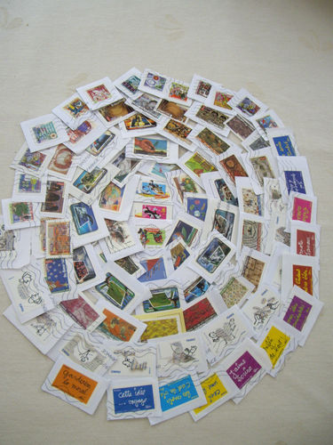
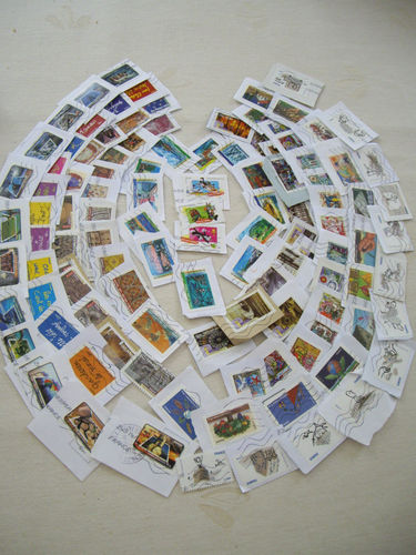
To start off I will show two arrangements of small amounts of kiloware (stamps sold by weight, generally still on pieces of paper) that caught my eye this evening on
ebay.
These are from a seller in France who also dabbles in other appealing and intriguing art pieces and ordinary objects that have some extraordinary feature about them.
A spiral / circle shape
A circle / arc / horseshoe shape
These jump out at you on the
ebay listings page as they are so different from most listings. There is the factor of, wait now, I can't see or read all of the stamps easily.
But they sure got me to click on them and look.
Rounded off objects are generally more pleasing to us humans than squared off ones.


