Hi all,
Following on from the cover shown by Rod of the 'wrong value' 13/14p I thought it would be nice to see some favourite errors/varieties of members own collecting field.
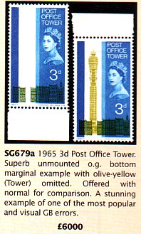
As a G.B. collector here are three of my favourites.
1. The tower has gone to POT.
2. Once again the Post Office is not in the red.
(img]
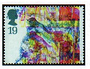
https://www.stampcommunity.org/uplo...scom2pos.jpg3. It looks as if the printer celebrated Xmas a little early and a little too well.
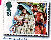
It is supposed to look like this.
The description reads - '1994 Christmas 19p Major multiple colour shift. This stamp
defies description and must be the best colour shift ever. '
Cheers
Ron.


