| Author |
 Replies: 29 / Views: 19,013 Replies: 29 / Views: 19,013 |
|
|
|
Valued Member
United States
84 Posts |
|
|
Here is my collection of 4th Bureaus. I took the original first 23 designs issued in 1922 and focused on just them (no subsequent Harding, Wilson, etc.) Not how most would do it, but hey. My scanner did not do the custom pages justice. They are printed on cream colored 100# archival card stock, clear mounts. Since I designed the pages, I left out the coil waste issues. If I win the lottery, I can add those later. This is also my first attempt with dropbox. Here is the first part: https://www.dropbox.com/s/nue8sstu1...201.pdf?dl=0And the second part: https://www.dropbox.com/s/yukm6yrd5...202.pdf?dl=0 |
Send note to Staff 
|
|
|
Pillar Of The Community
Canada
4648 Posts |
|
|
Pillar Of The Community
United States
901 Posts |
|
|
Arrows2Atoms
Amazing collection. Thank you for posting. |
|
Send note to Staff
|
| Edited by gettinold - 10/25/2019 4:13 pm |
|
|
Pillar Of The Community
United States
1851 Posts |
|
|
I have increased my search for solo, correct, non-philatelic usages of the Fourth Bureau regular issue on cover, and designed the following page format to show them in an album. Does anyone see ways the page format could be improved? The cover image here is off-center - Let's presume I will correct that in the final mounting - and I believe "per (ship)" in my draft description here is wrong. I'm really interested in comments just on graphical elements and page arrangement. Thanks. 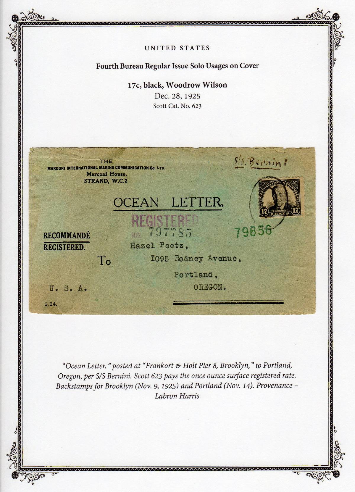 |
|
Send note to Staff
|
|
|
Pillar Of The Community
6331 Posts |
|
|
Coming from the exhibiting standpoint where text is often minimal, I am not a fan of frames or repeating lots of text at the top of each page, although that is common with album layouts. That said, the hierarchy of the size of the text lines usually goes from largest to smallest, and from bold to non-bold. It is unusual to have "United Stated" non-bold compared to the lines which follow, although it is upper-cased. Some of the layout choice depends on whether each page stands alone or as part of a larger whole. If part of a larger album, then "United States" is really unnecessary, and possibly the first words on the page should merely be "solo uses". But no two people will make identical pages.
I would consider adding cropped scans of the reverse-side postmarks, or a reduced-sized scan of the entire back side, since a considerable amount of the postal history is there.
On the write-up, It would be proper differentiate between the 2 cent letter RATE and the 15 cent registration FEE. Also, there is something wrong with the backstamp date of Nov 9, 1925, which is before the issue date. Provenance and expertising credits are often in a smaller font and would look better all on the same line. Some additional background on the ship might be interesting too. |
|
Send note to Staff
|
|
|
Pillar Of The Community
United States
1851 Posts |
|
|
Thanks, just what I was looking for. These pages will form a standalone album just for these covers. Not an exhibit and not part of a larger album. |
|
Send note to Staff
|
|
|
Valued Member
496 Posts |
|
|
Pillar Of The Community
United States
911 Posts |
|
|
Agree with John Becker about the frame and the font issues. If the entire album will fourth issue solo uses, I would delete United States and Fourth Bureau Regular Issue Solo Uses on Cover from the header. If you want, you could create a title page for the album with that information.
Where there is more than one rate that could be paid with a solo use, are you planning to show the different uses? If so, I would include the use in the header. |
|
Send note to Staff
|
|
|
Pillar Of The Community
United States
1851 Posts |
|
|
Pillar Of The Community
United States
1851 Posts |
|
|
Also, does anyone have strong feelings about the term "solo usage" versus "single franking"? Presuming this album eventually includes rarities of use, I'd like to position it to be sellable as a unit in the future and use the terms that a specialist would recognize as accurate and used with care. |
|
Send note to Staff
|
|
|
Pillar Of The Community
United States
911 Posts |
|
|
Thinking about it some more, I would include "flat plate" or "rotary press" in the header. You have the Scott number and issue date, so it is clear that your cover has the flat plate stamp, but I imagine you will have 17¢ rotary in the album also. I think the headers should tell you quickly how the cover differs from the other 17 cent stamp covers in the album (here flat vs rotary and then the rate being pad) but on other denominations you will have coils, coil waste, don't know if you are including booklet panes, Kansas / Nebraska overprints, etc. |
|
Send note to Staff
|
|
|
Pillar Of The Community
6331 Posts |
|
|
use vs usage vs franking: Each collector will have their own wording opinion (sometimes quite strong). Use what you want. Make yourself happy, rather than trying to guess about the whims of the next custodian. A future specialist collector will see the material on its own merits and gloss over most of the text. It will be disassembled and incorporated into their pages and yours discarded. Sorry, but true.
While it works neatly for mounting solo frankings, What happens when you have a cover with multilple denominations to make up the rate? Where do you file it? I have a notebook of covers with Farley's National Parks stamps. My original mounting was by denomination and it soon proved awkward due to the combination frankings. I now have it arranged by postal use: first class, 3rd class, airmail, special delivery, registered, foreign destinations, etc., and let the stamps be secondary story. Solo and combination frankings are intermixed. |
|
Send note to Staff
|
|
|
Pillar Of The Community
United States
1851 Posts |
|
|
Very good advice from you both. I don't have a good answer for the combo frankings now, but you've given food for thought. I'm focusing on solos now and passing over combo covers that come up for sale, but for some denominations I may have to compromise if solos are scarce. |
|
Send note to Staff
|
|
|
Valued Member
United States
238 Posts |
|
|
@Arrows2Atoms - that is an amazing collection of 4th Bureau issues. There are a few things I'll need to add to my collection. |
|
Send note to Staff
|
|
|
Replies: 29 / Views: 19,013 |
|


