| Author |
 Replies: 43 / Views: 7,968 Replies: 43 / Views: 7,968 |
|
|
|
Valued Member
Russian Federation
197 Posts |
|
|
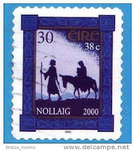
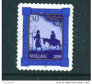
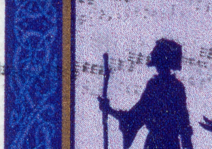
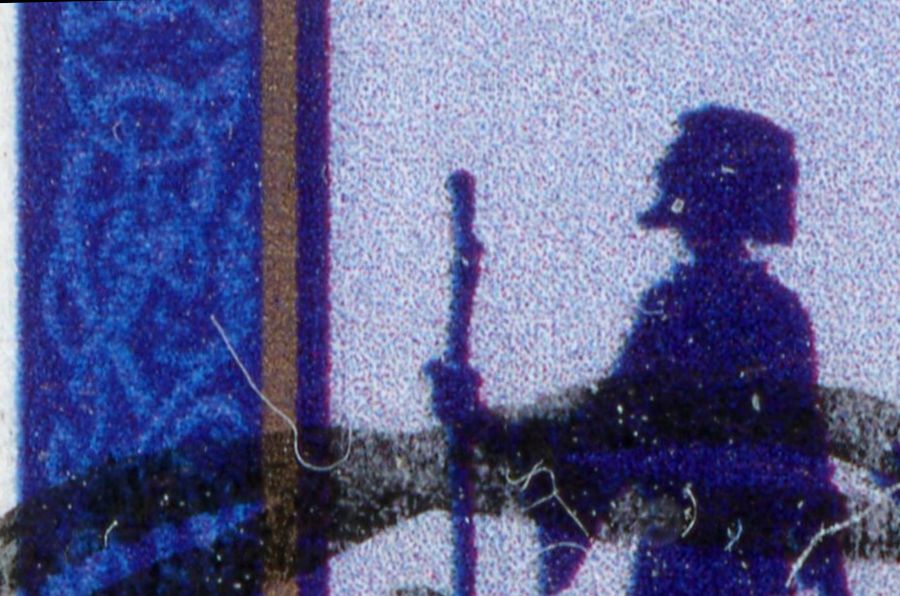
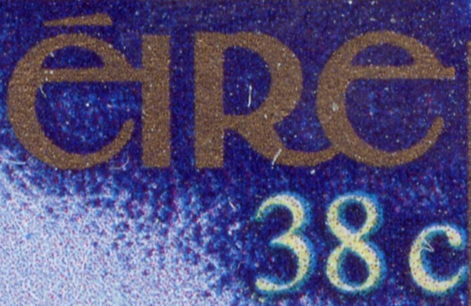
Meanwhile is there a comment on the obvious difference in the background of the two stamps shown in the post of 09/30/2013 ? |
Send note to Staff 
|
|
|
Rest in Peace
Canada
6750 Posts |
|
|
Beautiful stamp!
The colour shade of the left hand stamp is lighter overall than the right hand stamp.
The 'EIRE', the sky, the side pillars, the scribing in a light shade on the pillars, are all of a light shade.
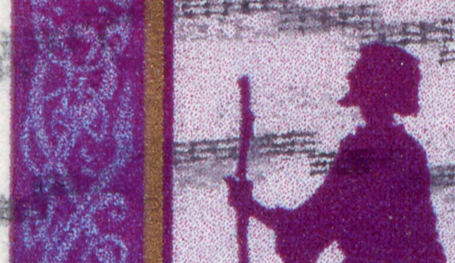
I do not know much at all about chemical changes, as I have not studied them. Many things can affect colours such as sunlight exposure, UV exposure, acid rain just being present within the atmosphere could also affect colours, depending on what the ink pigments are composed of and what chemicals are present in trace amounts in the atmosphere, over time.
Many variables.
It is very difficult to say what exactly affected your stamps, without seeing them in a new, mint-never-hinged state. Who knows what conditions the may have gone through or travelled under? |
|
Send note to Staff
|
|
|
Rest in Peace
Canada
6750 Posts |
|
|
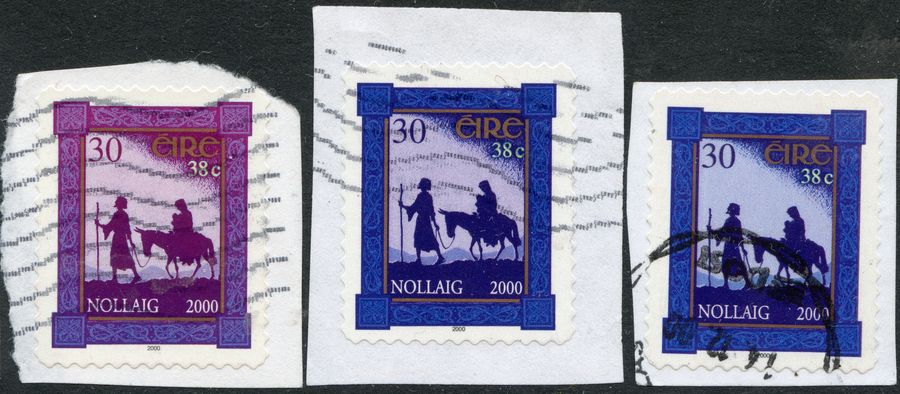
These are coutesy of ebay, both pictures shown are from booklets, self-adhesive. The first stamp shows a whitish background, while the second two have more of a purplish-bluish cast to them and their background. Perhaps there was two printings of these ?? OR perhaps the lighting of the camera shots affected the display? 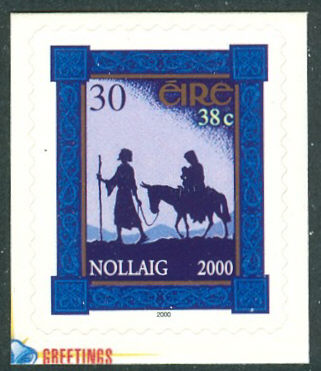 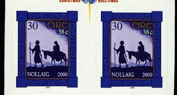 Your picture carried forward here: 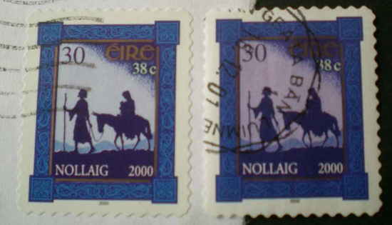 The background changes the colour displayed also. A white background makes things appear more white, a black background, more dark. |
|
Send note to Staff
|
|
|
Rest in Peace
Canada
6750 Posts |
|
|
Rest in Peace
Canada
6750 Posts |
|
|
The people's silhoettes are light blue compared to black also. Fascinating.
This could be caused partly but not wholy by an adjustment of the colour and brightness with scanning software or editing software aftyerwards also. |
|
Send note to Staff
|
|
|
Bedrock Of The Community
United States
10604 Posts |
|
|
One can never tell shade variations using scans, there are far too many variables. Only on direct examination can one see if any variations do in fact exist. |
|
Send note to Staff
|
|
|
Valued Member
Russian Federation
197 Posts |
|
|
Thank you, Puzzler, for the comments and comprarisons.
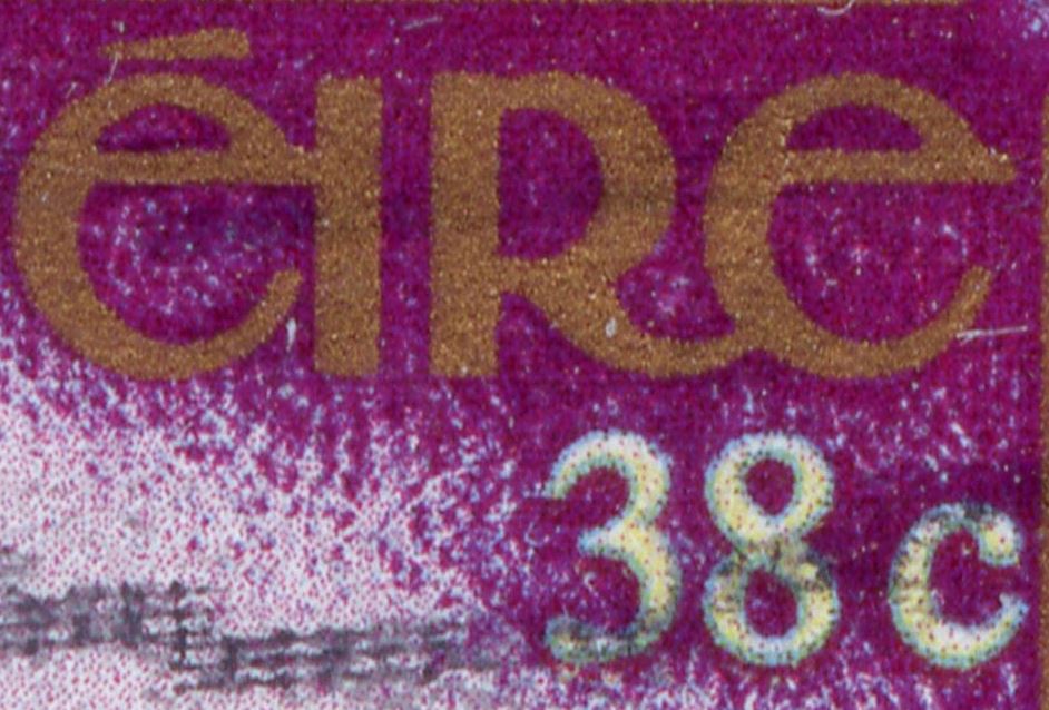
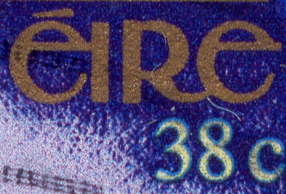
As you can see my two stamps are one shot. That means photographed in the same light (and resolution). The backgrounds are different not only in the saturation, but in the colour itself (bluish vs. tint of violet).
Of course, revcollector, nothing can beat direct comparisons, yet most of what we see, learn and know comes to us through the imnperfect photos, and even then we are capable of coping with things and situations properly. |
|
Send note to Staff
|
|
|
Valued Member
Russian Federation
197 Posts |
|
|
Here is a picture where both stamps are featured with a white background. They still look distinctly different. 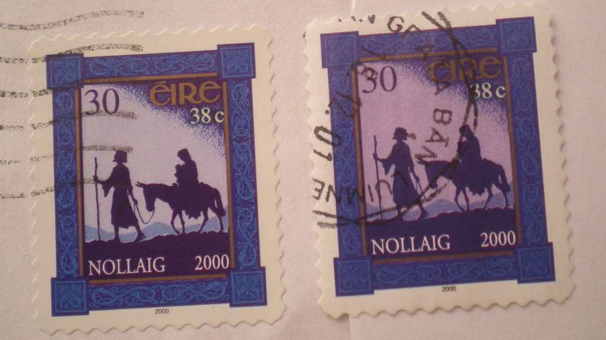 |
|
Send note to Staff
|
|
|
Pillar Of The Community
Germany
1714 Posts |
|
|
In the UK some stamps are printed for booklets and are done by different printers to the counter sheet versions so there are noticeable differences occasionally. Perhaps your 30p/38c stamps come from different printers? Are the dimensions the same? Specialized Irish collectors may know if they are listed... or someone with a specialized Ireland S.G. or Scott catalog. I'd have suspected that by now varieties would be well known if not errors also. |
|
Send note to Staff
|
| Edited by scotzm - 10/14/2013 4:20 pm |
|
|
Valued Member
Russian Federation
197 Posts |
|
|
The dimensions and perfs are the same. I could not find any info of booklets. |
|
Send note to Staff
|
|
|
Valued Member
United Kingdom
5 Posts |
|
|
With regard to the Ireland 28c definitive, this series of definitive stamps were printed on both Ordinary (CCP1) and Chalk Surfaced (CCP3) paper.
The stamps printed on CCP1 paper glow bright under long wave UV light, whilst the ones on CCP3 paper show no reaction and appear dull.
The same mix of papers were used for the Irish 3rd definitive series, Architecture and the 5th series, Birds.
This mix of papers for these stamps does not appear to be recognised by the majority of the catalogues.
I have seen several references to the red / orange stamps of the Irish 4th series showing yellower colours than normal. I assume most to be the result of the stamps being exposed to sunlight. Many years ago, before Stamp Dealers vanished from the streets / Shopping Malls of the planet, it was not unusual to see stamps with apparent lack of red printing. Some dealers even increased the prices on these 'Errors'. |
|
Send note to Staff
|
|
|
Rest in Peace
Netherlands
963 Posts |
|
|
Steve,
you are part right!
It is a question of OBA's [optical brightening agents in the coating which gives the design f whitish/bluish appearance within the phosphor frame, wheres when there are NO OBA's the same area reflects the UV-lamp giving a violet impression!
This has NOTHING to do with CCP 1 or CCP 3 - in both cases the paper used comes from Tullis Russell
Rein |
|
Send note to Staff
|
|
|
Rest in Peace
Netherlands
963 Posts |
|
|
Replies: 43 / Views: 7,968 |
|