Stamp Community Family of Web Sites
Thousands of stamps, consistently graded, competitively priced and hundreds of in-depth blog posts to read


Stamp Community Forum
 
Username:
Password:
Save Password
Forgot your Password?

This page may contain links that result in small commissions to keep this free site up and running.

Welcome Guest! Registering and/or logging in will remove the anchor (bottom) ads. It's Free!

Scott #586B - Mysterious Black Ink.

Next Page    
 
To participate in the forum you must log in or register.
Author Previous TopicReplies: 19 / Views: 3,358Next Topic
Page: of 2
Rest in Peace
7742 Posts
Posted 03/26/2014   5:48 pm  Show Profile Bookmark this topic Add wert to your friends list Get a Link to this Message
Hi guys..Take a look at this Scott #586b booklet...Look at all the arrows and the circled area...There is evidence of black ink..Apparently this booklet has no black engravings or letters.


Send note to Staff

Bedrock Of The Community
United States
12128 Posts
Posted 03/26/2014   6:19 pm  Show Profile Bookmark this reply Add wt1 to your friends list  Get a Link to this Reply
A couple of spots you missed ...

Send note to Staff  Go to Top of Page
Rest in Peace
7742 Posts
Posted 03/26/2014   6:26 pm  Show Profile Bookmark this reply Add wert to your friends list  Get a Link to this Reply
Come on wt1...Your killing me...I didn't have enough arrows to go around...
Send note to Staff  Go to Top of Page
Bedrock Of The Community
United States
12128 Posts
Posted 03/26/2014   6:30 pm  Show Profile Bookmark this reply Add wt1 to your friends list  Get a Link to this Reply
You can even take that same image to the next level and blow up the words "postes/postage" where you can clearly see the slash mark ( / ) is positioned differently!

Send note to Staff  Go to Top of Page
Rest in Peace
7742 Posts
Posted 03/26/2014   6:52 pm  Show Profile Bookmark this reply Add wert to your friends list  Get a Link to this Reply
Ya..I see that wt1...hmmmm
Send note to Staff  Go to Top of Page
Pillar Of The Community
United States
5894 Posts
Posted 03/26/2014   7:34 pm  Show Profile Bookmark this reply Add smauggie to your friends list  Get a Link to this Reply
My wild off-the-wall guess is that the plate used to print these stamps was used to print color trials, and that they didn't properly clean the plate before starting production in the chosen color. Like I said . . wild and off-the-wall but it's the only thing that makes sense to me right now.
Send note to Staff  Go to Top of Page
Rest in Peace
Canada
5701 Posts
Posted 03/26/2014   7:41 pm  Show Profile Bookmark this reply Add BeeSee to your friends list  Get a Link to this Reply
The red and/or orange on these stamps has mixed in with the blue. Extremely common for this issue.

I cannot see any difference in the slashes
Send note to Staff  Go to Top of Page
BeeSee in BC
"The Postmark is Mightier than the Stamp"
http://brcstamps.com ---- BNAPS, RPSC, APS
Pillar Of The Community
Canada
5821 Posts
Posted 03/26/2014   8:36 pm  Show Profile Bookmark this reply Add lithograving to your friends list  Get a Link to this Reply
Like BC mentioned this is very common for these
booklets printed by the British American Bank Note Co.

They were printed on a 3 colour Goebel intaglio press
(also capable of up to 4 photogravure colours)
which used the Giori process whereby only one cylinder
plate was used with 3 ink fountains.

Therefore in a single pass 3 colours could be applied
but this obliviously caused bleeding together of the
colours, more or less depending how properly
the wiping paper cleaned the print cylinder.
Send note to Staff  Go to Top of Page
Pillar Of The Community
United States
8956 Posts
Posted 03/26/2014   8:40 pm  Show Profile Bookmark this reply Add Petert4522 to your friends list  Get a Link to this Reply
BeeSee, the bottoms of the two slashes are not the same distance from the two words 'postes'! I really believe the two slashes are printed under a different angle. Now, this is THE ultimate flyspecking!

Peter
Send note to Staff  Go to Top of Page
Pillar Of The Community
United States
8956 Posts
Posted 03/26/2014   8:49 pm  Show Profile Bookmark this reply Add Petert4522 to your friends list  Get a Link to this Reply
Lithograving, thank you for the explanation. Could you go just a bit further and tell us if this is normal for this type of printing, or if this is poor print quality? I collect US Transportation Coils and the later denominations were printed in two colors. The design was in one color, and the service inscription was in red. It is very hard, if not almost impossible to find stamps that do not have this "bleed".

Peter
Send note to Staff  Go to Top of Page
Pillar Of The Community
Canada
5821 Posts
Posted 03/26/2014   8:52 pm  Show Profile Bookmark this reply Add lithograving to your friends list  Get a Link to this Reply


Quote:
Take a look at this Scott #586b booklet.


BTW wert, you're six Queens short of a booklet.
Send note to Staff  Go to Top of Page
Pillar Of The Community
Canada
5821 Posts
Posted 03/26/2014   9:23 pm  Show Profile Bookmark this reply Add lithograving to your friends list  Get a Link to this Reply
Peter I'm no expert on printing but have always had an interest
in it.

I don't know what press was used for the transportation
coils but the BEP began in 1957 printing multicolour stamps
using a Giori press.
Now that so called Giori press used the giori process but
those presses were manufactured Koenig & Bauer AG (KBA).
but Goebel also used the same process.

I don't have a list yet of how many printers used this
Giori process but a short list would be BEP,BNAB BABN, State printers of Sweden, Spain, Italy, Denmark....

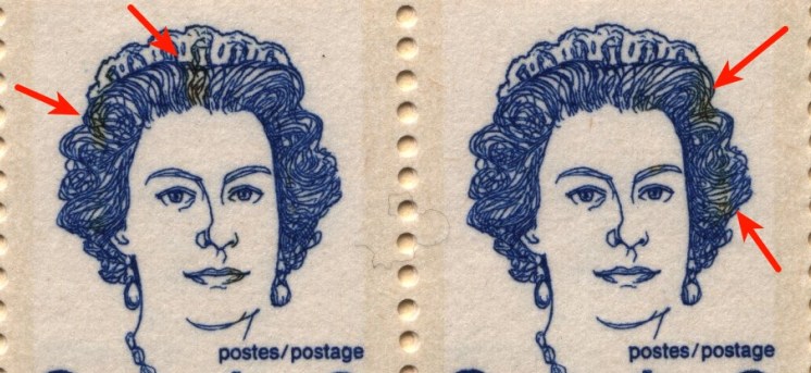
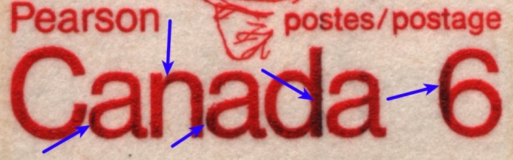
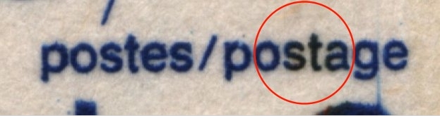
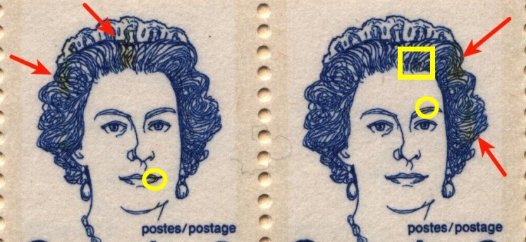
From what I have seen the degree of "bleeding" depends on how well
the inked areas are separated and the expertise of the
print team.

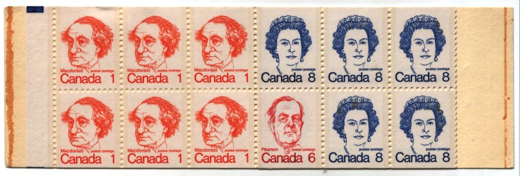
The Canadian ones are basically simple as is since even though
3 colours were used to print one sheet, each stamp was only
one colour therefore separation was easy.
Compare the US Giori from the sixties where you have the 3 colours
on one stamp and it sometimes got messy.


Take a look at this one here Spain Scott 1699


or this one which isnt that bad.


I my opinion the best results in colour separation was done
by the Swedish and Danish Printing Works.


Send note to Staff  Go to Top of Page
Edited by lithograving - 03/26/2014 9:48 pm
Pillar Of The Community
United States
8956 Posts
Posted 03/26/2014   9:50 pm  Show Profile Bookmark this reply Add Petert4522 to your friends list  Get a Link to this Reply
Lithograving, again thank you! The press used for some of the Transportation Coils was a Giori system intaglio press, built by Koenig and Bauer of Wurzburg, West Germany.

Peter
Send note to Staff  Go to Top of Page
Rest in Peace
7742 Posts
Posted 03/26/2014   9:53 pm  Show Profile Bookmark this reply Add wert to your friends list  Get a Link to this Reply
Well..Let me tell you that when a printer removes a cylinder plate to ready for another plate..The new plate size if almost and identical size as the one removed..A pressman would wash down the cylinder,,If and I do mean IF he did not clean it properly the bleeding or extra colour would be prevalent on the outer areas of the sheets that are now being printed..This does not explain why stamps in the middle of the sheets have colours that can not be explained.

Yes lithograving my friend, you are correct...6 less stamps,but was not trying to say this was a complete booklet, rather I was trying to centralize on the fact that there were colours that should not be there...
Send note to Staff  Go to Top of Page
Pillar Of The Community
Canada
5821 Posts
Posted 03/26/2014   9:59 pm  Show Profile Bookmark this reply Add lithograving to your friends list  Get a Link to this Reply
Yes Peter thanks, I just corrected it.

Koenig and Bauer indeed built the BEP presses.

Goebel, Darmstadt, Germany built the multicolour intaglio presses
for BABN, Sweden,Denmark and I believe Switzerland which
uses basically the same process as the K&B.

Send note to Staff  Go to Top of Page
Rest in Peace
Canada
5701 Posts
Posted 03/26/2014   11:15 pm  Show Profile Bookmark this reply Add BeeSee to your friends list  Get a Link to this Reply

Quote:
BeeSee, the bottoms of the two slashes are not the same distance from the two words 'postes'! I really believe the two slashes are printed under a different angle.


I cannot see that. There is too much "pixelization" in the scan which may give a false look. I checked many of the dozens of books I have under a 10X glass and cannot see any difference.
Send note to Staff  Go to Top of Page
BeeSee in BC
"The Postmark is Mightier than the Stamp"
http://brcstamps.com ---- BNAPS, RPSC, APS
Page: of 2 Previous TopicReplies: 19 / Views: 3,358Next Topic  
Next Page
 
To participate in the forum you must log in or register.

Go to Top of Page

Disclaimer: While a tremendous amount of effort goes into ensuring the accuracy of the information contained in this site, Stamp Community assumes no liability for errors. Copyright 2005 - 2026 Stamp Community Family - All rights reserved worldwide. Use of any images or content on this website without prior written permission of Stamp Community or the original lender is strictly prohibited.
Privacy Policy / Terms of Use    Advertise Here
Stamp Community Forum © 2007 - 2026 Stamp Community Forums
It took 0.24 seconds to lick this stamp. Powered By: Snitz Forums 2000 Version 3.4.05