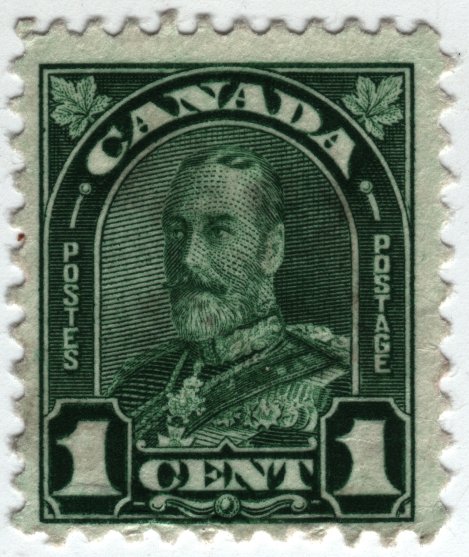
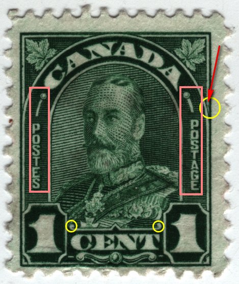
For those taking interest is flyspecking this stamp, why hasn't anyone mentioned...
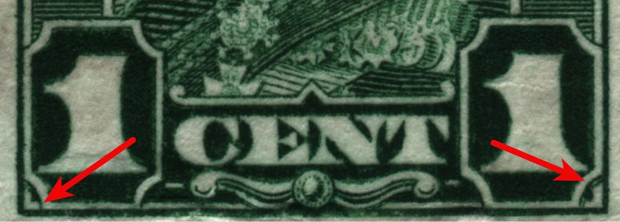
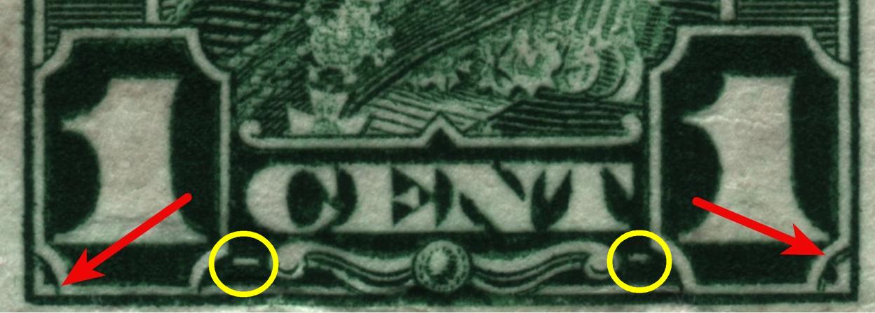
1. The printing anomaly in the vertical line (shown at the red arrow/yellow circle below).
2. The size of the arc above "POSTES" and "POSTAGE" is different both in width and length.
3. The thickness of the letters in the words "POSTES" and "POSTAGE" is different. In fact, there is a considerable difference in the third letter "S" in "POSTES" as compared to the same letter in "POSTAGE". (See pink boxes in image below.)
4. The circular ends to the line above the word "CENT" are differently shaped. (See yellow circles in image below.)
Probably all of these minor "defects" in printing were within acceptable tolerances to
Canada Post, but with flyspeckers who study these details, they still deserve mention.