| Author |
 Replies: 15 / Views: 4,660 Replies: 15 / Views: 4,660 |
|
|
Pillar Of The Community
United States
6661 Posts |
|
|
|
|
Valued Member
Canada
65 Posts |
|
|
Pillar Of The Community
United States
789 Posts |
|
|
3c right cheek.. so happy for you he's tearing up???!!
(left side of portrait) |
Send note to Staff 
|
|
|
Moderator

United States
4788 Posts |
|
|
Rest in Peace
7742 Posts |
|
|
stallzer...Beautiful stamps..Here is something to think about...Look at the picture below and figure out why the border around the numerals of the number "4" is difference than the rest...  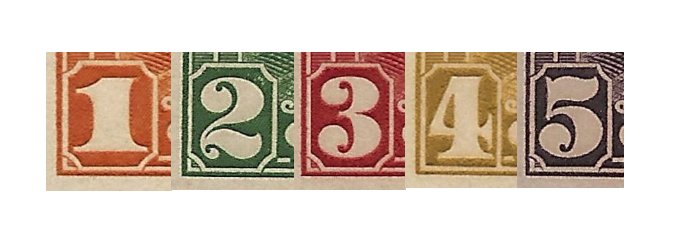 |
|
Send note to Staff
|
|
|
Pillar Of The Community
United States
6661 Posts |
|
|
That's just the way they were printed Wert, probably different die. Thanks for the nice comments all. |
|
Send note to Staff
|
|
|
Pillar Of The Community
Canada
6525 Posts |
|
|
That's interesting. I never noticed that about the 4¢ stamp before. Just a note, it was the last of the six scroll denominations to be issued.
1¢ - October 29, 1928
2¢ - October 17, 1928
3¢ - December 12, 1928
4¢ - August 16, 1929
5¢ - December 12, 1928
8¢ - December 21, 1928
Plenty of time to change the die. |
|
Send note to Staff
|
|
|
Pillar Of The Community
3859 Posts |
|
|
Are there two parts to this set with one being the portrait of King George V and the other of various Canada scenes? |
|
Send note to Staff
|
|
|
Pillar Of The Community
United States
6661 Posts |
|
|
Yes, the scroll set also includes the legendary Bluenose & $1 Parliament building among a few others. |
|
Send note to Staff
|
|
|
Rest in Peace
Canada
6750 Posts |
|
|
Beautiful stamps stalzer. Great angle to view the King from too. Action and daring and official all at the same time. Quote:. . . and figure out why the border around the numerals of the number "4" is difference than the rest.. Perhaps to do with him becoming a Mason or such lke, grounding in a way? The numeral 4 seems to have a part of a Cross of some sort configured within it. The 5c and 8c issued before it have two dots in the lower finials, perhaps a beginning of grounding or something? |
|
Send note to Staff
|
|
|
Pillar Of The Community
United States
6661 Posts |
|
|
Playing with a new scanner and came across these so I decided to do a side by side comparison. Old scanner  New scanner  New scanner  Old scanner  [/url] New scanner  Old scanner  |
|
Send note to Staff
|
|
|
Pillar Of The Community

United States
4429 Posts |
|
|
The old scanner has way too much sharpening applied and colors look more saturated. You can see the sharpening effects by the halo effect near the edges (transitions between light and dark). The new scanner images look much more natural. |
|
Send note to Staff
|
Al |
|
|
Pillar Of The Community
Australia
554 Posts |
|
|
I believe the settings may be important here. The old scans appear to be on the "color document" setting whereas the new ones are at the "color photo" setting which is the one I always use. |
|
Send note to Staff
|
|
|
Pillar Of The Community
United States
6661 Posts |
|
|
I agree, they are also a much better representation of how they really look. Just goes to show why you cant judge colors and shades without seeing the stamp in person. Both scanners are using default settings. Old scanner was a 3 in 1 HP, new scanner is only a flatbed Canon. Here are the others, the new scanner is much more accurate of how they really look. New scanner  Old  New  Old  New  Old  |
|
Send note to Staff
|
| Edited by stallzer - 10/29/2017 07:50 am |
|
|
Pillar Of The Community
United States
4429 Posts |
|
|
I do think the old scanner images could be improved by changing settings (reduce sharpening, etc). |
|
Send note to Staff
|
Al |
|
|
Valued Member
United States
85 Posts |
|
|
I thought the old ones were really nice showing off all the detail but wow those new scans though, now I want to obtain this set... thanks Stallzer.  Willie |
|
Send note to Staff
|
|
| |
Replies: 15 / Views: 4,660 |
|


