| Author |
 Replies: 16 / Views: 3,286 Replies: 16 / Views: 3,286 |
|
Rest in Peace
7742 Posts |
|
|
|
|
Pillar Of The Community
Canada
1394 Posts |
|
|
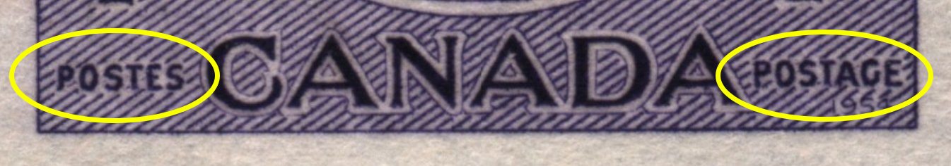
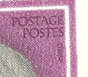
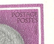
There's no difference in sizes as I've cut and pasted "POSTES" from your image beside and below "POSTAGE" and the lettering is virtually identical in size.  |
Send note to Staff 
|
|
|
Moderator

United States
12330 Posts |
|
|
I've recommended this before but it has been a while. I've used this little utility for quite a few years now and it is pretty handy. If you do a lot of measuring and comparing you might want to take a look at 'Screen Calibers' tool. They have a 'free' version (albeit with some features removed) but will allow you to quickly determine and measure on screen things like this. You can check it out at Don http://www.iconico.com/caliper/ |
|
Send note to Staff
|
|
|
Pillar Of The Community
Canada
4648 Posts |
|
|
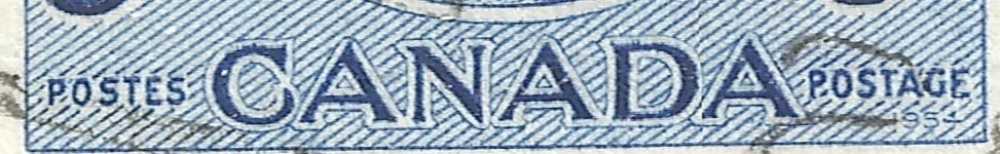
Interesting Wert, but, what impresses me even more is the "O" in "POSTAGE" that looks almost like a malformed "D"
Chimo
Bujutsu |
|
Send note to Staff
|
|
|
Bedrock Of The Community
United States
12128 Posts |
|
|
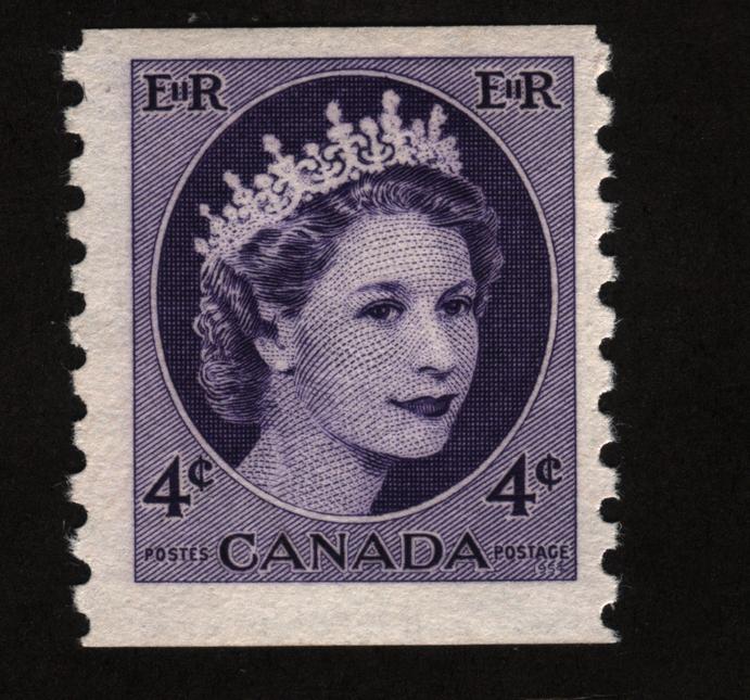
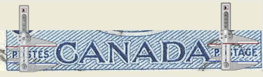
As long as we're looking at minor flyspecking of this stamp, has anyone noticed the slight difference in the third "A" in "CANADA" as compared to the first two. Notice that the third "A" is more pointed at the top as compared to more blunted tops on the first two "A's". In fact, I took the previously scanned enlargement and tried to put screen calipers on it showing just how different the third "A" appears in both size and position compared to the first two "A's". What do you think? 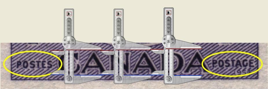 |
|
Send note to Staff
|
| Edited by wt1 - 07/20/2014 1:21 pm |
|
|
Moderator

United States
5094 Posts |
|
|
I think what we are seeing here is a lot of optical delusions ...
Sorry, illusions. |
|
Send note to Staff
|
|
|
Rest in Peace
7742 Posts |
|
|
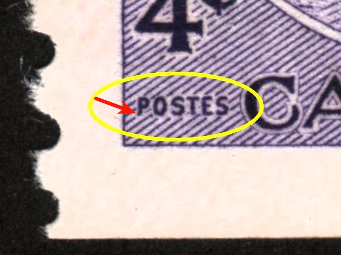
BlackJag...Look where my red arrow is pointing..That extra ink is from the diagonal line..Stamp in hand shows it is shorter..And the red line is right at the bottom of the "P". Oh well...most of you guys dont believe me..so case closed... 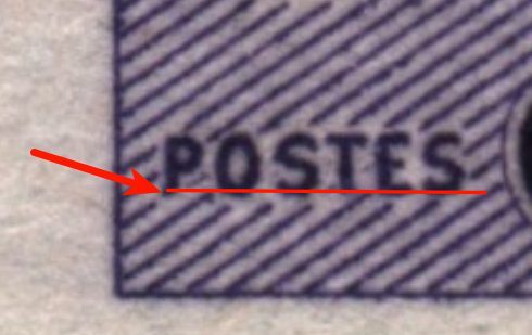 |
|
Send note to Staff
|
| Edited by wert - 07/20/2014 1:59 pm |
|
|
Moderator
United States
5094 Posts |
|
|
Bedrock Of The Community
United States
12128 Posts |
|
|
Another "optical illusion?" so it may be is in the original image, note the difference between the "4" and the "cent sign". You can visibly see that the diagonal lines between the characters are longer on the right than on the left. Does that mean there might be an ever so slight spacing difference between the characters? 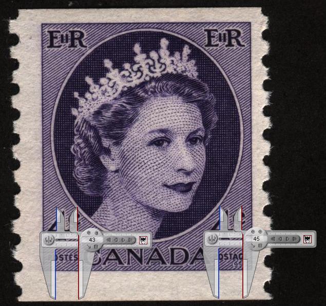 (As much as we play the "flyspecking" game with these stamps, I wonder if some of these subtle differences were made intentionally in the interest of thwarting counterfeiting.) |
|
Send note to Staff
|
| Edited by wt1 - 07/20/2014 2:33 pm |
|
|
Rest in Peace
7742 Posts |
|
|
Ok..Here is my last post on this...My heavy duty software has a measuring gauge accurate to 1/10 of a pixel...Take a look at the picture below guys. 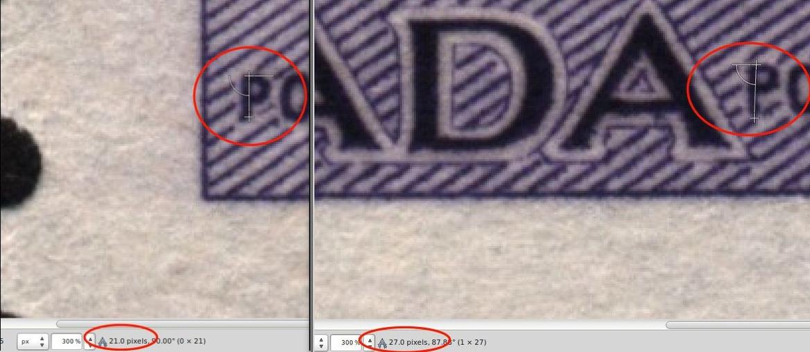 |
|
Send note to Staff
|
|
|
Moderator
United States
5094 Posts |
|
|
Bedrock Of The Community
United States
12128 Posts |
|
|
Rest in Peace
7742 Posts |
|
|
Partime...I ran it through my software and both "P" measure 19 pixels each..go figure. 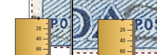 |
|
Send note to Staff
|
| Edited by wert - 07/20/2014 10:44 pm |
|
|
Moderator
United States
5094 Posts |
|
|
Well, this topic gets more interesting. Although I haven't tried this software, I am sensing a bias towards placing the cursor where one gets the result that one wants to get. Psychologically, I wanted to see the two P's a different size, and wt1 was able to confirm my feeling through his placement of the endpoints.
Maybe we need to do some sort of double-blind experiment where everyone measures the same part, using the same software, and let's see what they get.
In any case, I found this an interesting exercise, but am now ready to move onto more obvious errors ... maybe color differences that everyone can see on their monitors ... uh, oh! |
|
Send note to Staff
|
|
|
Moderator
United States
12330 Posts |
|
|
Frankly I don't know if these things classify as an error or a freak. No one ever seems to know what the original printing specifications for these kinds of tolerances are; is it +-0.01mm or ???
If a variance is within the original specification tolerances it means that the stamps are 'normal', they would have passed inspection when they were printed. I assume that errors and freaks are those which are not within the original specification tolerances and would have been pulled if discovered during printing. That is what would (in my mind anyway) would make them unusual or rare.
Don
|
|
Send note to Staff
|
|
|
Pillar Of The Community
923 Posts |
|
|
I agree with 51studebaker. Isn't it obvious that there are going to be every kind of tiny variation - because the stamps were engraved by a human being, not a pixel-differentiating robot. Perhaps we should be marvelling that he/she got it so close. |
|
Send note to Staff
|
|
|
Replies: 16 / Views: 3,286 |
|