Hi chipg and thanks for your comments, opinion and lovely image examples. I agree with you mostly. Grading should not be completely relative to the issue. Just because an issue is badly centered does not mean that an off centre stamp can suddenly be XF. Obviously, the reason we have standard classifications across issues is so that premium pricing can be attached to F, VF, etc. when it is warranted.
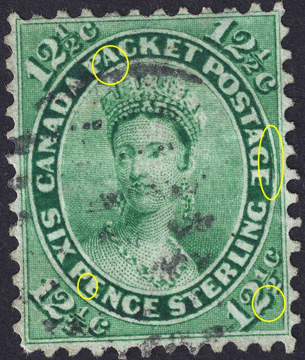
On the other hand, centering is not the only defining factor for grading. The stamp I show at the beginning of this post would surely not even be treated as fine for any reasonably modern Canadian stamp. However for this badly centered early issue, I believe some leniency towards centering can be allowed given the other characteristics of the stamp. The good colour, great perfs and nice light postmark on my copy would, I believe, make this stamp an easy Fine grade and perhaps F-VF at a push.
Of course it would be nice to assign an absolute grading system that applies for all issues even if it means no XF or VF examples exist. To me this is how grading should be done but not how it is done in the real world in my experience.
Grading is problematic at best and varies considerable across issues and time periods. If you look in the Unitrade catalogue, you will see that a typical Admiral stamp pricing difference between F and VF is actually bigger percentagewise than it is for the First Cents issue we are discussing here. This is of course quite absurd if you use absolute grading across issues. The Admiral issue is infinitely better centred that the First Cents issue so VF grading should demand a much bigger premium for the older issue. Yet Unitrade seems to have the opposite trend. To me, this suggests that the grading is relative and depends at least to some degree on what is available for the issue. A quick glance at
ebay listings reveals a clear subjectively for grading the centering on older Victorian issues. While all sellers have their own standards for grading, you can see a much greater leniency for what is considered VF centering on an old Victoria stamp.
The #18a stamp you have shown has without a doubt the best margins and centering I have ever seen on this stamp! Quite honestly, I do not know how you have such large margins on all sides without showing any of the surrounding stamps in the perforation tips. This stamp is a true gem under any subjective or objective grading system. Do you own these lovely examples?