My comeuppance: never having been terribly interested in the details of printing stamps (eg rotary vs flat press), I am
driven to nail-down the different methods of printing postcards. Go figure.
Perhaps the greatest variety of printing techniques are found in the halftones. One reason is that there were so many publisher active during The Golden Age, when halftone techniques dominated the postcard industry. But another reason is that there are just so many different ways to generate so many different patterns of so many different dots.
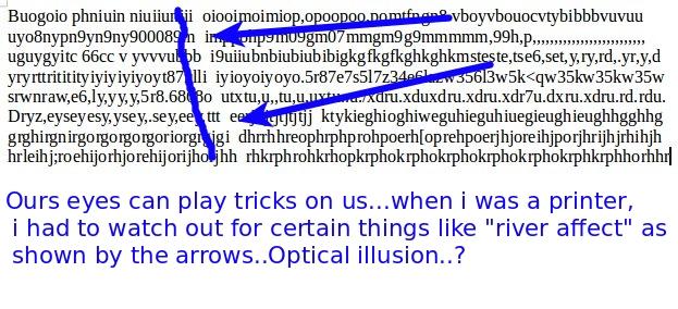
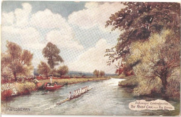
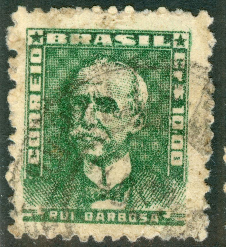
Recently, I've noticed a number of cards with a very peculiar pattern in the image:
Q/ Why in the world would someone create a tartan pattern of dense & sparse dots? Does the tartan pattern subliminally smooth the image?
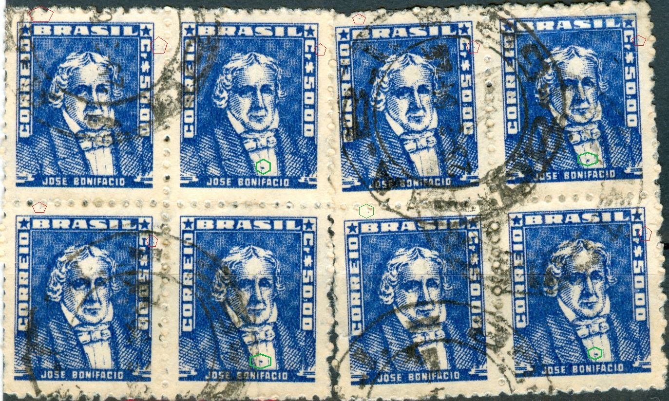
I typically scan postcards cards at 200 dpi but, for smaller areas of interest (the stamp, cds, publisher imprint/logo, or a detail of the image on the 'art' side of the card) I scan at 600 dpi.
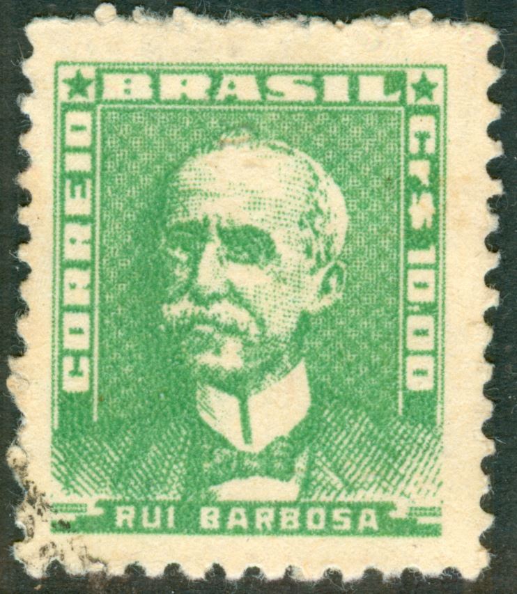
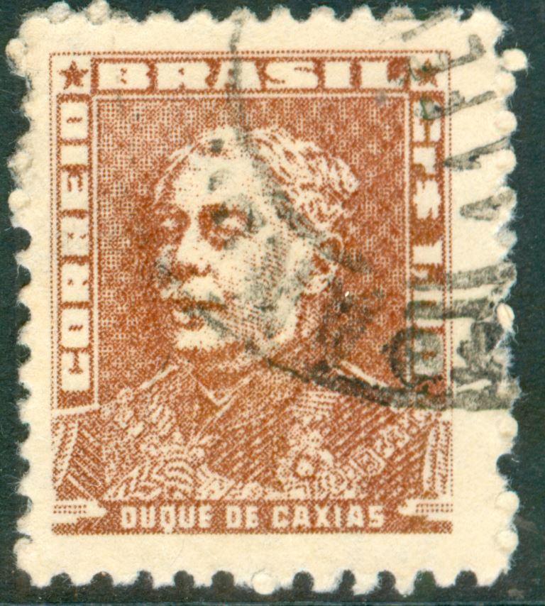
And here's what two parts of that same area of interest look like at 600 dpi:
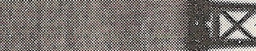
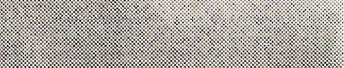
As you can see, the tartan pattern is diminished, revealing uniformly-spaced dots.
I won't bother embarrassing myself by trying to do the math to find an exact answer, but I can promise you those dots are not spaced at 200 dpi, or a harmonic thereof.
And, so, a cautionary hint: even if you scanned it yourself, you may not be looking at what you were looking at.
Cheers,
/s/ ikeyPikey
edited to correct 'checkerboard' to 'tartan'
PS: none of these images were run thru any image processing algorithms