Stamp Community Family of Web Sites
Thousands of stamps, consistently graded, competitively priced and hundreds of in-depth blog posts to read


Stamp Community Forum
 
Username:
Password:
Save Password
Forgot your Password?

This page may contain links that result in small commissions to keep this free site up and running.

Welcome Guest! Registering and/or logging in will remove the anchor (bottom) ads. It's Free!

Scott #306B - Design Oddity.

 
To participate in the forum you must log in or register.
Author Previous TopicReplies: 5 / Views: 1,659Next Topic  
Rest in Peace
7742 Posts
Posted 01/19/2015   9:48 pm  Show Profile Bookmark this topic Add wert to your friends list Get a Link to this Message
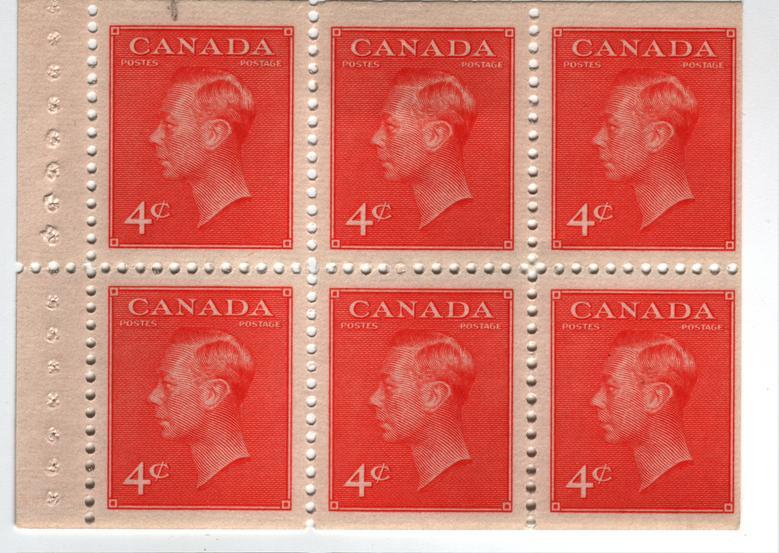
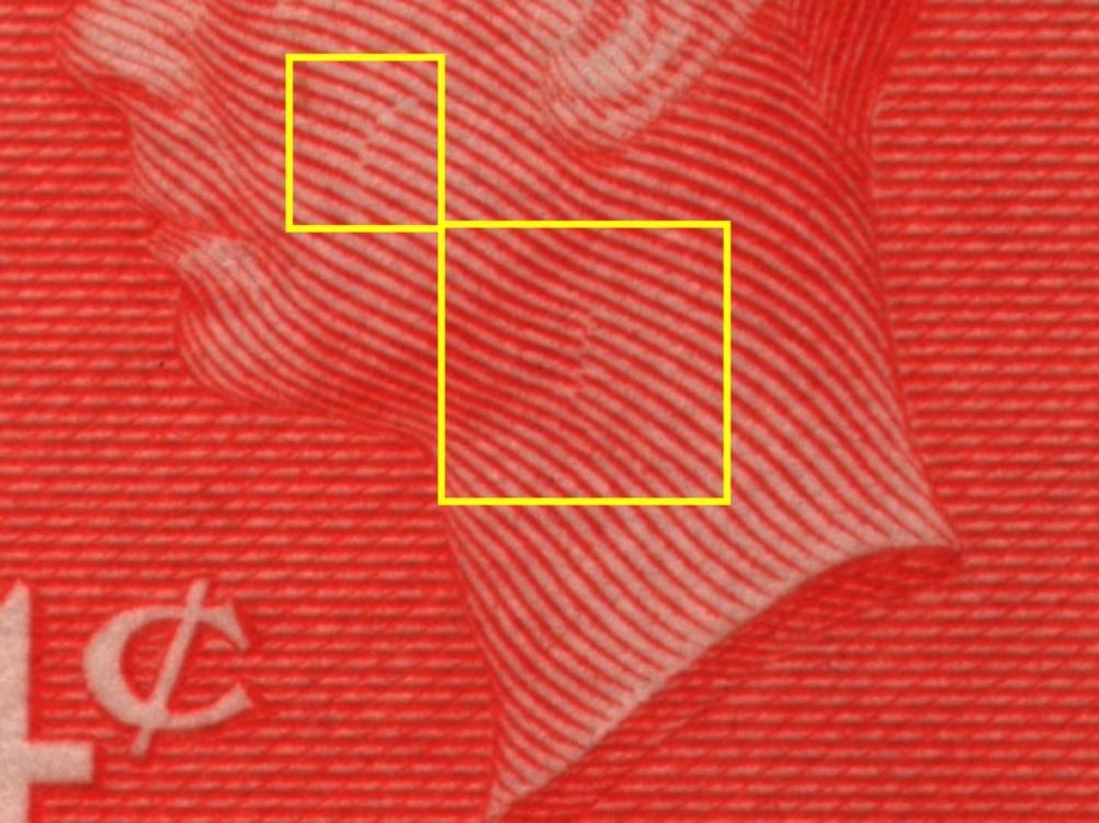
Hi guys...Nothing drastic, just wondering why the designer had lines not lined up like the rest of the design of the face..It was not for shading purposes, because these type of stamps have the shading done by thickening the actual lines printed....Looks like a scare on his check..??...Makes no sense..??
Robert


Send note to Staff
Edited by wert - 01/20/2015 08:04 am

Valued Member
139 Posts
Posted 01/20/2015   07:50 am  Show Profile Bookmark this reply Add nl1947 to your friends list  Get a Link to this Reply
Scan & monitor colour issues aside the stamp looks more like the 1951 orange vermillion # 306b
There were a few design changes of this stamp.
Some history here
http://postalhistorycorner.blogspot...49-1950.html
Send note to Staff  Go to Top of Page
Pillar Of The Community
Canada
1324 Posts
Posted 01/20/2015   2:29 pm  Show Profile Bookmark this reply Add CanadaStamp to your friends list  Get a Link to this Reply
I'd say it was a design trick to give the cheek "elevation" and to suggest neck to torso link.
Send note to Staff  Go to Top of Page
Edited by CanadaStamp - 01/20/2015 2:30 pm
Rest in Peace
Canada
6750 Posts
Posted 01/20/2015   10:12 pm  Show Profile Bookmark this reply Add Puzzler to your friends list  Get a Link to this Reply
The used ones I looked at here all have these same features.
Send note to Staff  Go to Top of Page
Rest in Peace
7742 Posts
Posted 01/20/2015   10:19 pm  Show Profile Bookmark this reply Add wert to your friends list  Get a Link to this Reply
Maybe the neck, but the what is it doing for his check..looks like a knife cut..
Send note to Staff  Go to Top of Page
Rest in Peace
Canada
6750 Posts
Posted 01/20/2015   11:08 pm  Show Profile Bookmark this reply Add Puzzler to your friends list  Get a Link to this Reply
Well, it does look bad up close, but it's really just a Z or S pattern in the lines drawn. Adds a colour or depth or something.
Send note to Staff  Go to Top of Page
  Previous TopicReplies: 5 / Views: 1,659Next Topic  
 
To participate in the forum you must log in or register.

Go to Top of Page

Disclaimer: While a tremendous amount of effort goes into ensuring the accuracy of the information contained in this site, Stamp Community assumes no liability for errors. Copyright 2005 - 2026 Stamp Community Family - All rights reserved worldwide. Use of any images or content on this website without prior written permission of Stamp Community or the original lender is strictly prohibited.
Privacy Policy / Terms of Use    Advertise Here
Stamp Community Forum © 2007 - 2026 Stamp Community Forums
It took 0.13 seconds to lick this stamp. Powered By: Snitz Forums 2000 Version 3.4.05