| Author |
 Replies: 28 / Views: 5,975 Replies: 28 / Views: 5,975 |
|
Valued Member
452 Posts |
|
|
1.)Is "s" inside the "U" in U.S. normal for this type of stamp? 2.)Do all these have the "s" 3.)and where would I read about it-I can't find it in my catalogs.  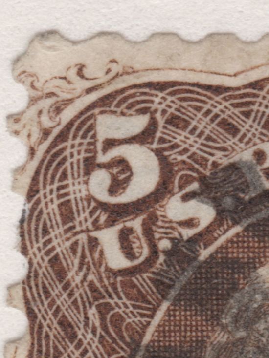 |
|
Send note to Staff
|
|
|
|
|
Pillar Of The Community
United States
2954 Posts |
|
|
Admittedly, I have never noticed this little detail about this issue (Scott type A26, #'s 67, 75, 76, 95, 105) and after searching my digital library, I don't have any pix with this level of detail. Fascinating find but I assume it to be normal. Thanks for sharing.
Brian |
Send note to Staff 
|
Brian Riley
APS 223349 |
|
|
Pillar Of The Community
United States
5894 Posts |
|
|
Pillar Of The Community
United States
517 Posts |
|
|
Not for sure on all of them but 75,76,76a 95, 95a has the mark so I would say yes they do. You can try the USPC Society web page and go to Brooksman vol.2 they may have a read about it there. I use those pages a lot. hope that helps |
|
Send note to Staff
|
|
|
Pillar Of The Community
1849 Posts |
|
|
It is just part of the ornate scroll design.
I guess you can see plenty things in it if
you look hard enough.
This is NOT a secret mark.... |
|
Send note to Staff
|
|
|
Valued Member
452 Posts |
|
|
It is a clearly defined "S" with the top and bottom prominent flourish of a scripted "S" and in a script used at the time and in the same type of stamps.
Some people can guess it is scroll work others choose differently whatever...
Just because you haven't seen it before doesn't mean it is not there.
Maybe not a secret mark but positively an "S" there no doubt about it.
|
|
Send note to Staff
|
|
|
Pillar Of The Community
United States
5894 Posts |
|
|
Valued Member
452 Posts |
|
|
No one is saying it is a secret mark it was just in the heading with ? after it and as I said maybe not secret mark but it is there, an "S". I agree with that.
I doubt it is scroll work, doesn't follow the wavy pattern at all or connect to anything to flow in that design.
I guess we are just all guessing here and drawing up sides I disagree with Kevin heck he has been wrong on all three of my last posts he posted on lol but one guess is good as the next since that is what we are doing in this case. |
|
Send note to Staff
|
| Edited by LarryBruce - 02/18/2015 10:17 pm |
|
|
Pillar Of The Community
United States
1947 Posts |
|
|
It is strange that when I enlarge the image of the entire stamp, I can not see the 's'. Also on looking at areas of the scroll work not covered by lettering, I do not see any portion that when isolated would form an 's'. |
|
Send note to Staff
|
|
|
Pillar Of The Community
1849 Posts |
|
|
LarryBruce.... 1st...I was not wrong on the last 3 posts of yours. This is the SAME stamp in discussion of a previous post. You have messed up a "srail test".... I stated all should match...but when you clearly distorted the photo.... Quote:
One problem is that you somehow distorted the crop as you moved it (look especially at the top comparison -- Those aren't the bottom perfs pasted up there -- they've been elongated vertically/compressed horizontally.) 2nd....just a coincidence to the "s" Not right, not wrong.... |
|
Send note to Staff
|
|
|
Pillar Of The Community
United States
578 Posts |
|
|
I've looked at thousands of these 5c stamps and never noticed that -- very interesting!
Just out of curiosity, I did a little scrounging. I assumed it would be on the other plate 17 5c issues (all the shades, grills, proofs, specimen overprints...and it is,) but it's also on the plate 58 reissue (Scott 105) and plate 3 "First Design"/"Premiere Gravure" (formerly Scott 57.) I noticed it's even present on a few essays! It can sometimes be difficult to see on the Scott 67 & 75 shades, due to the tendency of those inks to "feather."
But it's clear & well-formed on the plates that produced these 5c stamps; no doubt it was something very intentionally integrated into the design (wouldn't surprise me if someone involved in the design/engraving (or their spouse/significant other) had a name that started with "S", LOL!)
On another note, the 5c reissue (Scott 105) already has a recognized "secret mark" (the "notch",) making it something that can be conclusively identified from a picture (...and yes, even the best dealers/auction houses occasionally misidentify a scarce Scott 105 as the more common Scott 76; it always pays to look carefully at the scans/photos!)
Anyway, it's a very neat observation LarryBruce, and something I never noticed before. Kind of like finding a "hidden Mickey" at Disney World! |
|
Send note to Staff
|
|
|
Pillar Of The Community

United States
1271 Posts |
|
|
srailkb, would you mind posting an image of the "Notch" secret mark for a #105 (if you have or can get an image of it)? It would be helpful to know just where and what to look for to help others to identify a #105 from a #76. Chances may be slim in finding one, but knowing what to look for would be helpful for anyone looking for one.  |
|
Send note to Staff
|
|
|
Rest in Peace
United States
763 Posts |
|
|
I must admit that I too, never noticed this "S" in that location before, but let me also quickly add that I am in agreement with those who say it is merely part of the scrollwork and is not (in my opinion) and "intentional" "S" put there by the engraver. And I reach that conclusion because, if you study the background scrollwork of the same stamps (the 5c 1861-68) you will also observe what also appears to be an "S" in at least two other places - in the "O" of "Postage" at the top and in the "C" of "Cents" at bottom. Therefore that proves conclusively (I think) that it was not an intentional "S" but rather just a quirky scrollwork design.
I do not have time (mail just arrived!) to post images, but perhaps someone else can show us the two areas I've noted here so we can all decide if they too resemble an "S". |
|
Send note to Staff
|
|
|
Pillar Of The Community
United States
578 Posts |
|
|
Sorry Bill, I'm going to disagree with you on this. Here's a close-up of the "C" in CENTS (to be perfectly honest, there's nothing there that even remotely resembles an "S"): 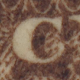 Here's a close-up of the "O" in POSTAGE (that doesn't look like an "S" to me either. Maybe a backwards one if anything, but IMO more like randomness there.) 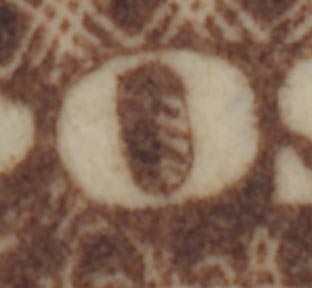 The picture LarryBruce posted shows an "unmistakable" "S" inside the "U" -- deliberate & intentional in the design IMO, not just some randomness of the scrollwork. For everyone else, here's the "notch" that's present on Scott 105's. The notch distinguishes it from all other issued stamps (67/67a/67b/75/76/76a/95). For a fun little aside, note the second "S" inside that "U" -- present at the very bottom of the trough. That one does take a little imagination, but it's different enough from the surrounding scrollwork that it may have been intentional as well :-)  |
|
Send note to Staff
|
|
|
Pillar Of The Community
United States
2954 Posts |
|
|
Great pic, srailb! This may require another topic, but I'd like to know if any of the other 1861 re-issues had secret marks ...
Brian |
|
Send note to Staff
|
Brian Riley
APS 223349 |
|
|
Rest in Peace
United States
763 Posts |
|
|
I admit that under very high magnification, neither looks like an "S" as they did with a 15X glass! So let's forget my last post! And I agree that the OP's DOES appear to be an "S", but to "prove" it was deliberate is another story. I would say that you would need some evidence that the lettr "S' had some significance to the engraver, who was I think Donaldson, but to be sure requires more research than I have time for right now. Usually there were TWO engravers that worked on the designs, one for the vignette (often) and one for the lettering and scrollwork. It would be interesting to uncover that info (engraver's names). I am starting to warm up to the possibility that it is an intentional "S"! And at some point, as I get time, I will contact the top collector of these 5c stamps to ask if he knows about the "secret S"? |
|
Send note to Staff
|
|
|
Replies: 28 / Views: 5,975 |
|


