| Author |
 Replies: 9 / Views: 2,156 Replies: 9 / Views: 2,156 |
|
|
Valued Member
Canada
79 Posts |
|
|
|
|
Valued Member
Canada
79 Posts |
|
|
Pillar Of The Community
3860 Posts |
|
|
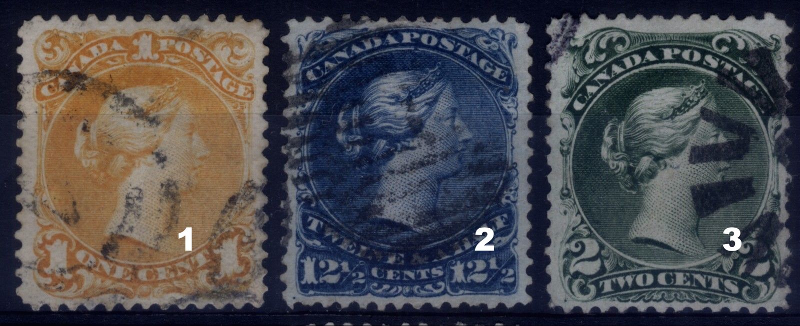
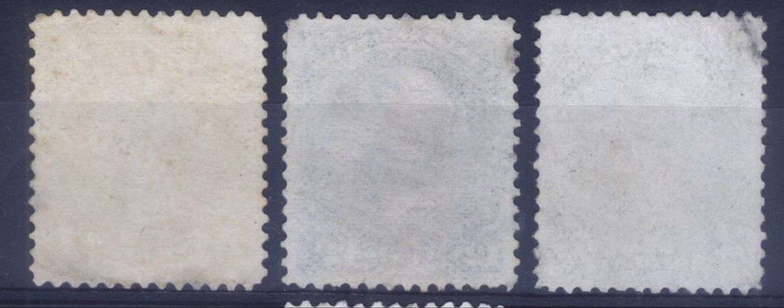
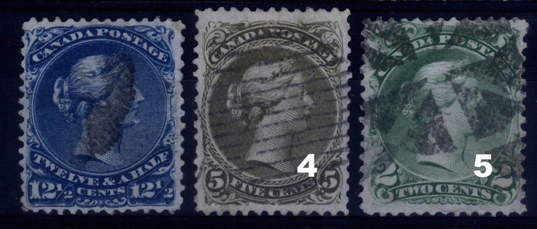
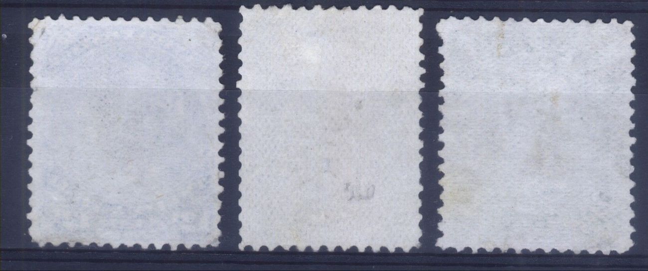
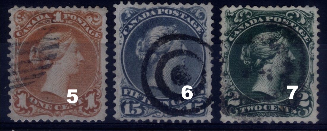
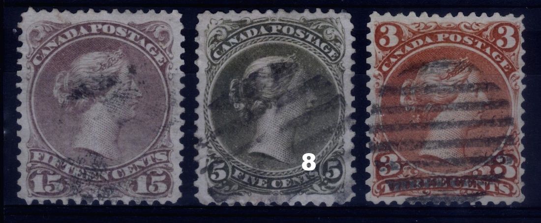
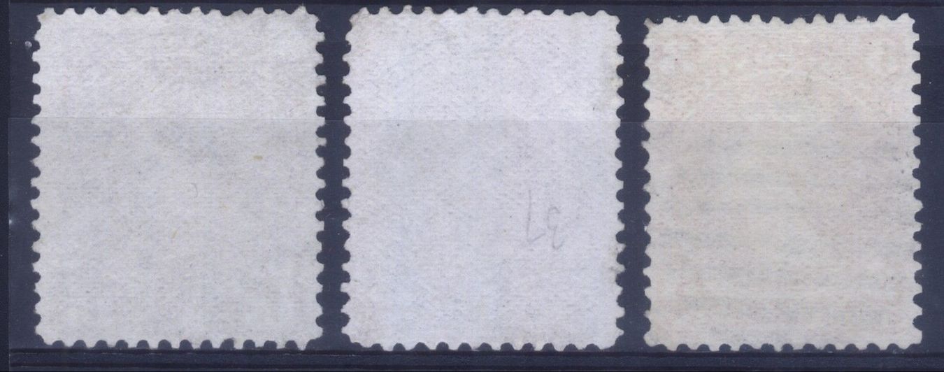
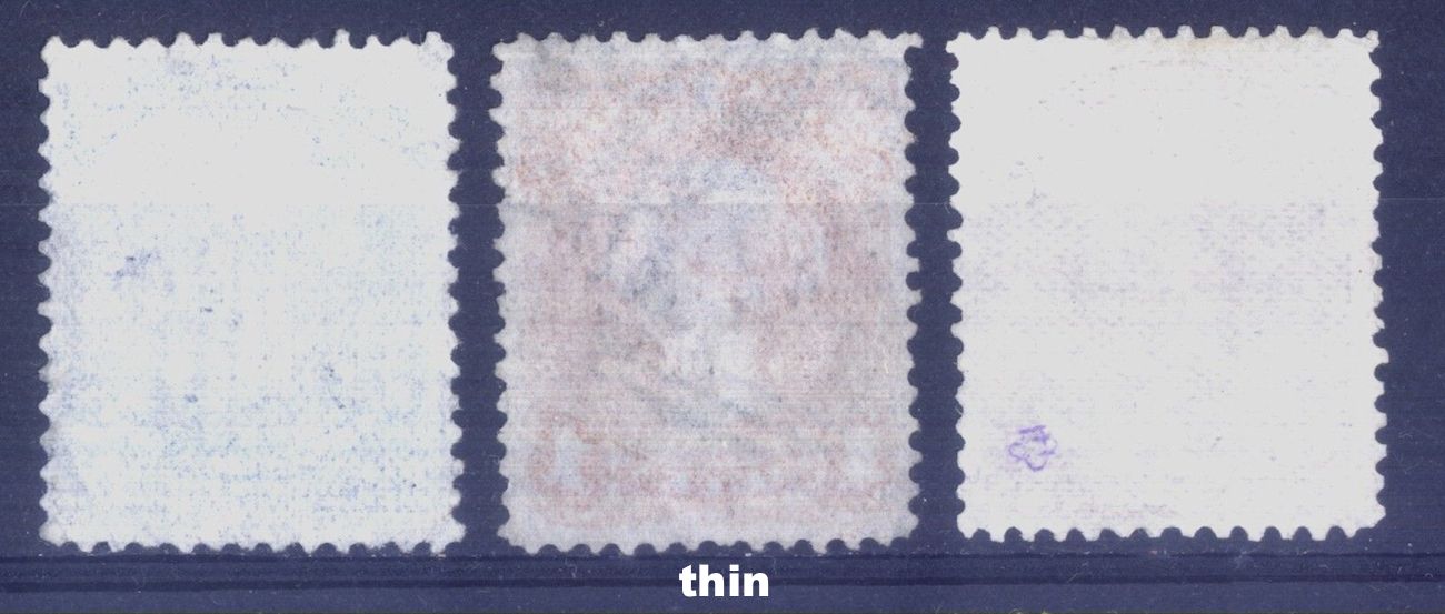
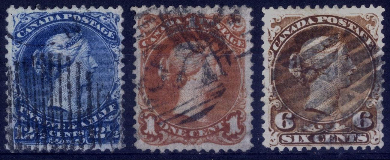
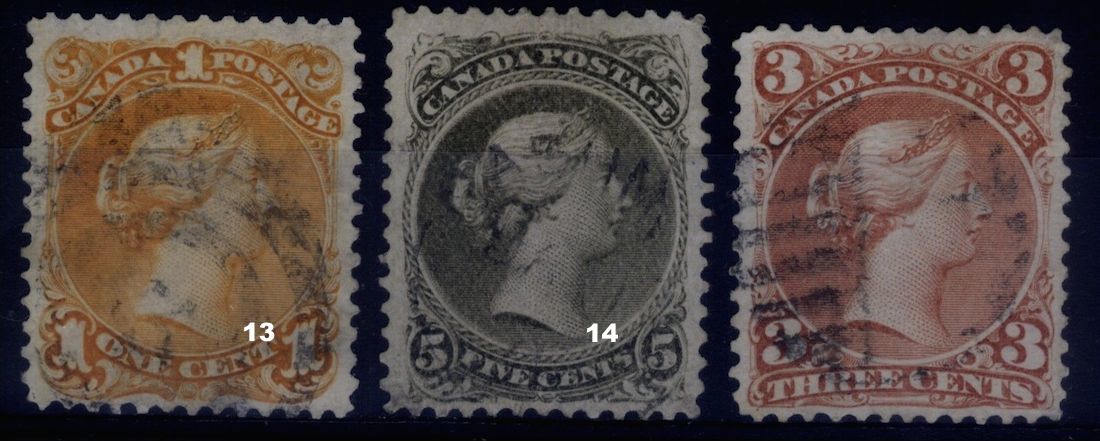
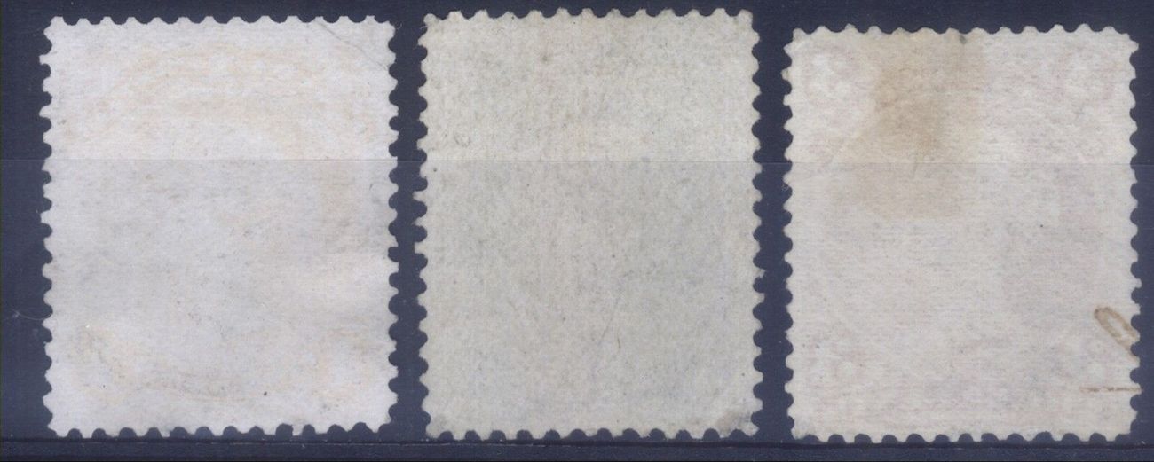
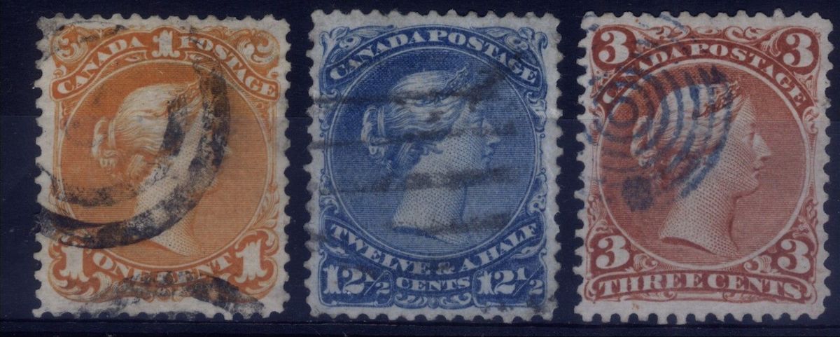
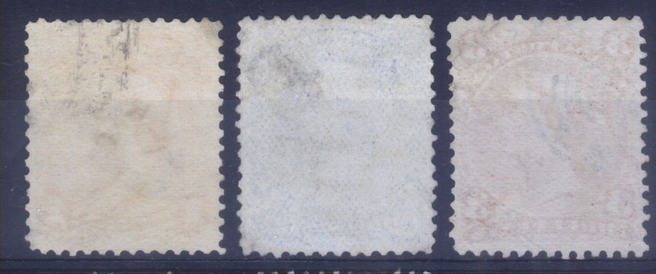
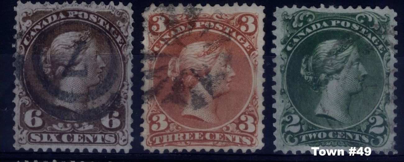
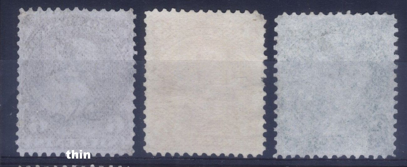
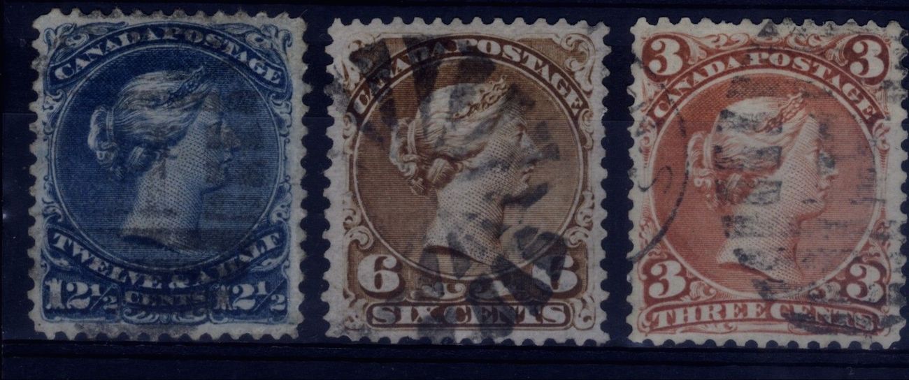
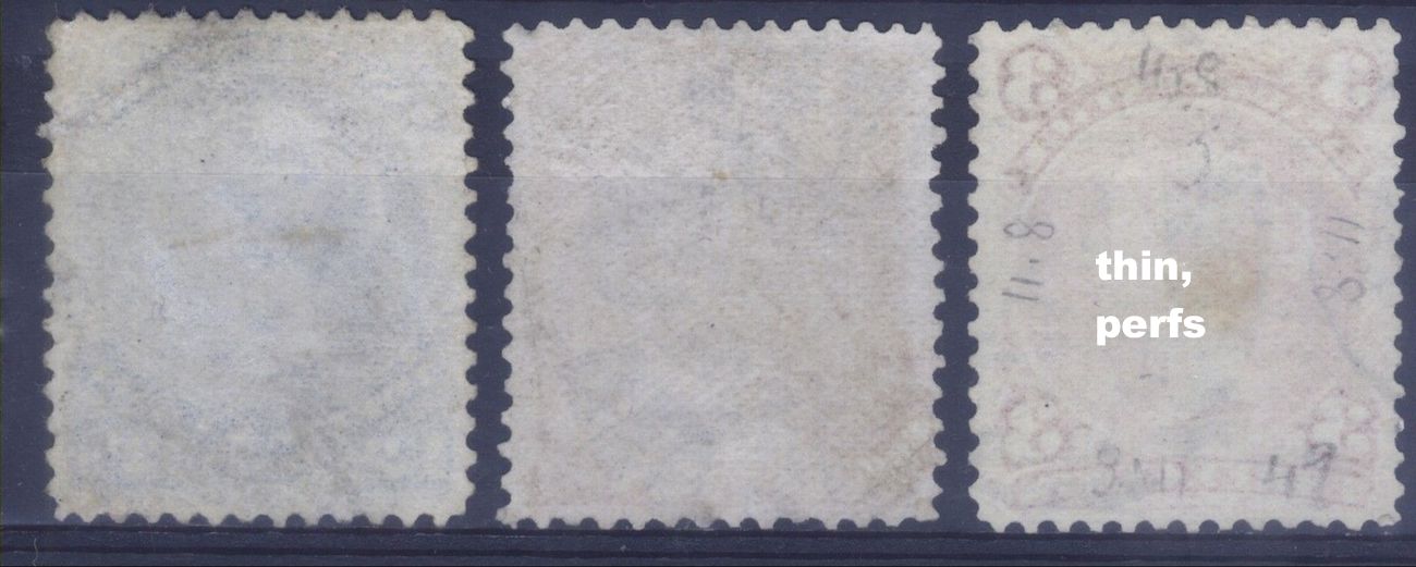
The vertically wove paper (# 4, # 14) on two of the 5 cents makes it interesting compared to the horizontal wove paper (# 8) on one of the 5 cents. Also, the 5 cents appears to have a higher used catalogue value than most of the other regular Large Queens. |
Send note to Staff 
|
|
|
Valued Member
Canada
305 Posts |
|
|
Pillar Of The Community
3860 Posts |
|
|
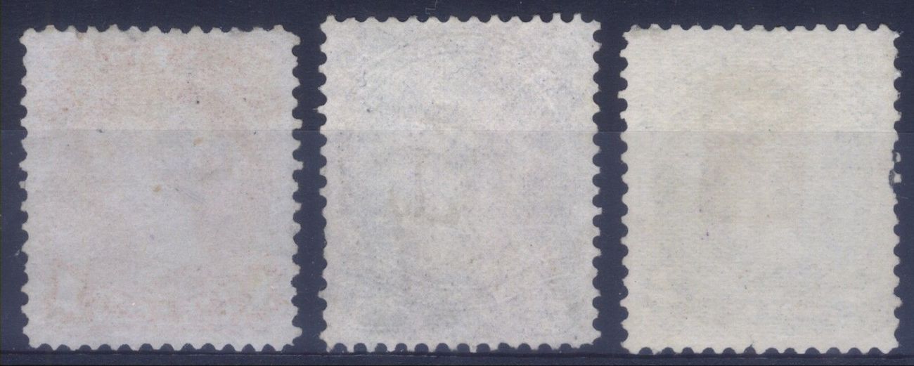
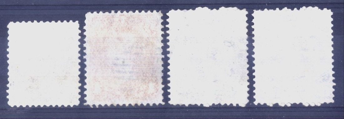
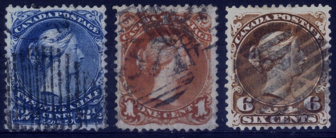
It does look like horizontal laid lines, but it could be horizontal lines made by the scanner since they appear to also be continuous into the black areas off of the stamps. |
|
Send note to Staff
|
|
|
Valued Member
Canada
79 Posts |
|
|
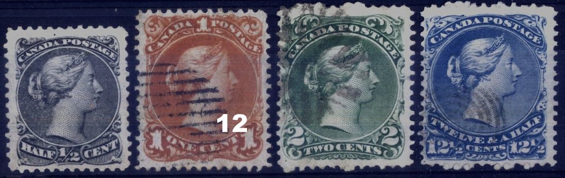
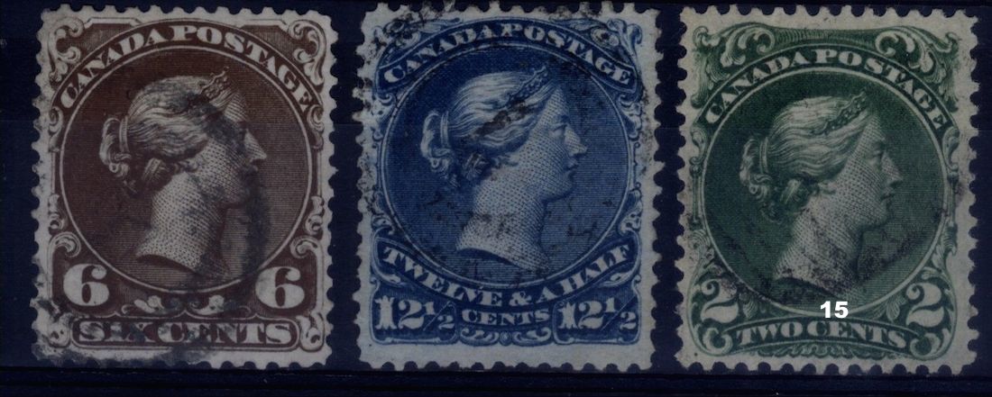
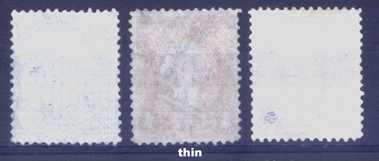
Do you mean the orange 1c on the last line, between the blue and brown? The paper seems very thin to me... |
|
Send note to Staff
|
|
|
Valued Member
Canada
305 Posts |
|
|
Yes, that's the one but I dont see it orange (on my screen). The 12 and a half on the same line could also be Bothwell. Hard to tell from the pic. |
|
Send note to Staff
|
|
|
Valued Member
Canada
79 Posts |
|
|
Coriandre, I was under the impression that laid paper was a thicker. The 1c in question is visibly thinner.
From Greaves:
"Thickness of Laid Paper
The One Cent laid paper is a relatively thick soft paper, with some variation in thickness recorded."
Am I missing something here? |
|
Send note to Staff
|
|
|
Valued Member
Canada
79 Posts |
|
|
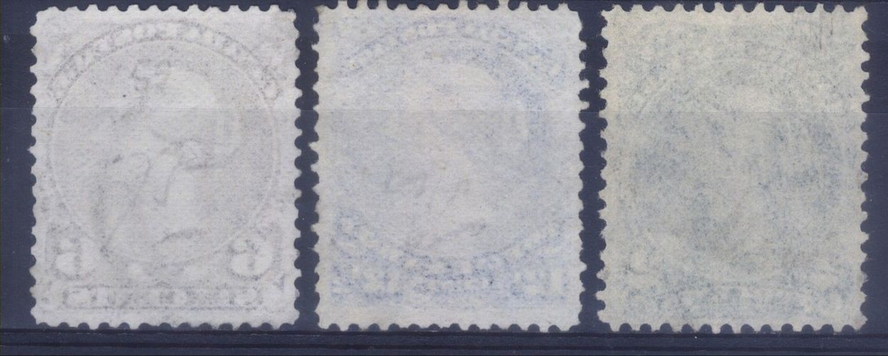
And yes, at first glance the 12c almost looks like it's concealing a watermark. But I suspect it's just the imprint of the vertical lines of the grid cancel... |
|
Send note to Staff
|
|
|
Valued Member
Canada
305 Posts |
|
|
Yes, laid paper is on the thick side. It was just bizarre that you could see horizontal lines on it but like Jogil mentionned, it could be from the scanner. For the 12 cent, it is the paper that looks to have a vertical pattern but, hard to tell from the scan |
|
Send note to Staff
|
|
| |
Replies: 9 / Views: 2,156 |
|



 Posted 05/05/2015 4:52 pm