| Author |
 Replies: 35 / Views: 4,390 Replies: 35 / Views: 4,390 |
|
|
|
Rest in Peace
7742 Posts |
|
|
Pillar Of The Community
Canada
728 Posts |
|
|
The reason that some Large Queens have poor perfs is because of the paper they were printed on. I'm talking specifically of the Bothwell Paper (Duckworths Paper 6) that has the watermark. This paper was poor quality and generally has poor perfs. And this is one way to spot them. Now there were many different paper types used to print the LQ's. If you get one on the good papers, it will have decent perfs. This one seems ok except the left side. 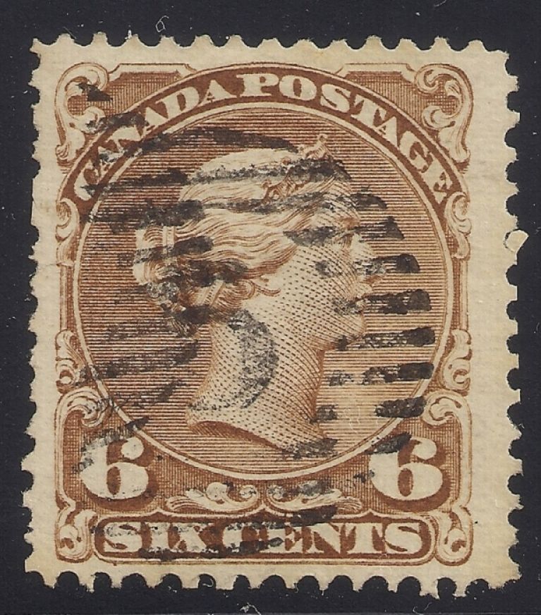 |
Send note to Staff 
|
|
|
Valued Member
Canada
84 Posts |
|
|
SUPERB #27 jimjung ; MINE the cancel is quite heavy but the centering is perfect |
|
Send note to Staff
|
|
|
Rest in Peace
7742 Posts |
|
|
jimjung...I have noticed that a lot of #27 have a smaller margin on the left side as shown on my stamp below also. Robert 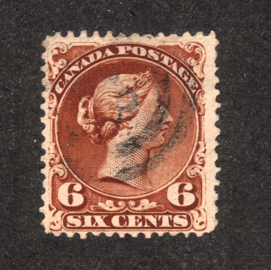 |
|
Send note to Staff
|
|
|
Pillar Of The Community
Canada
1416 Posts |
|
|
Jim, Wert, of my 10 number 27, only 1 has F/VF centering. This one also has a red cancel. Any guess at what the cancel is? (I see the letters DON) 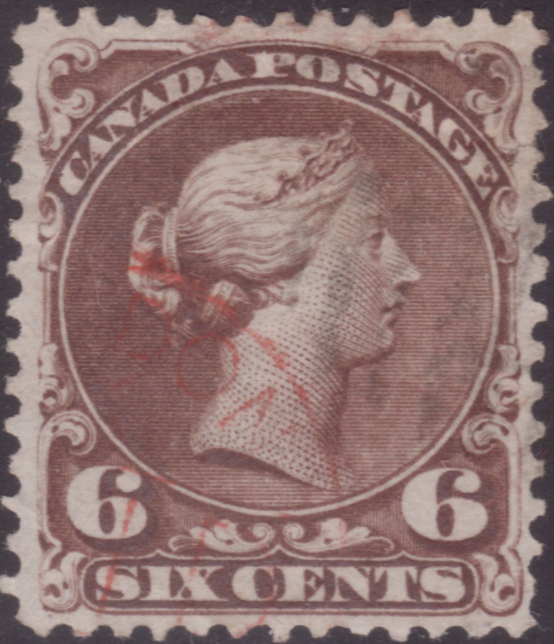 |
|
Send note to Staff
|
| Edited by Gilles le timbre - 07/11/2015 12:51 pm |
|
|
Pillar Of The Community
United States
1125 Posts |
|
|
some 6c large queens: top row: dark brown, yellow brown, black brown, brown bottom row: re-entry, re-entry, soft blotting paper 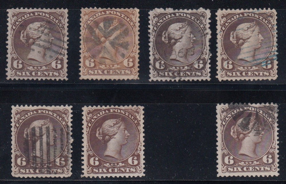 |
|
Send note to Staff
|
|
|
Pillar Of The Community
Canada
644 Posts |
|
|
GIlles, yours looks like part of a "PAID" bank cancel (fiscal)
Possibly "LONDON" - pretty early use. |
|
Send note to Staff
|
| Edited by 3Dadeo - 07/11/2015 3:37 pm |
|
|
Pillar Of The Community
Canada
728 Posts |
|
|
Gilles, I think your LONDON PAID postmark might look like this. The date is in the Large Queen period (1871). 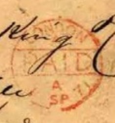 chip - your Black Brown is particularly nice, especially with the 1868 date. LQ`s are tough to find with the date so nice. And the early date supports the 1st Printing Black Brown of the 6c. I looked at some of my 6c LQ`s and I did find alot centered to the left. I do have them centered to the right also. Honestly, I have alot of LQ`s. Here is a nicely centered vertical pair of the 6c. The LQ`s was the first issue that I created a collection for just one issue of stamps. 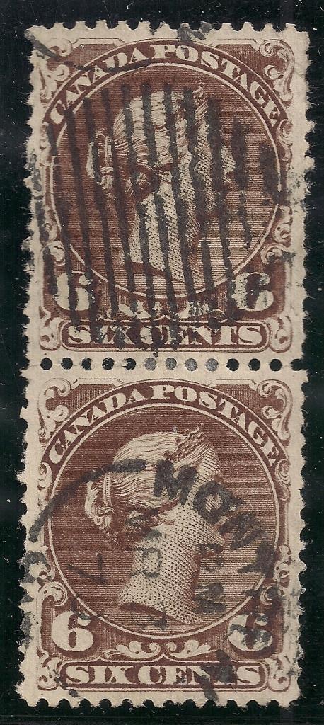 |
|
Send note to Staff
|
| Edited by jimjung - 07/11/2015 5:09 pm |
|
|
Valued Member
Canada
84 Posts |
|
|
Pillar Of The Community
United States
1125 Posts |
|
|
Rest in Peace
7742 Posts |
|
|
Pillar Of The Community
Canada
644 Posts |
|
|
If you had to chose, which is most important to you (ie. what do you look at first)?
Perforations, Centering, Cancel
I always look at the perfs first, then cancel, and lastly the centering. The perfs have to be good first before I look at the rest, but that's my preference (I'm probably in the minority). What is yours?
|
|
Send note to Staff
|
| Edited by 3Dadeo - 07/12/2015 10:30 am |
|
|
Pillar Of The Community
Canada
1416 Posts |
|
|
Rest in Peace
7742 Posts |
|
|
Valued Member
United States
258 Posts |
|
|
Quote:
If you had to chose, which is most important to you (ie. what do you look at first)? 3Dadeo: My preference would be centering. Cancellation is second and if it obliterates the face of the stamp it would out weigh perfect centering. Terry |
|
Send note to Staff
|
|
|
Replies: 35 / Views: 4,390 |
|




 Posted 07/10/2015 7:16 pm


 .....
.....


