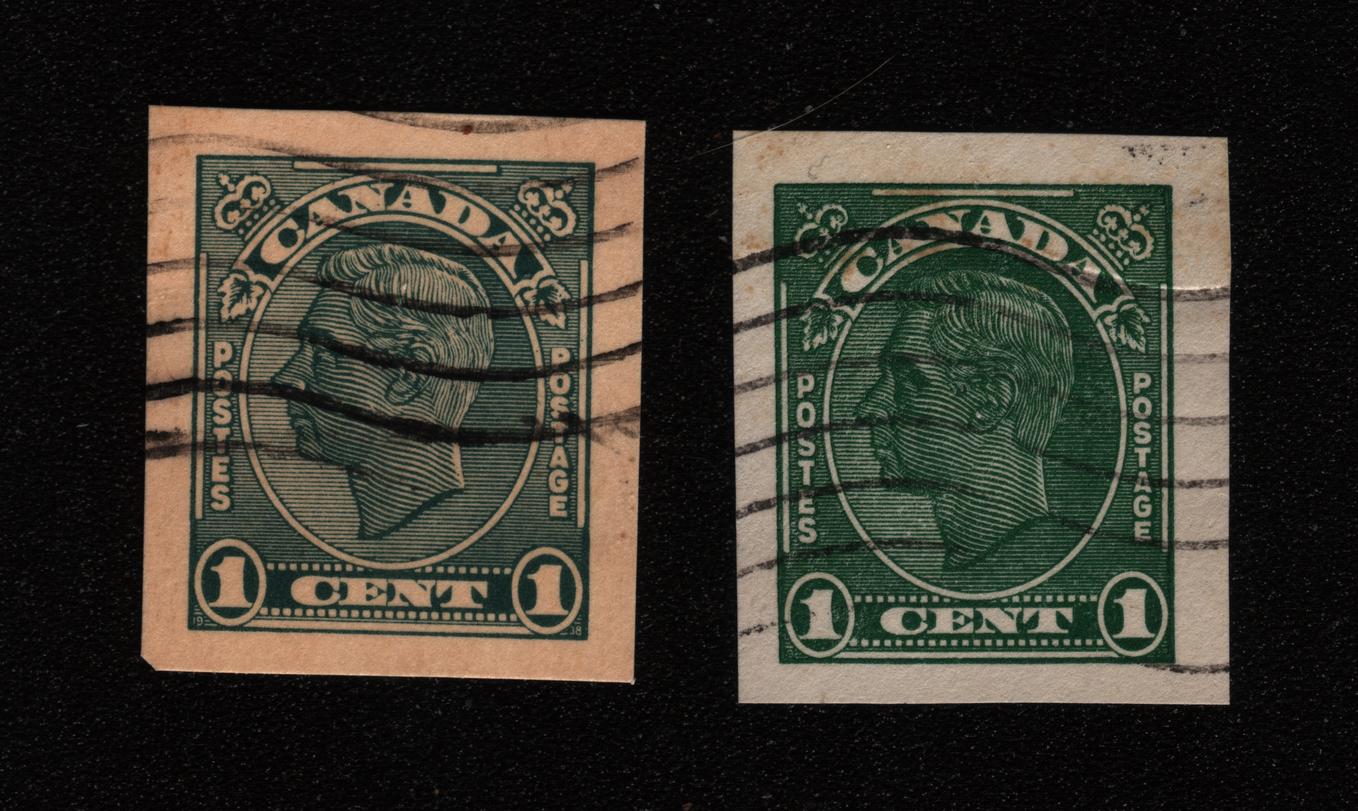
Comparing the 2 side by side, notice the difference in the green coloring of the crowns, the maple leafs, and "PO" of both Postage and Postes. Could it be over- or under-inking. Or, maybe it is worn dies that are causing these differences?
Robert, Kuhli, as I said before, the left stamp looks like it is printed on reddish paper, at least on my monitor. I am hoping someone with deeper knowledge of these can chime in!
Webb's 7th Edition page 76 Looks like the one on the left is Offset P66)and the one on the right is Typographed (P66d) "If the date in the lower (two) corners cannot be clearly read, the stamp is typographed." Offset has a tiny dot in the "A" of POSTAGE", not a large one. There don't seem to be any varieties on paper tinted in any way.
Disclaimer: While a tremendous amount of effort goes into ensuring the accuracy of the information contained in this site, Stamp Community assumes no liability for errors. Copyright 2005 - 2026 Stamp Community Family - All rights reserved worldwide. Use of any images or content on this website without prior written permission of Stamp Community or the original lender is strictly prohibited. Privacy Policy / Terms of UseAdvertise Here





 Posted 02/04/2016 12:55 pm