| Author |
 Replies: 22 / Views: 3,797 Replies: 22 / Views: 3,797 |
|
Valued Member
Canada
96 Posts |
|
|
|
Now, I should start by saying that I don't mean 'unique' as necessarily being 1 of 1 in existence; though low numbers may certainly be a part of this topic.
Recently I stumbled on some custom covers done by someone some 40+ years ago. I realize that's not actually 'old' by most collector's standards, but its old enough the person who created these custom covers has passed on.
At first I thought 'okay, interesting...'. You see I was busy scanning an auction site at the time for space topical covers, and seeing the same old covers & cachets appear over and over. So I didn't pay much attention at first, as I was preoccupied with the same sorts of mainstream things I expect many new people are when they first start collecting covers. Then I saw a few more custom covers by this individual, and one of them in particular jumped out at me. What got my attention was the cachet this person chose to paste to their envelope before having it made into a FDC. I realized in that moment that some actual contemplation & thoughtfulness had gone into creating this cover. It was like a work of art... making me wonder what the artist was thinking as he designed and created this cover. It makes a statement for certain... potentially a number of statements... any one of which could have represented the thoughts of the person who put it together.
I decided to buy the cover. Then a few more by the same person. Each one of them being meaningful to me in some way after carefully considering them before I purchased. Now, I don't want to say too much about these particular covers just yet. The reason being that I want to see if they survive the trip, and then I'd like to get some proper scans or pictures of them before I show them. I will share when I receive them.
But this got me thinking... these custom covers are certainly unique in the sense that they stand out as artistic treasures to me, and will undoubtedly be key pieces of my collection. This sort of thing is completely new to me, and completely unexpected. I could see this changing completely what I thought my cover collecting experience was going to be.
Have others had similar experiences with collecting covers, and do you have some pieces that just really feel more like meaningful 'art' to you than simple covers? Pieces where someone has spent some amount of time clearly designing the covers to evoke thought in others?
Does anyone have examples they might be willing to share?
|
|
Send note to Staff
|
| Edited by itviking - 02/24/2016 1:13 pm |
|
|
|
|
Pillar Of The Community

United States
663 Posts |
|
|
Valued Member
Canada
96 Posts |
|
|
For sure, I will. The images used in the ads for them weren't that good, so I'd like to wait until they arrive in the mail and take some nice pictures or scans of them. Then I thought I would post them here, without saying much about my own interpretation of them, and let other people ponder them and give their thoughts. A little anticipation might be fun. :)
In the meanwhile, does anyone else here collect custom covers created by others that they find intriguing? |
Send note to Staff 
|
| Edited by itviking - 02/25/2016 10:33 am |
|
|
Moderator
1589 Posts |
|
|
I'm not sure if this is the kind of thing you are talking about or not, but I am always attracted by this like this: 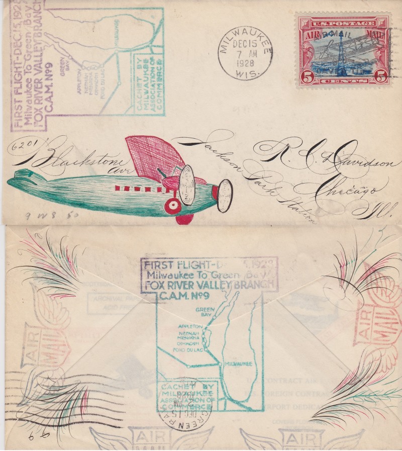 Basil |
|
Send note to Staff
|
|
|
Valued Member
Canada
96 Posts |
|
|
Wow, I love the writing on that one. There's an art that seems lost these days.
Do you think the hand drawn/colored, artistic portion of the cachet was added on afterward (add on)? The colored plumbs on the back suggest the same ink as the colored drawing on the front, and they are certainly done with enough skill and flare that they could match the skills of the amazing hand writing. Also, the colors in the hand drawn portion match the rubber stamp portion of the cachet. So I'm thinking after the rubber stamps, but perhaps done by the same person?
Btw, yes that is sort of what I had in mind with my use of the word 'unique'. However, other than being an attractive and interesting piece of art on its own, it doesn't evoke any thought; it doesn't make a statement; it doesn't make me wonder why they drew what they drew. Does that make sense? I can't think of another way to describe it... but maybe someone else can think of better words for what I mean? |
|
Send note to Staff
|
| Edited by itviking - 02/25/2016 11:45 am |
|
|
Valued Member
Canada
96 Posts |
|
|
Here's an example of what I'm thinking of, and interestingly... by the same cover maker: Bob Jones. "Its creator, Bob Jones of Sidney, Ohio, was an editor at Linn's Stamp News in the 1960s who wrote a weekly column on U.S. stamps (today written by John Hotchner). Jones did only occasional FDCs, and always in small quantities (fewer than 10)." http://www.ronnei.com/unlisted19.html |
|
Send note to Staff
|
|
|
Rest in Peace
United States
4052 Posts |
|
|
Now, that is one hellacious First Flight Cover!
I think that the aircraft was clearly drawn first, but that's me.
Cheers,
/s/ ikeyPikey |
|
Send note to Staff
|
|
|
Moderator
1589 Posts |
|
|
I don't think any of the artwork was added later. If anything, the airplane was drawn first, and then the address artfully arranged around the plane. The rubber stamp on front was likely done last, and done sideways so as not to interfere with the drawing and calligraphy. I understand a little better what you are asking about with the example from Todd's collection. This isn't nearly as "unique" but it does evoke a "why" that I haven't found an answer to: 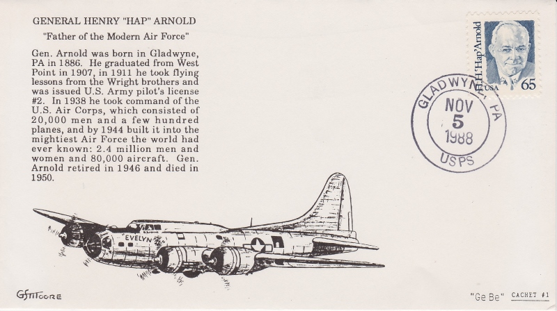 Who was "Evelyn?" I'm thinking someone important to the artist, perhaps his wife. Basil |
|
Send note to Staff
|
|
|
Valued Member
Canada
96 Posts |
|
|
I think you're right about the drawing being placed earlier. Now that I look at the writing, it becomes more clear that some words and names were written on angle that conform to the space allowed by the drawing. Had the drawing not been there first, the writing would likely have all ben horizontal. |
|
Send note to Staff
|
|
|
Valued Member
Canada
96 Posts |
|
|
Apparently there was a B-17 named 'The Lady Evelyn', which was attached to the 301st BG, squadron 32. MIA 1943.
"Delivered Cheyenne 19/5/43; Gore 20/5/43; Smoky Hill 31/5/43; Morrison 8/6/43; Assigned 32BS/301BG St Donat 20/6/43; Oudna 6/8/43; Missing in Action {13m} Capua, It. 4/9/43 with Wilbur Crouch, Co-pilot: Kinney, Navigator: Fleischauer, Bombardier: Kimber, Flight engineer/top turret gunner: Allen, Radio Operator: Goll, Ball turret gunner: Curtician, Waist gunner: Shripka,Tail gunner: Kulthua. Missing Air Crew Report 513. THE LADY EVELYN." |
|
Send note to Staff
|
|
|
Valued Member
United States
44 Posts |
|
|
The beautiful, artistic flowing calligraphy on your airplane cover is named Spencerian Penmanship or Spencerian Calligraphy. It became popular in the mid- 19th century. I have a Spencerian lesson book someplace in my collections, but a quick search didn't turn it up yet. Its a real art form! Here is a link to some examples of the penmanship https://www.google.com/search?q=Spe...kusefpg9O1AM: |
|
Send note to Staff
|
| Edited by Hoxsie454 - 02/25/2016 2:24 pm |
|
|
Valued Member
Canada
96 Posts |
|
|
Wow, that's fantastic. I'd love to learn more about that. I would imagine its done with a standard calligraphy set? |
|
Send note to Staff
|
| Edited by itviking - 02/25/2016 2:51 pm |
|
|
Valued Member
Canada
96 Posts |
|
|
So here's an example of one of Bob Jones' custom covers. This one is not one of mine, but just an example from online, so hopefully no one minds me using it as an example. Bob Jones did a lot of 'photo cachets', sometimes combining stamps and cachets to help make a subtle point, sometimes to simply enhance the subject of the cancelled stamp. This one doesn't necessarily make any huge statements at first glace, at least not to me, but it still is very interesting and begs a few questions... ...look it over, then note anything that you find interesting.  |
|
Send note to Staff
|
|
|
Moderator
1589 Posts |
|
|
itviking, I was aware of the "Lady Evelyn," but if that is the origin, why not "Lady Evelyn" on the drawing? Here's a possibility: the obituary of an Evelyn who was married to a "George S. Moore:" http://www.legacy.com/obituaries/to...id=155455337But it could be nothing more than a striking coincidence. "George S. Moore" is a common name. Interestingly, the Moore who produced this cover produced a lot of other covers under a bewildering variety of names, yet I can find out nothing about him in the AFDCS publication First Days. So at the end of the day, I'm still left wondering. |
|
Send note to Staff
|
|
|
Valued Member
Canada
96 Posts |
|
|
That could very well be. The name could conceivably serve both purposes, a tribute to his wife as well as a tribute to fallen pilots. Using a specific name like 'Lady Evelyn' might be too specific, suggesting it was a tribute to just that one aircrew, where as the cover is really more focused on the air force being built up under 'Hap'. Just using the name 'Evelyn' leaves it open for interpretation, but leaves the possibility of a tribute (of either or both kinds) more of a subtle suggestion; not overpowering the actual purpose of the cover.
Sometimes the purpose of art is to leave people wondering, and I think that cover does that nicely; in a subtle way. |
|
Send note to Staff
|
| Edited by itviking - 02/25/2016 4:47 pm |
|
|
Valued Member
Canada
96 Posts |
|
|
Re: the Bob Jones cover... notice the more modern 'airmail' stamp (NJ cancelled) vs the 'city mail delivery' (Washington cancelled). There's also the word 'NO' in there. It appears the words 'NO' was written on something translucent and purposely placed into the picture. Any thoughts? |
|
Send note to Staff
|
|
|
Replies: 22 / Views: 3,797 |
|


