| Author |
 Replies: 19 / Views: 3,946 Replies: 19 / Views: 3,946 |
|
Valued Member
United States
79 Posts |
|
|
|
I have read several people say that the only way to be certain that a first issue revenue imperf or part perf is real is if it is part of a pair or block of four. Is this the general consensus? Aside for looking for cut-off perforations, how would one go about being sure?
|
|
Send note to Staff
|
|
|
|
|
Pillar Of The Community
United States
867 Posts |
|
|
While there are others more qualified to respond to this post, let me contribute a few things to look for.
1. Cancellation Date. The true imperf and part perf stamps were delivered to Internal Revenue very early. So dated cancels from 1866 and later are almost certainly altered to imitate the early imperf or part perf varieties.
2. Paper. The early First Issue stamps were printed on thin, almost translucent paper. If the stamp is on a thick, opaque paper, it is a late issue and certainly did not originate as an imperf or part perf stamp.
3. Color. This is an area where one needs experience. Generally speaking the original colors tend to be dull and later much more brilliant (probably a poor choice of words). To gain this experience, assemble a reference collection of each color with dated cancels arranged in chronological order. You will see the changes - they are not subtle. If your stamp's color matches the color from the late 1860's, it is unlikely that you have a genuine unaltered imperf or part perf.
These three considerations will cull out most of the weeds that are being offered on internet auction sites. |
Send note to Staff 
|
|
|
Pillar Of The Community
United States
6433 Posts |
|
|
Good synopsis, Ron. One caveat: Re: #1, there are exceptions to this, most notably $5 and $10 denominations used in locations on the west coast. I'm not sure why these exist, but they legitimately do. I don't know if there was a hoard of imperfs in storage somewhere that then saw the light of day at some point. The ones I have seen have the appropriate ink shades and paper types for imperfs. Some examples... Dated 1868. 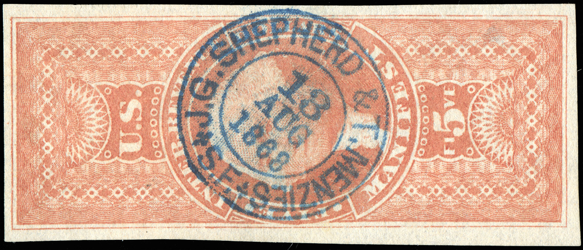 Dated 1869.  One additional potential diagnostic with respect to handstamp cancels, even if you cannot see the date, is the cancel type. There are certain circular and oval handstamp cancel designs that only came into use in the late 1860s. You learn to recognize these after a while and when you see them on supposed imperfs or part perfs, they are a negative indicator. Additionally, herringbone and circular cut cancels were a late period implementation, so if you see a proposed imperf or part perf with that type of cancel, that should set off alarm bells. |
|
Send note to Staff
|
|
| Edited by revenuecollector - 08/22/2016 08:26 am |
|
|
Bedrock Of The Community
United States
10629 Posts |
|
|
Most imperf and part perf stamps were used in 1863 or early 1864. Anything used later is suspect, except for the previously mentioned west coast usages, mainly in San Francisco. They also occur on some of the lower values. The correct papers, shades, and impressions of imperf and part perfs can really only be learned through experience. For example, the correct paper for the one cent values would not be correct for the two cent values. Plus there were perforated examples being issued at the same time, which can make the proper identification of some part perfs extremely difficult or even impossible depending on the margins involved. |
|
Send note to Staff
|
|
|
Pillar Of The Community
United States
867 Posts |
|
|
 So here is an image I found of an R1b for the First Issue gurus to comment on for the benefit of the person who started this thread. It is currently being offered on ebay: http://www.ebay.com/itm/US-Sc-R1b-u...AOSwA3tXoP3zNo date to assist us. No telltale remnants of perfs. With a scan we often cannot tell about the paper. But we should be able to use the color to aid us in determining whether this is a genuine R1b. |
|
Send note to Staff
|
|
|
Pillar Of The Community
United States
867 Posts |
|
|
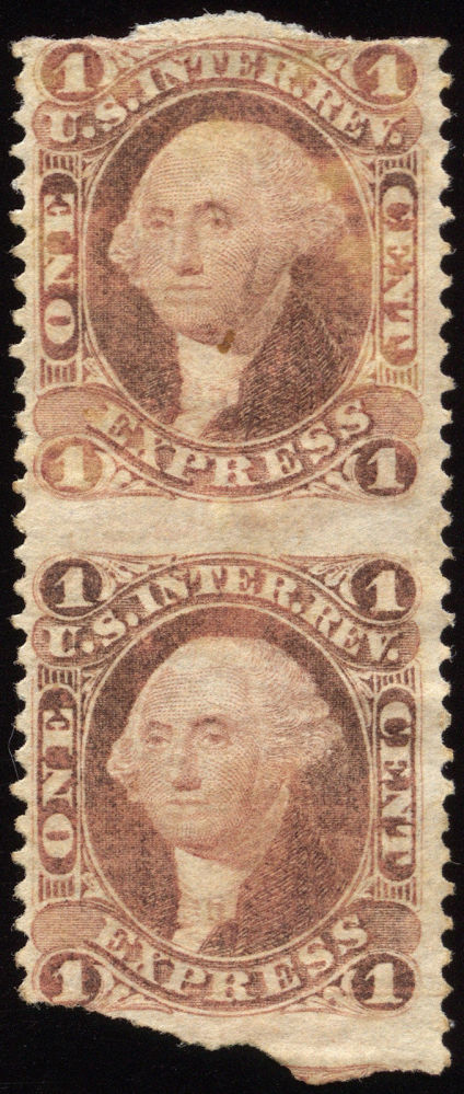 So here is another R1b, a pair even, so we do not have to work hard authenticating it. Dan may even recognize this image. Once again we do not have a dated cancel to aid us. Anyone notice any differences from the previous image I showed? |
|
Send note to Staff
|
|
|
Pillar Of The Community

United States
856 Posts |
|
|
Quote:
Anyone notice any differences from the previous image I showed? Color, of course. Bright (almost surely faked) vs. dull (undoubtedly genuine). |
|
Send note to Staff
|
|
|
Pillar Of The Community
United States
910 Posts |
|
|
Bedrock Of The Community
United States
10629 Posts |
|
|
The first is trimmed, the color is too bright red. The second is somewhat oxidized but genuine, since a part perf pair and an imperf pair catalog the same. So there is no reason to add perforations to an imperf pair. Something that has been done fairly regularly for the last 120 or so years to both singles and pairs when the catalog value makes it worthwhile. In some cases of very scarce part perfs, most to nearly all examples have been altered in this way. |
|
Send note to Staff
|
|
|
Valued Member
United States
79 Posts |
|
|
This discussion has been most helpful - especially with the addition of the images. |
|
Send note to Staff
|
|
|
Valued Member
United States
79 Posts |
|
|
Revcollector noted: "For example, the correct paper for the one cent values would not be correct for the two cent values."
My question: what is the best resource for this kind of detailed information about the papers used? |
|
Send note to Staff
|
|
|
Pillar Of The Community
United States
867 Posts |
|
|
The best resource is to make mini-reference collections of each denomination of stamps arranged in order by date. You can then compare papers and color shades. Words are poor guides for authentication of potentially problematic stamps. This is not about book learning, but about comparing to genuine stamps made at about the same time as the patient in question.
Ron Lesher |
|
Send note to Staff
|
|
|
Bedrock Of The Community
United States
10629 Posts |
|
|
Pillar Of The Community
United States
867 Posts |
|
|
The illustrated R1b that I pictured here has been deleted from ebay, based on my posting it as an altered stamp on Stamp Smarter. http://stampsmarter.com is another potential resource that we should all be encouraging to illustrate the bogus material so all can learn what to look for. |
|
Send note to Staff
|
|
|
Moderator

United States
12330 Posts |
|
|
This thread get my 'Thread of the Month' award. Thank you to the revenue guys for communicating some great advice and their experience on identifying imperf and part-imperf revs! can I reuse some of this info on Stamp Smarter?
Don |
|
Send note to Staff
|
|
|
Valued Member
United States
79 Posts |
|
|
If the early 1st issue revenues, in general, tend to be dull while later issues tend to be brighter (with some caveats), why is my R27P4 bright? I assume it was printed before they issued the stamps for use, so I am a bit confused. Why would it be bright but the issued stamps at the beginning be dull?
|
|
Send note to Staff
|
|
|
Replies: 19 / Views: 3,946 |
|