Stamp Community Family of Web Sites
Thousands of stamps, consistently graded, competitively priced and hundreds of in-depth blog posts to read


Stamp Community Forum
 
Username:
Password:
Save Password
Forgot your Password?

This page may contain links that result in small commissions to keep this free site up and running.

Welcome Guest! Registering and/or logging in will remove the anchor (bottom) ads. It's Free!

US Scott #2529c Varriant

 
To participate in the forum you must log in or register.
Author Previous TopicReplies: 5 / Views: 2,636Next Topic  
Pillar Of The Community
United States
910 Posts
Posted 03/30/2017   2:08 pm  Show Profile Bookmark this topic Add alub to your friends list Get a Link to this Message
Hi

I see three different variations for Scott's image A1881.
Scott #2529
Scott #2529a
Scott #2529C


I have come across a fourth. If one looks at the denomination and the USA on the Scott #2529C, one has a thin font and the other has a thick.


Is one a forgery? If so, which? Any other ideas?

thanks

Joe
Send note to Staff

Pillar Of The Community
United States
1495 Posts
Posted 03/30/2017   5:10 pm  Show Profile Bookmark this reply Add Trainwreck to your friends list  Get a Link to this Reply
There are differences in the rope tied to the post too.

Robert
Send note to Staff  Go to Top of Page
Pillar Of The Community
United States
8956 Posts
Posted 03/30/2017   5:11 pm  Show Profile Bookmark this reply Add Petert4522 to your friends list  Get a Link to this Reply
Alub, the perforations look different. Also, the pictures are unclear but I see a difference in the loop around the pole. Am I correct?


Peter
Send note to Staff  Go to Top of Page
Pillar Of The Community
Learn More...
United States
1493 Posts
Posted 03/30/2017   5:23 pm  Show Profile Bookmark this reply Add JLLebbert to your friends list  Get a Link to this Reply
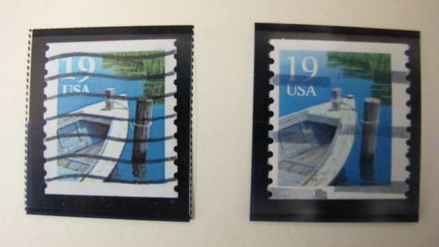
I think the thick font is 2529 (and all of its varieties) while the thin font is 2529C. 2529 has two loops of the rope whereas 2529C has only one.
Added: There is also a 2529b which is the untagged version of the type II 2529a. I have all of the different varieties and 2529C is the only one with the thin font. I find it interesting that Scott makes no mention of the differences in the fonts used for this design.
Send note to Staff  Go to Top of Page
Edited by JLLebbert - 03/30/2017 5:27 pm
Pillar Of The Community
United States
910 Posts
Posted 03/30/2017   5:41 pm  Show Profile Bookmark this reply Add alub to your friends list  Get a Link to this Reply
Thanks for all the answers:

So if I am understanding your answer, the cancellation has covered up perfectly the second loop on the rope.

thanks

Joe
Send note to Staff  Go to Top of Page
Pillar Of The Community
Learn More...
United States
1493 Posts
Posted 03/30/2017   5:54 pm  Show Profile Bookmark this reply Add JLLebbert to your friends list  Get a Link to this Reply
Yes, the cancellation does do a fairly good job of covering the top thinner loop of the rope on your 2529. Can't tell from the scan whether it is type I or II. The 19 appears smoother (more dots) in the type II.
Send note to Staff  Go to Top of Page
  Previous TopicReplies: 5 / Views: 2,636Next Topic  
 
To participate in the forum you must log in or register.

Go to Top of Page

Disclaimer: While a tremendous amount of effort goes into ensuring the accuracy of the information contained in this site, Stamp Community assumes no liability for errors. Copyright 2005 - 2026 Stamp Community Family - All rights reserved worldwide. Use of any images or content on this website without prior written permission of Stamp Community or the original lender is strictly prohibited.
Privacy Policy / Terms of Use    Advertise Here
Stamp Community Forum © 2007 - 2026 Stamp Community Forums
It took 0.13 seconds to lick this stamp. Powered By: Snitz Forums 2000 Version 3.4.05