| Author |
 Replies: 19 / Views: 4,660 Replies: 19 / Views: 4,660 |
|
Rest in Peace
7742 Posts |
|
|
Trying to figure out what colour the right side stamp is compared the the normal left stamp...pretty sure it is a 41 and not a 37. Thanks, Robert 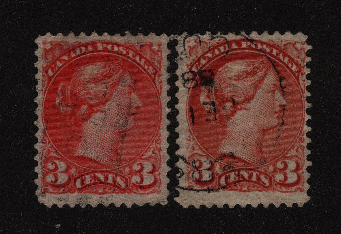 |
|
Send note to Staff
|
|
|
|
|
Pillar Of The Community
Canada
1449 Posts |
|
|
wert
looking at your scans (mostly the right 3c) and taking as reference the Color Guide for Canada, by Richard Morris, it would either be a Rose Carmine or Bright Vermillion - Morris does not show in his color chart for the 3 cents the Bright Vermillion but shows the Deep Rose Carmine - but discusses the Bright Vermillion in his paragraph on the Second Ottawa Printings 1887-1897. I wonder why it is not included in his color chart.
The rose carmine would be a 12 X 12.25 mostly vertical mesh. I agree with you that it would be a 41.
Rene |
Send note to Staff 
|
|
|
Rest in Peace
7742 Posts |
|
|
Pillar Of The Community
Canada
1449 Posts |
|
|
wert here is my deep or rose carmine, using Morris's colour chart - scan changes the colour - this is not the greatest looking 41a  Just compare colours Rene 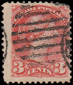 |
|
Send note to Staff
|
| Edited by Renden - 10/17/2017 12:54 pm |
|
|
Rest in Peace
7742 Posts |
|
|
Well...Now I am back to square one. Here is the colour difference between the two stamps. Robert  |
|
Send note to Staff
|
| Edited by wert - 10/17/2017 1:41 pm |
|
|
Rest in Peace
Canada
5701 Posts |
|
|
Robert, I think you stamp on the right is 37, a late Montreal printing, before BABN moved into the Gazette building in October 1888. Your February 1888 date is much too early for 41a.
The stamp on the left is probably 41 vermillion, second Ottawa printing. Check the perfs on both.
Everybody's screen looks different, so I cannot confirm shades.
P.S. Change the title, it says 47 instead of 41.
|
|
Send note to Staff
|
|
| Edited by BeeSee - 10/17/2017 4:05 pm |
|
|
Pillar Of The Community
Canada
1449 Posts |
|
|
the R colour (Commonwealth English spelling) palatte looks like a deep Rose (Morris) and the L a deep rose carmine (Morris) - if the scan is compatible with the Colour chart ! Am not talking about stamps, here - Now, one has to remember that I am referring to a very specialized document(s) by Richard Morris, the Color Guide for Canada's Small Queens and if you do not follow its methodology, you do not have the proper colour, either for the # 37 or # 41 (Unitrade specialized cat of Canadian stamps)I wonder if we can do it on Scanned pics of our stamps . Color(American English)= Colour (Commonwealth English) Rene  |
|
Send note to Staff
|
| Edited by Renden - 10/17/2017 4:38 pm |
|
|
Rest in Peace
Canada
5701 Posts |
|
|
Renden, on one of my office monitors, I see chocolate brown on the right and red brown on the left. On my other monitor I see pretty well the same colours but slightly different shades. On both monitors they look more like shades of the 6c small queen rather than the 3. |
|
Send note to Staff
|
|
|
|
Pillar Of The Community
603 Posts |
|
|
First off, correct typo in title please
I find the easiest way to tell a 37 from a 41 is to look at the back, the 41 usually seems to bleed pink to the back. Offhand I would say a 37 (corrected from earlier post), allowing for some colour variance, I see a bit of orange rather than rose. |
|
Send note to Staff
|
| Edited by archerg - 10/17/2017 5:36 pm |
|
|
Pillar Of The Community
Canada
1449 Posts |
|
|
@beeSee - you just proved my point.......very difficult to name the right colour on a scan
@archerg - if it was that simple, you could write a book on the subject as a recognized reference |
|
Send note to Staff
|
|
|
Moderator

United States
12330 Posts |
|
|
Pillar Of The Community
603 Posts |
|
|
Hi BeeSee
Seems I should have read your post before I made my reply. Guess I am a bit petulant today.. I agree with all you said. Perhaps we should work on that book together. |
|
Send note to Staff
|
|
|
Pillar Of The Community
Canada
1449 Posts |
|
|
Valued Member
39 Posts |
|
|
Hello Wert, I believe that the left stamp is a late 2nd Ottawa printing, some shade of vermillion. The ink on this one should probably have bleed through. It should also react to UV light. I agree with BeeSee on his evaluation of the right hand stamps. It is a late Montreal printing before the move to the Gazette building that produced the rose carmine shade. This stamp is a shade of orange, yours look very deep and maybe somewhat just a very little bit oxydized. Looking at shades of 37 and 41 is so tricky even with good lighting, through a computer screen after the image has been processed by scanners and software is misleading if not downright impossible. I have provided an image that I hope will help. It shows a progression of shades through 1887 to 1890. All the stamps stuck between the November 1888 and February 1889 stamps are shades of 41a rose carmine. I've checked those against each other and against the Morris color guide. The fourth stamp on this row is dubious, I have stored it next to the other 41a, but every time I look at it I change opinion and place it somewhere else!! Notice the difference in the shade of the paper and the usage of a cork cancel, which would be very late. 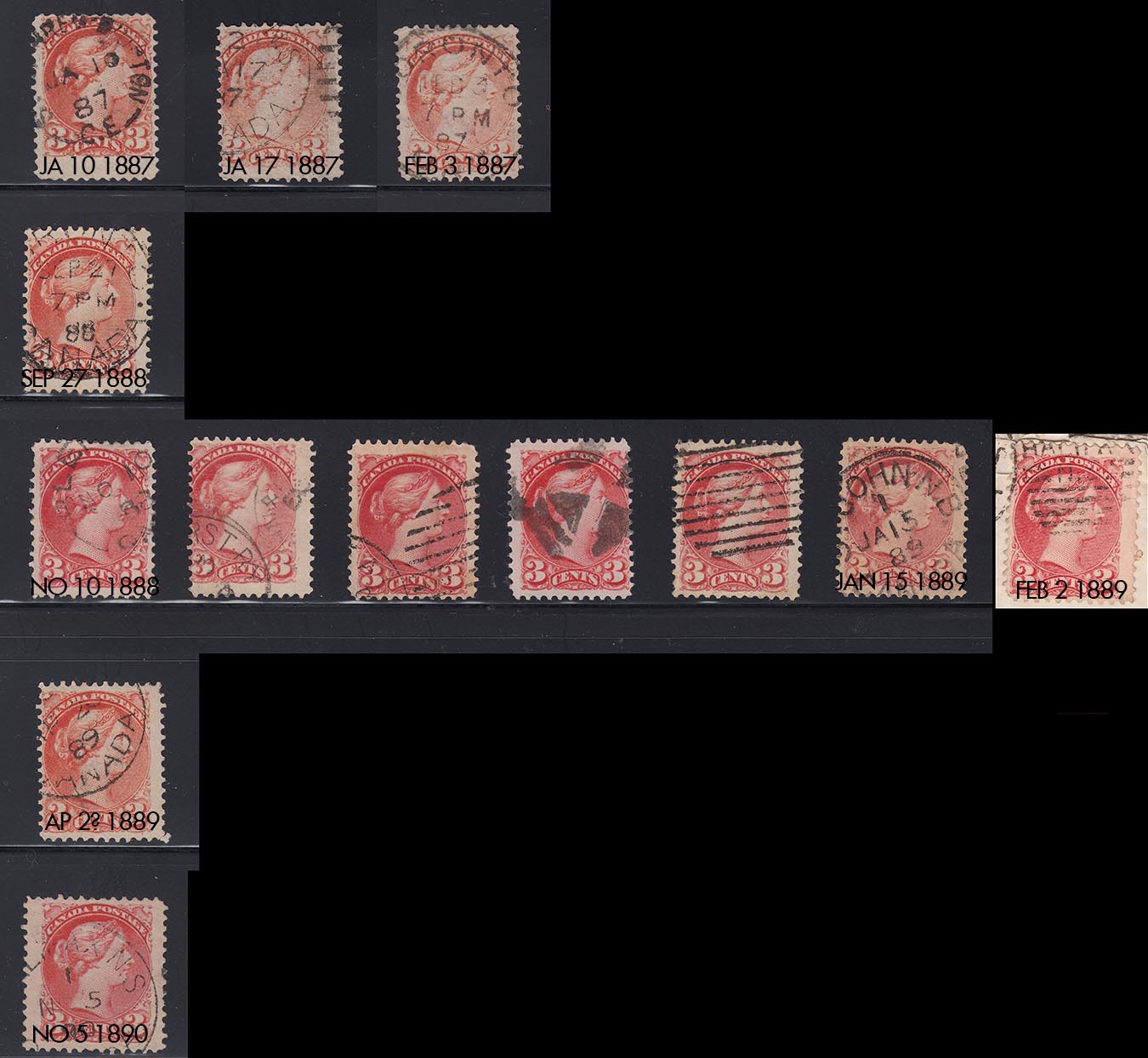 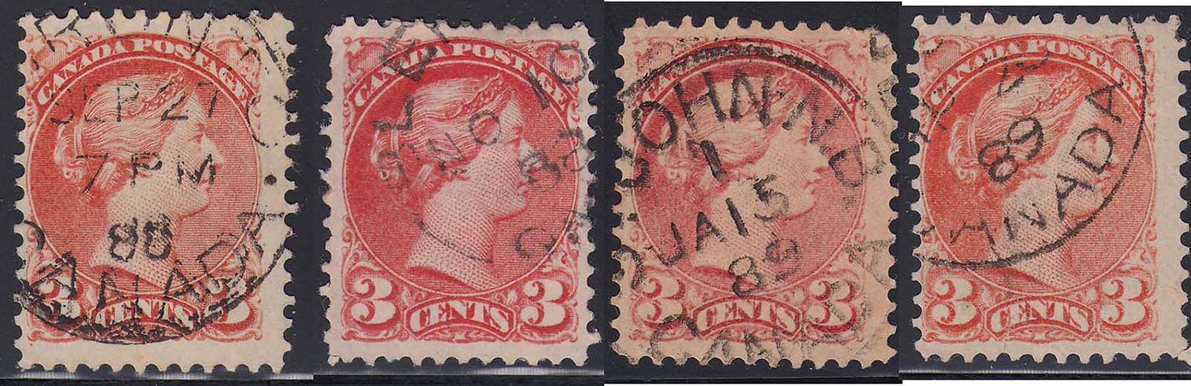 |
|
Send note to Staff
|
|
|
Rest in Peace
Canada
5701 Posts |
|
|
Nice layout sequence Cjusz_911. Your Gazette printings stand out pretty good on my monitors at the office.
The Sept 27/88 stamp is interesting. It has the guide dot in the lower left, late usage. Can you check the perforation please? |
|
Send note to Staff
|
|
|
|
Valued Member
39 Posts |
|
|
I knew you would ask BeeSee!!  Perforations is a hotly debated subject! I use my own method, which is pretty simple, but more often than not it does not correspond to standards that have been established with other tools. Theses standards are nonetheless always my starting point, so keep that in mind when you will see my results! I scan my stamps at 2400 dpi which is the highest native resolution of my scanner, than add perforation marks in Photoshop and count the distance between the marks in pixels. I often try and put marks in different holes to make sure I am not measuring shifted perfs, which happens often with the Small Queens. The rest is simple maths : There are that many pixels per inch, convert that to cm. That gives me a measure of distance between the perfs. There are that many holes over that distance, make an equivalence and voilà. So here are my measurements : 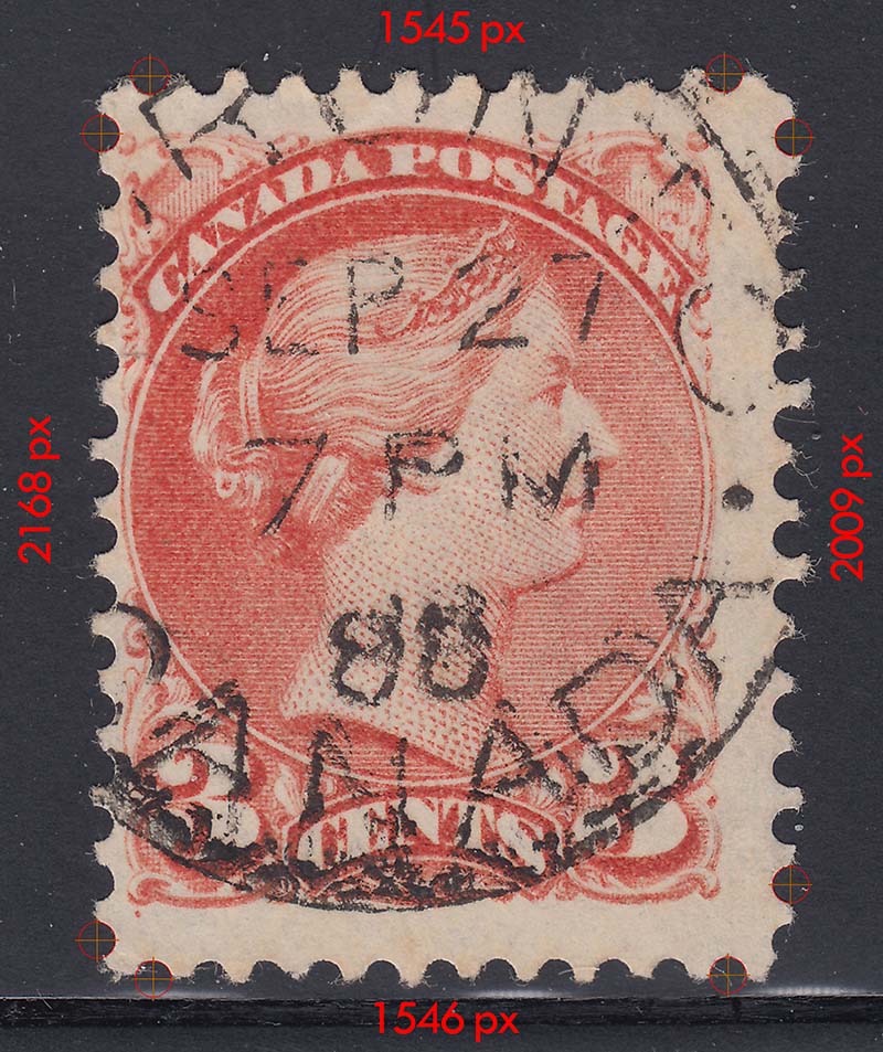 And the math : Up 12.23 Down 12.22 Left 12.20 Right 12.23 That's pretty much 12.25 all around I would say. |
|
Send note to Staff
|
|
|
Replies: 19 / Views: 4,660 |
|


