| Author |
 Replies: 513 / Views: 40,489 Replies: 513 / Views: 40,489 |
|
|
|
Pillar Of The Community
Australia
3299 Posts |
|
|
I had another look. The stamp on the left is Freeman's 16 Wellington 3R16. 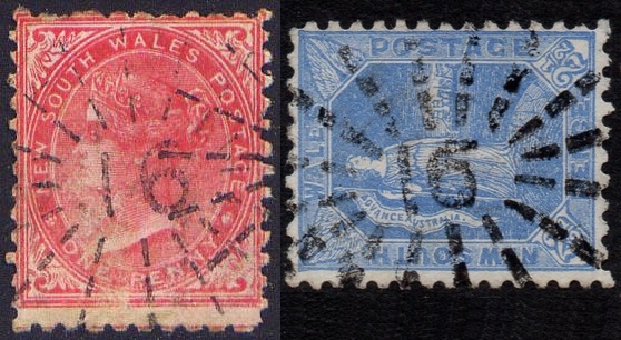  |
Send note to Staff 
|
|
|
Pillar Of The Community
Australia
937 Posts |
|
|
Bobby De La Rue, the stamp you have shown above is Freeman's 91 of Tabulam, showing that the rays do not correspond with those of the blue stamp. The difference is especially evident for the lower rays.
Hugh had that stamp as Wellington in his first edition but corrected it to Tabulam in the second edition. |
|
Send note to Staff
|
https://www.fairdinkumstamps.com Fair Dinkum Stamps - Specialising in stamps from early Australia and the colonies, Australian philatelic literature, catalogues, stockbooks and accessories. |
| Edited by fairdinkumstamps - 07/28/2023 9:51 pm |
|
|
Pillar Of The Community
Australia
3299 Posts |
|
|
Quite right FDS Hugh sold me a 91 Tabulam years ago but it appears it's a 16 Wellington! Confirmation bias at it's best  An 1883 Wellington cover extract below for comparison. 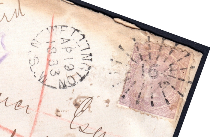 I'll have to double check my 16 Wellington as it's probably a 91...... EDIT: Nope, I have two 16s and no 91  |
|
Send note to Staff
|
| Edited by Bobby De La Rue - 07/28/2023 10:40 pm |
|
|
Pillar Of The Community
Australia
1214 Posts |
|
|
Pillar Of The Community
Australia
1214 Posts |
|
|
Pillar Of The Community
Australia
1214 Posts |
|
|
Pillar Of The Community
Australia
3299 Posts |
|
|
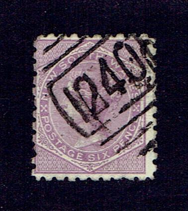
Hi Aussie Al, The second one is a 529. The first one gives every impression of being a 1246 but it's different to the image in Freeman's book. The numeral below was auctioned by Phoenix Auctions, auction 2164, lot 818. Listed as NNS (number never seen). Hammer $170 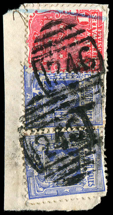 Looks like you have a nice find Let's wait for Fairdinkumstamps though, because I'd like his opinion on this one. |
|
Send note to Staff
|
|
|
Pillar Of The Community
Australia
937 Posts |
|
|
I agree with Bobby De La Rue that these are not the same font 1246 shown by Hugh Freeman in his book, The Numeral Cancellations of New South Wales.
The font more closely matches 1240. Unfortunately, I don't have any examples of either that may shed further light. |
|
Send note to Staff
|
https://www.fairdinkumstamps.com Fair Dinkum Stamps - Specialising in stamps from early Australia and the colonies, Australian philatelic literature, catalogues, stockbooks and accessories. |
|
|
Pillar Of The Community
Australia
3299 Posts |
|
|
Pillar Of The Community
Australia
915 Posts |
|
|
This looks interesting A lot of bars No 1? I'm not sure Would appreciate any info Thanks 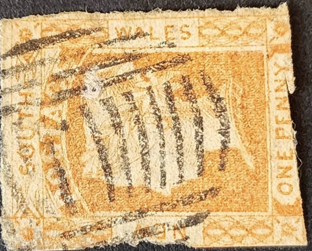 |
|
Send note to Staff
|
|
|
Pillar Of The Community
Australia
3299 Posts |
|
|
Hi Pshann,
That's a Sydney dumb obliterator.
If I've correctly identified it, then according to Granfield, it was in use from 1854 to 1857.
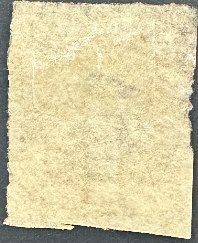
Could you please confirm the stamp has a double lined 1 watermark? |
|
Send note to Staff
|
|
|
Pillar Of The Community
Australia
915 Posts |
|
|
Pillar Of The Community
Australia
915 Posts |
|
|
Bobby
The date range you espouse seems unreal.
Where do you reference?
Thanks |
|
Send note to Staff
|
|
|
Pillar Of The Community
Australia
915 Posts |
|
|
Pillar Of The Community
Australia
3299 Posts |
|
|
Peter Granfield wrote a monograph in 2013 on the early cancellations of Sydney. It greatly expanded on the information contained in White's 'Postal History of NSW'.
Why does the date range seem unreal? I can see the watermark, which was introduced at the beginning of 1854. |
|
Send note to Staff
|
|
|
Replies: 513 / Views: 40,489 |
|




 Posted 07/28/2023 5:34 pm


 .
.