Stamp Community Family of Web Sites
Thousands of stamps, consistently graded, competitively priced and hundreds of in-depth blog posts to read


Stamp Community Forum
 
Username:
Password:
Save Password
Forgot your Password?

This page may contain links that result in small commissions to keep this free site up and running.

Welcome Guest! Registering and/or logging in will remove the anchor (bottom) ads. It's Free!

Custom Labels For Vario Binders

Next Page    
 
To participate in the forum you must log in or register.
Author Previous TopicReplies: 19 / Views: 6,827Next Topic
Page: of 2
Pillar Of The Community
Learn More...
United States
4424 Posts
Posted 12/08/2017   2:19 pm  Show Profile Bookmark this topic Add angore to your friends list Get a Link to this Message
I was experimenting with creating some nice labels for my Vario binders.

I used standard Burgundy color for background but the result did not match the Vario "Burgundy".

These were printed on Avery 5436 labels (removeable- from most surfaces) on a color laser printer. I cannot decide if I like normal or bold but likely need to make text smaller to match countries that take two lines.

Send note to Staff
Al

Moderator
Learn More...
United States
4788 Posts
Posted 12/08/2017   2:48 pm  Show Profile Bookmark this reply Add kirks to your friends list  Get a Link to this Reply
My 2¢ worth ... I prefer the "normal" font over the bold one.

Even with a slight color variation, they look nice.

KirkS
Send note to Staff  Go to Top of Page
Pillar Of The Community
United States
507 Posts
Posted 12/08/2017   3:03 pm  Show Profile Bookmark this reply Add dkabq8 to your friends list  Get a Link to this Reply
Nice!
Send note to Staff  Go to Top of Page
Pillar Of The Community
United States
772 Posts
Posted 12/08/2017   7:25 pm  Show Profile Bookmark this reply Add chris2015 to your friends list  Get a Link to this Reply
I like the normal font too. Nice.
Send note to Staff  Go to Top of Page
Pillar Of The Community
Learn More...
United States
1951 Posts
Posted 12/08/2017   7:36 pm  Show Profile Bookmark this reply Add jkelley01938 to your friends list  Get a Link to this Reply
Angore,

Normal. Have you experimented using a gold color for the lettering?

Jack Kelley
Send note to Staff  Go to Top of Page
Pillar Of The Community
Learn More...
United States
4424 Posts
Posted 12/09/2017   06:35 am  Show Profile Bookmark this reply Add angore to your friends list  Get a Link to this Reply
No, but I could try it.
Send note to Staff  Go to Top of Page
Al
Pillar Of The Community
United States
772 Posts
Posted 12/09/2017   11:03 am  Show Profile Bookmark this reply Add chris2015 to your friends list  Get a Link to this Reply
Have you seen these from the BigBlue blog?


Send note to Staff  Go to Top of Page
Valued Member
Canada
437 Posts
Posted 12/09/2017   1:26 pm  Show Profile Check clivel's eBay Listings Bookmark this reply Add clivel to your friends list  Get a Link to this Reply
angore, that looks great. I also prefer the normal font. I also like Jack's suggestion of using gold for the lettering.

One possibility for getting a more accurate approximation of the burgundy colour would be to scan part of the cover and then use the "dropper tool" in an image editing program such as the gimp to pick-up the colour red,green,blue values.
Unfortunately the scan won't be a solid colour so you would probably need to zoom in and pick a few of the pixels to try for the closest match.
Clive
Send note to Staff  Go to Top of Page
Pillar Of The Community
1448 Posts
Posted 12/09/2017   1:39 pm  Show Profile Bookmark this reply Add Jkjblue to your friends list  Get a Link to this Reply
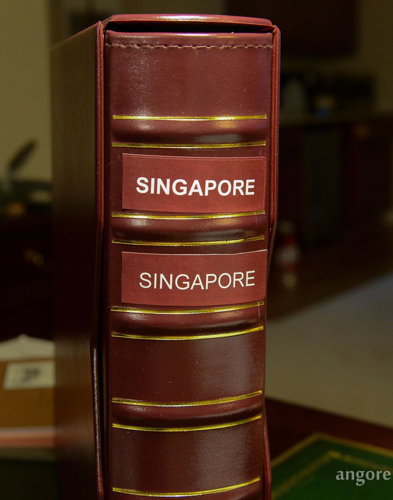
That pic above from my Big Blue blog is courtesy of Ron (Brown Derby) from his guest post, An Unusual Approach to a Classical Period Album.

The link is

http://bigblue1840-1940.blogspot.co...-period.html

for those that would like to read the full report.

I extracted the relevant information about how he did his labels from the comments section of the above blog post.


Quote:
I have an HP Ink Jet printer. I have laid out an excel sheet with the cells set up to match the size of the desired label(s), one for the Scott Specialty Binder and two for the Vario G Binder.

I print full sheets using Avery #6470 removable Full Sheet Labels which print out 8.5 by 11 inch pages which contain as many labels as fit on a page. I then carefully cut these up, peel off the protective back, and stick these "removable" labels on the binder backbone.

The trick is the background color and the font color. I play around with custom mixes of blue, yellow, and green as per excel background and font colors on the ribbon at the top of the excel sheet. The idea is to get the letter fonts close to "gold" and the background a compatible, good looking match to the basic binder color. This is done by trial and error, and you must print out and match until you like the look. It is never a perfect match to the basic binder color, but a slight amount of contrast can actually be quite attractive. If you study the pictures in detail, you will see what I mean.

I hope this answers your question. I had a lot of fun doing this, and it is relatively cheap to change these labels as whim and circumstance dictate.


Quote:
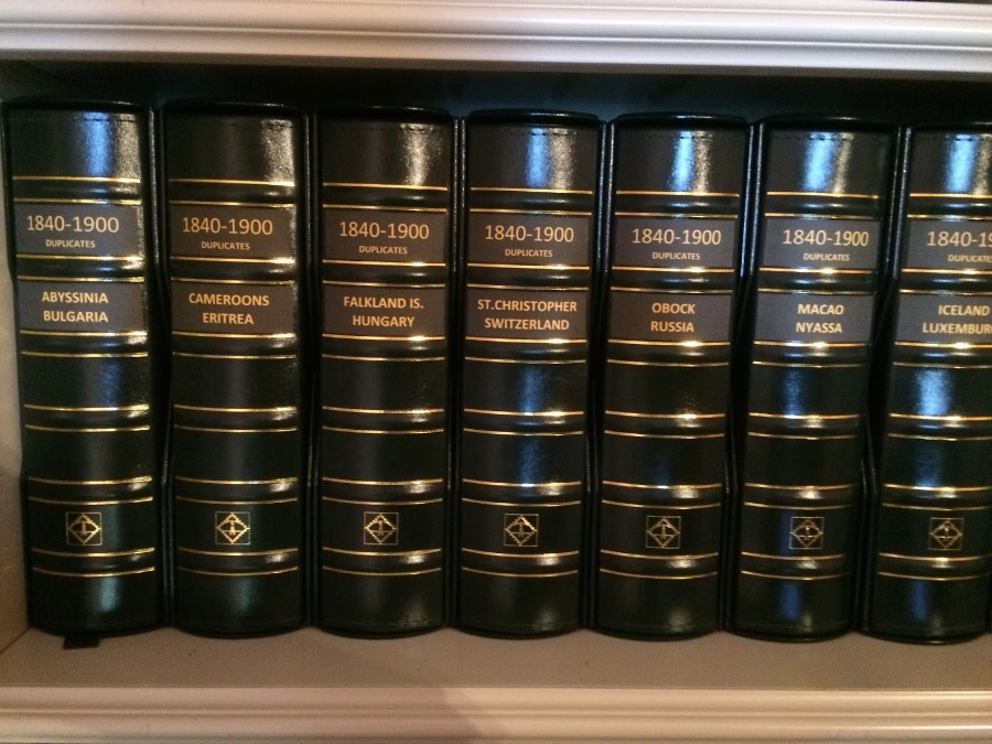
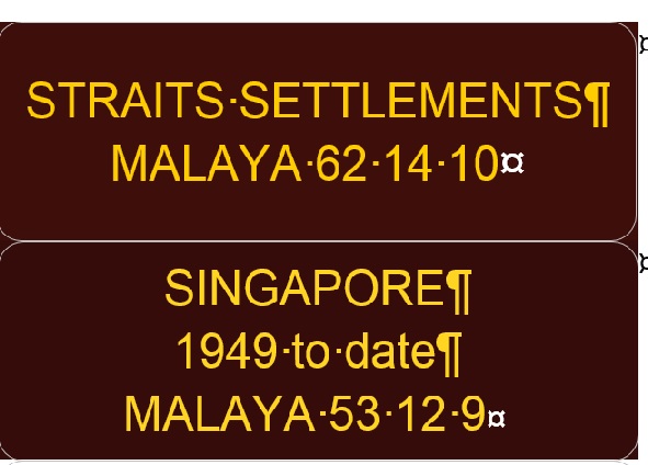
The Red/Green/Blue settings that I am currently using are 255/204/0 for the "gold" lettering, 0/20/10 for the Specialty Binders, and 0/0/0 (i.e. Black) for the Dark green Vario G binders. Black looked better than anything else I could come up with because the Vario binders are such dark green.


Quote:
You also asked for the Font settings of the labels as well as R/G/B.

I chose Calibri lettering for all parts of all labels. I used size 36 for the years (e.g. 1840-1900), size 16 BOLD for "POSTAGE STAMPS" and "DUPLICATES", size 26 for the Specialty album countries, and size 25 BOLD for the Vario G country names.


Send note to Staff  Go to Top of Page
Classical era collecting with the Blues
http://bigblue1840-1940.blogspot.com/
Edited by Jkjblue - 12/09/2017 1:43 pm
Pillar Of The Community
Learn More...
United States
4424 Posts
Posted 12/09/2017   3:50 pm  Show Profile Bookmark this reply Add angore to your friends list  Get a Link to this Reply
Thanks for feedback.

I have been experimenting. It looks like 53,12,9 is fairly close and the gold (255/204/0) mentioned above works better than standard gold - not enough yellow for good contrast. One challenge is the binder has a different gloss (labels after printing are low gloss).
Send note to Staff  Go to Top of Page
Al
Edited by angore - 12/09/2017 3:52 pm
Pillar Of The Community
United Kingdom
895 Posts
Posted 12/09/2017   4:19 pm  Show Profile Bookmark this reply Add Ringo to your friends list  Get a Link to this Reply
Ever tried Letraset transfers? You can get gold ones and rub them onto the surface. They work well.

Packs like this: https://images-na.ssl-images-amazon...._SY300_.jpg
Send note to Staff  Go to Top of Page
Pillar Of The Community
United States
611 Posts
Posted 12/09/2017   4:30 pm  Show Profile Bookmark this reply Add Walkman82 to your friends list  Get a Link to this Reply
Great looking labels, an inspiration for me to try these on my Lighthouse albums. Thanks!
Send note to Staff  Go to Top of Page
Pillar Of The Community
Learn More...
United States
4424 Posts
Posted 12/09/2017   5:20 pm  Show Profile Bookmark this reply Add angore to your friends list  Get a Link to this Reply
This is a Word screenshot of a test label.

The font size is 16 but not able to get 4 lines like Big Blue tends to show if "Duplicates" is at 16.

These are two colors...put the RGB on the label since changing so much.


Send note to Staff  Go to Top of Page
Al
Edited by angore - 12/09/2017 5:45 pm
Pillar Of The Community
Learn More...
United States
1951 Posts
Posted 12/09/2017   6:51 pm  Show Profile Bookmark this reply Add jkelley01938 to your friends list  Get a Link to this Reply
I like the bottom one.

Jack
Send note to Staff  Go to Top of Page
Pillar Of The Community
1328 Posts
Posted 12/14/2017   12:35 am  Show Profile Bookmark this reply Add DrewM to your friends list  Get a Link to this Reply
You'll notice that Ron's "black" labels from his post on the Big Blue blog are not a matching color, but a complementary color. Matching colors is awfully hard, and you nearly always end up with the colors that aren't quite the same. Better, I think, to choose a color that just looks "right" on your binders than trying to match colors. Black, dark green, even white wouldn't look bad at all.

I like the less bold font more than the bolder one which seems too heavy.

You've chosen a sans serif font which looks good. But I wonder if you'd find serif fonts more elegant?
Send note to Staff  Go to Top of Page
Pillar Of The Community
Learn More...
United States
4424 Posts
Posted 12/15/2017   2:12 pm  Show Profile Bookmark this reply Add angore to your friends list  Get a Link to this Reply
This is what I ended up for now.

After looking at it for a while, I want the text to be brighter so will make it yellow but want to get used to it before experimenting more.

Send note to Staff  Go to Top of Page
Al
Edited by angore - 12/15/2017 2:16 pm
Page: of 2 Previous TopicReplies: 19 / Views: 6,827Next Topic  
Next Page
 
To participate in the forum you must log in or register.

Go to Top of Page

Disclaimer: While a tremendous amount of effort goes into ensuring the accuracy of the information contained in this site, Stamp Community assumes no liability for errors. Copyright 2005 - 2026 Stamp Community Family - All rights reserved worldwide. Use of any images or content on this website without prior written permission of Stamp Community or the original lender is strictly prohibited.
Privacy Policy / Terms of Use    Advertise Here
Stamp Community Forum © 2007 - 2026 Stamp Community Forums
It took 0.28 seconds to lick this stamp. Powered By: Snitz Forums 2000 Version 3.4.05