| Author |
 Replies: 15 / Views: 1,883 Replies: 15 / Views: 1,883 |
|
|
Valued Member
United Kingdom
299 Posts |
|
|
In the first image below the two stamps on the left are much darker than the common brown ones. The paper is soft and porous, without grill. According to my stamp color key they are both between dark-brown and blackish-brown. However, I can't see the diagonal line under the top left scrolls, which would confirm them being design A45a. Comparing them with the other stamps in my books the two subjects are way darker ... Now, they are both circulated and as some of you have pointed out in previous posts, special prints are very unlikely to be found circulated. On the top of everything else, the second of the two dark stamps (row 2, column 1 in the first picture) has a partial double print on the back (second image) and that makes it even more unusual, in my opinion. What do you think about them, please? 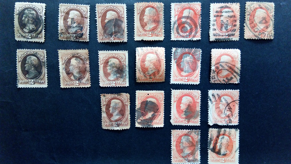 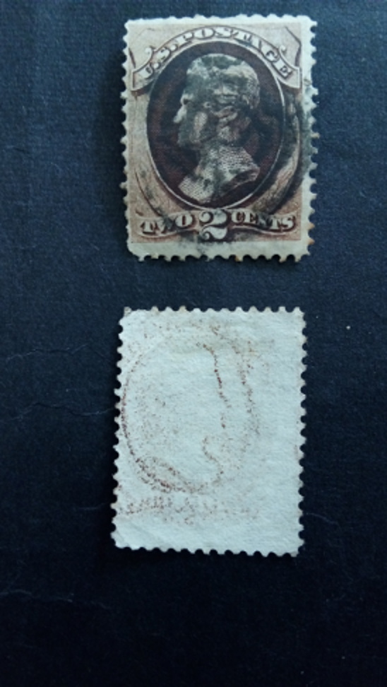 |
|
Send note to Staff
|
|
|
|
|
Pillar Of The Community
1375 Posts |
|
|
If there is no secret mark, these two are 146 who also come in a darker brown.
the image on the back is inverted, so probably a setoff of another stamp of the same design. |
Send note to Staff 
|
|
|
Pillar Of The Community
United States
1414 Posts |
|
|
The stamps are 157 brown. Scott 146 is red brown. The note in the US Specialized Catalog states that 146 and 157 can be distinguished by color. The "secret mark" may not actually exist, but the lines in the scroll are not joined if the stamp is a 146 printed by National Bank Note Company. Since the paper is relatively soft, check for the Continental Bank Note Company ribbed paper variety. |
|
Send note to Staff
|
|
|
Pillar Of The Community
1375 Posts |
|
|
thank you, I didn't know this about the secret mark. The two stamps appear a bit yellow-brown in my monitor so I believed that the information of "no secret mark" would lead to 146. But the paper itself should also be checked, that's true. |
|
Send note to Staff
|
|
|
Valued Member
United Kingdom
299 Posts |
|
|
Stamperix, it is just a matter of RGB settings on the monitor, I guess - there is no yellow on them, I can assure you  The colors of the two stamps are between dark brown and blackish brown when using a Stanley Gibbons color key. Later I will post some very high-resolution images of the paper, which I will take with a microscope cam. Clark, paper questions please: doesn't ribbed paper feel rougher than, let's say, silky paper? The ribs are lifting the fibers set on them and form small rugosities, don't they? ... and shouldn't be ribbed paper sensibly thicker than the thin paper? |
|
Send note to Staff
|
| Edited by aug-stamps - 02/15/2018 11:24 am |
|
|
Pillar Of The Community
1375 Posts |
|
|
thank you :), well I have kind of a good equipment, but this week I am on another monitor where I don't care about colors - normally... but the main factor here is that "no secret" mark does not necessarily mean that it's a 146 which I didn't know (as for example in Micarelli this is not mentioned that way).
you can see ribbed paper the best in oblique light, then the lines appear quite nice. |
|
Send note to Staff
|
|
|
Valued Member
United Kingdom
299 Posts |
|
|
Stamperix, for me, as a beginner in Philately, a very difficult obstacle is the huge difference between how I see colors on a typographic printed material (including CMYK color standard) and how the colors are reproduced on screen through RGB. ... and I can't see a solution to ease this problem ... |
|
Send note to Staff
|
|
|
Pillar Of The Community
1375 Posts |
|
|
well there is a "RGB color world" which would be accurate if:
1) person A makes a scan with color management (scanner and monitor calibrated) and compares the real stamp under normalized light with the one on the monitor.
2) person B looks at this stamp on its monitor with color management (hardware calibrated monitor with color profile)
of course people see colors differently, but this workflow would allow seeing colors quite accurately. of course it sounds a bit strange as I write this when above I have seen a wrong color :).
so everyone who has a good monitor showing exact RGB colors has a good chance to see correct stamp colors on the monitor, if the image file was produced correctly. But this is not often the case, so there is no 100% solution for this. But I guess that for example Siegel has improved this in the last years. |
|
Send note to Staff
|
|
|
Valued Member
United Kingdom
299 Posts |
|
|
Here are the magnified images of the scrolls of the two stamps. First, the stamp with no print on verso: 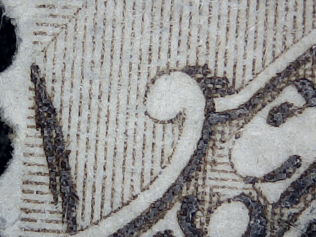 Second, the stamp with double impression on the back: 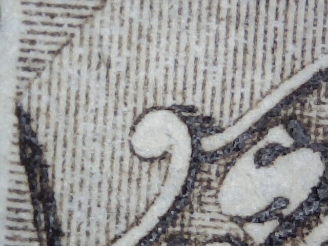 The paper seems to have a large X pattern grid on the first stamp and a small X grid pattern on the second stamp. 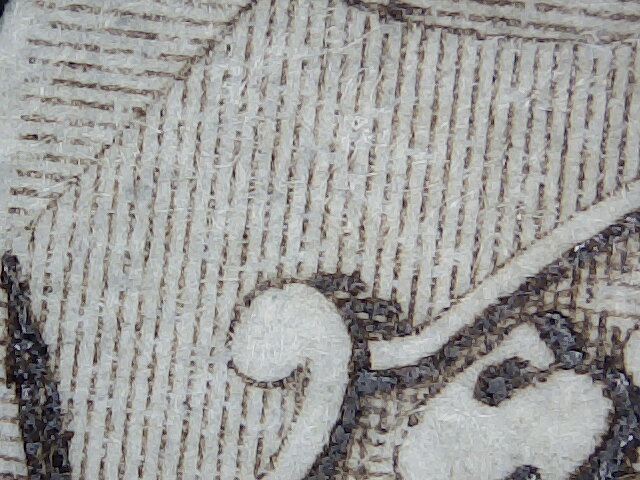 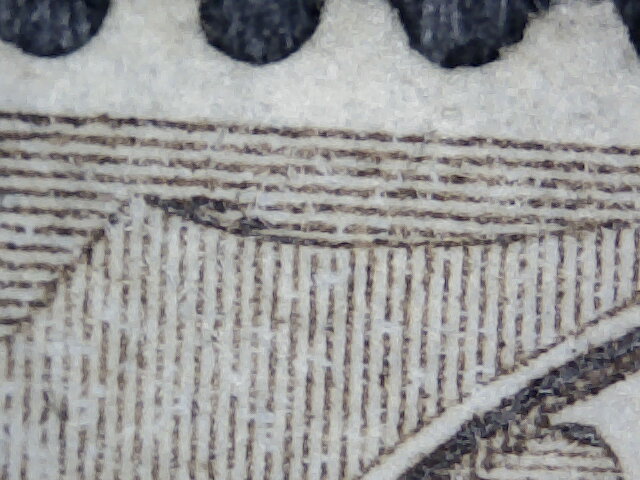 Paperwise, here is an image of the paper on the stamp with the double impression on the back. The other stamp - with no impression on the back - is still covered with a layer of glue which is definitely not the original ... 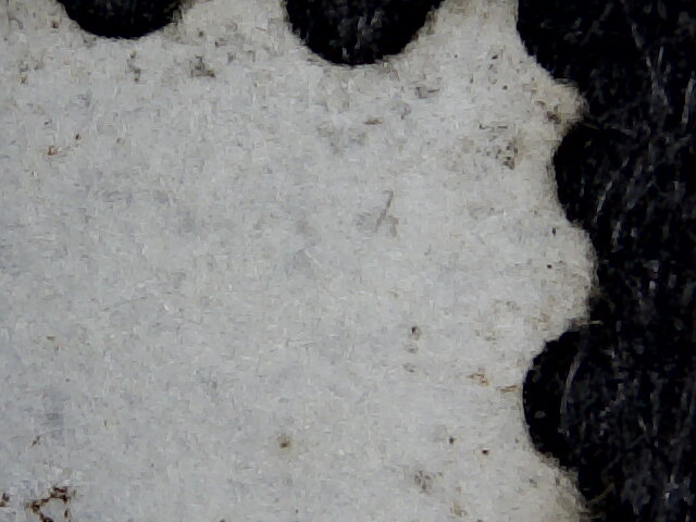 |
|
Send note to Staff
|
|
|
Pillar Of The Community
1375 Posts |
|
|
Valued Member
United Kingdom
299 Posts |
|
|
Pillar Of The Community
United States
1942 Posts |
|
|
You have image resolution problems. All 5 of those pics show an odd white swirling which interferes with image continuity overall.
First three pics: all show the marks typical of Scott #157; in all three the junction is occluded; i.e. the "lines join." |
|
Send note to Staff
|
|
|
Pillar Of The Community
United States
1414 Posts |
|
|
A couple of clarifications: 1. Brookman describes the "secret mark" as a "blur" between the two lines. Aside from the color difference, the two lines in a 146 are unambiguously not joined. The image on the left is from a 146 and the one on the right is from a 157. And it should be clear that 146 is red brown and 157 is brown: 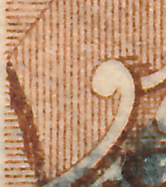 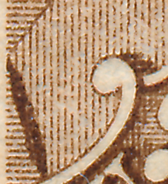 2. Continental Bank Note Company Paper silk paper, misnamed for the tiny linen fibers in the paper, has hundreds of tiny fibers visible front and back under high magnification. The term "silk paper" is also used to describe revenue paper with large, prominent fibers and "experimental" silk paper with sparse, usually blue fibers in soft paper. 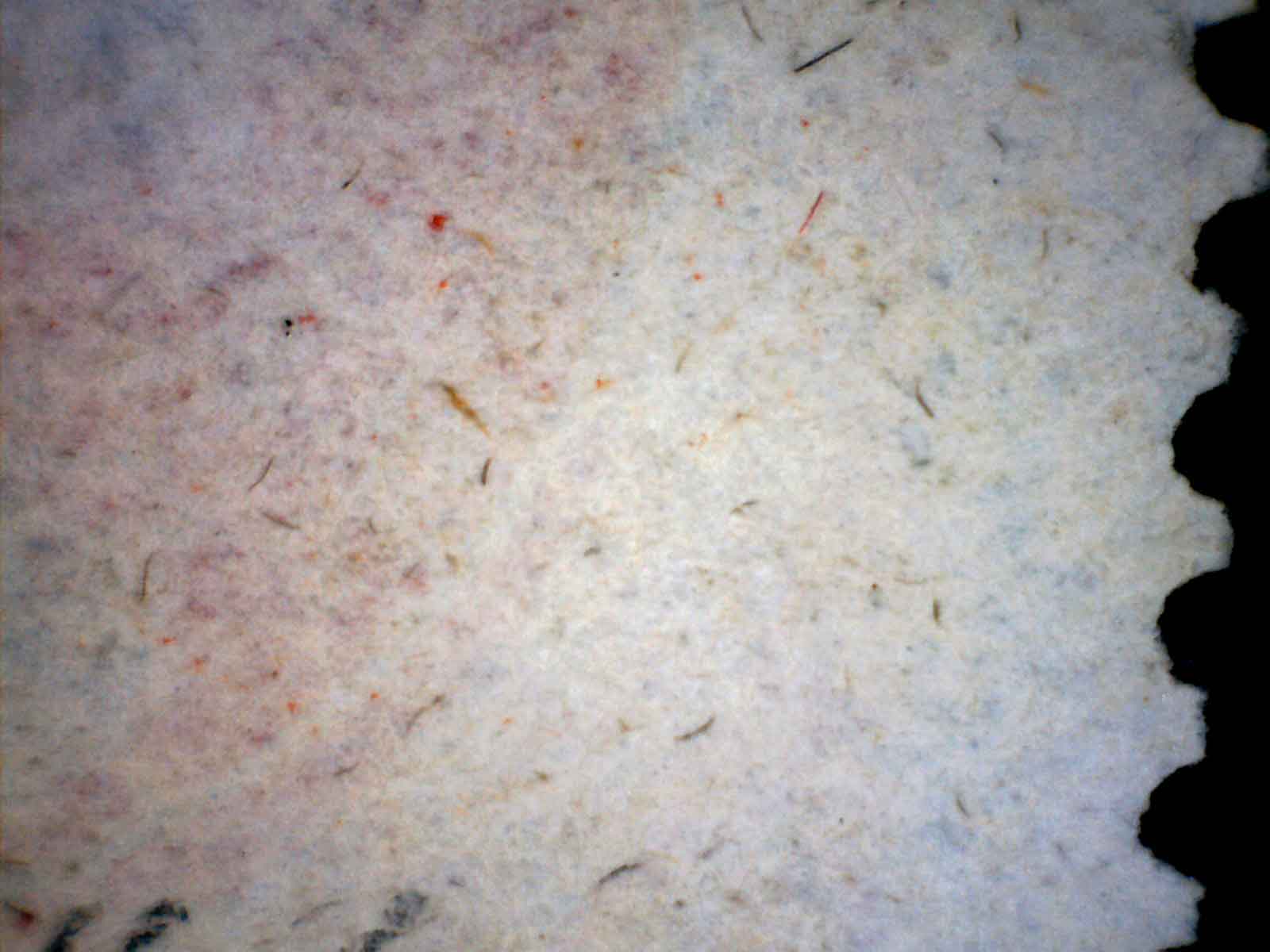 3. Continental Bank Note paper progressed from hard, like National Bank Note paper to intermediate and then soft that cannot be differentiated from early examples of American Bank Note paper. 4. The term "silk paper" has nothing to do with paper texture. Quote:
doesn't ribbed paper feel rougher than, let's say, silky paper? [edited to remove redundant text and images.] |
|
Send note to Staff
|
| Edited by cfrphoto - 02/16/2018 10:13 am |
|
|
Valued Member
United Kingdom
299 Posts |
|
|
Now I am working by elimination The two stamps are definitely not Scott#146, as Clark was pointing out earlier. [Thank you, Clark, for the very detailed explanation you posted earlier!] Here is why! According to Luff, the following colors were issued without grill on 15th of Apr 1870: 2c pale red-brown; red-brown, deep red-brown, orange-brown, brown, dark-brown. Regarding the accuracy of the records of the issues of National Bank Note Co., based on the figures reported by the Postmaster General, Luff is making the following statement: "As the stamps of the 1870 issue appeared in April of that year and the contract of the National Bank Note Co. expired on April 30th, 1873, it is evident that the preceding tables do not accurately report the total issue of the stamps manufactured by that company." As such, we might be entitled to take with a pinch of salt the entire data made available to the public at the time, including here the types of paper supposedly used. Then, Luff makes the following crucial statement regarding the 'secret marks' of Continental Bank Note Co.: 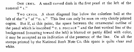 According to Luff, <<
if [sic] the space between the ornamental outline of the panel which is inscribed "U.S. POSTAGE" and the first vertical line of the background (counting toward the left) is blurred or partly filled with color, it may be accepted as an indication of the presence of the line.>> and <<In all the stamps printed by the National Bank Note Co. this space is quite clear and white.>> Next contribution will be on Scott#157. |
|
Send note to Staff
|
|
|
Pillar Of The Community
United States
1942 Posts |
|
|
Quote:
According to Luff, the following colors were issued without grill on 15th of Apr 1870:
2c pale red-brown; red-brown, deep red-brown, orange-brown, brown, dark-brown. I think you have drawn an incorrect inference from Luff. The reference list for color on pages 125-126 (Luff, 1902 edition) is provided to give you a sense of the range of colors recognized and known to have been issued IN THE LIFE OF THE ISSUE, not just on the first dates of issue. At no time does he state or infer that the whole range of material in all its varieties and colors was all issued on the same day. Quote:
"As the stamps of the 1870 issue appeared in April of that year and the contract of the National Bank Note Co. expired on April 30th, 1873, it is evident that the preceding tables do not accurately report the total issue of the stamps manufactured by that company."
As such, we might be entitled to take with a pinch of salt the entire data made available to the public at the time, including here the types of paper supposedly used. Luff's remark calls attention to the fact that the PMG reports are out of phase with the terms of the production contracts. That is a call to the reader not to take the numbers at face, since they will require adjustment. I don't see how you get from that to "we might be entitled to take with a pinch of salt the entire data made available to the public at the time...." Please explain. |
|
Send note to Staff
|
|
|
Valued Member
United Kingdom
299 Posts |
|
|
Essayk, yes, the colors issued during the entire life span of the issue: that is exactly what I understood by reading the passage Regarding the inaccuracy of data, my logic is the following: if the reporting by Continental Bank Note & Co. to the Master General was inaccurate then their books might have been inaccurate. As such, we should be entitled to a bit of caution regarding the information publicly available about them. |
|
Send note to Staff
|
|
| |
Replies: 15 / Views: 1,883 |
|


