| Author |
 Replies: 21 / Views: 5,854 Replies: 21 / Views: 5,854 |
|
Valued Member
South Africa
229 Posts |
|
|
|
Just thinking about album pages and fonts what fonts does everyone use for their pages, always open to new
Anything but this font - Comic Sans
|
|
Send note to Staff
|
|
|
|
|
Pillar Of The Community
Australia
3282 Posts |
|
|
Valued Member
South Africa
229 Posts |
|
|
Valued Member
Belgium
71 Posts |
|
|
I use Old English Text MT for the header and Helvetica Normal for the rest of the page. |
Send note to Staff 
|
|
|
Pillar Of The Community

United States
4427 Posts |
|
|
I create pages for existing albums so have to use something that matches.
Not many consumers actually have the actual Helvetica font installed. |
|
Send note to Staff
|
Al |
|
|
Pillar Of The Community
United States
1125 Posts |
|
|
For my album pages (which have a grid background), I use Candara. I thought it gave me a kind of "retro" feel - something that looks like the old hand'lettered pages. victoria.cgpostal.com 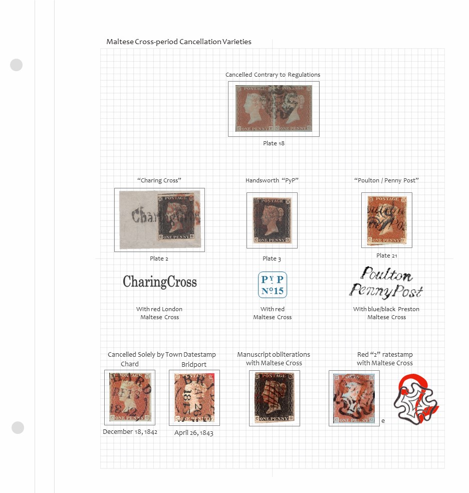 |
|
Send note to Staff
|
|
|
Pillar Of The Community
Norway
1661 Posts |
|
|
I use candera as well, same as chipg. The font reminds me of some beautifully crafted typewritter made pages I once bough, but had to break up.  Here's a sample of one of my 'extra-stuff-pages-on-quadrille'  @chipg - your page is both beautiful and inspiring, well done!! |
|
Send note to Staff
|
|
|
Rest in Peace
United States
4052 Posts |
|
|
For ages, the rule was serif for text and san serif for headlines.
The reason is that the little tails (etc) in the serif fonts made small text easier/faster to read.
But in the age of screens, we've come to prefer sans serif fonts, such as Helvetica et al, because they look 'cleaner'.
I would recommend testing a proper proportional serif font (eg, Times New Roman) on your album pages, as they are paper (a diffuse background), not screens (an illuminating background).
Cheers,
/s/ ikeyPikey |
|
Send note to Staff
|
|
|
Pillar Of The Community
United States
1125 Posts |
|
|
Ikey: I tend to agree. For my album, there is minimal text with each item and the san serif Candara reminds me of the albums of old. For exhibits, where there is usually more text, I go with Garamond:  |
|
Send note to Staff
|
|
|
Valued Member
South Africa
229 Posts |
|
|
Every body seems to favor clean, not fancy fonts, they all great fonts I tend to like the
serif fonts, like the old worldly look. |
|
Send note to Staff
|
|
|
Pillar Of The Community
United States
1510 Posts |
|
|
Pillar Of The Community
United States
4427 Posts |
|
|
It will print Steiner pages as Arial at least on systems without Helvetica. From I can tell, Acrobat encoded Arial MT. |
|
Send note to Staff
|
Al |
|
|
Valued Member
Canada
437 Posts |
|
|
The Steiner pages I have examined use Helvetica. As the font data is embedded in the PDF the actual Helvetica font will be used to display and print the PDF irrespective of whether one has the font on one's computer or not.
Fonts may be substituted when viewing/printing a PDF if the computer that generated the PDF does not have the font installed or the font is not licensed for embedding. This does not apply to Steiner's pages.
Clive
|
|
Send note to Staff
|
AlbumEasy - Free software for creating custom stamp album pages ChromaMate - Compare, match, analyse, free colour matching software ImageSleuth - Images, hidden inside images, revealed. A retroReveal alternative PSGSA - The Philatelic Society for Greater Southern Africa |
| Edited by clivel - 05/01/2018 6:42 pm |
|
|
Pillar Of The Community
United States
4427 Posts |
|
|
Clive, When I look at properties in older PDFs, I see this. 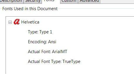 I am not sure if he embedded Helvetica. I have seen differences in some PDFs. The telling clue on the actual font is the G. Arial does not have the vertical descender like Helvetica. See differences. On my system Arial is used and I do not have Helvetica installed. I do not have Arial MT installed either. From what I could find, Arial MT was included in early Adobe Acrobat versions so believe Steiner embedded it. 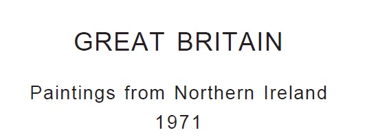 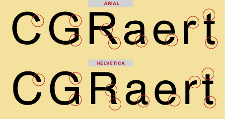 On a recent 2016 PDF I see this: 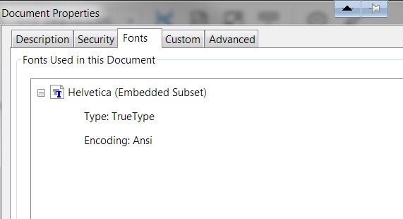 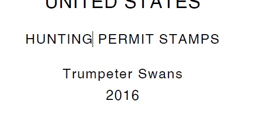 The font is embedded correctly and prints correctly. The kerning is not tight like normal Helvetica. |
|
Send note to Staff
|
Al |
| Edited by angore - 05/01/2018 8:00 pm |
|
|
Pillar Of The Community
United States
1510 Posts |
|
|
I thought it was Arial but the his spacing is different than the Arial used by my version of MS Word. |
|
Send note to Staff
|
|
|
Moderator

United States
12330 Posts |
|
|
Hi Timm, The 'spacing' is called kerning, many app allow you to increase/decrease the kerning to achieve the most eye-pleasing balance. In Word, you can change the character spacing by using the Advanced tab in the Font dialog box as shown below. 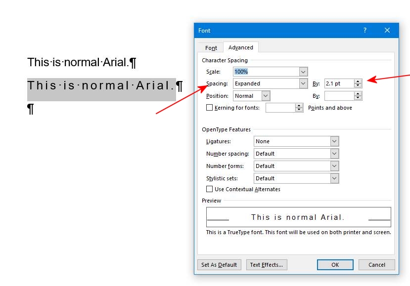 Don |
|
Send note to Staff
|
|
|
Replies: 21 / Views: 5,854 |
|


