Stamp Community Family of Web Sites
Thousands of stamps, consistently graded, competitively priced and hundreds of in-depth blog posts to read


Stamp Community Forum
 
Username:
Password:
Save Password
Forgot your Password?

This page may contain links that result in small commissions to keep this free site up and running.

Welcome Guest! Registering and/or logging in will remove the anchor (bottom) ads. It's Free!

The 1972-1978 Caricature And Landscape Issue Of Canada

Previous Page | Next Page    
 
To participate in the forum you must log in or register.
Author Previous TopicReplies: 139 / Views: 10,818Next Topic
Page: of 10
Valued Member
Canada
97 Posts
Posted 01/16/2019   11:28 pm  Show Profile Bookmark this reply Add Brixtonchrome to your friends list  Get a Link to this Reply
Hi Lithoengraving, Yes of course! How silly of me! I had forgotten to mention that the inscriptions on the Ashton Potter printings of the $1 and $2 were engraved by the BABN.

Interestingly, with respect to the $2, I have found that they can be distinguished by the paper fluorescence as well, which I will discuss eventually when I begin illustrating paper fluorescence. But generally plate 1 stamps exhibit a dull fluorescence that is speckled with a sparse concentration of low fluorescent fibres. Plate 2 have a bluish fluorescence that contains a much denser concentration of fluorescent fibres. Since I haven't posted about fluorescence yet, this probably all sounds like gibberish, but I promise that it will make sense by the time I am done.

I hadn't noticed the differences in the lettering and the actual lithography itself, but I will be sure to check again. Whenever Unitrade tells me something can't be done, I take it as a challenge, and apparently you do too!
Send note to Staff  Go to Top of Page
Pillar Of The Community
Canada
5821 Posts
Posted 01/16/2019   11:50 pm  Show Profile Bookmark this reply Add lithograving to your friends list  Get a Link to this Reply
Brixtonchrome

Thanks for your fast response and like I said before
your thread has piqued my interest again for these definitives
and Canadian stamps in general.

I hope you don't mind that I posted a few scans and I
certainly don't want to hijack or interfere/interrupt with the
sequence of your posts.
Send note to Staff  Go to Top of Page
Valued Member
Canada
97 Posts
Posted 01/17/2019   3:01 pm  Show Profile Bookmark this reply Add Brixtonchrome to your friends list  Get a Link to this Reply
No, thanks for doing so. The more the merrier!
Send note to Staff  Go to Top of Page
Rest in Peace
Netherlands
963 Posts
Posted 01/19/2019   04:28 am  Show Profile Bookmark this reply Add Galeoptix to your friends list  Get a Link to this Reply
Chris

I will make scans today, but it seems to me that the 15c and the 25 were printed in 3 [three) colours!

If I am right, Unitrade is right as well as fsr as the 25c twins are concerned...

Rein
Send note to Staff  Go to Top of Page
Rest in Peace
Netherlands
963 Posts
Posted 01/20/2019   08:03 am  Show Profile Bookmark this reply Add Galeoptix to your friends list  Get a Link to this Reply
Chris,


I am beginning to think it is NOT a colourshift, it is a lot of ink coming from the other parts of bears! Also look at the right of the part that got mirrored in the pond of the second bear!


Also remember that this is NOT the traditional recess the BABN is performing but something thst comes close to photogravure as far as ink goes!

Rein
Send note to Staff  Go to Top of Page
Rest in Peace
Netherlands
963 Posts
Posted 01/20/2019   08:04 am  Show Profile Bookmark this reply Add Galeoptix to your friends list  Get a Link to this Reply
It is a pity I do not have that many copies, but I wonder whether there are just 2 types! I will scan my 3rd type if I can find time today....

But around this time - 1970-ies - the Goebel and the DLR/Giori presses with combined photogravure and recess, were using a recess method that comes very close to photogravure - the cylinder bring etched [not engraved!] often with the lines having hardly any ink, just a flat, undeep recess which gives a different shade [!]. I noticed this in the UK Castles and the Belgium King Baldwin definitives
Send note to Staff  Go to Top of Page
Rest in Peace
Netherlands
963 Posts
Posted 01/20/2019   08:05 am  Show Profile Bookmark this reply Add Galeoptix to your friends list  Get a Link to this Reply


Quote:
The type 2 printing is shown on the left, while the type 1 printing is shown on the right. Here, the difference is in the shading of the bears and their shadows. On type 1, the shading appears more or less even. On type 2 there the centre of each shadow is solidly inked. Type 1 is only found on plate 1, but type 2 is found on plates 1 and 3. No plate 2 was issued for this value.


Type 1:


Type 2:


So what is the difference???

In type 1 the centres of both the bears and their shadows are less pronounced as far as ink goes; in the alleged type 2 the lower halfs of both bears and their shadows are less filled with ink!

Is that all???

Does this distribution of ink exist in all stamps of a particular plate/cylinder??
Send note to Staff  Go to Top of Page
Rest in Peace
Netherlands
963 Posts
Posted 01/20/2019   08:06 am  Show Profile Bookmark this reply Add Galeoptix to your friends list  Get a Link to this Reply
In my copies of type 1 [ex. Chris F.]:


all 4 stamps seem to have the same distribution of ink [depth of cells].
Send note to Staff  Go to Top of Page
Edited by Galeoptix - 01/20/2019 08:11 am
Rest in Peace
Netherlands
963 Posts
Posted 01/20/2019   08:07 am  Show Profile Bookmark this reply Add Galeoptix to your friends list  Get a Link to this Reply
My 3rd [third] type:


has the darker centres i.e. the positive of type 1!
Send note to Staff  Go to Top of Page
Edited by Galeoptix - 01/20/2019 08:11 am
Rest in Peace
Netherlands
963 Posts
Posted 01/20/2019   08:08 am  Show Profile Bookmark this reply Add Galeoptix to your friends list  Get a Link to this Reply
And now the Siamese twins!


Clearly type 4 :) or type 3 with the dark side shifted towards the right???

Does anybody know the sheet position of these twins???
Send note to Staff  Go to Top of Page
Rest in Peace
Netherlands
963 Posts
Posted 01/20/2019   08:09 am  Show Profile Bookmark this reply Add Galeoptix to your friends list  Get a Link to this Reply
Direction of printing in photogravure is a common feature nothing to do with double print or impression!


I haven't seen such phenomenon - to this extent! - in recess prinitng sof ar as here with the twins :)

Elsewhere in Stampboards - http://www.stampboards.com/viewtopi...=+direction:


Quote:

Here's a couple of Canadian examples:


The explanation given there is wrong as far as photogravure goes, it may fit the shown offset-litho copies...
Send note to Staff  Go to Top of Page
Rest in Peace
Netherlands
963 Posts
Posted 01/20/2019   08:09 am  Show Profile Bookmark this reply Add Galeoptix to your friends list  Get a Link to this Reply
Back to the Siamese!

As found on ebay:


4 [four] Twins!

Making it type 4 :)
Send note to Staff  Go to Top of Page
Pillar Of The Community
Canada
5821 Posts
Posted 01/21/2019   3:32 pm  Show Profile Bookmark this reply Add lithograving to your friends list  Get a Link to this Reply
Rein it's great to see you do some detective work
on these Canadian definitives.

You state:
Quote:
I will make scans today, but it seems to me that the 15c and the 25 were printed in 3 [three) colours!


Here is the original brochure from Canada Post Office


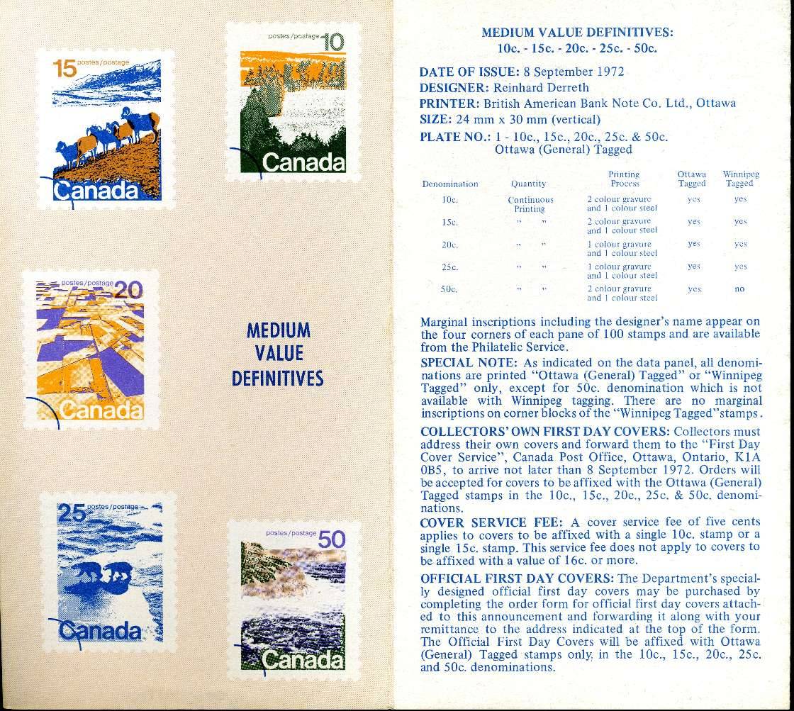
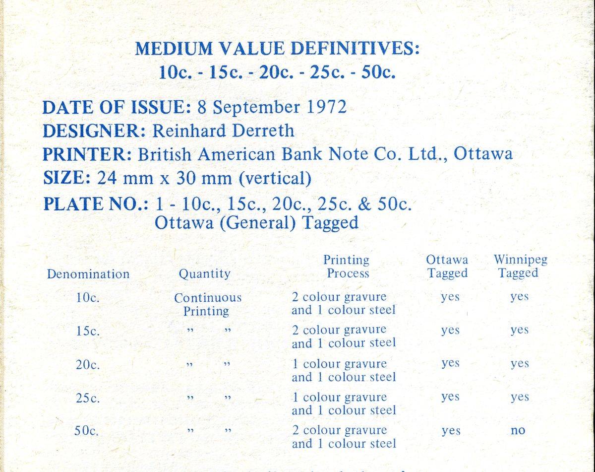
Rein, maybe you are right about the 15c Scott/Unitrade 595
being printed in 3 colours going by what it says above.

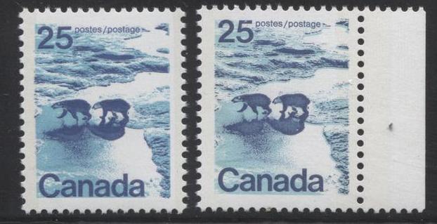
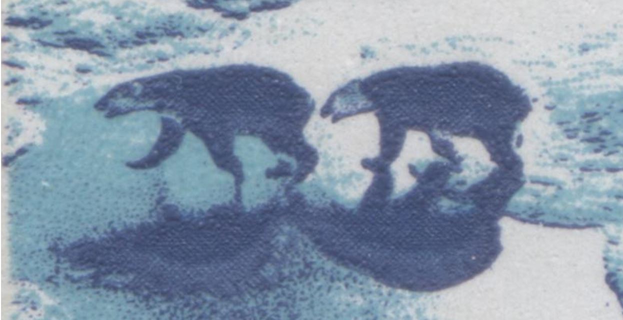
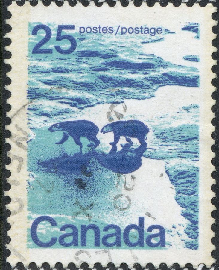
I actually only see 2 colours in both the 15c and the 25c.

Here are a couple of my Scott 595 plate blocks 1 & 2.


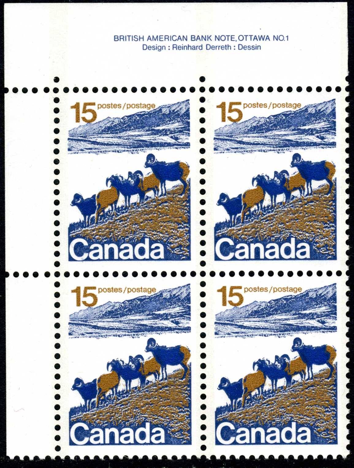
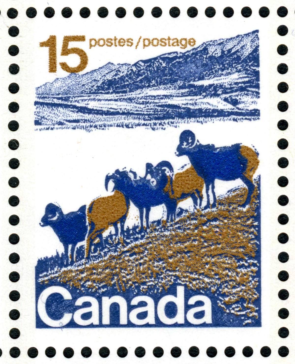
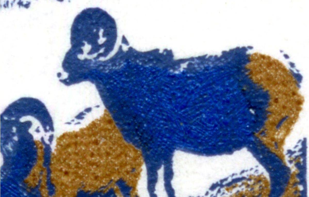
For Plate Block 1 it looks like the blue tail type and on PB2
below I see a raised hump but only partially raised.


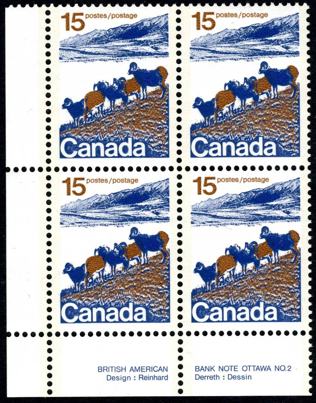
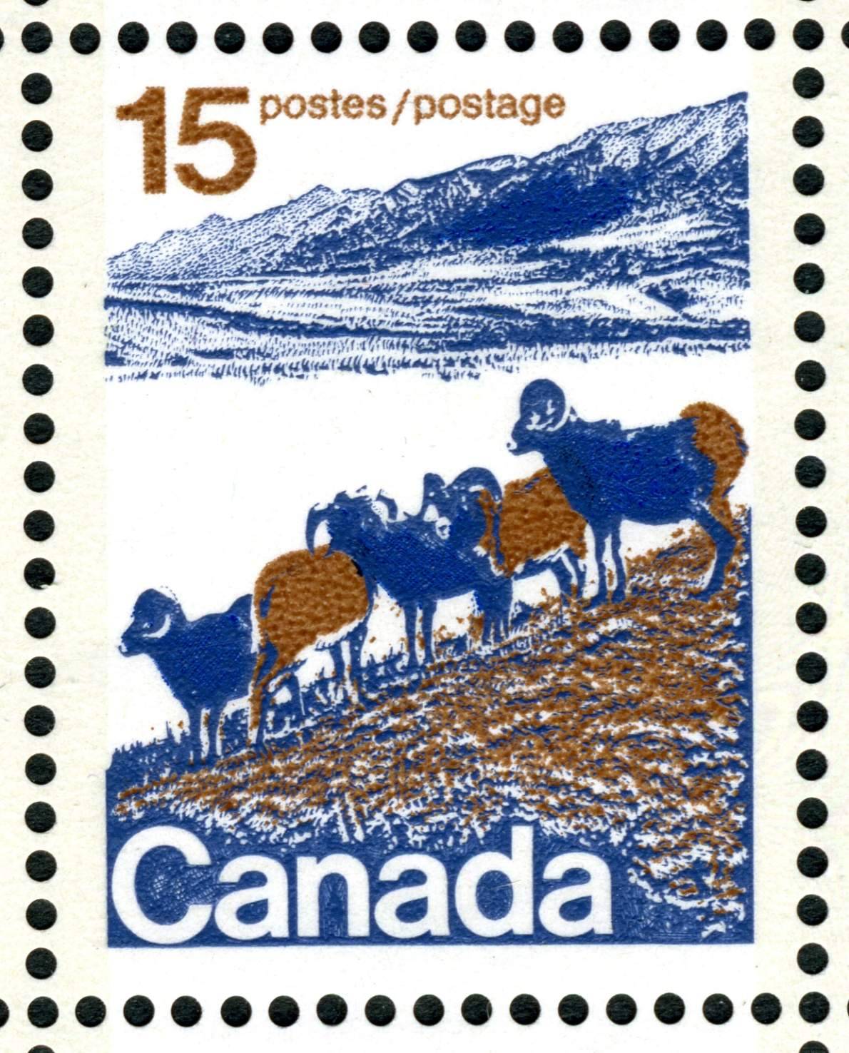
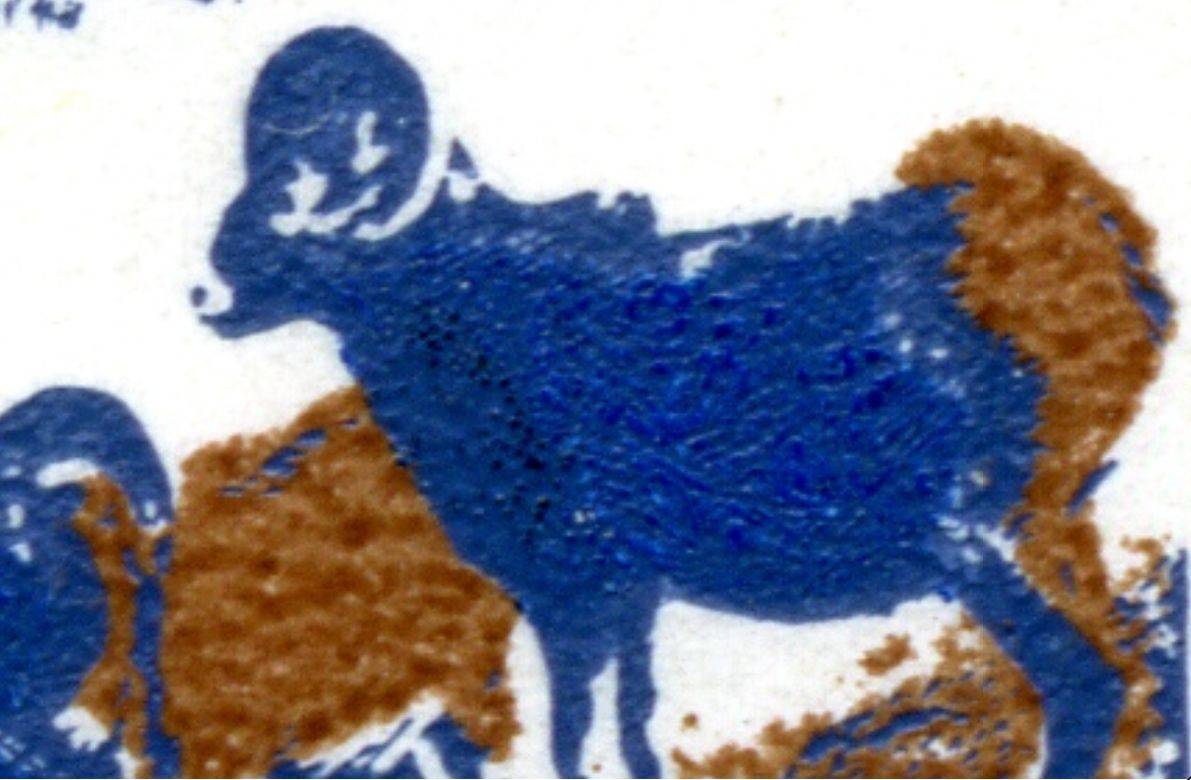
I think BABN was still learning how to use the Goebel press
since there was so much misregistration and actually the
perfectly registered/aligned copies are the exception.


PS: For the life of me I can't see why Scott/Unitrade calls these
mid values multicolored. Two colours is considered multi?
Looking through various countries , in the past Scott would list up to 4 single colours
before they called a stamp multicolor.
Catalogues are getting more and more useless.IMO

Send note to Staff  Go to Top of Page
Rest in Peace
Netherlands
963 Posts
Posted 01/21/2019   4:52 pm  Show Profile Bookmark this reply Add Galeoptix to your friends list  Get a Link to this Reply


You can see the white spots thanks to the shift of bright blue [photogravure] in relation to the grey blue [recess].

A similar bright blue [photogravure] is in the 25c causing the blops to join the sheep-> twins!
Send note to Staff  Go to Top of Page
Edited by Galeoptix - 01/21/2019 6:03 pm
Rest in Peace
Netherlands
963 Posts
Posted 01/21/2019   4:55 pm  Show Profile Bookmark this reply Add Galeoptix to your friends list  Get a Link to this Reply


The 15c has a bright blue [photogravure] that when it shifts causes the white spot. The grey blue is in recess!

So as the brochure said, 3 colours!

The 25c has a similar second photogravure cylinder with the bright blue that when it shift causes the blobs to join the sheep > twins!
Send note to Staff  Go to Top of Page
Edited by Galeoptix - 01/21/2019 6:02 pm
Page: of 10 Previous TopicReplies: 139 / Views: 10,818Next Topic  
Previous Page | Next Page
 
To participate in the forum you must log in or register.

Go to Top of Page

Disclaimer: While a tremendous amount of effort goes into ensuring the accuracy of the information contained in this site, Stamp Community assumes no liability for errors. Copyright 2005 - 2026 Stamp Community Family - All rights reserved worldwide. Use of any images or content on this website without prior written permission of Stamp Community or the original lender is strictly prohibited.
Privacy Policy / Terms of Use    Advertise Here
Stamp Community Forum © 2007 - 2026 Stamp Community Forums
It took 0.2 seconds to lick this stamp. Powered By: Snitz Forums 2000 Version 3.4.05