Wow! I am thrilled by all the discussion that has taken place on this thread and I must apologize for the inaccuracies in my work that "studystamps" has taken it upon himself to point out. I was actually going to write a summary of the factual inaccuracies in what I wrote and the corrections. But he has beaten me to the punch.
Despite having 41 years of experience as a philatelist I still have a lot to learn, but I don't allow that to deter me from writing and presenting my observations as I see them. Some of the hypotheses that I express here may ultimately be incorrect. But I don't think that is necessarily bad if it gets all of us to think and examine our stamps with a more critical eye. So, I will tell all of you what I'm pretty sure I told him when we had an e-mail exchange a few days ago:
While I believe that the archives and printer's records are an important source of information for philatelic research, I do not believe for one second that they tell the whole story behind a stamp issue's production. We are dealing with large organizations here: the post office department on one side, and a printing company on another. A lot of decisions are made and carried out. Things go wrong, stuff comes up. Not everything that happens or every decision that is made is written down. I guarantee it. I've worked in public accounting for 21 years and I believe that has given me some insight into the fact that there is much that goes on in organizations that is NOT documented. So, for that reason, I am more of what I would call an empirical philatelist. I rely on two things primarily:
1. My eyes, and
2. My knowledge of basic philatelic principals
Then, I will apply knowledge that I have gleaned from studying other issues. For instance, most of my hypotheses about the screening dots on the different printings, which I wrote about last week comes from my general knowledge of photogravure printing, which I learned from collecting Great Britain QE2 material and South Africa from 1931-1956 or so. So, while my hypotheses may not ultimately be correct all the time, I think they are still a good way to stimulate exploration and discussion on these topics. I have learned a lot of new information that I did not have before too, like the technical process of paper-making, which Rein has shed a lot of light on for me, for which I am very thankful.
Galoptix has raised a very good point, which is that many collectors cannot afford to acquire every specialized catalogue out there or join every specialized group. Indeed, this is my reason for doing all the philatelic writing that I do - to make as much information as readily available to you as I can, without requiring you to pay for it. I left a lucrative career in public accounting where I was a partner in a Toronto firm in order to devote my life to philatelic research and stamp dealing. I'd be the first to admit that I am not in the same position as such names as Leopold Beaudet, and Hans Reiche because these men have had 40 more years to gather their knowledge than I have. So, I guess what I am saying is that I hope that the occasional inaccuracy in my writing, corrected as the information becomes available does not put you off reading my articles.
So, with that, I will post the article that I published on my website today:
This week, I am going to look at one aspect of this issue which has not received a lot of attention until recently: the varieties found on the low value caricature stamps. Unitrade only lists a few varieties on the booklets, and some constant varieties on the 8c Queen. However, as you examine a large number of these stamps, it becomes apparent that there are quite a number of varieties that are not listed in Unitrade on these stamps. This post will present some of the varieties that I have found on the stamps I have examined. This post however, must be considered a work-in-progress, because I sold most of the varieties that I found on this issue. I will continue to add scans and descriptions as I come across more varieties. In the meantime if you have a variety that I have not illustrated here and are willing to send me a scan, I will be happy to add it and mention you by name, as the source.
One observation I can offer right upfront, is that most of the constant varieties are not anywhere near as common as you might think. I have examined several full sheets of the 8c Queen stamp and not found any of these varieties on any of them, which suggests that these varieties are only found on some, but not all of the panes that were printed.
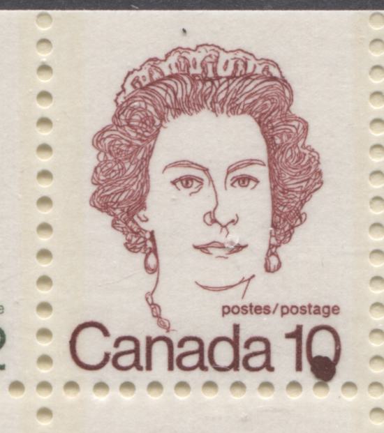
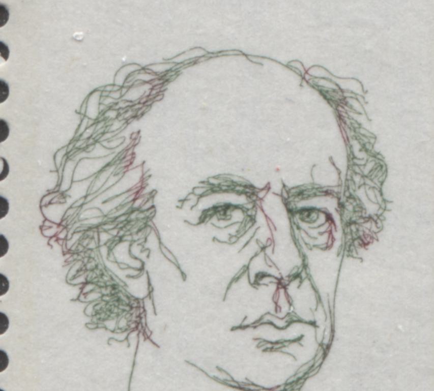
Constant Varieties on the 8c QueenUnitrade lists four constant varieties on the 8c Queen, All of these consist of dots of ink on, or near the Queen's face:
1. Weeping Queen - positions 13 and 20. This is a small dot just under the right eye.
2. Tear on Side of Nose - position 52. This is a larger dot between the right eye and half way down the nose.
3. Dot by Queen's Ear - position 44. This is a small dot under the hair, near the right ear.
4. Earring variety - position 13. This is a larger, smudgy dot located under the earring of the left ear.
Unfortunately, even with 15 complete sheets or so of these stamps and thousands of singles, I have never located an example of any of these varieties. So they must be relatively scarce and must occur on only one of the panes in the printing layout. However, they appear pretty much as described, and I will try to add scans to illustrate as they become available.
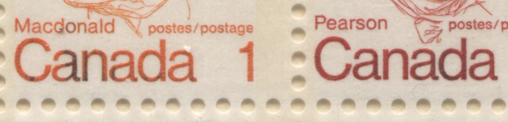
Varieties on the Booklet StampsAs McCann says in his booklet catalogue, the booklets of this issue suffered from notoriously poor quality control, which has resulted in numerous major and minor varieties occurring on the stamps contained in these booklets. Unitrade lists the following varieties on the booklet stamps:
1. Broken Tiara on the 8c Queen.
2. Broken 1 on the 1c Macdonald.
3. Missing 1 on the 1c Macdonald.
4. Bottom half of "Canada 8" missing from the 8c Queen.
5. Stuttering C on "Canada"
6. 7. Orange in the Queen's hair on the 8c.
7. Doubling under 10's on the 10c stamps.
8. Repeating 10's on the 10c stamps.
9. Green or orange ink on the gum side.
10. Orange line 1 mm thick at the right side of a 1c stamp.
I have never seen the "stuttering C" variety, but I assume that it is a "C" of "Canada" that is printed several times. The other varieties are all very self-explanatory.
The pictures below illustrate some of these varieties:
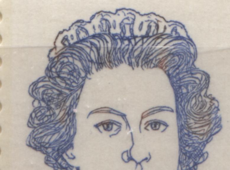
This picture shows one variation of the orange in the Queen's hair that occurred when some of the ink from the 1c Macdonald stamps wound up mixed with the ultramarine ink that was used to print the Queen. For some strange reason, the orange does not usually appear anywhere else on the Queen, except for the hair.
The next picture shows a weak example of the "Repeating 10's" variety:
When I first saw this variety, I did not recognize it because I expected the 10's to be vertical, in line with the normal 10's. In actual fact, with this variety, the 10's appear sideways. In most cases, only the "0"'s are prominent. But on stronger versions of the variety, both the 1's and the 0's are clearly visible.
In addition to the listed varieties, there are several unlisted ones. Most all of these are due to ink migration that occurred during printing, but nonetheless, they still make for some interesting displays. Below are some of the varieties that I have found on the booklets I have handled so far:

This is an example of a typical 25c booklet that shows evidence of ink migration between the different stamps: orange from the 1c to the 8c Queen, and ultramarine from the 8c Queen to the inscriptions of the 1c and 6c stamps. Below is a close-up scan of that migration:
Here, you can see the migration of the ink as lettering that appears almost black, instead of the normal orange or scarlet.
Here is the back of that same booklet pane showing a partial reverse-offset of the inscriptions:
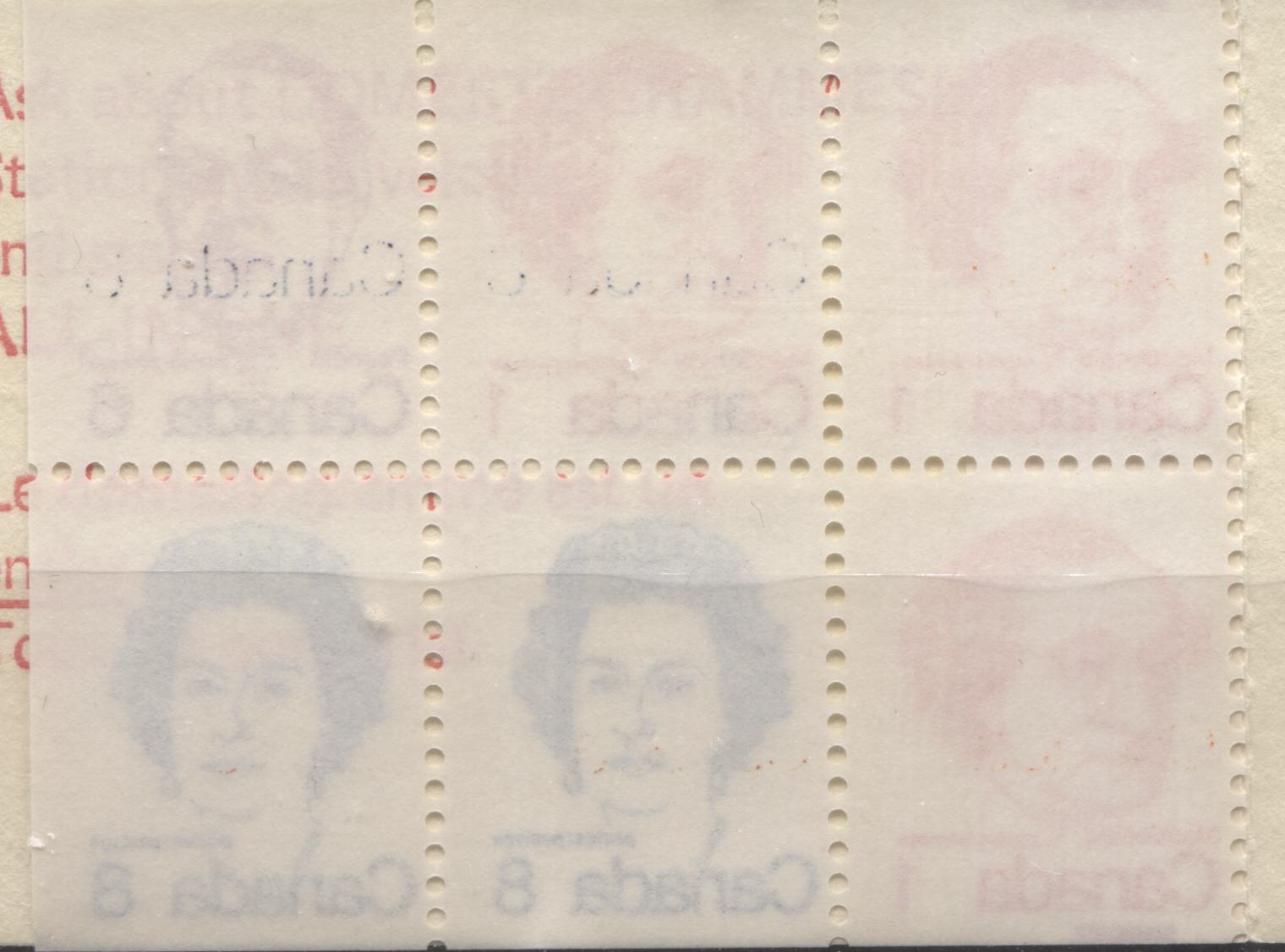
#65279;#65279;#65279;#65279;This is a relatively common variety that does occur with some regularity on these booklets. So, it is not rare, but it is interesting nonetheless.
Below is another very striking non-constant variety that occurred on the 50c booklet, the "blob on 10":
#65279;#65279;This variety has occurred due to over-inking, and is almost certainly not constant, but it is very visually striking.
Unfortunately I do not have a lot of examples of the varieties that I originally found on these booklets, as I sold most of them to customers over the last year or so. However, I can generally describe most of them as follows:
1. Several involve the 10c Queen and consist of dots in and around the Queen's portrait, very similar to the constant varieties described for the 8c Queen sheet stamps, but in different positions on the stamps. I called most of them the "buzzing bee" variety or the "extra earring" variety.
2. The 2c Laurier stamp can quite often be found with traces of red ink in Laurier's hair, which come from the 10c Queen stamps in the booklet.
I do have an example of the 2c Laurier booklet stamp showing red ink which has migrated from the 10c stamps:
Here, you can clearly see the red ink on some of Laurier's features, as well as in his hair. These are fairly common, although they do not occur on anywhere near every booklet printing. This is just one example - the red can appear in several different locations, and to differing extents.
Other VarietiesIn addition to the constant varieties there are several other varieties that can be found on these stamps. Most consist of vertical hairlines that run through the design in various positions, due to cracking of the plates. I have seen these most commonly on the 2c, 4c, and 6c values, though I am confident that they exist on all values. Other varieties that I have found consist of random smudges of colour that can be found in the background. I cannot remember which values I had seen these on, but I suspect that if you look hard enough you can find examples on all values in the set.
The scan below shows an example of a typical hairline variety found on a 2c Laurier stamp:
Here, you can clearly see a vertical line that runs from the top of the design, to the top of the "2". It is not uncommon to find 2 or three of these fine hairlines on a single stamp.
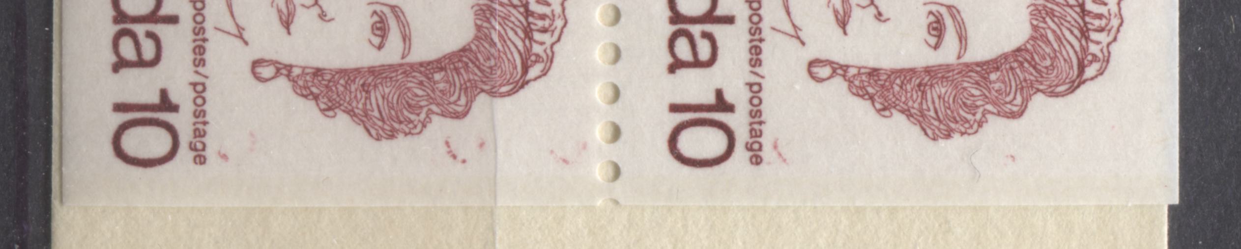
The 8c Queen was a stamp that seemed to turn up several varieties other than those listed. That will be the subject I discuss next.
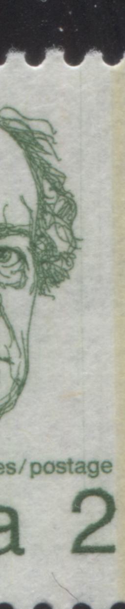
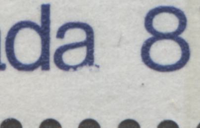
8c QueenUnitrade lists only 1 variety that is not constant, and that is the spur on the "8" variety. I do not have an example to illustrate here, but it appears exactly as its name suggests. Other varieties involve damage to the letters of the inscription and extra dots of colour in various locations of the background. The damaged letters that I usually see are the second "a" of "Canada" and the "d" of "Canada", as well as several letters of the "postes/postage" inscription.
The following scans show some of these varieties:
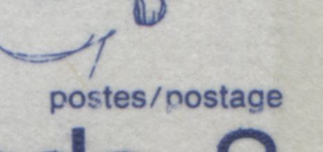
This scan shows the damaged letters of the "postes/postage" inscription that results from dry inking.
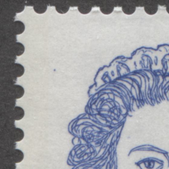
This scan shows one of the many "dot" varieties that can be found on these stamps, which may or may not be constant, depending on what further research reveals. This one shows a dot to the left of the Queen's Tiara at the upper left corner of the design.
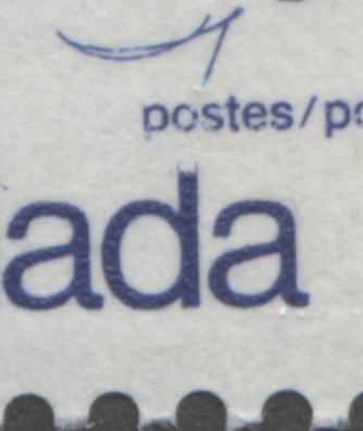
This scan shows the short "d" in Canada. Here you can see traces of where the top of the "d" would normally be, but a chunk of the ink has lifted clean off, resulting in a shortened "d".
This scan shows the damaged second "a" in "Canada".
I have found most of the damaged letter varieties on full sheets of stamps, though not on every stamp in the sheet, and not on all sheets. Therefore, I would conclude that these are not likely constant varieties, but occur with some regularity on a small proportion of the stamps. Interestingly, I have not found them on the CBN printings, but so far only on the BABN printings. I cannot remember how many dot varieties I found, but it was somewhere between 5-10 in various locations on the stamps.
This concludes my brief examination of the varieties found on the low value stamps of this series. Next week, I will explore some of the shade variations found on the stamps of this issue.