| Author |
 Replies: 7 / Views: 1,734 Replies: 7 / Views: 1,734 |
|
|
Valued Member
28 Posts |
|
|
Hi I need some help on color of stamps. I have a whole sheet full of schermack type 3 perf with 3 of this type of rich red colour 2 cent variety with wavy cancellations. Would this qualify for a deep rose red color ? Much appreciated 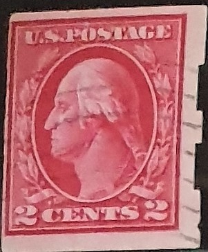 |
|
Send note to Staff
|
|
|
|
|
Rest in Peace
United States
652 Posts |
|
|
If you mean Scott 482A, no. It is not a type IA, but a type I. As such it is either Scott 409 or Scott 482, both common with Schermack type III perforations. |
Send note to Staff 
|
|
|
Valued Member
28 Posts |
|
|
Pillar Of The Community
United States
1170 Posts |
|
|
I heard that this special color glows under UV lighting. Is that correct and a way to determine this color? |
|
Send note to Staff
|
Michael Darabaris |
|
|
Valued Member
United States
9 Posts |
|
|
If it is the deep rose red, what will that mean to you. I ask because I have a few some deeper in color than others. |
|
Send note to Staff
|
|
|
Rest in Peace
United States
205 Posts |
|
|
Type Ia stamps (#482A and #500) were not printed with a special ink. In fact, each of the plates producing Type Ia stamps were at press with three other Type I plates, all utilizing the normal ink in the shade of whichever ink batch was current at the time - purely an accident that so many #500 are in a rose shade. I have seen #500's range from a pale rose to a very dark carmine.
Personally, I have no reservations in stating that chasing the Type Ia by color shade is the wrong way to go. My copy of #482A was not a stand-out shade of rose. I think the color as listed on a certificate is often that of the catalog description, not of the actual stamp's shade. For example, many Carmine Rose #449's are cert'd as Red because that's how Scott lists it. |
|
Send note to Staff
|
|
|
Moderator

United States
12330 Posts |
|
|
I agree 100% with Tipzi. No part of our hobby has more misinformation or misunderstandings than stamp colors. No one alive knows what a 100 year old stamp color was when it was printed. Old books and article are virtually useless because few of the writers ever defined the ambient lighting conditions. And even those that did, we are still left trying to interpret the meaning of a word like 'carmine'. Our hobby has barely scratched the surface of ink chemistries and how aging is impact colors. Color guides are at best good only for a few years from publication since they age and change over time just like stamps.
It has been said here many times; the only way to become good at stamp colors is to build a large reference collection, develop a good 'color eye', define a quality, consistent and defined ambient lighting system, and then spend a year or two studying. Forget old color guides, forget catalog color nomenclature, and by all means forget digital imaging. (And keep in mind that this opinion is coming from a guy whose entire life and career has been wrapped around technology.)
Don
|
|
Send note to Staff
|
|
|
Pillar Of The Community
673 Posts |
|
|
While I don't disagree with what others have said, I will add there is one thing that CAN and DOES help in identifying color, particularly what it "looked like 100 years ago". That, is in the proofs. Especially proofs on India paper. These proofs seem to hold their color much better than their stamp counterparts. Obviously if a proof is left out in the sun, it can turn hideous or fade out, but those kept in good condition have retained their color. This is also a means of identifying fakes, when the color of a 192 "looks amazing" or a 210... those are clues of altered proofs to try to fool for an impressive stamp.
So we can learn alot about the colors, and how the used to look, but studying proofs.
But one of the BIG problems is in the definitions of the colors... look at a 7c Stanton "vermilion" then look at a J29 or J30 (postage due) which are also described as vermilion which looks nothing like that of the Bank Note colors... this isn't an issue of color drift on either stamp over time, they just are not at all the same color. Why vermilion is used in this way for both stamps is anyone's guess. The 7c Stanton was printed from 1870 to around 1875 (National and Continental), the J29 and J30 were printed in 1894, 20 years after... two different Scott specialists (by that I mean the people at Scott who assign such definitions) clearly didn't have an agreed view of what the color vermilion is.
Good reference are invaluable. And it's the one area I have the greatest angst in helping others with, because it really is a matter of recognition. Which is why I always try to steer away from ID by color as much as possible, and use it only as a last resort. Because for most, if they don't have at least a good dozen GOOD examples of color varieties (more in some types like the 70's and 78's), it's a virtual impossibility. And certification is ok, but many stamps just don't warrant the money to be spent on them for a "bad cert" when all you really want to know is the color.
|
|
Send note to Staff
|
|
| |
Replies: 7 / Views: 1,734 |
|




 Posted 01/20/2019 11:00 am


