| Author |
 Replies: 30 / Views: 3,006 Replies: 30 / Views: 3,006 |
|
Pillar Of The Community
558 Posts |
|
|
|
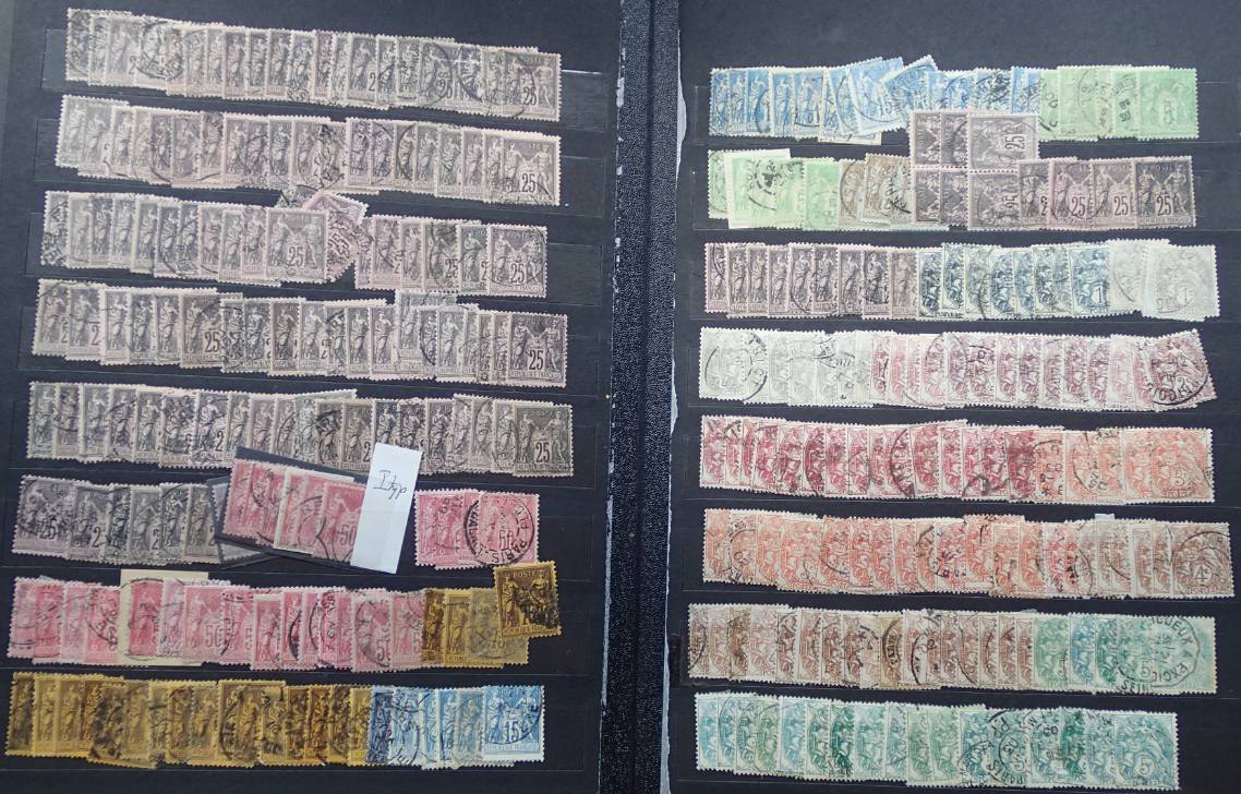
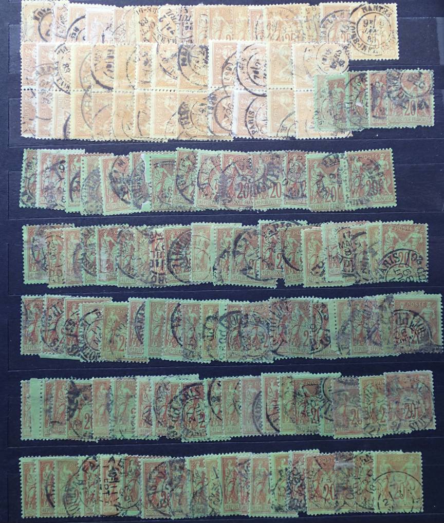
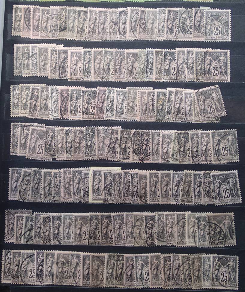
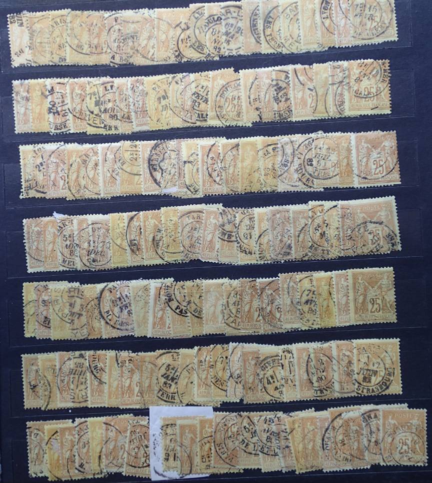
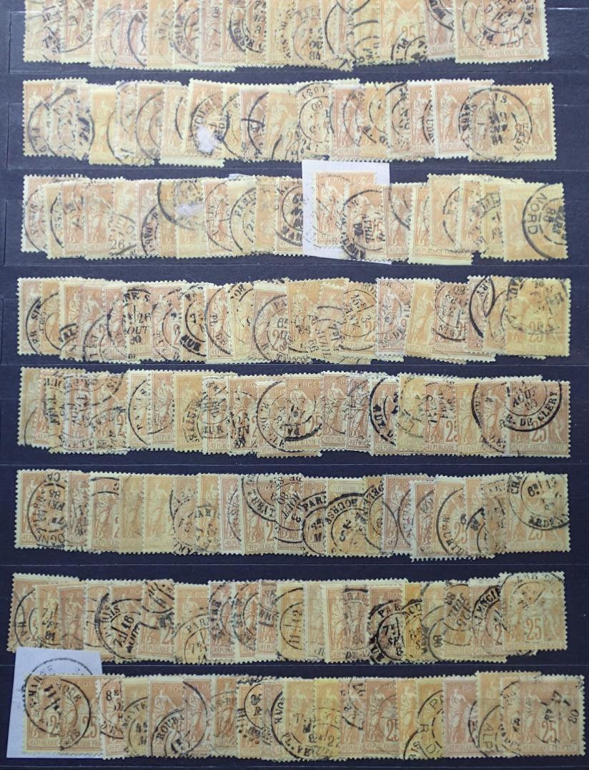
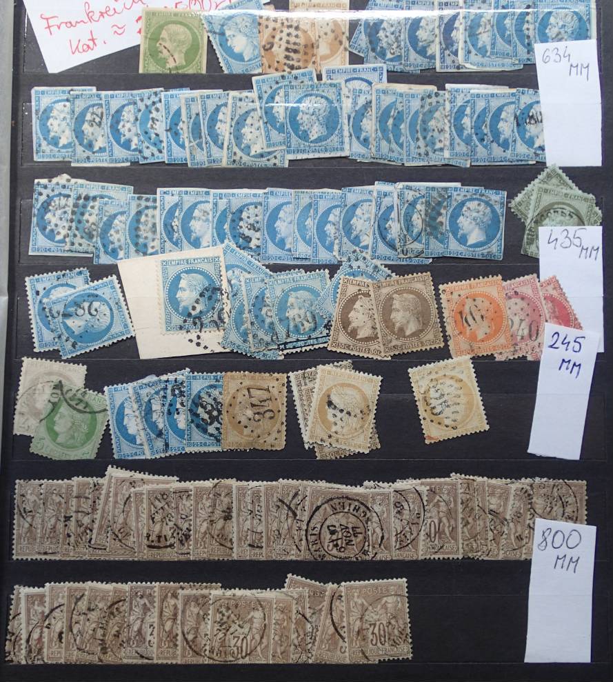
i recently bought some pages with classics 1853-1875, the vision is to focus on cancellations.
i bought a brandnew Y/T catalogue to focus on shades, but which catalogue (online or paper) offers information on cancellations, rarity and priceguides and so on?
can post some pics later.
|
|
Send note to Staff
|
|
|
|
|
Pillar Of The Community
Australia
3282 Posts |
|
|
Pillar Of The Community
United Kingdom
8579 Posts |
|
|
Pillar Of The Community
France, Metropolitan
3744 Posts |
|
|
The specialized catalogs for cancels & markings is 'Pothion".Many different types of "Pothion catalogs". Many can be found on e bay or Delcampe,as usual with specialized books ;they can get expensive for the whole serie .These are mostly for specialists.If it's just for a few stampos it's not worth it IMO. Pothion uses "Indices" or number levels for rarety from 1-39, 39 being the most rare. http://docs.philateliques.free.fr/m.../pothion.htmhttp://philatelie-annecy.fr/wp-cont...DOT-2018.pdf________________________________________________________________________________ For colors there is the "Nuanciers" where all the color varieties are listed.These also are for specialists.Link below has different types for individual stamps. (Lien)http://www.philaclub.net/philaclub/fr/index.php |
Send note to Staff 
|
| Edited by perf12 - 07/12/2019 07:44 am |
|
|
Pillar Of The Community
United States
8407 Posts |
|
|
I am puzzled how you can identify color from a book or computer screen . There is a lot lost in translation and each catalog has a different way to describe color then each author of a book has there own way to describe color . The only true way to describe color is to have the shades represented , is to have the actual stamps under the same light layed out in front of you with the catalog next to them . My advice is to buy a few classic collections plus buy a few stamps off of dealers or ebay ,now your ready to lay it out in front of you to identify color . |
|
Send note to Staff
|
|
|
Pillar Of The Community
United Kingdom
8579 Posts |
|
|
Indeed. I have the guide to colours of the Ceres/Napoleon issues. I can't say that I've found it very helpful, although that may well be my fault, rather than the author's. Even in the Chauvet book, I have trouble picking out the differences in colour/shade. And even if you have the stamps in front of you, you have to make allowances for the effects of light, storage etc over 150 years. My brain hurts. |
|
Send note to Staff
|
|
|
Pillar Of The Community
France, Metropolitan
3744 Posts |
|
|
So what are you going to do with your 50 stamps of YT no.9 in front of you? Are you going to name the color for each stamp ?.What will you base your choice of color from a given color discription? The general catalogs don't show pics of ALL the color varieties.There are not many full color discription books available anyway; at least for French issues.If you are collecting a given country better using the guides of the country in question.
Everyone knows for example SG specialized catalogs are for British areas,not Scott or YT.
|
|
Send note to Staff
|
|
|
Pillar Of The Community
558 Posts |
|
|
@Bobby
yes, that one I knew, but I don't fully understand it, also seems lacking on some points, so quite sad to find it's one of the better :(
@goeffha
thanks, once I see what Y/T has in it, I might get that specialized one (which I guess I should have started with) |
|
Send note to Staff
|
|
|
Pillar Of The Community

United States
808 Posts |
|
|
My own concern is that, for any given issue, catalogues seem to be increasing the number of color variants, with increasingly finer distinctions of shade, and assigning separate ID numbers to them. As though color differentiation of older, often postally used stamps weren't already hard enough. I'd understand if the printing authority intended to modify a stamp's color, or if a printing error occurred. But if one batch of ink simply varied slightly from the one before? Or if the paper had slightly different absorption characteristics? Or if atmospheric conditions had an effect? Assigning a new number and color name to an obvious error or intended change is fine. Otherwise, instead of five or six new numbers with esoteric color nomenclature I'd prefer a catalogue just say "various shades exist." |
|
Send note to Staff
|
|
|
Pillar Of The Community
United States
808 Posts |
|
|
And after all, do we really need to collect all the various shades of a stamp? If one wants to, fine of course. But the proliferation of catalogue numbers, each with its own assigned color name and value, feels too much like a push in that direction. |
|
Send note to Staff
|
|
|
Pillar Of The Community
United Kingdom
8579 Posts |
|
|
It's perfectly possible to collect without the frippery. Gibbons's Stamps of the World catalogue is predicated on this basis - no shades, perfs, watermarks etc. If you collect a country in some detail, you're likely to end up with a lot of material, and you'll be more inclined to look for varieties. In the case of France, there are no watermarks and almost no perf varieties, so colours and shades assume greater importance. |
|
Send note to Staff
|
|
|
Moderator

United States
12330 Posts |
|
|
Quote:
My own concern is that, for any given issue, catalogues seem to be increasing the number of color variants, with increasingly finer distinctions of shade, and assigning separate ID numbers to them... Hi EMaxim, Note the term 'shade' is not correct, the correct color term is 'hue'. (Shade specifically means a darker version of a hue; easy to remember since it is derived from viewing a color in the shade.)  I hate that our hobby attempts to use colors in any kind of identification; it is moronic that they try to do this. Inks are ephemeral. How humans see colors are totally dependent upon the person and the ambient lighting. They might as well use other subjective criteria like 'pretty' to ID a stamp. While we probably can all typically agree on a stamp being green or red, we can also all probably agree that Haley Berry is pretty. The rub comes with the 'closer' decisions. Additionally, colors change over time. So a stamp color that was identified 50 years ago will not be the same hue as it is today. Virtually all used stamps have an unknown provenance. Who can say for sure what light exposure it has seen or what kind of environmental conditions (like soaking) it has suffered through. Lastly, the hobby's color nomenclature is a total mess. No color names are standardized, leaving hobbyists to figure out that what person calls 'carmine' another calls 'bright red'. I concur with your concern and hope one day that chemical analysis methods will resolve the exact ink formulas used when a stamp was printed and finally send the inane use of stamp color identification to its grave. Don |
|
Send note to Staff
|
|
|
Valued Member
United States
288 Posts |
|
|
I did a small group of webpages when I handled the Lafayette (Steve Walske) collection. They might be useful. The link is Here: http://www.rfrajola.com/lafayette/l...tteindex.htmColor in philately is an historical artifact that we have inherited. Many, many listings in the early catalogs included imagined differences in color that did not correspond to separate and distinct print runs. Stamp colors change over time and what you see now is often a shadow of a former color (especially if a used stamp). Forget catalog listings when not a separate printing that can be differentiated bu other means is my best advice |
|
Send note to Staff
|
|
|
Pillar Of The Community
United States
808 Posts |
|
|
Thanks to the three of you. I agree entirely, and it's gratifying to find that I'm not alone in feeling this way.
Eric |
|
Send note to Staff
|
|
|
Pillar Of The Community
558 Posts |
|
|
I've previous asked the forum on plating of various issues in various countries.
in Denmark the printing house kept very accurate logs of what and when they produced. They also preserved a large amount of test sheets.
Because of this, specialists can accurately place most stamps in one of the over 500 prints and in a position 1-100.
We don't have to rely on colours at all, because in a print, the colour varies a little, and the test of time takes it's toll.
however this doesn't seem to be the case that many places in the world.
But naturally every single issue around the world wasn't printed in one day, and it wasn't possible to "hit" the same "hue" the next time a print was made. The colour will of course wary.
In addition to this, clichés were worn down, new ones made others repaired and so on, a "Hue" is thus also often accompanied with a characteristic "like worn plates" new plates, blurred, clear.
With enough material, especially blocks, letters and perhaps even access to sheets, one could in theory attempt to split prints into "hue" and characteristics. But without records, it will never be more than a qualified guess.
IF, you're just assuming from a catalogue and your own interpretations on how a color looks, and your material is limited it is indeed "moronic"
in ALL of the countries I've worked with except Danish (and areas), it seems all this information has had no relevance to collectors (publishers of catalogues) or it simply doesn't exist.
|
|
Send note to Staff
|
|
|
Pillar Of The Community
558 Posts |
|
|
Replies: 30 / Views: 3,006 |
|