| Author |
 Replies: 28 / Views: 3,594 Replies: 28 / Views: 3,594 |
|
Valued Member
United States
86 Posts |
|
|
Does anyone here have better information than the Scott catalog when it comes to distinguishing between the Nyassa 1921 Lisbon and London surcharges? Scott lists the two sets as #81-93 and #94-105. I have postponed doing anything with these for years. Good descriptive information and associated images seem to be scarce. Scott has descriptions, but I haven't been able to sort these according to the Scott descriptions. It seems, if I sort by one of the Scott characteristics, I can't consistently match up the other characteristics Scott identifies. While the characteristics presented by Scott are OK, some are subject to inking variation and don't seem to provide very reliable guidance. Also, there are some obvious differences in the Centavos letters that Scott does not addressed. The only images of the surcharges I have found online are here and they appear to be second or third generation copies. www.dcstamps.com/wp-content/uploads/2013/02/SAF-Nyassa-Album.pdf I'm guessing the left portions and right portions of the two images are from separate sources. For my own purposes, I copied the two separate images from that source. I combined them into a single image and resized them so the sizes of the surcharge graphics match more closely. That makes it easier to compare the information in the separate images. However, I have identified surcharge lettering variations that I have not found discussed anywhere. One example that Scott didn't mention is the "e" in Centavo and Centavos. In some cases, the horizontal center portion of the letter is literally horizontal and very straight and it ends abruptly where it meets the rounded portion at the right side of the letter. In other examples, that segment is clearly curved and the right end of the segment does not end abruptly. Rather, it continues smoothly as a curved line. Another example is the "a" in Centavos. In most of my examples, the "a" appears to be pregnant. In these examples, the upper portion of the line that forms the closed loop first rises upward away from the vertical element before curving around and downward to form the closed loop. A few of my stamps show that line extending horizontally or even downward and to the left from the vertical element, creating a shallower loop than is the case with other copies. These are observations only. I don't have enough experience with these to determine how these two additional characteristics might help distinguish the Lisbon from the London surcharges. Does anyone here know of reliable sources for additional information? If anyone here has succeeded in using the Scott or other information to distinguish the Lisbon from the London surcharges, can you share your methodology? Thanks for any help you can provide! Tom 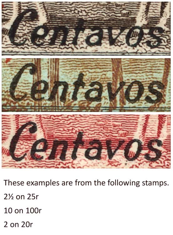 |
|
Send note to Staff
|
|
|
|
|
Pillar Of The Community
United States
8399 Posts |
|
|
HOOS----- Try this ,it is from my collection ,a picture of the two different prints ,the top stamp is from the Scott 94 -105 London series ,the other the lower stamp is the early copy from Lisbon . 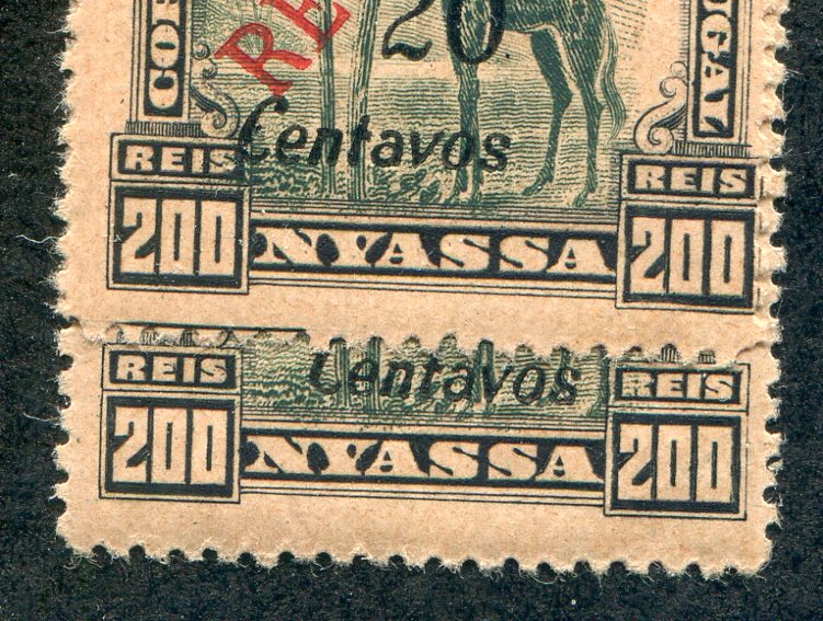 |
Send note to Staff 
|
|
|
Pillar Of The Community
United States
8399 Posts |
|
|
You need to put the same value from both sets to see the difference. Putting a single stamp next to a different value does nothing for me and tells me nothing . Reading about it is never clear to me which is which . |
|
Send note to Staff
|
|
|
Pillar Of The Community
United States
3224 Posts |
|
|
Hopefully, someone has a picture resource for Nyassa. There is such variation with the same value that comparison of only one of each type may not be very useful IF you even knew you had one of each type. I think Tom has already found that out. Heavy inking and worn/used type make comparison and identification a real problem. Now one problem is that I believe some letters used, particularly for the Lisbon print, are strays from another very similar typeface that nobody bothered to check. Sometimes there are also variant letter styles within a typeface; I believe the "e" with the curved crossbar is that, since it is not rare but not common, either. I also feel that the Scott descriptions are mostly useless. From old notes I made, here are the points in "Centavos" that I suspected to be characteristic: 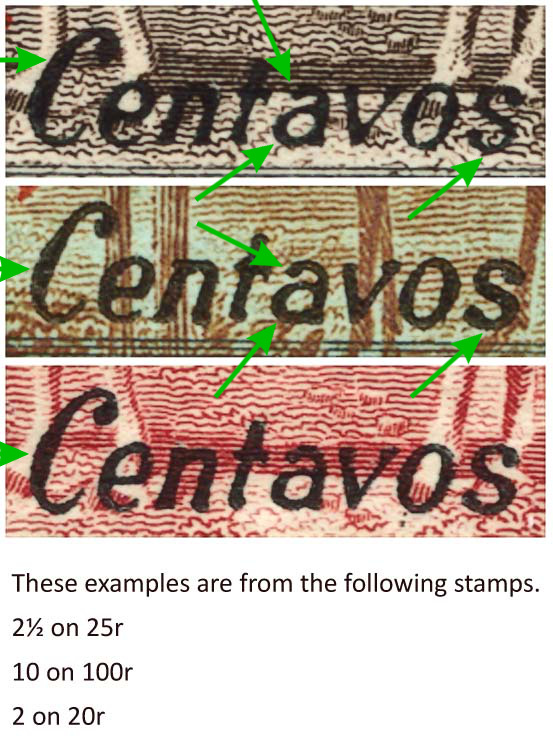 - The wider part of the first "C" in the London print is more evenly balanced, whereas the Lisbon print "C" is heavier toward the bottom.
- The pregnant "a" indicates the London print. Further, there is no ball/drop at the top of the "a" for the London print, whereas the Lisbon print does have a ball/drop at the top of the "a".
- The "s" of the London print is narrower and looks rounder; whereas the Lisbon print has an "s" that is comparatively wider and may be flattened at the bottom. So, I basically agree with Scott on this point. Do we have to say that this is not useful for stamps where "Centavo" is singular?
So for Tom's examples, I would say the top image is a London print, the others are Lisbon. EDIT: Both of floortrader's look like Lisbon prints to me. The top stamp is a London print per Y&T below. |
|
Send note to Staff
|
| Edited by hy-brasil - 07/29/2019 2:03 pm |
|
|
Pillar Of The Community
6326 Posts |
|
|
I will risk French copyright laws and post this image from the 1925 Yvert and Tellier catalog - it's the only edition I have. Note the O/P types are reversed from Scott. 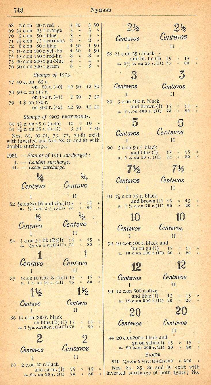 |
|
Send note to Staff
|
|
|
Pillar Of The Community
United States
8399 Posts |
|
|
John --Thanks for that page ,will redo my page on this issue and see what I have in another album . |
|
Send note to Staff
|
|
|
Pillar Of The Community
United States
1565 Posts |
|
|
The best picture resource for these surcharges would be the Mundiphil catalog published in Portugal (Selos Postais, Colonias Portuguesa). I have the 7th edition from 2015 and just received, a week ago, the 8th edition from 2019. Both catalogs have side by side comparisons of the London and Lisbon surcharges for all values.
If one is an APS member, one could check in the APRL union catalog to see if the APRL has the 2015 edition available for borrowing (2019 just came out and they may not have it yet). Or the staff may be willing to scan in the page and send it to you.
The format for 2019 is a larger size book, with enlargement of the surcharge comparisons. But 2015 should be sufficient. Both are paperbacks and I don't want to damage the binding by trying to do a scan of the page. I don't have the type of scanner that can just scan in a page without laying the book flat.
There is a caution contained in "Forgeries of Portugal & Colonies," by the late D. J. Davies. Many of the stamps on the market today from Nyassa are 1922 reprints. Davies notes several crude forgeries with these surcharges. The book is sold out at the ISPP here in the states. However, a few copies may still be available from the publisher, the Portuguese Philatelic Society, in the UK, or could be borrowed from the APRL.
Sorry I can't be of more help. Nyassa is one of the two colonies where I have yet to complete assimilating several collections into my main P & C albums (the other being Azores). Steve |
|
Send note to Staff
|
| Edited by Climber Steve - 07/29/2019 12:42 pm |
|
|
Pillar Of The Community
United Kingdom
8578 Posts |
|
|
Pillar Of The Community
United States
8399 Posts |
|
|
Steve ---On your scanner ,move it to the edge of the table/desk ,so half the book hangs over the edge of the desk as your scan it . ,this will save the binding from getting damaged due to your scanner .then I just rotate the scanned page on the computer. |
|
Send note to Staff
|
|
|
Pillar Of The Community
United States
3224 Posts |
|
|
So per Y&T, separating these by the figures of value alone works for me, though not that easy for the 10c surcharge if heavily or badly inked.
Then, floortrader's top stamp is the London print. |
|
Send note to Staff
|
|
|
Pillar Of The Community
United States
1565 Posts |
|
|
floortrader: I'll try that. Thanks. As an aside, so far, I get any needed scans done at the local UPS store and then send the document to my home e-mail. I have not used the scanner on the printer due to the color part not working. Steve |
|
Send note to Staff
|
|
|
Pillar Of The Community
United States
2830 Posts |
|
|
Hy-Brasil, in your scans one thing that jumps out at me is the second diagonal stroke of the "v" in centavos. The stroke is much thicker in the middle stamp vs. the other two, which both seem quite thin and narrow. The second serif of the "v" in the middle stamp appears rounded, while the 1st and 3rd stamps appear squared off at the very top.
Floortrader's examples also show this characteristic. Wonder if this is a characteristic one could see in your other examples? |
|
Send note to Staff
|
|
|
Pillar Of The Community
United States
3224 Posts |
|
|
Shermae, the "v" is going to be affected by inking and that right stroke will not be consistently thin unfortunately. My old notes say that its appearance varied a lot. Apologies for the smaller images but I have only a couple of the issue left, so most were taken from recent scans and are about as big as I dare. Also, I'm only showing one of each which is not the whole story: 10 centavo: 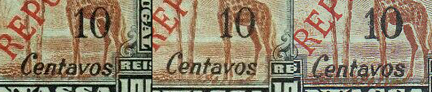 (L to R) Lisbon print, London, another London. Compare the "v"s in the first two and they're pretty much identical except for inking. The "10"s look identical to me for those two. The rightmost stamp has a common type "v" with the left serif unprinted or worn, the right serif more a blob. Also, it has an odd "10" which may be just due to inking. 20 centavo: 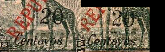 (L) Lisbon print, (R) London print according to figure of values in Y&T. Note the "C"s and the "s"s are the opposite of my hypothesis. The left stamp has a very fine right stroke with that taller than the left; very clear serifs also. The right has strokes of even height and level serifs. That "v" is just like all of the above 10c values including both prints. More "v" madness: 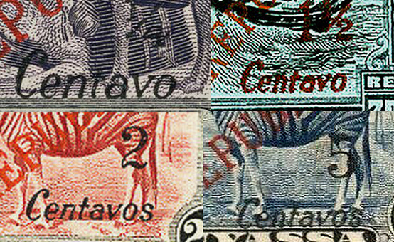 - 1/4c London: Not an illusion, the left leg of the "v" is apparently longer than the right. A guess is that this is a stray from another typeface. Note also the "1/4" appears to have an open top to the "4", but it is just uninked at top.
- 1-1/2c London: The red overprints are often overinked like this. The "v" looks like there is no serif at left (might be worn type) and the serif at right looks to be a ball. The overinking affects the base of the "2" in the figure of value.
- 2c London: The "v" has a thin right stroke that looks curved with a left serif that's actually only partial as is the right serif. The fork of the "v" is filled with just enough ink to make the letter look curved.
- 5c London: Another right stroke that looks curved, but is just underinked at the bottom.
So, does anyone have info/images on the Lisbon print forgeries? |
|
Send note to Staff
|
| Edited by hy-brasil - 07/31/2019 01:08 am |
|
|
Valued Member
United States
86 Posts |
|
|
Thank you all for the comments and information. A lot of information to review and digest. I'll try to scan a few more examples and post them in a day or two.
Thanks!
|
|
Send note to Staff
|
|
|
Pillar Of The Community
United States
1565 Posts |
|
|
Hy-Brasil wrote: "does anyone have info/images on the Lisbon print forgeries?" The Davies book gives just two illustrations of forgeries, and one is inverted. Perhaps contact the ISPP at: www.portugalstamps.com . There is a Contact Us icon at the bottom. I suspect the expertization files could have what you're looking for. If you're a member of ISPP, that would help (not sorry for the shameless plug ;-) ;-) ). Another option; which I could do sometime in August; is to check my 28 years worth of ISPP journals; plus a number prior to 1991 when I joined; to see what's there. Probably quicker to do the query on the web site. |
|
Send note to Staff
|
| Edited by Climber Steve - 07/31/2019 09:06 am |
|
|
Pillar Of The Community
United States
8399 Posts |
|
|
To sum it up .....there are differences or varieties in the London Printing {this is what I have and thought it was the Lisbon Printing}. But nobody has shown a Lisbon Printing and the one on ebay is actually a London Printing . Is that correct ????? |
|
Send note to Staff
|
|
|
Replies: 28 / Views: 3,594 |
|


