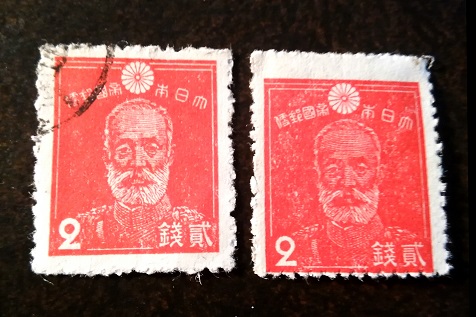
The maddening problem of color. Two stamps from the same issue, otherwise identical, can have their colors vary more than two others to wch catalogues assigns different color names. But Germania also seems correct in noting the different thickness of the 2s.
The different thickness of the "2" is due to light/heavy inking. In the right stamp, the Japanese characters are also thinner, the right frameline is thinner than the left one but the lines across the forehead and the collar are stronger. This is all due to heavier inking and is not a major deal.
There is a difference in color shades here, but no major difference in value that I can see.
Disclaimer: While a tremendous amount of effort goes into ensuring the accuracy of the information contained in this site, Stamp Community assumes no liability for errors. Copyright 2005 - 2026 Stamp Community Family - All rights reserved worldwide. Use of any images or content on this website without prior written permission of Stamp Community or the original lender is strictly prohibited. Privacy Policy / Terms of UseAdvertise Here