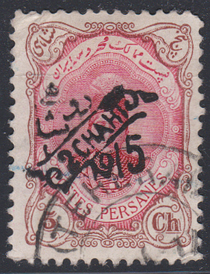
Looks to be the correct basic stamp and the cancel is from 1915, but the one(s) illustrated in the Persiphila catalog have heavier, watery ink. It looks like a forgery to me.
Without copying images from that catalog, note from upper left going counterclockwise:
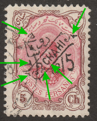
- character is angled and should be more relatively upright.
- This line is supposed to be a bud, rounder. This is too long.
- Again, this is supposed to be a leaf.
- This "2" is too wide.
- "C" should clearly extend below the level of "H".
- This should be more leaf-like.
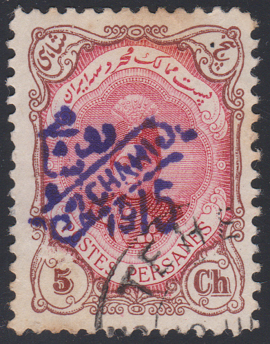
The one below I think matches the Persiphila catalog but is not certified. It is the correct stamp, the cancel and blue crayon are on top of the surcharge, and the cancel is dated 1917: