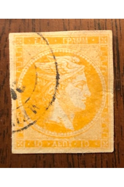
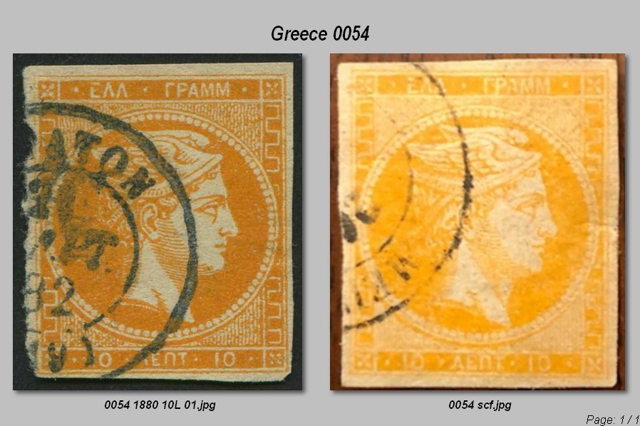
Otherwise, it's basically not being on greenish paper, yes. That's pretty evident almost always. Even from the scan, this looks like the usual cream paper of those later issues. The shading lines along the back of the neck and around the chin cover relatively big areas, typical of later issues. I know every reference says "coarse impression" but that's just relative to the the extremely finely done first issues.
Then it often comes down to a slog of comparing print characteristics. I basically go backwards by eliminating the ones that it can't be and work through the rest. The 1L can drive you nuts. My reference is from the
Stamp Specialist book series, with the blue book having an excellent article by Robert O. Truman on the Large Hermes Heads, with B/W photos. There's also:
http://bigblue1840-1940.blogspot.co...s-heads.htmlPlus IDs here on SCF have been very good. As always, a picture is worth a thousand words.