Stamp Community Family of Web Sites
Thousands of stamps, consistently graded, competitively priced and hundreds of in-depth blog posts to read


Stamp Community Forum
 
Username:
Password:
Save Password
Forgot your Password?

This page may contain links that result in small commissions to keep this free site up and running.

Welcome Guest! Registering and/or logging in will remove the anchor (bottom) ads. It's Free!

How To Pick One From Duplicates

 
To participate in the forum you must log in or register.
Author Previous TopicReplies: 8 / Views: 950Next Topic  
Valued Member

United States
100 Posts
Posted 12/19/2019   11:23 am  Show Profile Bookmark this topic Add stampboylife to your friends list Get a Link to this Message
Newbie here. Just collect worldwide stamps, and constantly come across this dilemma of picking the best stamp from duplicates.

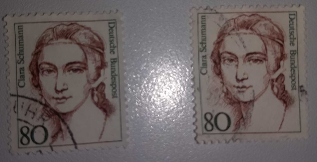
The image below is one example where Stamp A on left has darker cancel, but on bottom left away from main image.

Stamp B on right has lighter cancel, but across the center of image.

So which is better? Assuming perf and back of the stamp are all similar.

I don't have room to store all duplicates. Any help / guidance on this topic is much appreciated.
Send note to Staff

Pillar Of The Community
United Kingdom
8579 Posts
Posted 12/19/2019   11:48 am  Show Profile Check GeoffHa's eBay Listings Bookmark this reply Add GeoffHa to your friends list  Get a Link to this Reply
I'd keep the first, which doesn't interfere with the image. An exception would be if the cancellation were an attractive, central one, or if it were a stamp where a cancellation showing in-period use was important.
Send note to Staff  Go to Top of Page
Pillar Of The Community
United States
1495 Posts
Posted 12/19/2019   11:58 am  Show Profile Bookmark this reply Add Trainwreck to your friends list  Get a Link to this Reply
Which has the better eye appeal? The right one is not bad, except for the ink smudge along the right hand side. If my choice, the left one, until a better one came along to improve the centering.

Robert
Send note to Staff  Go to Top of Page
Bedrock Of The Community
United States
10594 Posts
Posted 12/19/2019   12:18 pm  Show Profile Bookmark this reply Add revcollector to your friends list  Get a Link to this Reply
To me it's not close, the left stamp has much better eye appeal.
Send note to Staff  Go to Top of Page
Pillar Of The Community
United States
669 Posts
Posted 12/19/2019   1:15 pm  Show Profile Bookmark this reply Add kcaramat to your friends list  Get a Link to this Reply
I would question if the LH stamp was a (cancel to order) CTO. If that is common with this series, I would prefer a stamp postally used instead of contrived.
Send note to Staff  Go to Top of Page
Edited by kcaramat - 12/19/2019 1:18 pm
Pillar Of The Community
United States
1805 Posts
Posted 12/19/2019   2:37 pm  Show Profile Bookmark this reply Add dudley to your friends list  Get a Link to this Reply
In the end it's a matter of personal preference, and of what visual qualities of a used stamp appeal to you the most. Do you want to see as much of the cancel as possible or as much of the stamp image as possible? People go both ways (hence "face-free" cancels and "socked-on-the-nose" cancels are both considered desirable). The CTO vs. postally used question raised by kcaramat is also pertinent. Also the color of the cancel. Etc.
Send note to Staff  Go to Top of Page
Pillar Of The Community
Canada
1462 Posts
Posted 12/19/2019   3:21 pm  Show Profile Check gmot's eBay Listings Bookmark this reply Add gmot to your friends list  Get a Link to this Reply
This is a perennial question, and one that applies to mint stamps too of course. What characteristics appeal to you the most? Clean cancels, centring, large margins, gum condition, position of cancel, etc. In the end, all comes to what weight you put on those individual factors.

And my 2 cents - if I had both, would definitely choose the one on the left.
Send note to Staff  Go to Top of Page
Pillar Of The Community
United States
1565 Posts
Posted 12/19/2019   3:34 pm  Show Profile Bookmark this reply Add Climber Steve to your friends list  Get a Link to this Reply
I would keep both in my collection. If one looks closely, assuming the scan is accurate, the stamp on the right is a obvious lighter shade (compare her hair).

Using that thoughtline, which I use all the time, these are different stamps and one is not a duplicate of the other.
Send note to Staff  Go to Top of Page
Edited by Climber Steve - 12/19/2019 3:36 pm
Pillar Of The Community
United States
3224 Posts
Posted 12/19/2019   3:48 pm  Show Profile Bookmark this reply Add hy-brasil to your friends list  Get a Link to this Reply
It's a matter of personal preference. In Germany, I believe the ideal (aside from socked-on-the-nose) is a CDS in the lower left corner. Doubtful that this one is CTO as those from this time typically have first day cancels and Bonn was the official first day city for this stamp. CTOs are sold at face anyway, not at deep discount. I prefer the left one.
Send note to Staff  Go to Top of Page
Edited by hy-brasil - 12/19/2019 3:50 pm
  Previous TopicReplies: 8 / Views: 950Next Topic  
 
To participate in the forum you must log in or register.

Go to Top of Page

Disclaimer: While a tremendous amount of effort goes into ensuring the accuracy of the information contained in this site, Stamp Community assumes no liability for errors. Copyright 2005 - 2026 Stamp Community Family - All rights reserved worldwide. Use of any images or content on this website without prior written permission of Stamp Community or the original lender is strictly prohibited.
Privacy Policy / Terms of Use    Advertise Here
Stamp Community Forum © 2007 - 2026 Stamp Community Forums
It took 0.13 seconds to lick this stamp. Powered By: Snitz Forums 2000 Version 3.4.05