| Author |
 Replies: 19 / Views: 4,051 Replies: 19 / Views: 4,051 |
|
Valued Member
68 Posts |
|
|
I want to add some pages to my album on Scott Specialty blank pages. What font / typeface do I use to match the existing pages? Brent  |
|
Send note to Staff
|
|
|
|
|
Bedrock Of The Community
Australia
38679 Posts |
|
|
If I may join you Brent,
I was curious as to the font employed in the Scott Catalogue? |
Send note to Staff 
|
|
|
Moderator

United States
12330 Posts |
|
|
Pillar Of The Community
United States
3224 Posts |
|
|
On the page shown, that's neither Bodoni MT or Palatino suggested in the earlier thread, not by a long shot.
There are differences in print typefaces vs. computer ones, plus there is the letter spacing on the Scott page that may only be possible with kerning/fine adjustment.
I would cut and paste each country name to a blank form, assuming you are adding to existing pages and you have originals to copy. You may need to convert to a black-and-white image. If you have something that allows image sharpening, use it. The smaller font is an altogether different one but if you're going that far, you might have to do a cut-and-paste job. That smaller one is an extended font (wider than standard) so could be equally hard to find or match. |
|
Send note to Staff
|
| Edited by hy-brasil - 02/23/2020 06:22 am |
|
|
Pillar Of The Community

United States
4424 Posts |
|
|
Moderator
United States
12330 Posts |
|
|
Here is Palatino font above the original album page, not exactly the same but may be close enough for your needs.  Don |
|
Send note to Staff
|
|
|
Pillar Of The Community
United States
7239 Posts |
|
|
When I looked at "G" and "R" my thoughts were that "this is font you're not going to find."
Palatino looks to be a great substitute. |
|
Send note to Staff
|
|
|
Pillar Of The Community
United States
853 Posts |
|
|
Pillar Of The Community
United States
3224 Posts |
|
|
That's an excellent match. Well done, jleb1979! You are one of the few here who can tell the difference in overprint typefaces.
And now that I look again at the Scott title, that's some wonky /inconsistent letterspacing there. R and I are closer together than other pairs of letters, for one. And that's why you don't use certain typefaces for titles, though kerning/changing spacing between letters can help that problem, either with metal or electronic type. |
|
Send note to Staff
|
| Edited by hy-brasil - 02/23/2020 5:06 pm |
|
|
Moderator
United States
12330 Posts |
|
|
Quote:
...You are one of the few here who can tell the difference in overprint typefaces... Yes, the rest of us are brain dead morons who mistakenly thought that they might try helping others. |
|
Send note to Staff
|
|
|
Pillar Of The Community
United States
7239 Posts |
|
|
With metal type, letters with diagonals cause the biggest problems. Notice what the "A's" In GREAT BRITAIN do to the spacing.
For kerning/correcting, all you can do is add more space between the other letters. |
|
Send note to Staff
|
| Edited by bookbndrbob - 02/23/2020 6:02 pm |
|
|
Bedrock Of The Community
Australia
38679 Posts |
|
|
Quote:
Yes, the rest of us are brain dead morons who mistakenly thought that they might try helping others.  Thanks for the link Don. Appreciated. |
|
Send note to Staff
|
|
|
Pillar Of The Community
United States
8956 Posts |
|
|
Pillar Of The Community
United States
1430 Posts |
|
|
Pillar Of The Community
United States
7239 Posts |
|
|
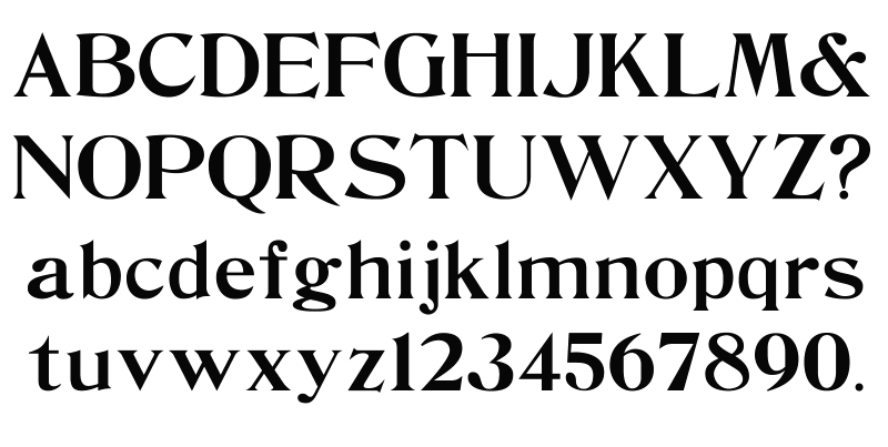
Interesting. The De Vinne Wood font includes an ampersand and a question mark, but no capital "V". |
|
Send note to Staff
|
|
|
Pillar Of The Community
United States
3224 Posts |
|
|
Studebaker51 wrote: Quote:
Yes, the rest of us are brain dead morons who mistakenly thought that they might try helping others. You explained it was a close match; fair enough. So did bookbndfrbob. Rather than a brain dead moron, you are acting tightly wound again and taking comments personally that do not apply to you. The ability to distinguish typefaces is not common on this site at all; it's quite uncommon generally. I'm assuming jleb1979 spent some real time in finding a best match. |
|
Send note to Staff
|
|
|
Replies: 19 / Views: 4,051 |
|