| Author |
 Replies: 3,764 / Views: 245,109 Replies: 3,764 / Views: 245,109 |
|
|
|
Pillar Of The Community
United States
911 Posts |
|
|
The Hare correspondence covers that I have seen only span a short period that corresponds with use of the '56 5¢ stamp. None of the '47 issue covers are addressed to Hare (mostly addressed to Noble and Wier). I don't have any Hare covers prior to '56 or with 1861 issue stamps. I do have a 5¢ perf 1857 type 1 (I think #28 red brown) addressed to Hare. |
Send note to Staff 
|
|
|
Pillar Of The Community
United States
2226 Posts |
|
|
Valued Member
170 Posts |
|
|
Looks wider spaced horizontally than vertically -- or is that an illusion? Why would they make the placement tighter in one direction? |
|
Send note to Staff
|
| Edited by banknoteguy - 05/30/2020 12:26 pm |
|
|
Pillar Of The Community
United States
2226 Posts |
|
|
#11 strip of three - positions 95-97L4. The spacing is bad due to the transfer roll getting more and more out of alignment with the previously-entered column toward the bottom of the plate. As most here know, bad alignment like this resulted in extra frame lines being added to the "three rows" of plate 3 covered earlier in this thread.  |
|
Send note to Staff
|
|
|
Valued Member
170 Posts |
|
|
I was not aware that the spacing varied that markedly. That 95-97L4 block is very interesting. |
|
Send note to Staff
|
|
|
Pillar Of The Community
United States
2226 Posts |
|
|
Quote:
Looks wider spaced horizontally that vertically -- or is that an illusion? Why would they make the placement tighter in one direction? The vertical spacing was determined by the spacing between the reliefs on the transfer roll, which was fixed. The horizontal spacing was determined by how far the siderographer placed the transfer roll from the previous entries on the plate. |
|
Send note to Staff
|
|
|
Pillar Of The Community
United States
2226 Posts |
|
|
While we're on the subject of multiples, spacing problems, and the "three rows," Here is a 79-80L3 pair with an extra frame line added at left, omitted frame lines in the middle, and the normal two frame lines at right.  |
|
Send note to Staff
|
|
|
Pillar Of The Community
United States
605 Posts |
|
|
classic coins -- those are some really nice multiples you posted -- I especially like the 95-97L4 strip for the way it shows the spacing between 95 and 96L4 -- which I believe is the closest spacing between any two vertical columns on all 13 of the imperforate plates. Very nice! On the subject of spacing -- attached is a scan of position 19R7 -- which shows the TFL abnormally close to the design -- and actually touching the left end of the top label block. Unlike the tight spacing on your 95-97L4 strip which, as you noted, resulted from misalignment of the transfer roll during entry, this spacing variety resulted from sloppy recutting.  |
|
Send note to Staff
|
|
|
Pillar Of The Community
United States
2941 Posts |
|
|
This is 89L3, of the Three Rows plate positions. The cancel adds some uniqueness. Edit: wow, sorry for the giant image. This was done with my camera.  |
|
Send note to Staff
|
| Edited by stampcrow - 05/30/2020 2:53 pm |
|
|
Pillar Of The Community
United States
605 Posts |
|
|
Here is an odd combination of 3c imperforate plate positions used on piece which has always intrigued me for an explanation. It is a Kansas Territorial usage franked with 22L6 on the left and 54L1L on the right. The piece is docketed as 1857. The color of the 54L1L is in-between 1853 dull red and 1854 rose red -- and the impression shows no evidence of the serious plate wear seen on later printings -- so likely a late 1853 or early 1854 printing. In any event, 1857 is a very late usage for a plate 1L stamp. On the other hand, 1857 is contemporaneous with the period during which plate 6 stamps were in general usage. I guess the postmaster (or sender) had an old 3 cent stamp laying around and decided to use it -- but that is a very long time for the 54L1L to be laying around unused -- as back in the 1850's, folks typically did not buy stamps until the time of actual mailing? Either way, this is a very strange combination usage from the perspective of plate positions.  |
|
Send note to Staff
|
|
|
Pillar Of The Community
United States
2226 Posts |
|
|
ioagoa, Thanks. I appreciate the feedback.
That's a really nice example of the mis-cut top frame line on 19R7. And a beautiful four-margin stamp! |
|
Send note to Staff
|
|
|
Pillar Of The Community
United States
2226 Posts |
|
|
Stephen, that's a great example of 89L3, with three frame lines at left, and only one at right.
Yeah, it's especially neat that the radial cancel is centered on the lower-left rosette. |
|
Send note to Staff
|
|
|
Pillar Of The Community
United States
2226 Posts |
|
|
ioagoa, that territorial usage is very strange, indeed. That piece has a lot going on, and is a great conversation item. |
|
Send note to Staff
|
|
|
Pillar Of The Community
United States
1125 Posts |
|
|
Pillar Of The Community
United States
3487 Posts |
|
|
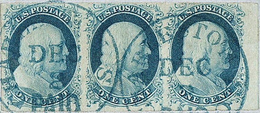
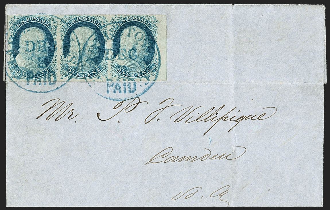
spqr - Thanks for the information on Hare. That's useful. I do have a Noble cover, from late 1851. I guess I might as well post it ... the use is Dec 1851 and the stamp is a 10A.  |
|
Send note to Staff
|
|
|
Replies: 3,764 / Views: 245,109 |
|