|
This page may contain links that result in small commissions to keep this free site up and running.

Welcome Guest! Registering and/or logging in will remove the anchor (bottom) ads. It's Free!
To participate in the forum you must log in or register.
| Author |
 Replies: 3,825 / Views: 255,632 Replies: 3,825 / Views: 255,632 |
|
|
|
Pillar Of The Community
United States
2230 Posts |
|
|
mootermutt987, I totally agree that the plum color doesn't have much eye appeal, and I have referred to it as muddy myself. |
Send note to Staff 
|
|
|
Pillar Of The Community
United States
2230 Posts |
|
|
Following up on ioagoa's Nashua jumbo 43R5L with the guide dot positioned well below the bottom frame line, here is the position below, from the early state (53R5e). The postal clerk apparently wasn't satisfied with the completeness of the hand stamp, so he diligently wrote the numeral 2 of the date over the incomplete 2.  |
|
Send note to Staff
|
|
|
Pillar Of The Community
United States
1162 Posts |
|
|
Not 100% sure, but that cancel looks like "Cherry Valley, NY". I had a college roommate from that town. It is amazing the lengths people went to 'back in the day' - re: the postmaster overwriting the handstamp cancel, just to be sure. |
|
Send note to Staff
|
|
|
Pillar Of The Community
United States
2230 Posts |
|
|
Pillar Of The Community
United States
2948 Posts |
|
|
That is a beautiful "Pinkish" stamp!! Quote:
Pinkish is a rare color. Good going in finding one. tx, not to sound cynical but..., I wonder how many recent certs have been granted for 1856 Pinkish that weren't already identified as such by one of the known experts?! It may be possible to "find one" but if it's not already christened I wonder how much luck one would have getting a certification for it. Anyone here have any experience with this? |
|
Send note to Staff
|
|
|
Pillar Of The Community
United States
1162 Posts |
|
|
Quote:
tx, not to sound cynical but..., I wonder how many recent certs have been granted for 1856 Pinkish that weren't already identified as such by one of the known experts?!
It may be possible to "find one" but if it's not already christened I wonder how much luck one would have getting a certification for it.
There was a similar conversation here (can't remember what thread. Might even be this one.) about the Plum shade. Is it possible to get a cert for it if it hasn't been anointed already by one of the recognized experts? The question wasn't adequately answered (at least for me) then, either. I would like to think that (for pinkish, or for plum) that a clean, previously unknown copy could get a good cert by at least the PF after they compare it with their reference copy (or copies). I assume they have reference copies of each of these. You know, if one day Billy Bob opens the family Bible and out falls a letter that hasn't seen the light of day in 150 years - could it get a cert?? Which raises the question: I wonder how many 'undiscovered' plums and pinkishes are actually out there. Who knows? |
|
Send note to Staff
|
|
|
Valued Member
United States
319 Posts |
|
|
I don't think "experts" have examined the vast majority of stamps, so there is plenty of room for unfound specimens, particularly of the lesser know rarities (of which there are many to the average collector). The more recognizable primary scott numbers probably were expertized more (if expensive enough) but even there you don't see that many sold with certificates (i.e. zeppelins for example, seem to rarely (1 in 10?) come with a certificate). Based on what's being sold on HIP/ebay, not in "stamp shops". |
|
Send note to Staff
|
|
|
Pillar Of The Community
United States
637 Posts |
|
|
Hello mootermutt, stampcrow, and all -- Regarding the discussion about expert certification of color varieties on the 1851 - 1857 3-cent imperforate issue -- a few thoughts... First off -- regarding other SCF discussion threads on this topic -- I am very interested in reading what others have had to say -- and have tried using the SCF search utility without success -- so if anybody could provide a link to the relevant thread(s) it would be much appreciated. I have been collecting the 1851 - 1857 3-cent issue for over 25 years -- and for most of that time, my primary interest was in color study. In my opinion -- and again, this is just my opinion -- certifying color varieties -- regardless of the expertizing agency -- can be problematic for a number of reasons. First -- is access to confirmed reference material. Second, is the expertise of the folks who are looking at the stamp and comparing it to the confirmed reference material (which for years has been the basic expertizing process). And third, when it comes to color varieties -- and especially the scarce to rare ones where an otherwise $10 stamp becomes a "four figure" stamp based solely on its color -- getting two "experts" to agree on a subtle difference in hue is not always as straightforward as one might think. Much has been written about the pitfalls and problems associated with color study -- for example -- About how we all see color differently. About how the color of the paper, the inking, and the impression all have an impact on the color we see when we look at the stamp. About how the lighting -- and the source of the lighting -- can change the way we see colors. About how colors can change over time due to the environment, storage conditions, and exposure to other external factors, etc., etc. More recently, some have taken a scientific approach toward color study based on the chemical composition of the ink and other "scientific" analysis. I will not get into any of those discussions here -- other than to acknowledge that all of these factors -- and others that I have not bothered to list -- are of legitimate concern when it comes to color study -- and likewise -- the certification of colors. The current color classification system most widely accepted among most (but not all) students of the issue all spins off of Chase's master color chart. This is the chart that Chase bequeathed to Amonette -- and which can be viewed at stampplating.com using the following link: http://www.stampplating.com/colorsAs far as I am aware -- Amonette was the only person (other than Chase) to ever possess and have complete unfettered access to Chase's master color chart -- and following Amonette's passing in May 2014 the whereabouts of the Chase master color chart still remain unknown (at least to me). As far as I know, it has never appeared at auction -- so is either still owned by Bill's family, was sold privately, or who knows? In any event, over the years, Amonette made up color reference charts by matching stamps to Chase's master chart -- and those "second generation" charts, generally speaking, became the primary source of reference material for others to use in colorizing stamps of the 1851 - 1857 3 cent imperforate issue. Within the group of color students that I have associated with over the years, many of us would colorize stamps and send them to Bill for his confirmation -- and then use the "Amonette confirmed" material to build out our own color reference sets. Even with access to a fully confirmed set of color reference material -- a further complicating variable that I feel compelled to mention, and one that seems to always cause "color confusion", is the conundrum of what us color students call "in-between" colors. In other words -- a color that does not fit nicely within one of the "typical" Chase classifications. For example -- a stamp that is half way between "1852 brownish carmine" and "1853 dull red"; or, a stamp that has "some copperish", but not enough to be called "copperish OB". I have plenty of "in-between" colored stamps in my own color chart -- and some of the most disappointing to me were ones where Bill would opine something like -- "very close to 1857 plum, but has a touch of 1857 yellowish brown" -- or in another case -- "very close to the 1856 pinkish -- but has a little 1856 yellowish rose red mixed in" -- and my last example -- "might have some 1851 experimental orange brown, but closer to 1852 brownish carmine". And the possibilities are infinite. Enough of my rambling -- as I could write volumes on this subject. Suffice to say that when it comes to debating (or certifying) colors -- after all the dust settles and all the smoke clears -- in my opinion, and again, this is only my opinion -- if one is going to get serious about color study, then one must acquire confirmed reference material and learn to be their own expert. In my view, a certificate from one of the recognized expertizing bodies (especially on the scarce to rare colors) is worthless unless the names of the expertizers are on the face of the certificate -- (and further provided that the name(s) of any expert who disagreed with the final opinion should not be listed just because they "looked" at the stamp -- or better yet, those experts who looked at the stamp, but who disagree with the final opinion should be listed as disagreeing -- but we all know that will never happen). Regards // ioagoa PS -- see the attached photo which explains in a single picture why there are so many color varieties on this issue. Acknowledged that this photo is from the archives of the Bureau of Engraving and Printing which did not exist circa 1851-1857 -- but one can only imagine how the inks were mixed by TCC over the 7 year period that the stamp was produced.   |
|
Send note to Staff
|
| Edited by ioagoa - 08/27/2020 12:25 pm |
|
|
Pillar Of The Community
United States
637 Posts |
|
|
Here is todays selection of 1851-1857 3-cent "eye candy" -- which I will post in a series of 3 postings to keep everything organized. This first post will show another 1856 pinkish and will be followed by two examples of the 1857 plum in the next two posts. Here is another example of the 1856 pinkish -- along with a scan of Amonette's "mounting card cert" -- this one being a Scott #11A -- position 6L5L. Regards // ioagoa Note -- the usual disclaimer regarding identification of colors vis-à-vis online scanned images applies. More specifically -- because of variations in scanner settings, and because different display screens render colors differently, this image is not suitable for confirming colors of other stamps in hand or in other images. 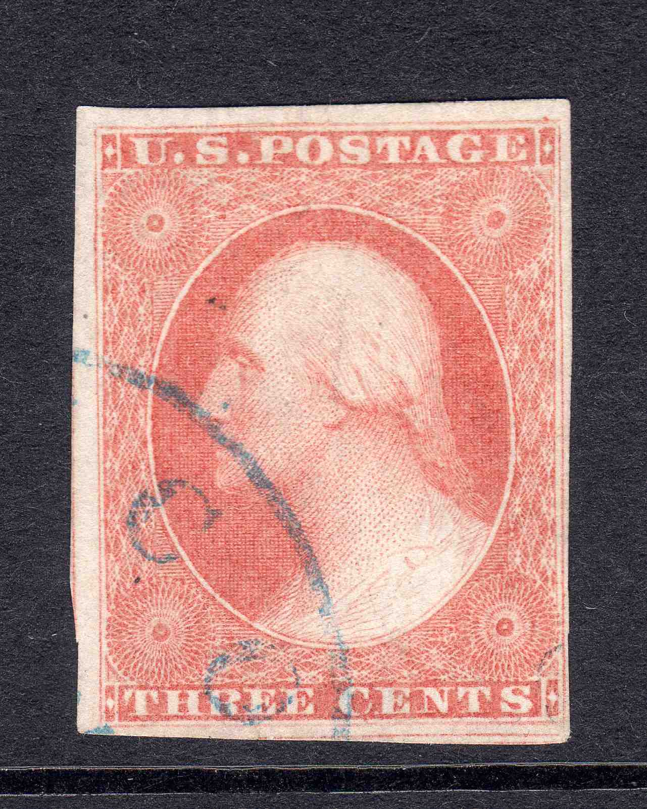 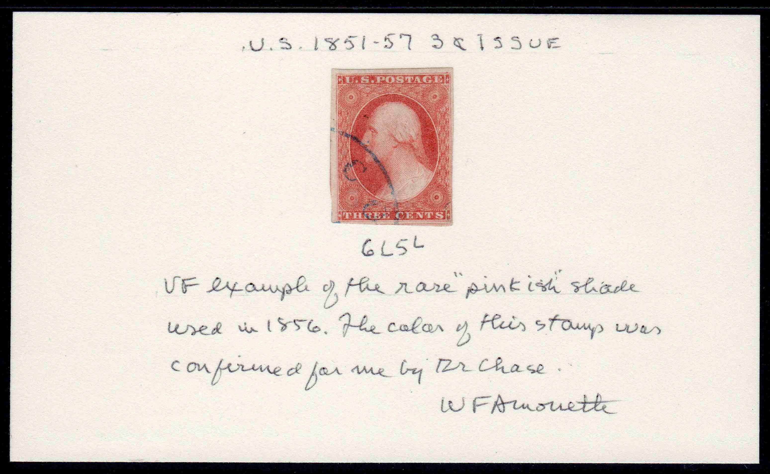 |
|
Send note to Staff
|
|
|
Pillar Of The Community
United States
637 Posts |
|
|
Eye-Candy post 2 of 3 -- Here is an example of an 1857 plum -- along with Amonette's "mounting card cert" -- this one being Scott #11A -- position 48L3. As some of you commented yesterday, the 1857 plum is not the prettiest color. The way I describe it in practical terms -- is that it is almost a pure brown -- lacking any carmine or claret. Thus, the name is a total misnomer -- as the color bears absolutely no resemblance to the fruit. Regards // ioagoa Note -- the usual disclaimer regarding identification of colors vis-à-vis online scanned images applies. More specifically -- because of variations in scanner settings, and because different display screens render colors differently, this image is not suitable for confirming colors of other stamps in hand or in other images. 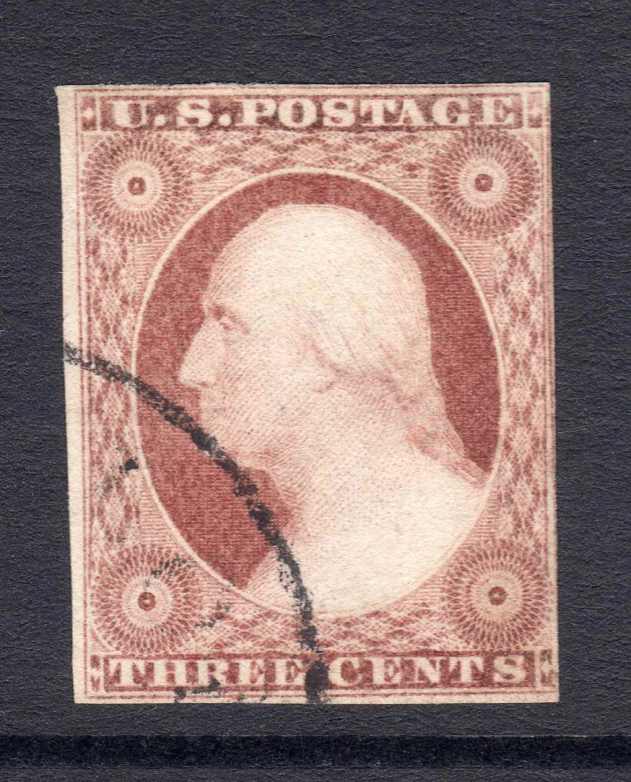 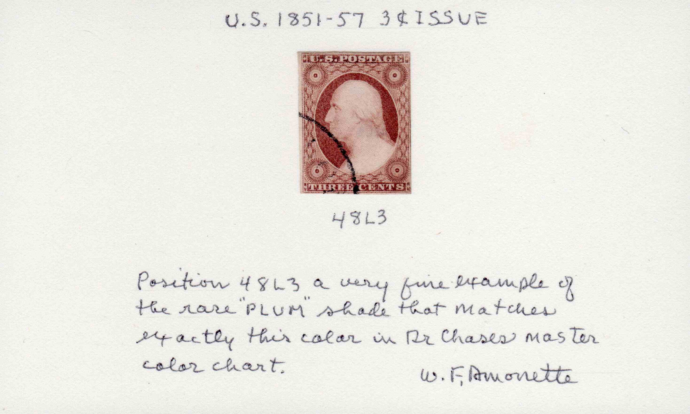 |
|
Send note to Staff
|
|
|
Pillar Of The Community
United States
637 Posts |
|
|
Eye-Candy post 3 of 3 -- Here is another example of the 1857 plum -- this one being Scott #11A -- position 65R2L -- which by the way -- is also a nice example of recut variety #25 -- "right inner line runs down too far". This stamp was originally colorized by E.L. Fritz -- one of the well known color experts -- and was then confirmed for me by Amonette -- who commented that he thought it was a "nice plum" (copy of Amonette's note is also attached). Too bad the stamp has a 10mm "score line" that almost goes completely through the paper -- but nonetheless -- it is one of the freshest examples of the 1857 plum that I have in my color chart. Regards // ioagoa Note -- the usual disclaimer regarding identification of colors vis-à-vis online scanned images applies. More specifically -- because of variations in scanner settings, and because different display screens render colors differently, this image is not suitable for confirming colors of other stamps in hand or in other images. 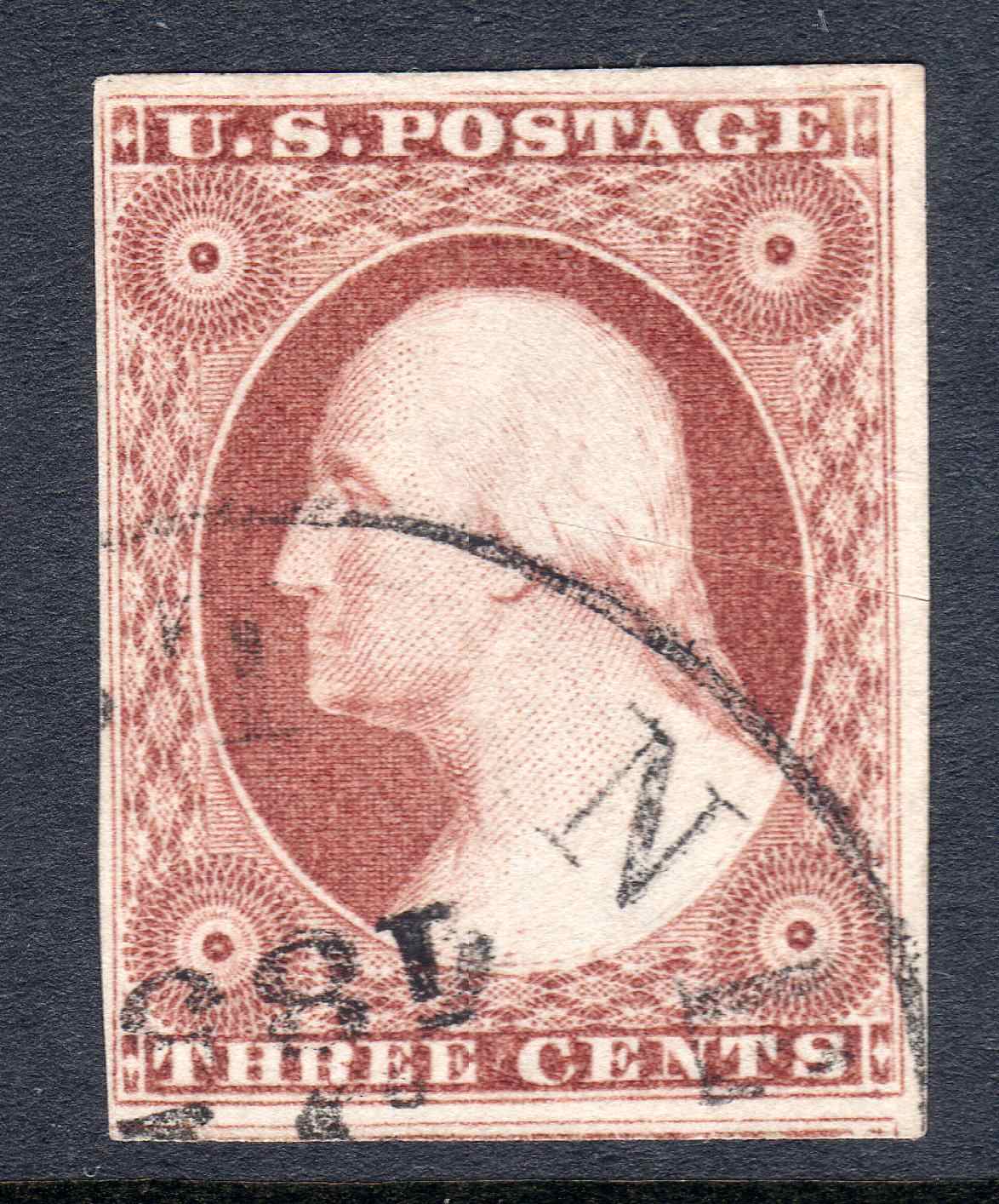 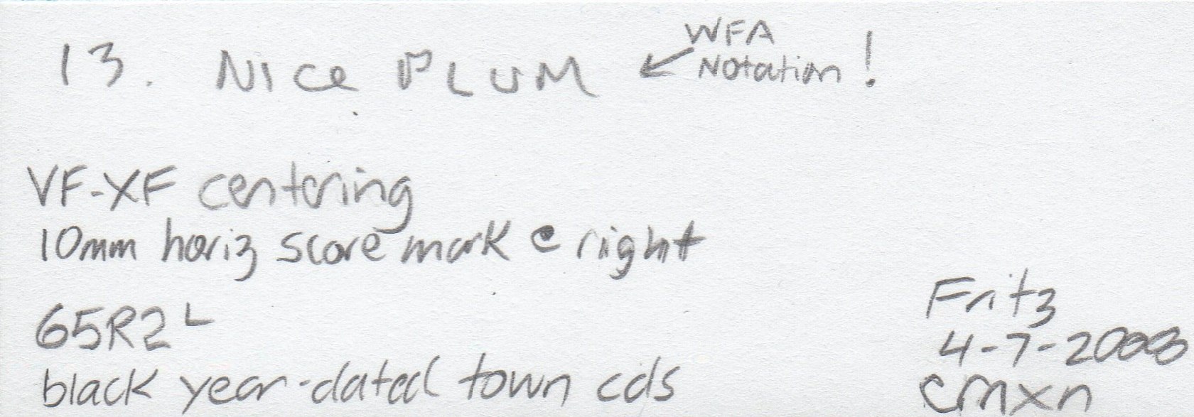 |
|
Send note to Staff
|
|
|
Pillar Of The Community
United States
3532 Posts |
|
|
Pillar Of The Community
United States
637 Posts |
|
|
Hi txstamp --
Thank you so much for the links to those threads. Much appreciated -- and I will check them out.
I do not know why I am having so much difficulty with the SCF search utility -- but it seems to comingle general web based search hits along with those from SCF?
Thanks again for the links.
Regards // ioagoa |
|
Send note to Staff
|
|
|
Pillar Of The Community
United States
1162 Posts |
|
|
Quote:
I have been collecting the 1851 - 1857 3-cent issue for over 25 years -- and for most of that time, my primary interest was in color study. In my opinion -- and again, this is just my opinion -- certifying color varieties -- regardless of the expertizing agency -- can be problematic for a number of reasons. First -- is access to confirmed reference material. Second, is the expertise of the folks who are looking at the stamp and comparing it to the confirmed reference material (which for years has been the basic expertizing process). And third, when it comes to color varieties -- and especially the scarce to rare ones where an otherwise $10 stamp becomes a "four figure" stamp based solely on its color -- getting two "experts" to agree on a subtle difference in hue is not always as straightforward as one might think. Ioagoa, I am only quoting the one paragraph, but I agree with your entire post 100%. Undoubtedly, the best cert for color on the 1851-56 issue is a Chase or Amonette assertion. This is a good example of how the right certification is worth $$$. Now that both of those men are gone, and due to the many points that you made, there is a vacuum, of sorts, in this field. There are great people - experts - out there today, but not with the 'cachet' or name-recognition of Chase or Amonette. And whether or not these few live experts are employed by the certifying services or not, I do not know. Nor does anyone else It WOULD be an incredible find to locate Chase's original master color chart. Although it is be every 3c 1851 collector's Holy Grail and THE centerpiece of any collection, I think it would do so much more good at one of the certifying services. And it would be a huge benefit to that service to advertise the acquisition. Of course, there is the 'support infrastructure' that would have to go along with the acquisition - the competent people to utilize the chart, the controlled environment to store it, the desire to find ways to 'study' the chart (chemical analysis, spectral analysis, etc) so we can all learn more about how to 'pin down' the colors/shades/sub-shades. Although Chase and Amonette viewed many, many 3c '51s, they didn't view them all. There are probably pinkishes and plums out there waiting to be identified, that have never been viewed by these men. With the lack of trust (perhaps the wrong word) in the certifying entities in this very focused field, what is a person to do these days? I've been at this for 35 or 40 years, and have a certain amount of confidence in my knowledge, but I am not a recognized expert. I am more well known as 'mootermutt' than as my real life person. Looking at the posts in this thread, it is clear to me that there are others that stand head-and-shoulders above me, expertise-wise. I can handle myself in the philatelic world (to my own satisfaction), but I have made my mistakes, too. I am just glad we have this forum to bounce ideas and questions off others with more expertise. I didn't mean to prattle on that long! Ioagoa, those latest plums and the pinkish are spectacular. I love this field because even a faulty stamp (a la the plum with the scoring) is a recognized treasure!! The margins on that pinkish are to-die-for!!! Worthy of a spot in any Rarities Sale, and likely one of the highlighted (in the philatelic press release) lots of that sale, too! |
|
Send note to Staff
|
| Edited by mootermutt987 - 08/27/2020 3:09 pm |
|
|
Pillar Of The Community
United States
2948 Posts |
|
|
ioagoa, mooter and all, fantastic responses!! Thank you for taking the time.
One thing I learned is that the Chase master chart is not broken up and in the hands of collectors. For some reason I thought it had been dispersed through auctions over the years.
I've only been collecting for about 5 years and with limited means.
Having said that I'm pretty sure I have an 11A OB, Exp. OB and less sure but likely a plum. That and $4.00 will get you an overpriced cup of coffee.
Since I have no plans on selling them it doesn't really matter at this point.
I've probably said this before..., I'll leave it up to my grandsons to have these things verified, if they want to, in the future.
|
|
Send note to Staff
|
|
|
Replies: 3,825 / Views: 255,632 |
|
|
To participate in the forum you must log in or register. | |
 Finally Found This R88A Plate Variety. Been Looking For One For Years Can USPS Imperforate Stamps Be Used For Postage? Hello From Albany, Oregom US Scott #rb11 Fake Or Facsimile? Scott #498 (1917-1919) Avatar Change Request 2023 Freedem Stamp. Is This Stamp Fake? Transvaal Postal History Help Earliest Stamp With In-Design Date? My First Stamps Help Newbie.help With Stamp Identification (J29) Inherited These Stamps, Are They Genuine? APS Membership Discount Metropex Stamp Show: Roseville, Minnesota October 23-24 Weird Covers, 1885,1886, And 1982 For Users Of Two-Post Blue International Albums What Is Your Experience With Binders. New Member Posting Image Of Avatar, Front And Back Of U2 Cut Square, Market Value Or References? Working On An Offline Collection George Washington 3 Cent 1861 With Print On The Back Hello From The Netherlands - New Member Then And Now, From Old Postcards New Member Wanting To Add An Avatar Sparks Auction Fees? 163 VF Nyfm Vertically Ribbed 163 XF Quartered Cork, Labeled Jumbo Finally Found This R88A Plate Variety. Been Looking For One For Years Can USPS Imperforate Stamps Be Used For Postage? Hello From Albany, Oregom US Scott #rb11 Fake Or Facsimile? Scott #498 (1917-1919) Avatar Change Request 2023 Freedem Stamp. Is This Stamp Fake? Transvaal Postal History Help Earliest Stamp With In-Design Date? My First Stamps Help Newbie.help With Stamp Identification (J29) Inherited These Stamps, Are They Genuine? APS Membership Discount Metropex Stamp Show: Roseville, Minnesota October 23-24 Weird Covers, 1885,1886, And 1982 For Users Of Two-Post Blue International Albums What Is Your Experience With Binders. New Member Posting Image Of Avatar, Front And Back Of U2 Cut Square, Market Value Or References? Working On An Offline Collection George Washington 3 Cent 1861 With Print On The Back Hello From The Netherlands - New Member Then And Now, From Old Postcards New Member Wanting To Add An Avatar Sparks Auction Fees? 163 VF Nyfm Vertically Ribbed 163 XF Quartered Cork, Labeled Jumbo
Disclaimer: While a tremendous amount of effort goes into ensuring the accuracy of the information contained in this site, Stamp Community assumes no liability for errors. Copyright 2005 - 2026 Stamp Community Family - All rights reserved worldwide. Use of any images or content on this website without prior written permission of Stamp Community or the original lender is strictly prohibited.
Privacy Policy / Terms of Use Advertise Here |
| Stamp Community Forum |
© 2007 - 2026 Stamp Community Forums |
| It took 0.39 seconds to lick this stamp. |
 |
|
|
|


 Posted 08/26/2020 4:28 pm


