|
This page may contain links that result in small commissions to keep this free site up and running.

Welcome Guest! Registering and/or logging in will remove the anchor (bottom) ads. It's Free!
To participate in the forum you must log in or register.
| Author |
 Replies: 3,764 / Views: 245,422 Replies: 3,764 / Views: 245,422 |
|
|
|
Pillar Of The Community
United States
2226 Posts |
|
|
Quote:
As some of you commented yesterday, the 1857 plum is not the prettiest color. The way I describe it in practical terms -- is that it is almost a pure brown -- lacking any carmine or claret. Thus, the name is a total misnomer -- as the color bears absolutely no resemblance to the fruit. Here is a repost of a composite image that I posted three years ago (in the second thread that txstamp linked above). This image indicates to me that what Chase ultimately called the "true plum" compares to the inside of the fruit, rather than the outside:  |
Send note to Staff 
|
|
|
Moderator

United States
12330 Posts |
|
|
Serious color study requires getting into philosophy (and physics and psychology), something that I have seen very few philatelists do; most of the time this is ignored by collectors. Stamps do not have color. Stamps have a surface in which ambient light waves bounce off , enter our eyes, and gets processed by our brains. Being reflected wavelengths, having a color discussion without the context of ambient lighting is inane. Did Chase or the other experts define the ambient lighting they used to ID colors? And how in the world can we agree on a color ID using our eyes when colors are subjective? https://plato.stanford.edu/entries/color/I dislike peeing in the Wheaties of today's color collectors, it is important work to continue. I am confident that one day there will be a non-destructive atomic level analysis that will definitively/objectively ID ink and pigment chemistries. (FYI, VSC6000/VSC8000 is a comparator, not an analytical device and it is not 'non-destructive' if the UV test is used. I assume that a single test of two is not too harmful but as far as I know no one can say for sure how many VSC UV exposures will harm a stamp.) When that day comes, it will be important to have historical color reference collections still together and available for analysis. It would not be surprising if the atomic level testing completely turns previous color IDs on their ear. In my opinion, the fact that catalog numbers (and values) are currently assigned based on color is not a good thing. Paying a premium for something that is not currently definitive will always be risky. Shopping for a cert may make a buyer today feel better but the jury will be out until objective/definitive analysis is possible. As I said in another thread, assigning catalog number of a subjective sensory perception like color is no different that assigning catalog numbers for gum varieties based upon the taste of the gum. Can anyone make the case that that production changes in gum are more or less important than production changes in inks/pigments? Why does it seem silly to suggest that gum ID be done by taste but doing color ID by sight is ok? I think that today's color collectors should stay the course and continue to build their reference collections. These reference collections are the bridge between what we thought we knew and what we will one day know for sure. But until objective/definitive analysis can be done, catalog publishers should remove the catalog numbers based upon color and the market place reaction to stamp color should be looked at very cautiously. Don |
|
Send note to Staff
|
|
|
Pillar Of The Community
United States
606 Posts |
|
|
Hi Don (51studebaker) -- I just finished making my first pass through the article you linked to your last post -- (i.e., the article titled "Color" as published in the Stanford Encyclopedia of Philosophy). I will also say that I have read many articles on color over the years -- admittedly most all having to do with the elementary basics of color theory and color nomenclature -- but never one that dives this deep into the philosophical and theoretical aspects of the subject. Very interesting and diverse concepts presented on both the philosophy and theories of color -- and a lot to absorb in a first read -- but one take away for me, unless I missed something, is that that even among top academic scholars there remains deep division concerning the nature of colors and how they fit into scientific accounts and classifications of the world. In any event, regarding colors on stamps -- regardless of what color philosophy or color theory one ascribes to, practically speaking, I 100% agree with you that in the absence of a proven objective and scientific way to definitively colorize stamps, the current process of matching stamps to color samples is, consequently, inherently subjective. I also agree with you that paying a financial premium for something that is "not definitive" will always be risky. That said, if one fully understands that risk, has the interest, the inclination, and derives enjoyment from this aspect of the hobby, then it is a worthwhile endeavor. With regard to color varieties seen on the 1851-1857 3-cent imperforate stamp -- Bill Amonette summed it up best in his original USPCS Chronicle article on the subject when he wrote, "There is so much difference of opinion regarding color that one has to depend on his own knowledge to be certain" (reference Chronicle Number 78, May 1973, page 85) -- and quite frankly, in my view, that comment is as accurate today as it was when Bill wrote it 47 years ago -- and, which was the main point of my post earlier this afternoon. Despite all of the problems, complications, and divided opinions on color study, I personally have found it to be a very interesting and satisfying part of the hobby for many years -- and YES -- I have taken many a risk that some of, or maybe even all of, the scarce to rare colors that I have acquired and found over the years, might, as you say, "get turned on their ear" some day. But along the way I have made lasting philatelic friendships with others who share the interest and passion for color study of the 1851-1857 3-cent stamp, have derived many hours of enjoyment with this great hobby that enabled me to step away and take respite from the daily fray of the 60 hour corporate work weeks, and have been very lucky to have had some great mentors along the way -- not to mention building a collection that I never get tired of looking at -- and now that I am retired from the corporate grind, I hope to be able to do the same for others who have an interest in color study (or plating of the 1851-1857 3-cent issue -- but that is another whole subject - although, unlike color classification, at least it is an objective subject  ). As an aside, with regard to ambient lighting -- I believe that Chase and Amonette recognized the importance of ambient lighting -- even if they did not have a "scientifically acceptable" solution. Chase noted that he placed his stamp desk at a large window facing north and did all of his color work in the daytime. Clearly not a scientifically controlled ambient lighting environment, but at least he recognized the importance of the issue and did the best he could with the tools available to him back in the day -- and, he advised others to do the same. In todays world, there is still no definitive standard, which I think we can all agree is problematic, but I will say that most the color students with whom I associate use an Ott Lamp that simulates natural daylight -- and with no other source of ambient lighting in the room when doing color work. Again, not a scientifically controlled, consistent ambient lighting environment -- but at least a teeny step better than incandescent and fluorescent lighting. In conclusion, I understand the points you are making -- and agree with most -- but until that day comes when there is, as you say, "a definitive non-destructive atomic level analysis that will definitively/objectively ID ink and pigment chemistries" -- I will stay the course -- and keep building and refining my color reference collection -- mainly because I enjoy the thrill of the hunt and looking at pretty stamps. In the meantime however, I will go and fix myself a fresh bowl of Wheaties  . Again -- great article you linked to your post -- and definitely gives new direction for thinking about color philosophy and theory. Regards //ioagoa |
|
Send note to Staff
|
|
|
Pillar Of The Community
United States
2942 Posts |
|
|
Moderator
United States
12330 Posts |
|
|
Hi ioagoa, I think the take-away for me is that stamp color appears to be something very simple yet is actually one of the most complex topics in our hobby. In a public forum like this, threads and posts can give many of us a peak into the hours and hours folks like yourself spend on color. We then get a few stamps on our desk and think, 'hey that looks plum to me'. Sensory opinions are second nature to us; it is simple to say this stamp is blue vs red or green vs brown. (Same for taste, it is relatively straight forward to make a call on salty vs sweet or bitter vs sour.) But things get dicey quickly when we try to differentiate the more subtle deltas. Chase and Amonette never had LED ambient lighting to work with and they did not have to deal with the additional technical challenges of discussing color from scanned images being viewed on countless combinations of computers, operating systems, and display devices. Today's color students have actually developed a new skill set; being able to account for these new technical layers, apply them to their 'in hand' experiences, and using the combination to make onscreen color IDs with a fair amount of accuracy. It is this ability that makes the rest of us look like rank amateurs and fools us into thinking that color IDs are simple. I have a huge amount respect for the years of discovery and learning that actually goes into becoming proficient in color identification. The cost is no small challenge either even for the least expensive stamps like the 3 cent. I do hope more information regarding ambient lighting configurations is posted. Here is a link which covers the basics of understanding and measuring ambient lighting conditions (intensity and wavelengths) https://www.lumitex.com/blog/light-measurement for those who might want to explore this important aspect of IDing colors. Don |
|
Send note to Staff
|
|
|
Bedrock Of The Community
12563 Posts |
|
|
Having just painted some walls "Simply White" and thinking that it was a tinge yellowish and having my wife tell me that it was a bit too grayish I understand the futile nature of agreeing on color. (The paint chip folder had over 100 "whites") |
|
Send note to Staff
|
|
|
Pillar Of The Community
United States
3489 Posts |
|
|
Color is difficult. No doubt.
3c 1851-57 color collecting is actually a highly developed and refined, albeit small field. What I'm trying to say is that the field is more or less well-understood given the limitations you have discussed.
It will remain a niche mostly for advanced specialists, who really spend the effort to understand this, and develop their own reference collections.
One big issue of course, is how do non color-specialists who just want a copy of a rare color to augment their more general collection play in this field? That is where we get into the discussion of listing colors in catalogs - or not. I agree that this is where it becomes quite problematic. |
|
Send note to Staff
|
|
|
Valued Member

United States
348 Posts |
|
|
This is the most informative thread for those who care to try to keep up with the discussion. 100 shades of White certainly is a tip off on how much variation is out there! Thanks all who have contributed.  |
|
Send note to Staff
|
|
|
Pillar Of The Community
United States
2942 Posts |
|
|
Quote:
One big issue of course, is how do non color-specialists who just want a copy of a rare color to augment their more general collection play in this field? tx, exactly and trying to obtain a cert isn't the path onto the playing field, in my less than humble opinion. The discussions here bolster my opinion. |
|
Send note to Staff
|
|
|
Pillar Of The Community
United States
606 Posts |
|
|
txstamp -- Thanks again for all those links to prior SCF discussions relating to color study of the 1851-1857 3-cent imperforate issue. I have now read all of them -- and I can see where the subject of color study -- along with many of its associated intricacies -- has been previously covered on this forum. I do wish that I had been an active SCF participant at the time these threads were going strong -- but back then had not yet retired and was still slaving to the corporate world. In any event -- thank you so much for providing the links.
Mootermutt987 -- in all of the excitement of yesterday's "posting traffic" I meant to respond to your post -- but never did.
First -- thank you for the compliments on the pinks and the plums -- "scientific analysis" aside -- it took me years to find these stamps and I never tire of looking at them.
Also, I totally agree with you that one of the reasons that I love plating, color study, and everything else about the 1851-1857 3-cent stamp is that even faulty stamps can be some of the best examples of a plate, color, or cancellation variety ,etc., etc. -- and thus great finds at bargain prices are still out there for anybody inclined to invest their time into acquiring the knowledge. Like I said in one of my prior posts -- I enjoy the philatelic camaraderie, the thrill of the hunt, and I never get tired of looking at interesting and pretty stamps.
You are "spot-on" with your comment about there being a vacuum of sorts when it comes to the certification of the scarce to rare colors now that both Chase and Amonette have passed -- and further that while there are other very knowledgeable experts out there, that none of them have the level of 'cachet' or name recognition value achieved by either Chase or Amonette. This is not meant to be a criticism of any other expert -- it is just a philatelic market reality. All of this was previously discussed in one of the thread links that txstamp provided -- so no point in belaboring it further here -- but suffice to say that I completely agree with you that a Chase or Amonette opinion is still the "gold standard" when it comes to color ID -- at least in my view. Personally, I know of only one other "expert" with the appropriate reference material and experience who actually does color work for APEX (as already pointed out in one of the thread links that txstamp provided). I know of a few others who have the necessary color reference material and experience, but as far as I know, none of them have ever done work for any of the expertizing services. There are probably other capable experts out there who I have never met as well -- but like you, whether these folks are employed by, or do volunteer work for, any of the expertizing services, I have absolutely no idea.
In any event, I completely agree that the current "certification" situation is problematic (for all of the reasons you state, for all of the reasons noted in the thread links that txstamp provided, and for all of the reasons as outlined in one of my prior posts from yesterday) -- and it is especially problematic (and comes with potentially significant financial risk) for a general collector who just wants to acquire a single example of a Scott listed scarce to rare color for which they will likely have to pay a significant financial premium to obtain.
Regarding the current whereabouts of the Chase master color chart -- I suspect that it is still with Bill's family -- as I know first hand that before Bill passed, he had worked for a number of years to get his son interested in colors and teach him what he knew -- all in the hopes of carrying on the "Amonette Legacy". Not sure where that all ended up -- but I suspect that the Chase master color chart is sitting in a safe deposit box at a bank in Radford VA and has not seen the light of day since Bill passed. Again, this is only a pure guess. Alternatively, if the chart was sold via private treaty -- then it is one of the best kept philatelic secrets, as the neither the chart nor any of the stamps in it, have yet to surface -- at least as far as I am aware. One thing of which I am certain however -- is that the chart was not sold at a public auction.
In any event, we are now back to where we started -- and will likely remain in that "holding pattern" for a while longer -- at least until there is a generally accepted, definitive and non-destructive scientific way to identify stamp colors. At the risk of repeating myself for the third time now in as many posts -- the current situation can best be summarized by quoting Bill's own words when he wrote his USPCS Chronicle article back in 1973, in which he concluded: "There is so much difference of opinion regarding color that one has to depend on his own knowledge to be certain".
Regards // ioagoa
|
|
Send note to Staff
|
|
|
Pillar Of The Community
United States
3489 Posts |
|
|
With the color discussion winding down a bit, I'll change gears here, and, heaven forbid, post a non-3c stamp. Here is a pair of #17s used on cover to London, via British Treaty mail paying the 24c rate via American Packet. 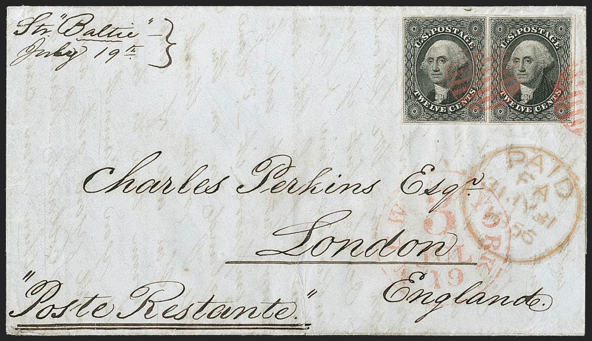 |
|
Send note to Staff
|
|
|
Pillar Of The Community
United States
2226 Posts |
|
|
txstamp, That is one of the most beautiful covers I've ever seen. It looks as fresh as the day it arrived in London, franked with a beautiful imperf pair lightly canceled in red, with trans-Atlantic hand stamps. The elegant handwriting tops it all off. Thanks for showing this spectacular piece of postal history. |
|
Send note to Staff
|
|
|
Pillar Of The Community
United States
1951 Posts |
|
|
Classic coins is right. I wonder if the stamp reached its destination, though. That's a pretty sketchy address!
Jack Kelley |
|
Send note to Staff
|
|
|
Rest in Peace
United States
920 Posts |
|
|
Back to the 3c stamps... I picked this one up because of it's ghostly appearance and discovered it was also a double transfer, 11a 10L1L. 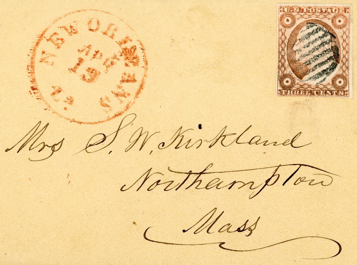 |
|
Send note to Staff
|
|
|
Pillar Of The Community
United States
3489 Posts |
|
|
Jack - mail at this time (not sure about London) was usually held at the PO for pickup.
The poste restante endorsement is actually specifically asking for the mail to be held. |
|
Send note to Staff
|
|
|
Replies: 3,764 / Views: 245,422 |
|
|
To participate in the forum you must log in or register. | |
Disclaimer: While a tremendous amount of effort goes into ensuring the accuracy of the information contained in this site, Stamp Community assumes no liability for errors. Copyright 2005 - 2026 Stamp Community Family - All rights reserved worldwide. Use of any images or content on this website without prior written permission of Stamp Community or the original lender is strictly prohibited.
Privacy Policy / Terms of Use Advertise Here |
| Stamp Community Forum |
© 2007 - 2026 Stamp Community Forums |
| It took 0.33 seconds to lick this stamp. |
 |
|
|
|


