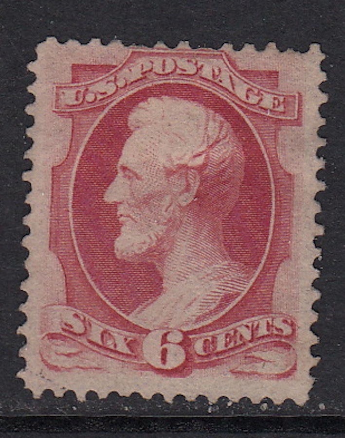
Riley111,
If I had to guess I would say yours is a #148. This is based on my perceived color (which I see as "Carmine" vs a "dull pink" of the 159) as well as description below.
#137&148 : The first four vertical lines of shading in the lower part of the left ribbon, to the left and downward from the ' S ' of ' SIX ', are of normal ( lighter ) strength .
#159&186 : The above lines are heavier.
Below are two copies that you can use for comparison. As noted elsewhere on this forum, color is not really something that can be absolute when viewed on-line due to many variances in software and monitors but it can be helpful. My copies below - #148 then #159.
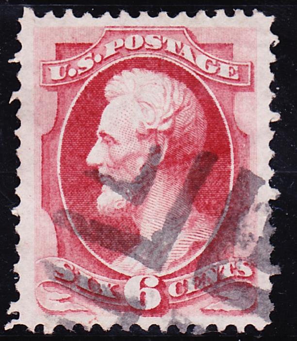
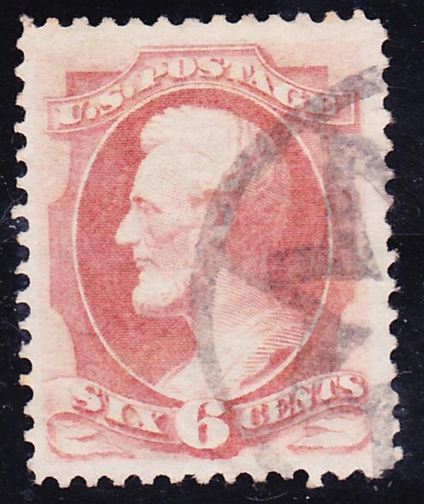
Hope this helps. I can tell you that the link provided by Don is a great tool that will help in many ways as you continue to learn.
Hobsun





 Posted 08/27/2020 12:32 pm