Hi Phillystamper,
The gap between the letters in the label and frame may not be the best feature to look at when plating, as inking variations can make this gap vary from printing to printing for the same plate position.
mootermutt987 provided a great rundown on what things to look for when plating.
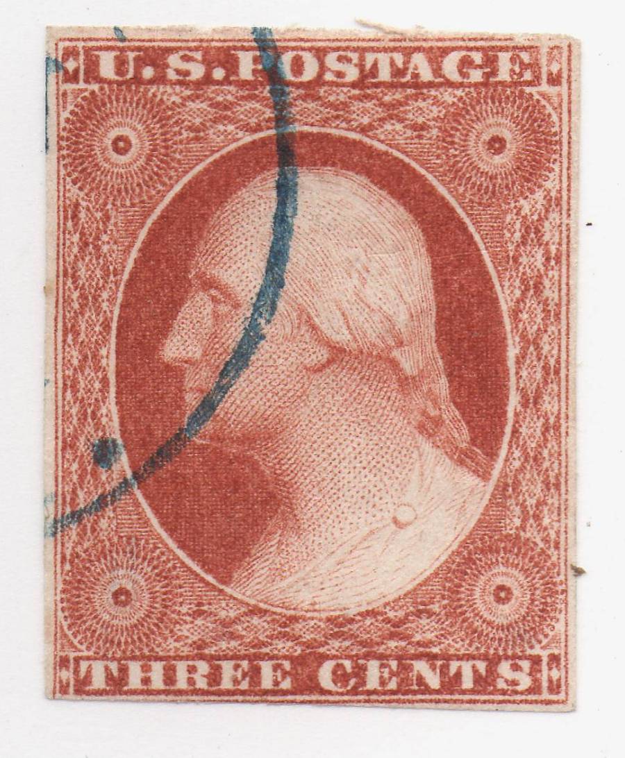
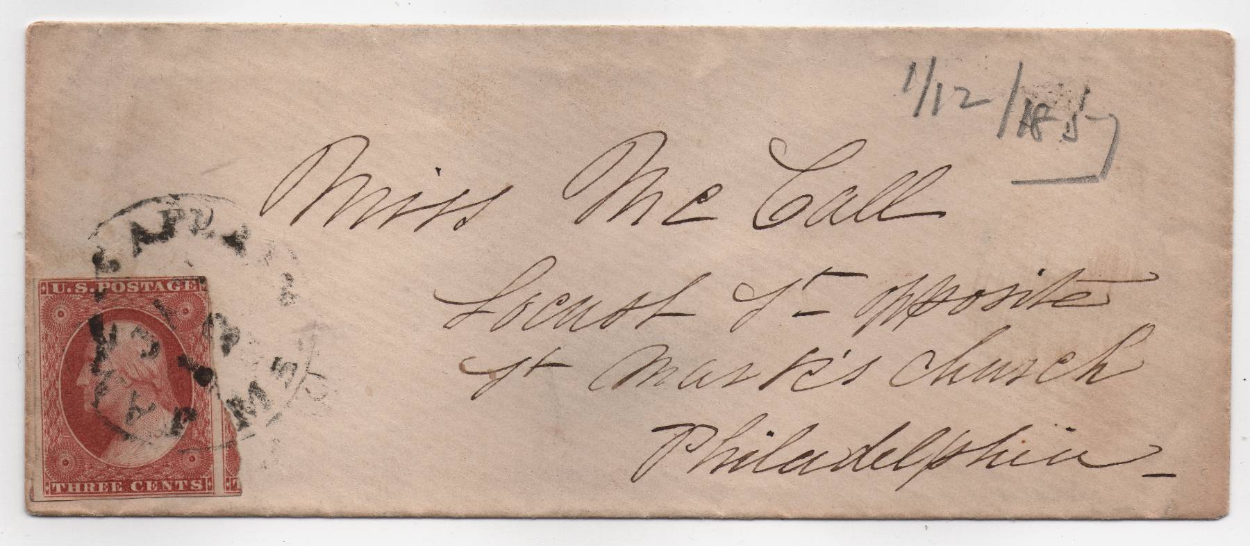
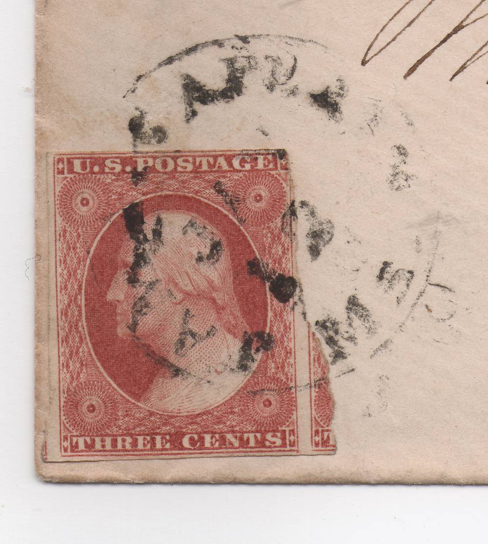
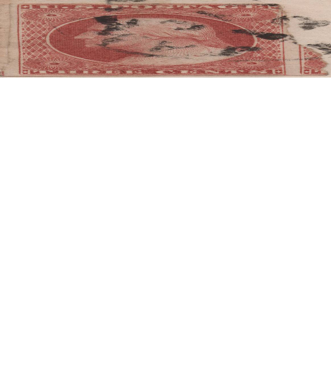
Following up on mootermutt987's statement about "how unstraight some inner/outer lines are," I rely heavily on the curves in the frame lines in my plating efforts, as these were all recut by hand on the plate with a cutting tool after the designs were transferred to the plate from the transfer roll. Because they were recut by hand, virtually every one of the 2600 3-cent imperforate positions has a unique look to it, like a fingerprint.
To help confirm the position of your stamp, I compressed your image to 10 percent of its original height in an image editor, and did the same with the Carroll Chase Smithsonian reference photo for 30R0 that is on the Plating Wizard site. Image compression helps show the curves better. I pasted these two images together for direct comparison, as is shown below. The left frame line has some very distinct curves.

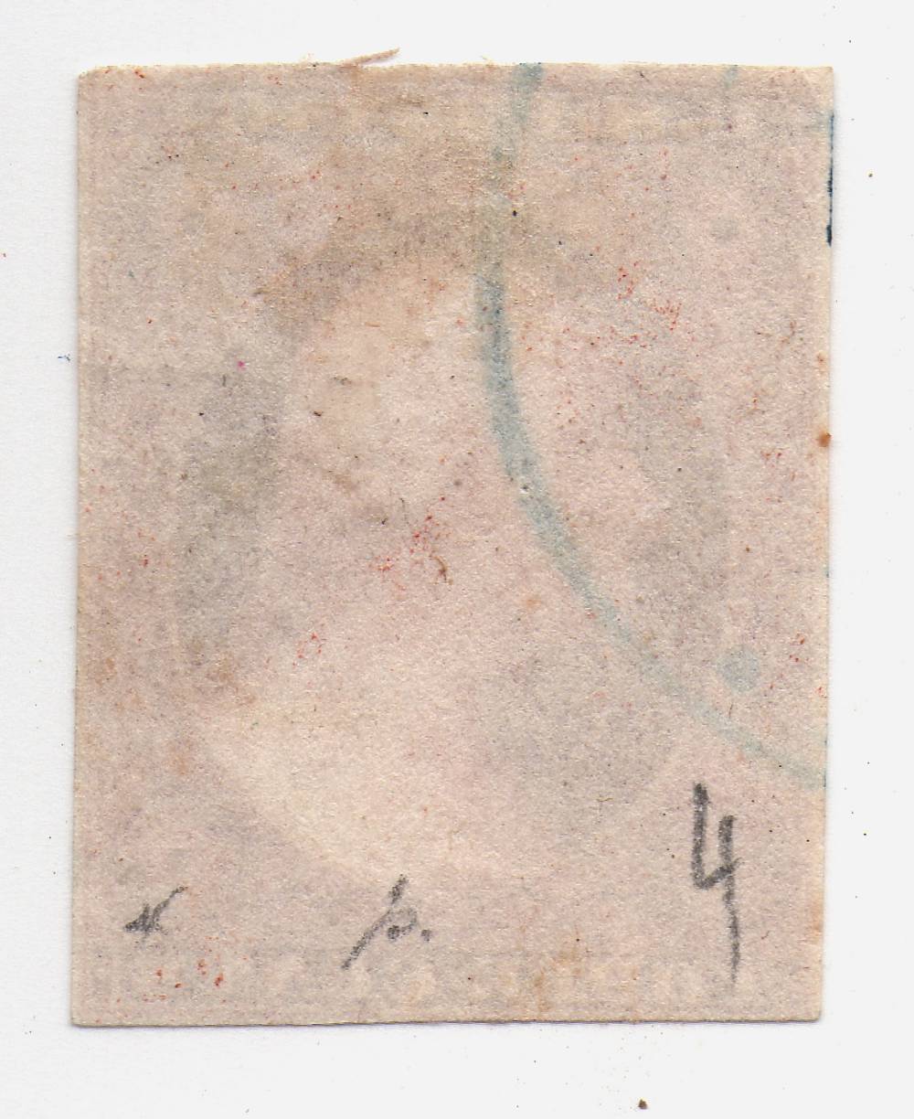
When studying frame lines with compressed images, it's important that the stamp was not warped when it was scanned, as warping can induce unnatural curves in the scanned image.
We'd be happy to look at any other imperforates you're working with, maybe to provide feedback on your plating efforts. Also, I invite you to read and post in an 1851-57 imperforate topic that I started:
https://goscf.com/t/72775I grew up in Philly (far northeast), by the way. Feel free to email me if you discuss the 3-cent imperforates more.