| Author |
 Replies: 14 / Views: 919 Replies: 14 / Views: 919 |
|
|
Valued Member
United States
117 Posts |
|
|
Collectors familiar with Private Die Match Stamps know that the RO83 was first printed on the old paper in the dull blue and ultramarine shades and later the dark blue shade on the silk paper. I have acquired a shade that appears to be a little darker shade than the silk paper variety without silk fibers. 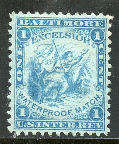 This is a picture of a mint, og, RO 83a in the light blue shade. 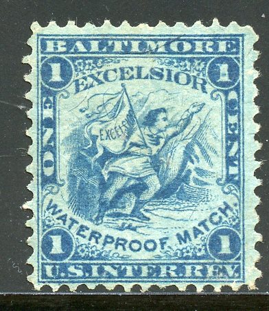 This is a picture of the RO 83b in the dark blue shade. 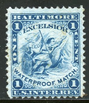 This is the picture of the darker blue variety with no silk fibers. The pictures of the last two stamps are darker than the pictures actually show. I would like to hear your opinion as to how this stamp should be classified as: could it be a color variety equal to Scott's 233a? |
|
Send note to Staff
|
|
|
|
|
Pillar Of The Community
United States
790 Posts |
|
|
jono
shades of the blue match stamps are common among those that were issued in large numbers. reasons can range from poor wiping of the plate, moisture content of the paper. poor quality control of the ink (mixing), and the amount of plate wear. the Boston book also mentions an anomaly about this stamp. see pages 179-180.
unless the ink is chemically different imo a notation of shades in the blue stamps should cover it, the ultramarine issues being the exception. |
Send note to Staff 
|
|
|
Valued Member
United States
117 Posts |
|
|
MandM, is the Boston book are you referring to the same book titled as "Historical Reference of the Revenue Stamps of the United States" compiled by the Boston Philatelic Society? I realize the complexities that can occur during the processes of printing stamps. Since Match Stamps are the only stamps I specialize in an I am aware of many color shades of the different printings. The reason I submitted this article is this stamp, with an almost proof like impression, is not the correct shade for RO83a and is slightly darker than the dark blue silk papered RO 83b and not even close to my RO83u. My conclusion is the stamp is a significant color variety that should be noted. I am providing a picture of the back of the stamp that I omitted my first posting, I hope it will be of some benefit. 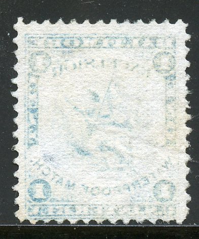 |
|
Send note to Staff
|
|
|
Bedrock Of The Community
United States
10590 Posts |
|
|
Remember, these colors were mixed in daylight or candlelight, and the previous day's ink was added to the next day's ink. The darker shade is clearly from an early printing on very thin paper, and probably from a new batch of ink. Saying "it is not the correct shade" given the total lack of quality control and the speed with which Butler & Carpenter had to work is really not factual. A certain amount of variation exists generally; look at the variations in blue first issues, which were printed at the same time with the same inks on the same machines. The government did request over time that dark stamps become lighter and light stamps become darker in order to combat cleaning and reuse. So a very early printing might well have been in a darker shade. It's nice to find from a collecting standpoint, but Scott will never increase the revenue section several pages by adding lots of shade varieties at this point. |
|
Send note to Staff
|
|
|
Pillar Of The Community
United States
790 Posts |
|
|
Moderator

United States
12330 Posts |
|
|
Looking at a stamp ink 100 years after has been printed is like looking at a wall painted 100 years ago; it has zero chance of looking the same as when it was first done.
In my opinion catalog editors who list color as the only identification characteristic ought to be hit upside the head with a wet fish. It is like trying to ID stamp gum by taste 100 years later. We virtually never know the provenance of a 100-year-old stamp including the environmental conditions it has been exposed to; yet we choose to ignore this fact when we discuss stamp ink colors. We also largely ignore any discussion of the ambient lighting (thank you revcollector for mentioning it above) which has a 100% impact of how we perceive hues and colors.
Collectors and historians should only care about one thing when it comes to stamp color, what is the ink chemistry? The ink chemistry is what can be used to accurately differentiate print runs from decades or centuries ago. Using only visual methods to ID ink chemistry can be very misleading, especially decades later and in a complete vacuum of provenance knowledge.
Don |
|
Send note to Staff
|
|
|
Bedrock Of The Community
United States
10590 Posts |
|
|
Some things about the shades of ink can be told by the paper and the impression, at least in revenues of this period. |
|
Send note to Staff
|
|
|
Pillar Of The Community
United States
790 Posts |
|
|
i agree with your statement about ink chemistry, ambient lighting and aging. a forensic analysis for most items is overkill. in most cases a notation that shades exist is enough for color identification.
historians and specialist collectors who want to learn all they can about a single issue or series will always be around and there efforts should be recognized where appropriate. |
|
Send note to Staff
|
|
|
Moderator
United States
12330 Posts |
|
|
I agree that folks who want to specialize in stamp color should feel free to pursue this interesting aspect of the hobby. But only using 'how a stamp looks today' as a definitive method for understanding the ink chemistry seems to be a stretch. Color specialists are laying some groundwork but I would not be surprised if one day folks will look back at current understanding and wonder how we could have been so wrong in our understanding of ink colors.
I also think that the assigning of catalog numbers to color/hue varieties appears to be a practice far less common today than it was decades ago. For example, consider how long has the Scott catalog listed color varieties of the #1. Once they listed them, removing them becomes problematic; collectors, dealers, auction houses, etc. would not be happy campers.
Colors have become even more challenging than it was before the internet, computers and digital imaging. We have laid a complex layer over a topic that was already a very hard row to hoe.
Don |
|
Send note to Staff
|
|
|
Bedrock Of The Community
12552 Posts |
|
|
The criteria for what deserves a color/hue catalog listing is also a mystery. There are untold numbers of stamp issues that are collected in different hues and the fact that they exist is well known but Scott will assign no minor catalog numbers or values to them or will use a catch-all note that they exist. In the meantime other issues are assigned large premiums for much more subtle hue differences. IMO it is all about an interested party lobbying for a particular issue to get special treatment.
Note: This is not a US centric issue. Zagorsky and Michel do the same thing. |
|
Send note to Staff
|
|
|
Bedrock Of The Community
United States
10590 Posts |
|
|
In some cases, specific shades were known to have been created and used in specific time periods, which can make identification much easier. |
|
Send note to Staff
|
|
|
Moderator
United States
12330 Posts |
|
|
Quote:
In some cases, specific shades were known to have been created and used in specific time periods, which can make identification much easier. Excellent point, used stamps/covers/docs with dates adds tremendously to the understanding of inks used. Don |
|
Send note to Staff
|
|
|
Bedrock Of The Community
12552 Posts |
|
|
Are there any reference/research materials available that document the tie between different colors/hues and specific date ranges? I am thinking in terms of US material such as Scott 1, 70, 78 etc. How about the W-F and other more modern issues that often have massive premiums assigned for "Lake" and other relatively subtle differences?
My issue with the whole thing is that unless the hue difference was a deliberate act documented in Post Office or contractor historical records why would it be treated differently for catalog purposes than a hue that occurred due to hand mixing in bad light of different batches of ink components lacking modern QA/QC controls. |
|
Send note to Staff
|
|
|
Pillar Of The Community
United States
867 Posts |
|
|
rogdcam - there may not be available government documentation, but it is a well known fact that during World War II, the Bureau of Engraving & Printing could no longer get certain inks from Germany. The backs of currency and certain bottled in bond strip stamps were a different shade of green during the late years of the war and shortly thereafter. Among the Scott-listed revenues, the so called purple narcotic stamps were produced during this same period (in contrast to the previous violet shades). Authentication should look for cancels between 1944 and 1947 on the purple narcotic stamps. Not all narcotic stamps saw this change. Apparently BEP had available enough stock in their vaults to supply the demand for some denominations. |
|
Send note to Staff
|
Ron Lesher |
| Edited by revenuermd - 02/24/2022 09:10 am |
|
|
Bedrock Of The Community
United States
10590 Posts |
|
|
The W-F had such huge quantities issued (and the BEP did not differentiate between perfs, wmks, etc) that I doubt that any real time frame could be created for shades. Plus the war would have changed them during WWI the same way they changed the revenues later to at least some degree. For the classics there is probably some serious research available regarding shades, since there is considerable agreement on when many were used. |
|
Send note to Staff
|
| Edited by revcollector - 02/24/2022 12:02 pm |
|
| |
Replies: 14 / Views: 919 |
|


