Stamp Community Family of Web Sites
Thousands of stamps, consistently graded, competitively priced and hundreds of in-depth blog posts to read


Stamp Community Forum
 
Username:
Password:
Save Password
Forgot your Password?

This page may contain links that result in small commissions to keep this free site up and running.

Welcome Guest! Registering and/or logging in will remove the anchor (bottom) ads. It's Free!

Help On Belgium J6 Vs J14

 
To participate in the forum you must log in or register.
Author Previous TopicReplies: 7 / Views: 898Next Topic  
Pillar Of The Community
Learn More...
1296 Posts
Posted 06/05/2022   1:44 pm  Show Profile Bookmark this topic Add Stamps4Life to your friends list Get a Link to this Message
So I've checked a few sites and found that the J14 examples vary widely color wise. Opinions as to which these 2 are? Also, which line is considered "The outer edge of the design" ? 1 or 2??


Send note to Staff
Edited by Stamps4Life - 06/05/2022 2:49 pm

Pillar Of The Community
United Kingdom
3211 Posts
Posted 06/05/2022   8:10 pm  Show Profile Bookmark this reply Add nigelc to your friends list  Get a Link to this Reply
These look like the original version. The lions' heads have a much heavier border in the redrawn design from 1916.

The Scott note about the outer edge could be clearer. I believe it refers to the inner of the two frame lines at the left and right sides (your no. 1).
Send note to Staff  Go to Top of Page
Nigel
Pillar Of The Community
Learn More...
1296 Posts
Posted 06/05/2022   9:33 pm  Show Profile Bookmark this reply Add Stamps4Life to your friends list  Get a Link to this Reply
Humm, but the lines are not the same between the 2 stamps. The no. 1 is thin on the left and thick on the right stamp.
Send note to Staff  Go to Top of Page
Pillar Of The Community
Canada
1462 Posts
Posted 06/05/2022   9:46 pm  Show Profile Check gmot's eBay Listings Bookmark this reply Add gmot to your friends list  Get a Link to this Reply
Michel says this about the two
1895 (Mechelner) printing - "the background lines touch the lion"
1916 (London) printing - "distinct contour lines around the lion"

So that agrees with GeoffHa, that these are both the earlier printing.

~Greg
Send note to Staff  Go to Top of Page
Pillar Of The Community
Learn More...
1296 Posts
Posted 06/05/2022   10:07 pm  Show Profile Bookmark this reply Add Stamps4Life to your friends list  Get a Link to this Reply
so was misreading the desc in Scott re: the lines. "thick vertical line at the outer edge of the design on EACH side". The lines on the alternate between thick and thin between the sides. In addition to the Lion's head. Thank you.
Send note to Staff  Go to Top of Page
Pillar Of The Community
United States
3224 Posts
Posted 06/05/2022   10:29 pm  Show Profile Bookmark this reply Add hy-brasil to your friends list  Get a Link to this Reply
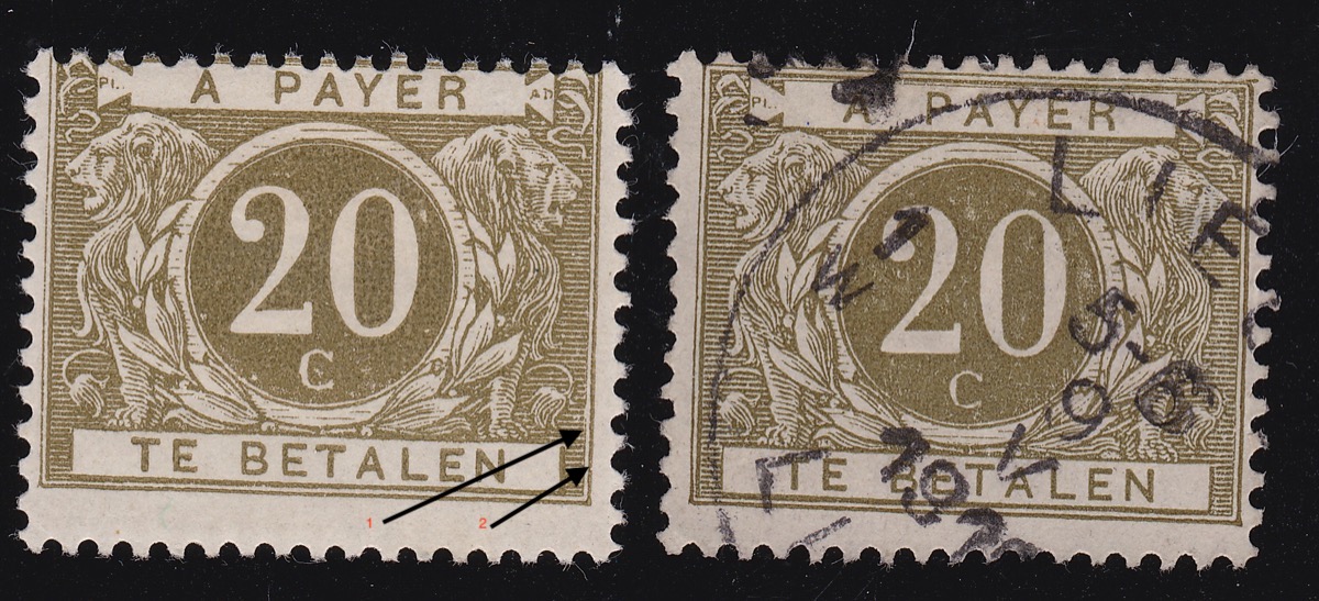
The frameline on the outside does not count as being part of the design. The vertical side lines are not always a reliable guide because of heavy or light inking. Do not get stuck on this one factor.

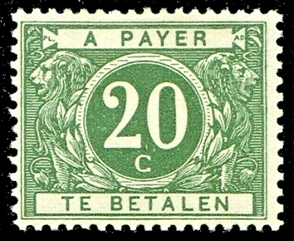
As noted by nigelc and gmot, The later 1916 issue has heavier outlines on the lions, most noticeably on the faces and chests. Both issues have heavy lines at the back of the lion heads. Still, this is the better spotting feature:

And this example shows the heavy lines at the sides of the designs.

So yes, yours are clearly from the first issue, Scott J6.
Send note to Staff  Go to Top of Page
Edited by hy-brasil - 06/05/2022 10:31 pm
Pillar Of The Community
Learn More...
1296 Posts
Posted 06/05/2022   10:38 pm  Show Profile Bookmark this reply Add Stamps4Life to your friends list  Get a Link to this Reply
yes I see the difference in the alternating frame lines vs yours and on mine the Lions vs on yours. Very nice.
Send note to Staff  Go to Top of Page
Bedrock Of The Community
Australia
38679 Posts
Posted 06/05/2022   10:45 pm  Show Profile Bookmark this reply Add rod222 to your friends list  Get a Link to this Reply
Serendipity!
I was just about to ask for an example of any J12 to J16
I like to Toggle between varieties.

The "Catalogus" had a differing loop at left top corner
This has turned out to be a furphy.

The most obvious difference is the colour ! Olive v Deep Grey green

Thanks for the example
Send note to Staff  Go to Top of Page
  Previous TopicReplies: 7 / Views: 898Next Topic  
 
To participate in the forum you must log in or register.

Go to Top of Page

Disclaimer: While a tremendous amount of effort goes into ensuring the accuracy of the information contained in this site, Stamp Community assumes no liability for errors. Copyright 2005 - 2026 Stamp Community Family - All rights reserved worldwide. Use of any images or content on this website without prior written permission of Stamp Community or the original lender is strictly prohibited.
Privacy Policy / Terms of Use    Advertise Here
Stamp Community Forum © 2007 - 2026 Stamp Community Forums
It took 0.17 seconds to lick this stamp. Powered By: Snitz Forums 2000 Version 3.4.05