| Author |
 Replies: 13 / Views: 631 Replies: 13 / Views: 631 |
|
|
Pillar Of The Community
750 Posts |
|
|
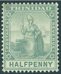
On the right is SG114 Dull Purple/Green (For reference). On the left is what seems to be my only choice of SG127 Grey-Green.All the others in the series are listed as Bi-Color. Should this maybe be called Grey-Green/Green? Or are my eyes playing shade tricks on me?? Thanks, pat 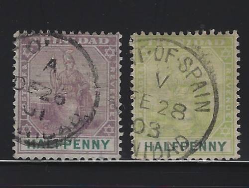 |
|
Send note to Staff
|
|
|
|
|
Pillar Of The Community
Australia
3291 Posts |
|
|
Hi Pat,
I'd say it's a colour changeling, either from soaking and/or too much exposure to sunlight.
It would be good to know if these stamps were printed in fugitive ink. |
Send note to Staff 
|
|
|
Pillar Of The Community
Netherlands
6579 Posts |
|
|
Pillar Of The Community
United States
8493 Posts |
|
|
Scott catalog #74 and #75 could be #92 also different watermark .Those are acceptable shades for both stamps |
|
Send note to Staff
|
| Edited by floortrader - 05/20/2023 07:17 am |
|
|
Pillar Of The Community
Netherlands
6579 Posts |
|
|
Quote:
could be #92 also different watermark Sure? |
|
Send note to Staff
|
| Edited by NSK - 05/20/2023 07:41 am |
|
|
Valued Member
United States
328 Posts |
|
|
Pillar Of The Community
750 Posts |
|
|
Has Crown CA WM. Probably SG127. Can find no shade variations listed. Is curious how the main color and the value color (faded?) differently. KGVIStamps example shows what looks to identical colors. Was it still a two step printing operation for this value?
Thanks all,
pat |
|
Send note to Staff
|
|
|
Pillar Of The Community
Australia
3291 Posts |
|
|
Quote:
Was it still a two step printing operation for this value? I would've thought so. |
|
Send note to Staff
|
| Edited by Bobby De La Rue - 05/20/2023 5:11 pm |
|
|
Pillar Of The Community
Netherlands
6579 Posts |
|
|
Pillar Of The Community
750 Posts |
|
|
So every now and then I should be reminded to go read the preface to the SG catalog(ue)  . It holds a lot of good information. To be honest, I do not think I have any used GB in my collection from this period that hold to the true Dull-Green color. All collectors should take to heart the section on condition, damage and pricing when evaluating the state of their collection; and especially when buying. (my 2¢) (As discussed previous) 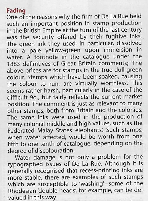 |
|
Send note to Staff
|
|
|
Pillar Of The Community
Netherlands
6579 Posts |
|
|
In 1881, the UK postage and revenue stamps were unified. If the Post Office was afraid of being defrauded by re-use of its postage stamps, the inland revenue service was even more so. It required stamps to be printed in double-fugitive (water and chemical) inks. At the time, the green and lilac inks for surface printing had that property.
You may note that the surface-printed postal fiscals from the early 1880s also valid for postage were printed in lilac or green.
The first unified postage stamp was the 1d lilac with 14 and, later, 16 dots in each corner.
A new series was planned. It was based on existing postage stamp designs. These were to be reprinted in lilac. To make the value easy to see even when cancelled and in bad lighting conditions, it was printed in large numerals. Only the 3d, 6d, and 1/- were ever prepared. The numerals were printed in carmine as black proofed to clash with a cancellation. The 1/= was not issued, but the 3d and 6d are listed as "surcharged' by Stanley Gibbons. This is a bad choice of words. First, it is not a change in the value of the stamp. So, it can only be interpreted as the French do. But the stamps were never issued in lilac, so there was no overprinting of existing stamps.
The series referred to in the snippet is the 1883 - 1884 series known as 'Lilacs and Greens.' The ½d stamp in slate-blue is the odd one out. The lower values were printed in lilac. The designs were repeated in green for the higher values.
|
|
Send note to Staff
|
| Edited by NSK - 05/21/2023 03:37 am |
|
|
Pillar Of The Community
United States
8493 Posts |
|
|
For new readers and collectors this is what they are talking about with the color fading . 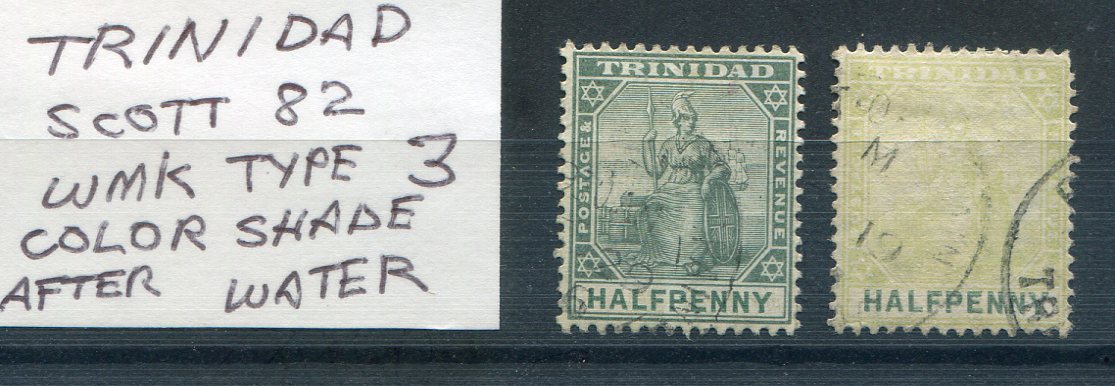 |
|
Send note to Staff
|
|
|
Pillar Of The Community
Netherlands
6579 Posts |
|
|
It looks like the ink used for the duty plate differs from that used for the head plate. You can always create your own listing after soaking. 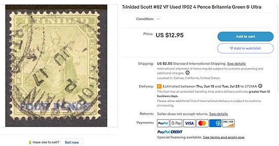 |
|
Send note to Staff
|
| Edited by NSK - 05/21/2023 07:17 am |
|
|
Moderator

United States
12330 Posts |
|
|
Since this thread is discussing inks and colors... Shade = color (or hue) + black So, no color can fade into another 'shade'. I realize that some folks will insist on using the term shade as they see fit, but in the context of discussing inks/paints or talking to anyone who knows anything about color mixing or color pigments; it will only serve to confuse. Don 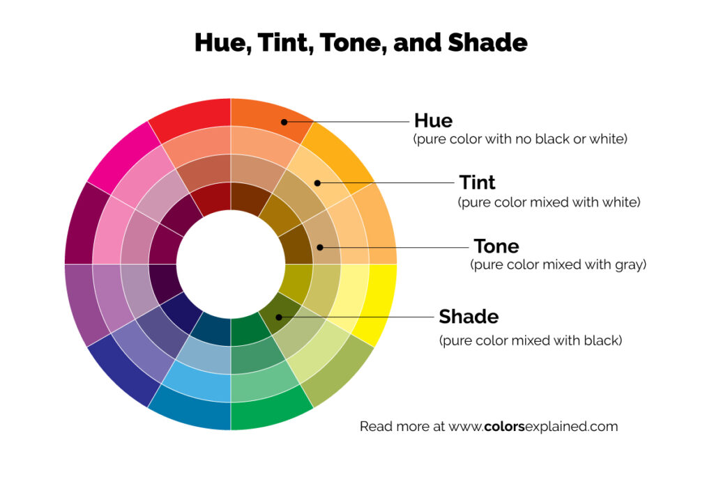 |
|
Send note to Staff
|
|
| |
Replies: 13 / Views: 631 |
|