| Author |
 Replies: 24 / Views: 3,333 Replies: 24 / Views: 3,333 |
|
Valued Member
United Kingdom
182 Posts |
|
|
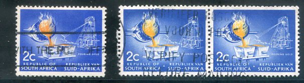
Could someone advise which of these stamps is ultramarine and which is blue please 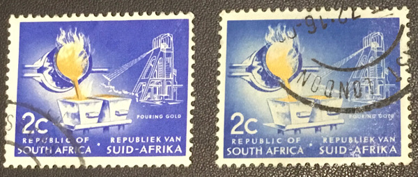 |
|
Send note to Staff
|
|
|
|
|
Pillar Of The Community
United States
8956 Posts |
|
|
I personally do not believe these are two different colors, but mostly that the right stamp is faded. it is probably very difficult to determine what the exact original color of that stamp was
Peter |
Send note to Staff 
|
|
|
Pillar Of The Community
Netherlands
6526 Posts |
|
|
Would it be correct to assume you have identified the paper (phosphorised) for both stamps and come to the conclusion it is the same paper?
Identifying 'shades' online is a futile exercise. From what I am seeing, I am tempted to say the left stamp is ultramarine but someone else might see it differently.
The stamp on the right shows signs of surface damage. I agree with Petert4522 its colour has faded. That makes it difficult to confirm its original colour. |
|
Send note to Staff
|
| Edited by NSK - 06/02/2024 02:54 am |
|
|
Pillar Of The Community
United States
8407 Posts |
|
|
Valued Member
Canada
434 Posts |
|
|
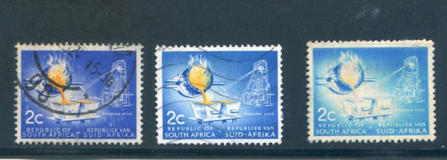
The first Republic of South Africa definitive series (of which yours is the 2c denomination), issued between 1961 and 1973, can be divided into nine distinct groups making it a real minefield.
The design was redrawn in 1962, making it relatively easy to identify the 1961 issue. But for the rest, one must rely on watermarks and paper types.
The watermarks are relatively straightforward, three different types were used: Coat of Arms, RSA in triangles, and RSA in Tête-bêche triangles.
One requires a UV lamp to identify the paper types, as some issues were on fluorescent paper, others had a phosphor frame and others were on phosphor paper.
Regarding the 2c stamp, Gibbons lists most issues as ultramarine and yellow except for a 1970 deep ultramarine and yellow, and a 1971 blue and yellow, printing.
Given the vagaries of identifying shades online, I think that it is more than likely that your lefthand stamp is the ultramarine.
Both your stamps are the redrawn 1962 onward design. Same with floortrader's, except for his first stamp in the second row which is the original design.
The 2c redrawn design may be identified by the 'N' in VAN which is directly above the final 'A' in AFRIKA, unlike the original design in which the 'N' is above the gap between K and A.
Clive
|
|
Send note to Staff
|
AlbumEasy - Free software for creating custom stamp album pages ChromaMate - Compare, match, analyse, free colour matching software ImageSleuth - Images, hidden inside images, revealed. A retroReveal alternative PSGSA - The Philatelic Society for Greater Southern Africa |
|
|
Pillar Of The Community
United States
8407 Posts |
|
|
Thanks Clive , I don't get that detail in modern issues .I would save the different issues because the color of the fire in the pot . |
|
Send note to Staff
|
| Edited by floortrader - 06/02/2024 8:05 pm |
|
|
Pillar Of The Community
United States
2830 Posts |
|
|
Valued Member
Canada
434 Posts |
|
|
Shermae,
I think that SG does a good job of listing all the issues. I have a 2020 copy of the SG CommonWealth and Empire catalogue which includes tables of the various characteristics.
However, it isn't easy to follow, nor do I think that it gives enough information to easily differentiate between the various issues.
Clive
|
|
Send note to Staff
|
AlbumEasy - Free software for creating custom stamp album pages ChromaMate - Compare, match, analyse, free colour matching software ImageSleuth - Images, hidden inside images, revealed. A retroReveal alternative PSGSA - The Philatelic Society for Greater Southern Africa |
|
|
Valued Member
United Kingdom
182 Posts |
|
|
Many thanks for responses, I've been going through my vast collation of the different values of these sets of stamps between 1961 and 1974, what a challenge. I have got the latest commonwealth catalogue which gives the handy tables. Some difficulty with some watermarks not showing and I'm using a signoscope T3 and Ronsonol in a black tray !, Also got some white phosphor or is this another type? Got some stamps that are bright all over. It's not that easy ? |
|
Send note to Staff
|
|
|
Valued Member
United Kingdom
182 Posts |
|
|
Again, thanks for responses, got a further query. On the attached 5c stamps of which I have approx 100 of there are different shades on the bottom section of the stamp, ratio is about 50/50 of dark and lighter ones. Is this down to soaking, is it a different paper or is it normal.They appear to be all redrawn copies. 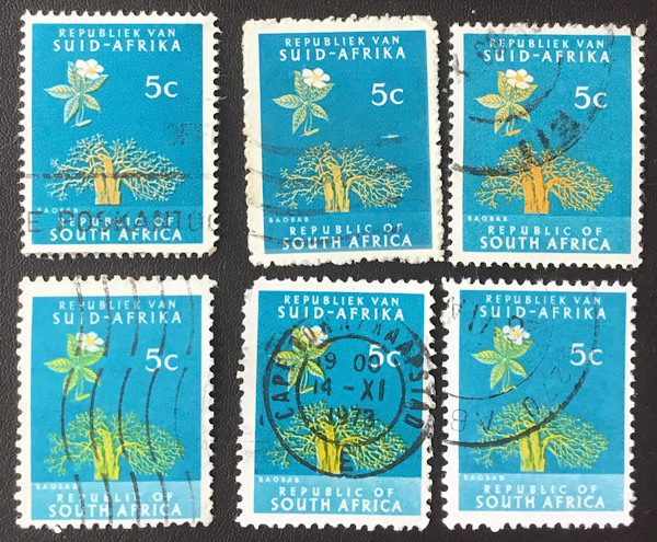 |
|
Send note to Staff
|
|
|
Valued Member
Canada
434 Posts |
|
|
Correct, all your 5c stamps are redrawn issues.
Regarding the colours, SG lists most of the printings as yellow & greenish blue, however, it also lists both orange-yellow & greenish blue. and lemon & deep greenish blue for the 1968 printing - SG B244 and B244a respectively.
The South Africa Colour Catalogue is less helpful regarding the colours of these stamps. Most listings don't mention a colour, and the ones that do, are listed as yellow & green-blue.
Given the multitude of printings over 12 years, it does seem likely that there should be many colour variations.
Clive
|
|
Send note to Staff
|
AlbumEasy - Free software for creating custom stamp album pages ChromaMate - Compare, match, analyse, free colour matching software ImageSleuth - Images, hidden inside images, revealed. A retroReveal alternative PSGSA - The Philatelic Society for Greater Southern Africa |
|
|
Pillar Of The Community
United States
2830 Posts |
|
|
Thanks very much for the confirmation Clive. You've rekindled a renewed interest in these issues for me. As I was browsing online today, it occurred to me that you could buy almost any set of this issue from a US seller and receive something different. Going to study SG to see if certain more expensive values were not reprinted so as to not pile up higher-cat stamps I can't really use. I can hope anyway! |
|
Send note to Staff
|
|
|
Pillar Of The Community
United States
763 Posts |
|
|
The six 5c stamps appear to be several varieties. If they were all scanned together then the stamps with the lighter blue on the bottom have a different perforation rate than the top stamps. The top center stamp has rough perforations which may be another variety. Maybe they have different watermarks? I don't know as I don't collect SA. But it appears to be a very interesting definitive set worth exploring. |
|
Send note to Staff
|
|
|
Pillar Of The Community
Canada
5821 Posts |
|
|
I also have a few of these laying around and I agree that this South African definitives series is fun to check out. 2 1/2c Groot Constantia All in one scan. Bottom 3 original design, small print, Scott 258 Top 8 redrawn , larger print, Scott 320 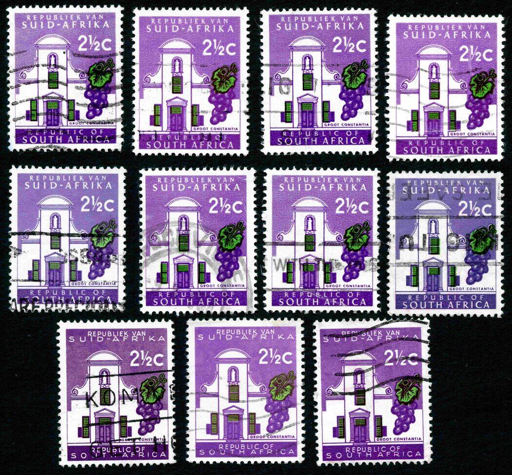 For Scott 258 it mentions 2 types Type I Lines of building faint. Type II Lines of building very strong, strong line between bottom of building and top of name panel 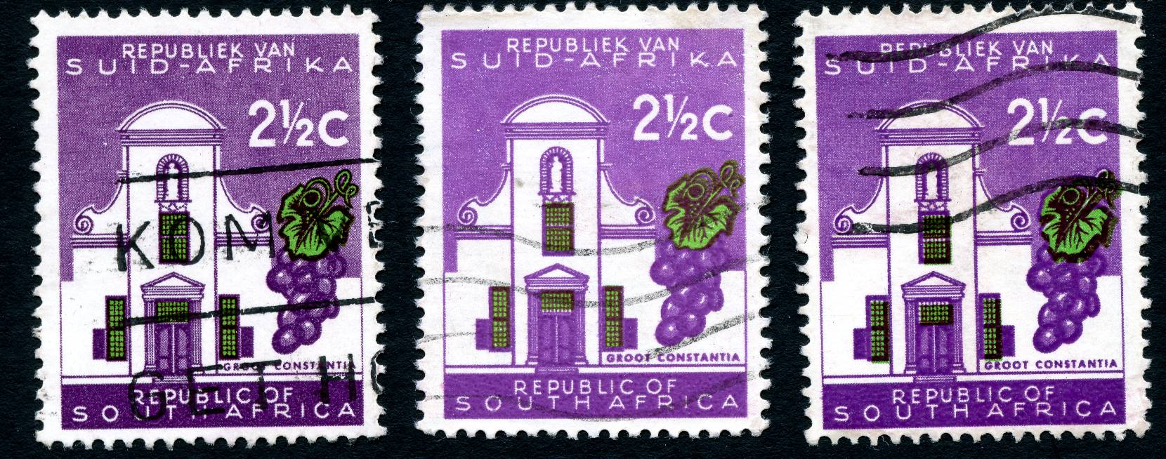 So is the one on the left Type II and the middle one Type I ? And what is the one on the right? For the redrawn ones I'm just interested in the many shades, not into perforations or watermarks. |
|
Send note to Staff
|
|
|
Pillar Of The Community
Canada
5821 Posts |
|
|
These I believe are the 3c redrawn, large inscription, Scott 321 I have none of the original design/first printing ones Top 3 are blue winged shrike and the bottom left is a black winged shrike. 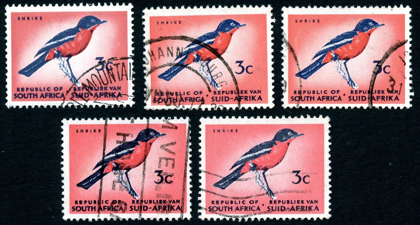 |
|
Send note to Staff
|
|
|
Pillar Of The Community
United States
2830 Posts |
|
|
Wow,.... this set is right up my alley. Does anyone know offhand if any values only had say under 4 printings? |
|
Send note to Staff
|
|
|
Replies: 24 / Views: 3,333 |
|