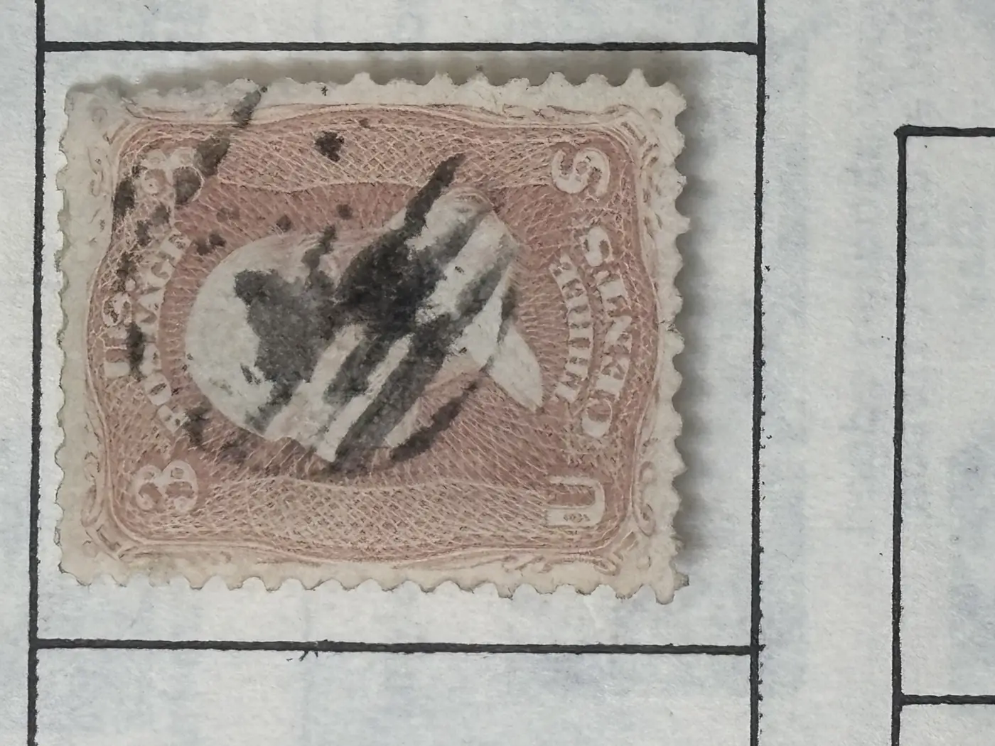
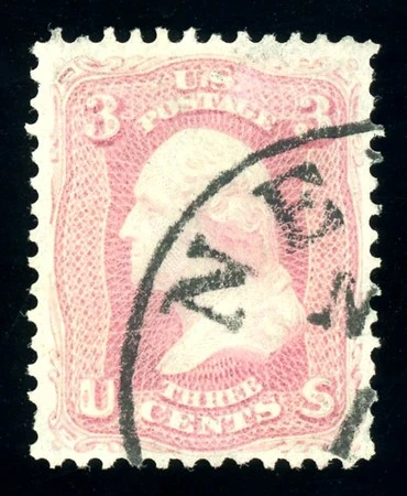
Scott #65. Even though it's hard to distinguish colors properly from digital images you can tell from the appearance of the printed design - much sharper looking on #65. #64 has kind of a fuzzy look to it.
Disclaimer: While a tremendous amount of effort goes into ensuring the accuracy of the information contained in this site, Stamp Community assumes no liability for errors. Copyright 2005 - 2026 Stamp Community Family - All rights reserved worldwide. Use of any images or content on this website without prior written permission of Stamp Community or the original lender is strictly prohibited. Privacy Policy / Terms of UseAdvertise Here