| Author |
 Replies: 3,972 / Views: 1,925,059 Replies: 3,972 / Views: 1,925,059 |
|
|
|
Pillar Of The Community
Czech Republic
623 Posts |
|
|
AnthonyUK - Lovely: Charles Mazelin interpreting J. Carre's design, actually a poster, featuring a parisienne admiring Pierre Gandon's Marianne in J. Carre's interpretation. Marianne has a look different from that on the actual post-war stamp engraved by Gandon himself. Charles Mazelin (1882-1964) and Pierre Gandon (1899 - 1990) were colleagues and friends. Does anyone know anything about J. Carre? For the items see http://www.coppoweb.com/cwstories.p...6/19/6080993It says the cinderella reproducing the poster for the exhibition marking the centenary of the first postage stamp issued in France was printed in 12 colour varieties during the exhibition held between the 1st and the 12th June, 1949. |
Send note to Staff 
|
| Edited by florian - 05/03/2013 01:55 am |
|
|
Pillar Of The Community
Czech Republic
623 Posts |
|
|
nethryk - My apologies for belated thanks and congratulations on your success in identifying Phillip Goodwyn Hall who had long remained anonymous as the vignette engraver of those beautiful Ceylon, New Zealand, Falkland Islands and Jamaica stamps.
I wish you the best of luck in your effort to uncover the other names of merit that are still, now perhaps unnecessarily, being kept secret.
As for your latest images, I particularly appreciate that of the design by Adolf Born (1930 - ), one of my favourites for his humour. Thank you. |
|
Send note to Staff
|
|
|
Pillar Of The Community
Czech Republic
623 Posts |
|
|
Galeoptix - Rein, I, too, had an impression that I could see the lines of the Rembrandt issue - when tilted as advised by you - sharper with my lens than in your images which seemed less clearly defined.
I had had the most doubts about the 25c+8c-value and again, your tilting the image at the angle of 90 degrees worked wonders and I can now see the screen perfectly. Thank you.
S pozdravem, Florian
|
|
Send note to Staff
|
| Edited by florian - 05/03/2013 01:56 am |
|
|
Pillar Of The Community
Czech Republic
623 Posts |
|
|
lithograving - Thank you for the excerpt from the aricle on the 1962 Hammarskjold inverts.
Are Hammarskojld's portrait and the image of the U.N.'s N.Y. headquarters really engraved? I have never believed so.
I did appreciate your insights on Jindra Schmidt's engravings. Thank you. |
|
Send note to Staff
|
|
|
Pillar Of The Community
Canada
5821 Posts |
|
|
@Rein, yes that last detail of Netherland Michel 676 more or less also convinced me that it's not "normal" engraving but instead looks like a raised screening.
|
|
Send note to Staff
|
|
|
Pillar Of The Community
Canada
5821 Posts |
|
|
Quote:
Are Hammarskojld's portrait and the image of the U.N.'s N.Y. headquarters really engraved? I have never believed so. You know Florian looking at that stamp also makes me wonder. The brown portion certainly does not look like " line " engraving.  Maybe the plates were etched ? Maybe Rein will weigh in on this with his expertise. What I don't understand is why use a press which is meant to print up to 3 colours in one pass using only one plate and then make two plates which required 2 passes. The article mentions that the Giori could not print one colour directly on top of another from a single plate. Why was that even necessary? The brown portions would have probably looked a lot better by using light and dark shading anyway instead of using the yellow for an underlay. In my opinion it was a poor choice of colours to begin with and basically ruined a pretty good design. |
|
Send note to Staff
|
| Edited by lithograving - 10/11/2019 6:59 pm |
|
|
Pillar Of The Community
Canada
5821 Posts |
|
|
Now this is what I call traditional American engraving. USA Scott 1195 Issued for Charles Evans Hughes 100th Anniversary of Birth Supreme Court Chief Justice and Governor of New York. Designer : Charles R. Chickering who was not only a prolific stamp designer but also a FDC cachet maker. I have a few Canadian First Day Covers he created. Engraver: Richard M. Bower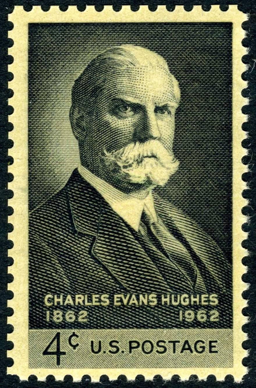 |
|
Send note to Staff
|
| Edited by lithograving - 10/11/2019 7:02 pm |
|
|
Pillar Of The Community
Czech Republic
623 Posts |
|
|
Time is already running short for the line-engraved beauties even in the Czech Republic. They are little by little giving way to those rather nondescript, gaudy-coloured, if not outright cheap and nasty reproductions in offset, albeit using stochastic screening, where mostly the contours only are line-engraved, as demanded by the postal authorities in an effort to reduce the production costs and remain in line with current world-wide trends. Some images of these, again shown on http://www.wnsstamps.post/en for the benefit of those interested:  Frantisek Zenisek "Oldrich & Bozena" 1884  Karel Skreta "Paris and Helena" about 1672  Frantisek Kupka "Lust for Life" 1901 - 1902  Frantisek Kupka "Lust for Life" 1901 - 1902 The respective whole miniature sheets, not at full resolution, however, can be viewed on: http://www.filaso.cz/katalog-znamky...amkach-arsikhttp://www.filaso.cz/katalog-znamky...-na-znamkach The result can bear no comparison with what has been achieved in this field ever since Andre Malraux incited engravers in France into such attempts in the early 1960s. |
|
Send note to Staff
|
| Edited by florian - 05/03/2013 05:47 am |
|
|
Pillar Of The Community
Czech Republic
623 Posts |
|
|
lithograving - Thank you for your comment on the U.S. Hammarskojld issue (Scott 1203 -1204). I, too, am looking forward to an opinion of Rein's. |
|
Send note to Staff
|
|
|
Rest in Peace
Netherlands
963 Posts |
|
|
Quote:
Maybe the plates were etched ?
Maybe Rein will weigh in on this with his expertise.
What I don't understand is why use a press which is meant to print up to 3 colours in one pass
using only one plate and then make two plates which required 2 passes.
The article mentions that the Giori could not print one colour directly on top of another from a single plate.
Why was that even necessary?
The brown portions would have probably looked a lot better by using
light and dark shading anyway instead of using the yellow for an underlay.
In my opinion it was a poor choice of colours to begin with and basically ruined a pretty good design.
Yes, the yellow underlay was not necessary at all. A real line engraving with two colours - easily separated as usual in the Giori process would do. Did the BEP not have a reel-fed press that was comparable to the French STIF's????? Up to 3 colours Giori + 3 colours indirect recess for the underlay??? The French and the Belgian Post Office did produce quite some remarkable stamps in the 1960-ies and later... The details look like etching rather than line engraving. But don't forget that printers did a lot of these tricks in the old days even! Even late 19th century stamps in recess are not always line engraved. I will post a few Brasil stamps here that although in recess show a few tricks - de gustibus non discutandum though... groetjes, Rein |
|
Send note to Staff
|
|
|
Pillar Of The Community
Czech Republic
623 Posts |
|
|
Galeoptix - Rein, excuse my ignorance. What does STIF stand for? |
|
Send note to Staff
|
| Edited by florian - 05/03/2013 06:26 am |
|
|
Rest in Peace
Netherlands
963 Posts |
|
|
Rest in Peace
Netherlands
963 Posts |
|
|
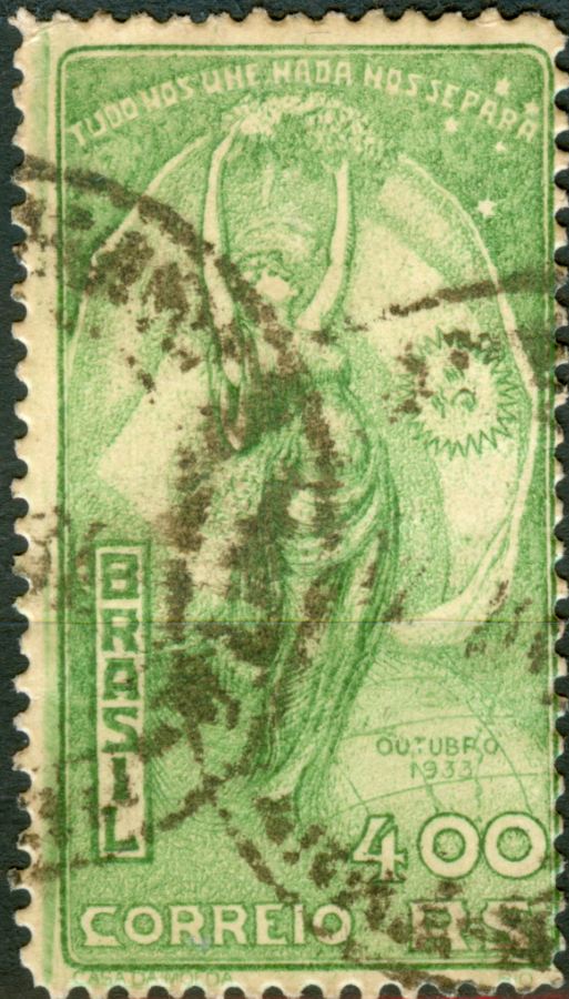
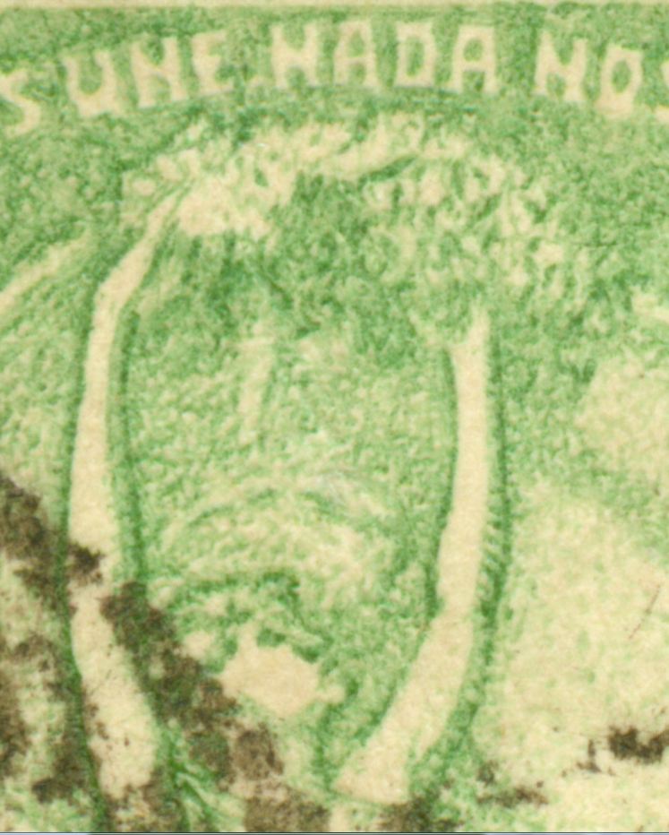
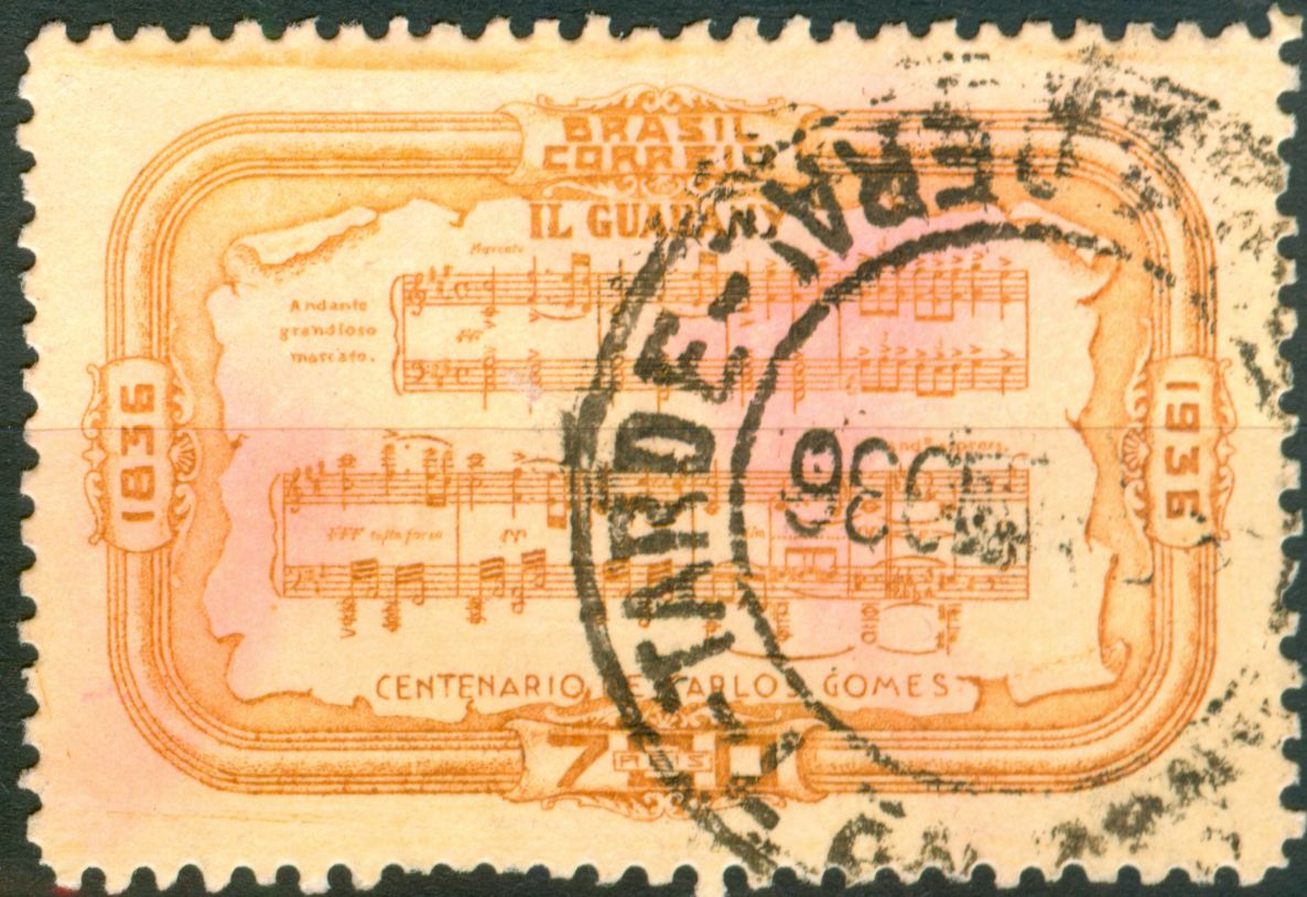
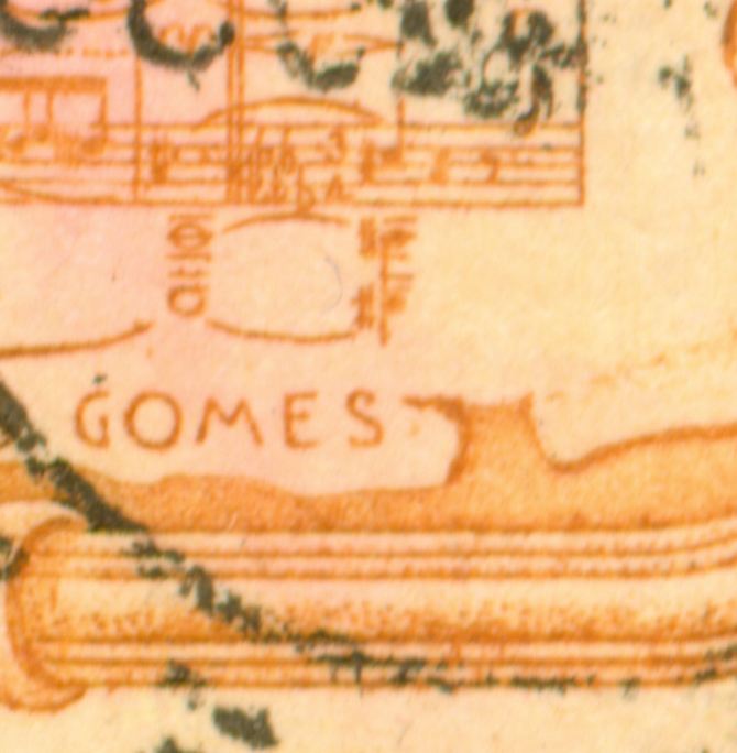
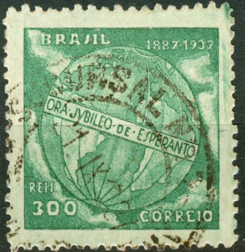
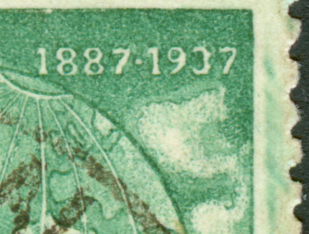
Recess by the Casa da Moeda! But line engraved? 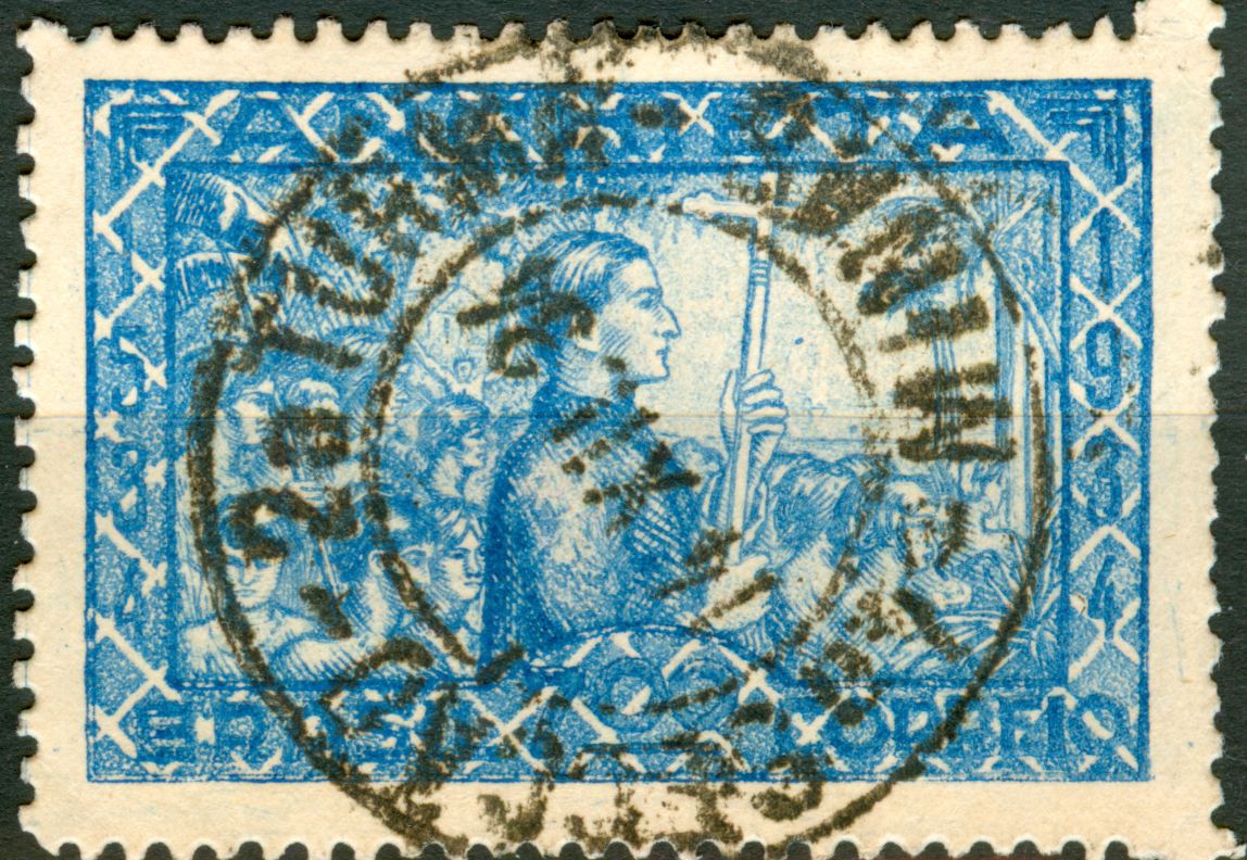 One can hardly tell what is written!  groetjes, Rein |
|
Send note to Staff
|
|
|
Rest in Peace
Netherlands
963 Posts |
|
|
Rest in Peace
Netherlands
963 Posts |
|
|
Replies: 3,972 / Views: 1,925,059 |
|