| Author |
 Replies: 3,972 / Views: 1,924,198 Replies: 3,972 / Views: 1,924,198 |
|
|
|
Pillar Of The Community
Australia
687 Posts |
|
|
Since you guys are mostly responsible for this I would like to show you the start of my album "The Engravers". As yet, I haven't printed a page - I am still undecided on whether the large scans should be in black and white rather than in the colour of the stamp, as shown here. The b/w image would tend highlight the actual stamp at the top, on the other hand this way they are colourful and attractive to me. I would appreciate you critiques. By the way I was going to start with Slania...but I don't have any of his stamps that I really like, whereas I do have some of Manley's work already on hand. thanks for looking alex [url=http://www.thegomc.com/PicHosting/share-0F23_4E3345A3.html"]  [/url] :) |
Send note to Staff 
|
|
|
Pillar Of The Community
Canada
5821 Posts |
|
|
That's a wonderful project Alex, an excellent presentation,thanks for showing them.
Would it be possible to see page by page?
Personally I would leave the large scans in colour. |
|
Send note to Staff
|
|
|
Pillar Of The Community
Canada
5821 Posts |
|
|
I believe we haven't yet shown any of the work of the Swiss engraver, Karl Bickel.Bickel was not only an engraver but also a designer who worked between 1923 and circa 1964. His son Karl Bickel junior also engraved a few Swiss stamps. This high value definitive set was originally issued in 1938, re-issued in 1942 and again re-issued in 1955. If you look close you can spot the red & blue fibers in the granite paper which is characteristic of the 1955 issue compared to the red & black fibers of the 1942 series. 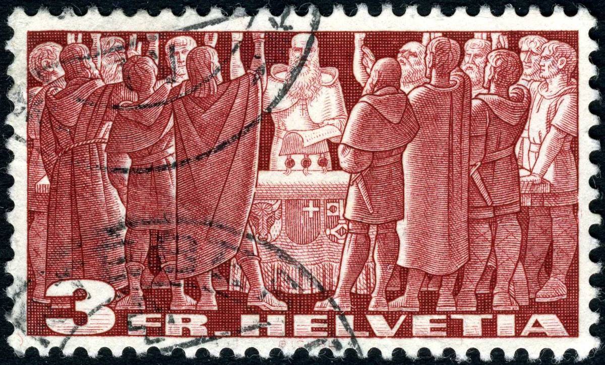 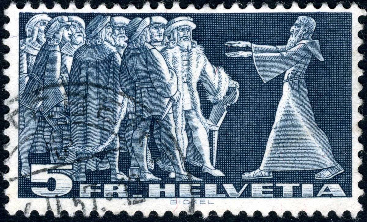 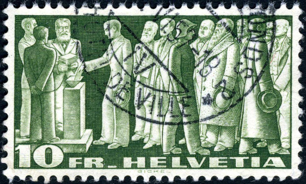 The quote below is taken from AHPS Research Resource: Essays and Proofs. High Values, 1938-
The 3, 5 and 10 Francs stamps had been current from 1914 without change in design except the
3 Francs value, which in 1931 was redesigned by E. Cardinaux. Such long currency warranted a change.
Furthermore, the Federal Printing Plant had been producing these stamps, and the Department had the
desire to take over this work and manufacture them with its modern rotary equipment. The transfer did
occur and the stamps in new design were placed on sale for the first time September 17, 1938 at the
National Philatelic Exhibition held in Aarau.
Eight artists had been invited to submit designs for this issue, but only two had the courage to
attempt the difficult task of reproducing historical motifs which the Department desired. One of these was
Karl Bickel and his essays were accepted. As usual he engraved the dies (Scott's designs A69, 70 and 71).
The stamps were printed on unwatermarked granite paper (red and black fibers). The light yellowish
tint of this paper proved to be fugitive, and under the influence of ordinary light turned to a greenish-gray.
This defect was corrected in 1942 when a similar paper but with fixed color in pale yellow was obtained.
These stamps are still current at this writing (1950).
Obviously, essays and proofs are in the archives, but none appear to have reached private
ownership.
|
|
Send note to Staff
|
| Edited by lithograving - 10/05/2019 01:13 am |
|
|
Pillar Of The Community
Canada
5821 Posts |
|
|
In 1941 Switzerland issued a low to mid value definitive set portraying historical events & persons including of course William Tell. Again all were designed & engraved by Karl Bickel. Unfortunately I'm missing the 70c. 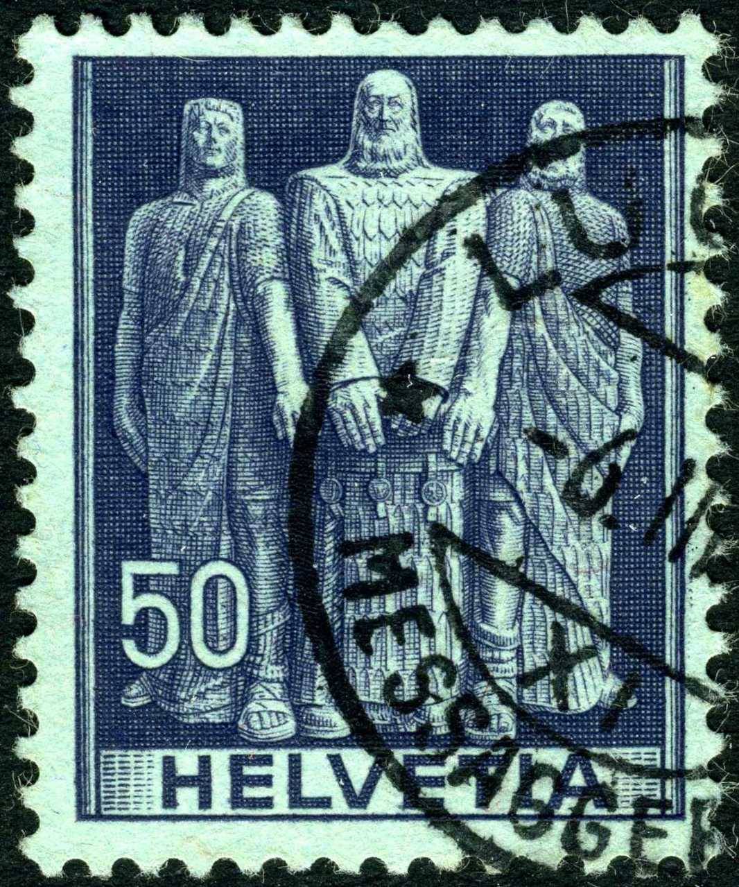 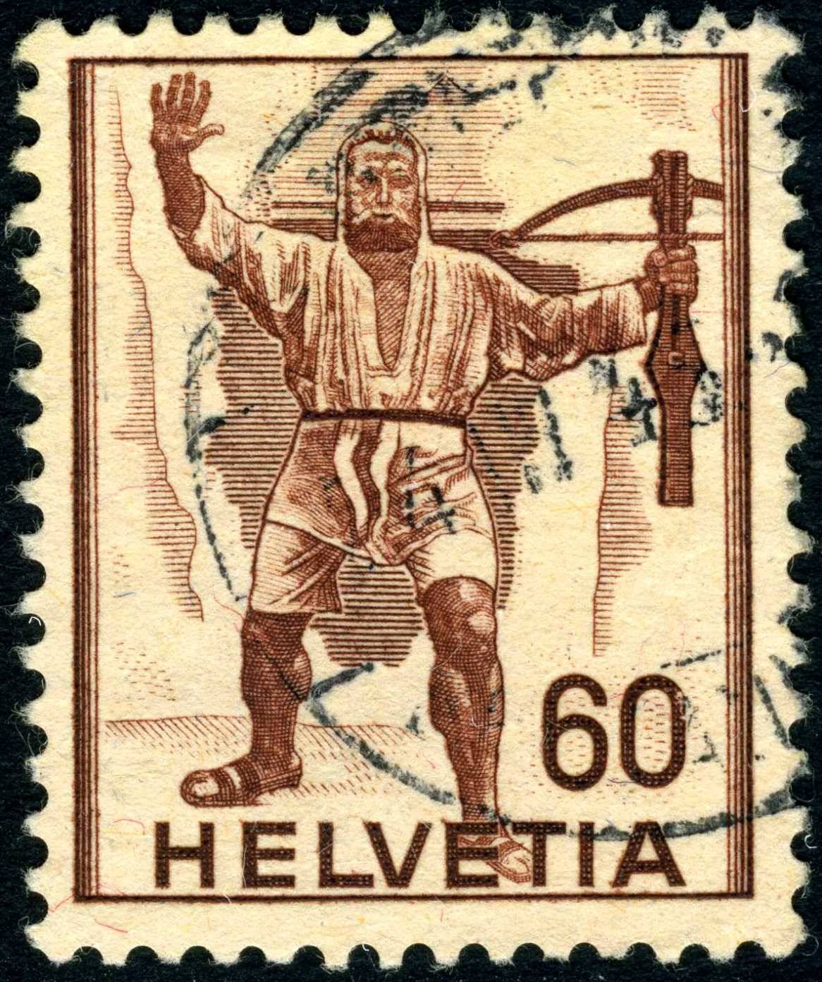 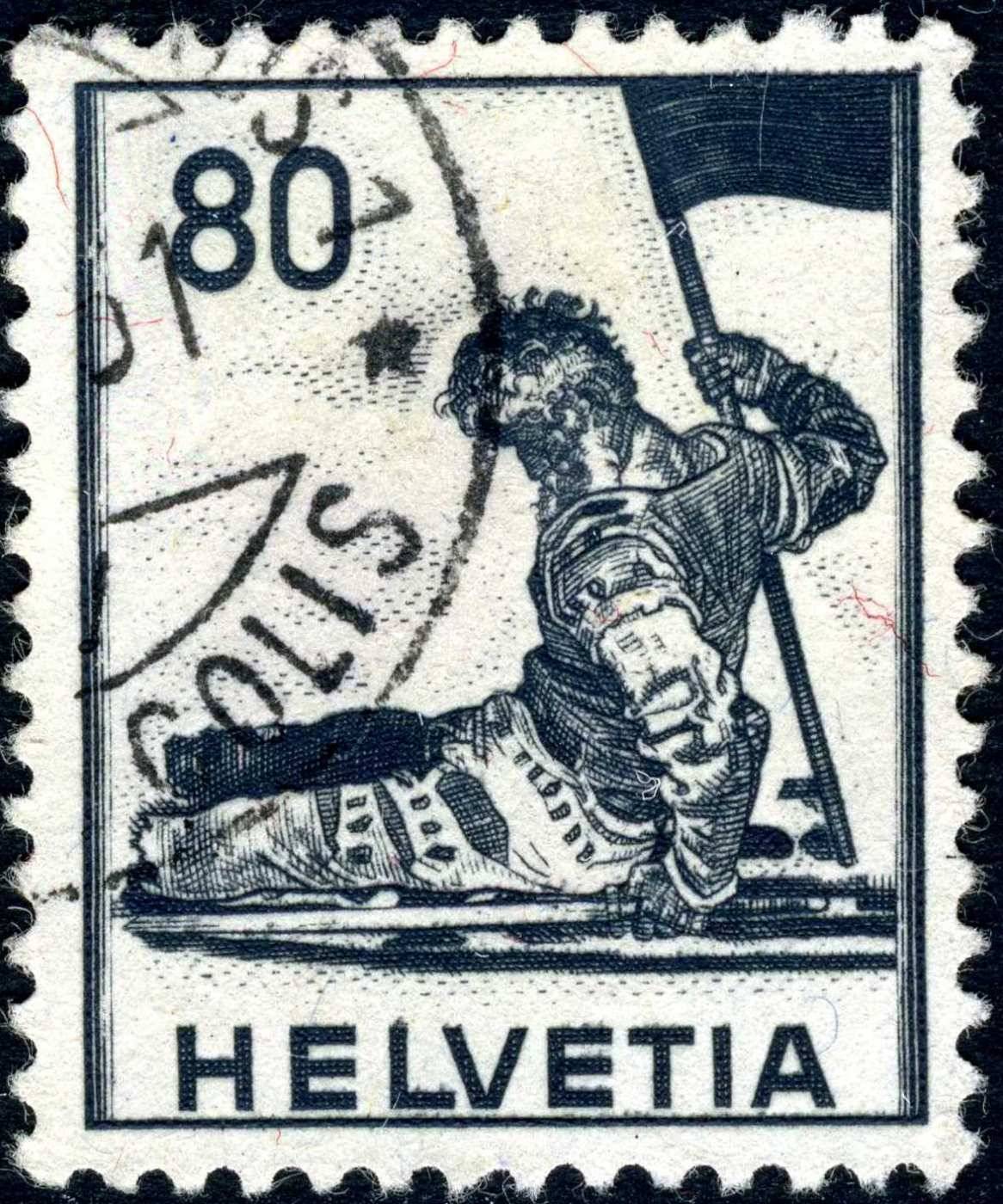 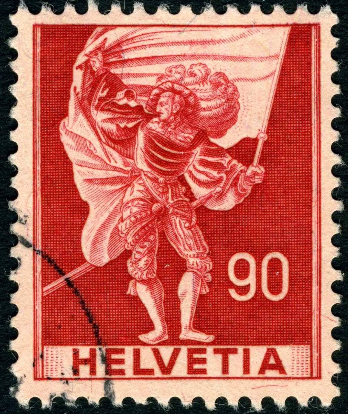 |
|
Send note to Staff
|
| Edited by lithograving - 10/05/2019 01:32 am |
|
|
Pillar Of The Community
Canada
5821 Posts |
|
|
The remaining four from which the 1 Fr is my favourite. 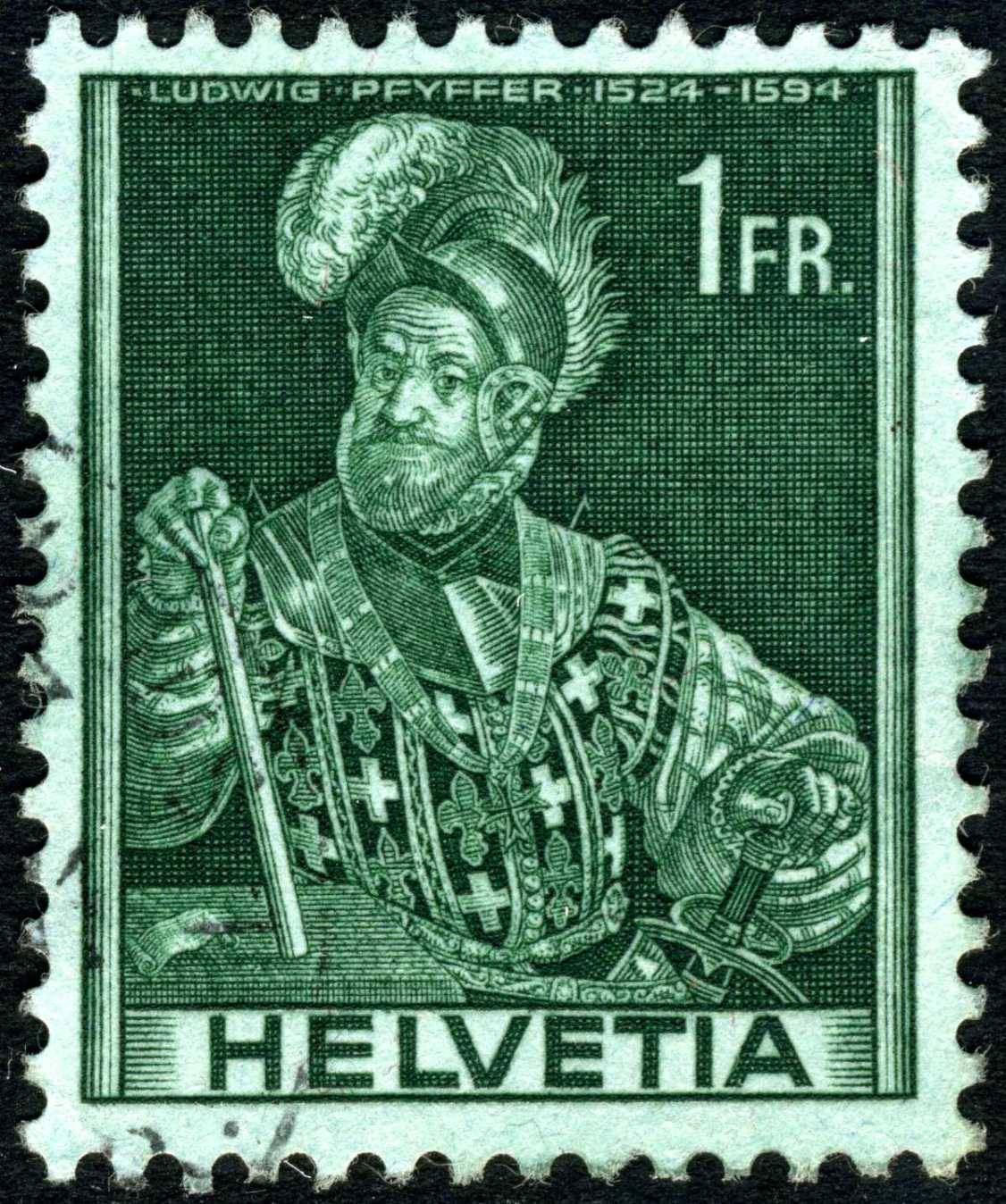 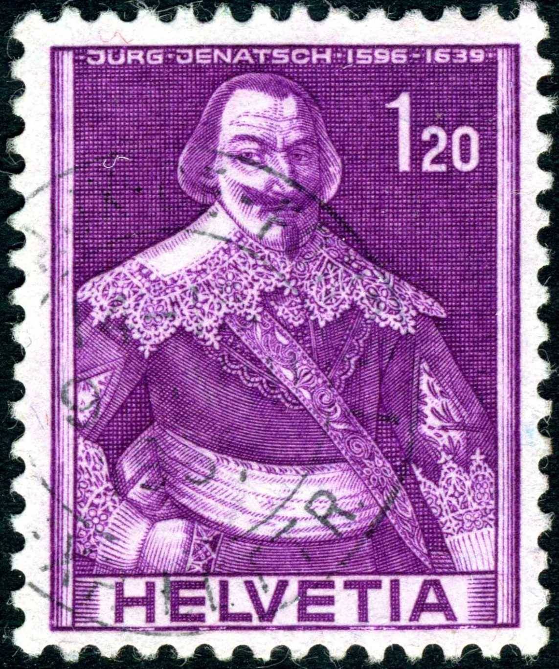 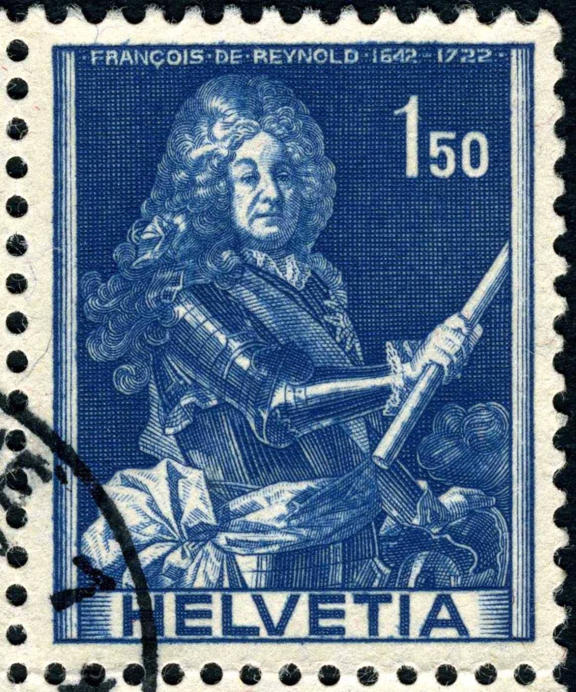 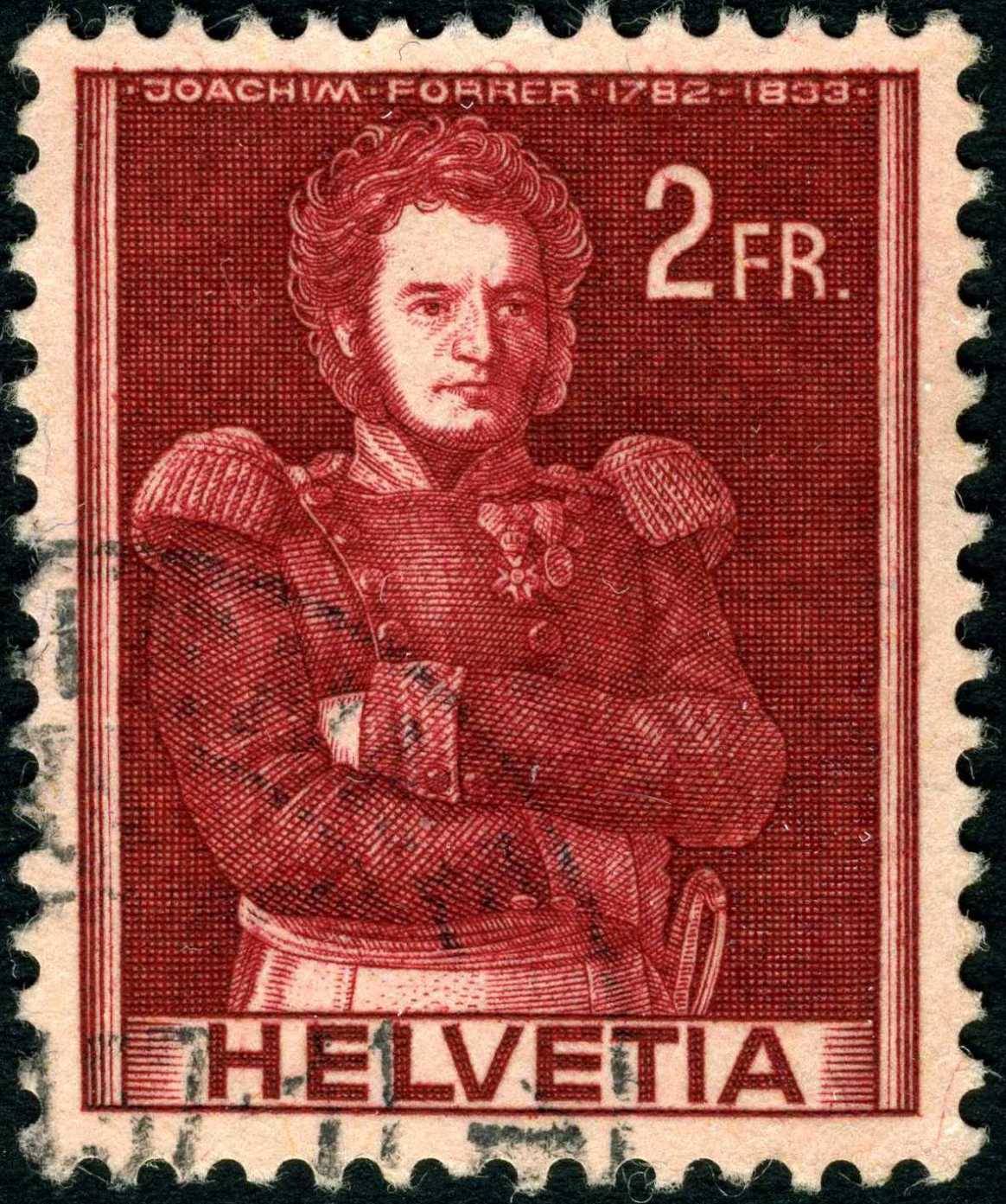 Another quote from the same journal regarding the stamp production. Historic Motifs, 1941
Pursuing its intention to manufacture all the regular issues in the Postal Printing Plant, the
Department, in 1940, took steps to add the one remaining group consisting of the denominations from 50
Centimes to 2 Francs. It was desired that these stamps carry historic motifs, and as the attempt to promote
an essay contest previously had met with failure, the Department turned over the matter of design and die
engraving direct to Karl Bickel.
With the final approval of the Bickel dies, the Postal Printing Plant proceeded with the remaining
steps, and on January 15, 1941, the new stamps (Scott's designs A77-85) were placed on sale.
These were intaglio-printed on unwatermarked, tinted, granite paper (red and blue fibers). Five
different tints were used and each of the nine values was assigned its particular tint.
With the issuing of this historic group, the manufacture of all stamps of the regular series had been
transferred to the Postal Printing Plant.
Neither essays nor proofs of this group in private ownership are known to the author. |
|
Send note to Staff
|
| Edited by lithograving - 10/05/2019 01:47 am |
|
|
Pillar Of The Community
Canada
2574 Posts |
|
|
Collecting by engraver is an amazing thread. Thank you all for keeping it alive! |
|
Send note to Staff
|
|
|
Valued Member
Spain
266 Posts |
|
|
Terrific album Perf. I'm sure it will look great in the end. More and more, I've been thinking about doing the same but I also like keeping them by country. Wonderful to have dilemmas like this. Now that you speak of Swiss stamps, I was looking at mine and noticed I have a few by Paul Boesch, and then found this site via google: http://www.swiss-stamps.org/index2.htmHas some interesting bulletins from the old days. And a few engravings from the 60s and 70s from Greece with landscapes. Can't find any photos on the web. Unfortunately in December 2010 I lost the Excel file I had used to inventory the stamps I had so for countries I have few stamps of (and no catalogues), I know longer know from which year they are unless it's mentioned on the stamp.... |
|
Send note to Staff
|
|
|
Pillar Of The Community
Canada
5821 Posts |
|
|
@ timbres667 I for one will try and keep this thread alive as long I'm alive or run out of stamps to post.  @ Andrew Thanks for the link, like you said there is lots of good info in those old bulletin. |
|
Send note to Staff
|
|
|
Pillar Of The Community
7838 Posts |
|
|
Perf14 - Nice concept. Here are a few additional thoughts, based on my experience: 1. If you are thinking of printing a large album on (photo quality?) paper, you may well find that you need MANY of those expensive color ink cartridges. 2. Also, you may find that it's difficult to get true color matches between your stamps and your printed images. 3. My conclusion is that keeping a virtual version of one's stamp collection in electronic form has a LOT of advantages over actually printing them on paper. - nethryk |
|
Send note to Staff
|
|
|
Pillar Of The Community
7838 Posts |
|
|
timbre667 - Thanks. We're committed, all right. Or, perhaps we should be committed?
lithograving - A beautiful bushel of Bickels. Thanks for posting.
- nethryk |
|
Send note to Staff
|
|
|
Pillar Of The Community
7838 Posts |
|
|
One of the giants of French stamp engraving is Charles Mazelin (1882-1964). Twice winner of the prestigious Prix de Rome, in 1906 and in 1908, Mazelin went on to design and engrave over 200 stamps for France, its colonies and ex-colonies, and other countries. Here are images of five "dark" examples of his work with various subjects and from various places. - nethryk Sainte Dévote, semi-postal stamp designed by Pierre Gandon, and issued by Monaco on January 27, 1944, Scott No. B76.  Miner, designed by Polish illustrator Stefan Zechowski (1912-1984), and issued by Poland on August 20, 1947, Scott No. 416.  Victory of Cythera, semi-postal stamp designed by Mazelin, and issued for use in Algeria on December 18, 1953, Scott No. B70.  Medieval town and leper, designed by Mazelin, and issued by Monaco on June 3, 1961 to honor the Knights of Malta, Scott No. 481.  Abbaye St. Pierre, Moissac, designed by French artist André Spitz (1883-1977), and issued by France on June 15, 1963, Scott No. 1072, Y&T No. 1394.  |
|
Send note to Staff
|
| Edited by nethryk - 07/31/2011 12:21 pm |
|
|
Pillar Of The Community
Canada
5821 Posts |
|
|
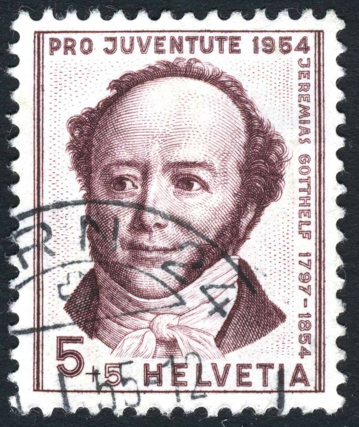
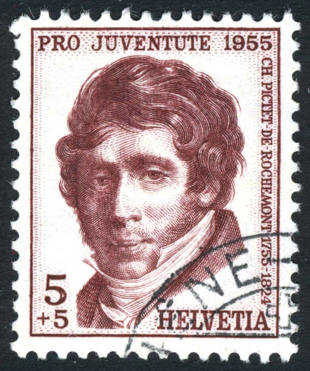
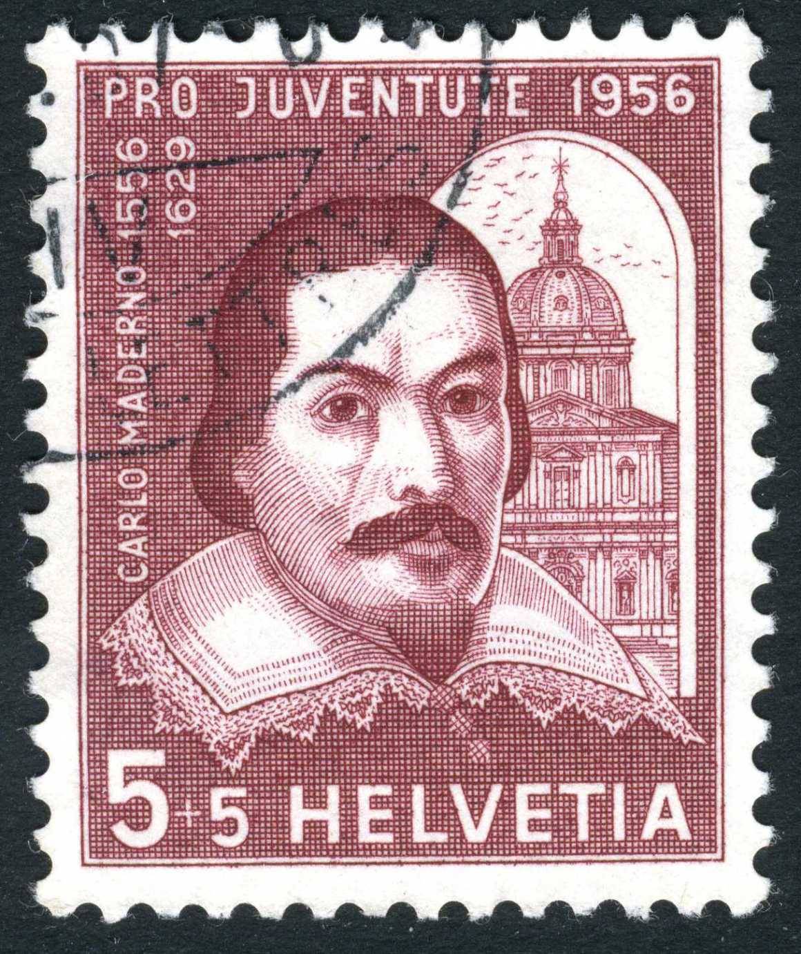
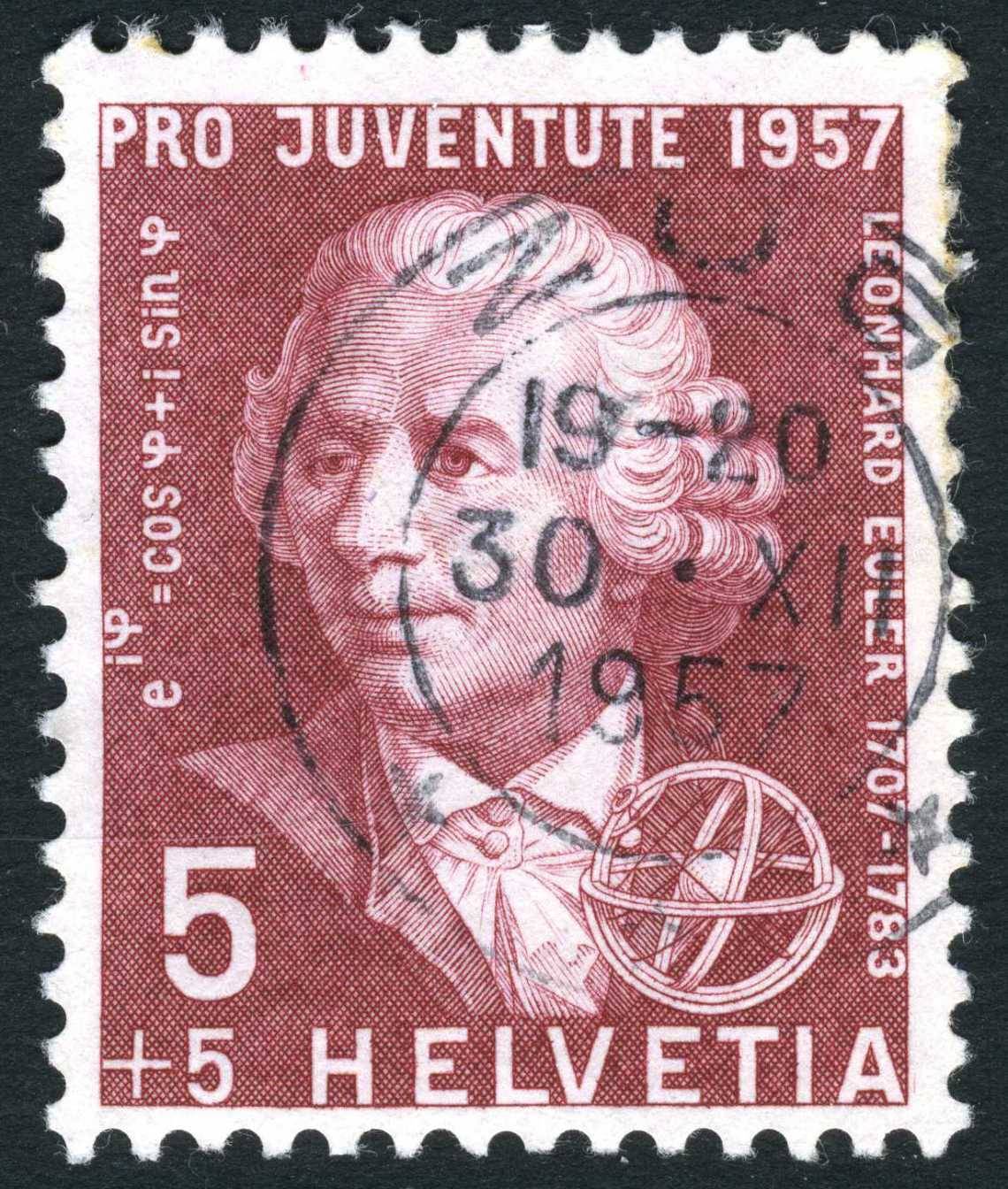
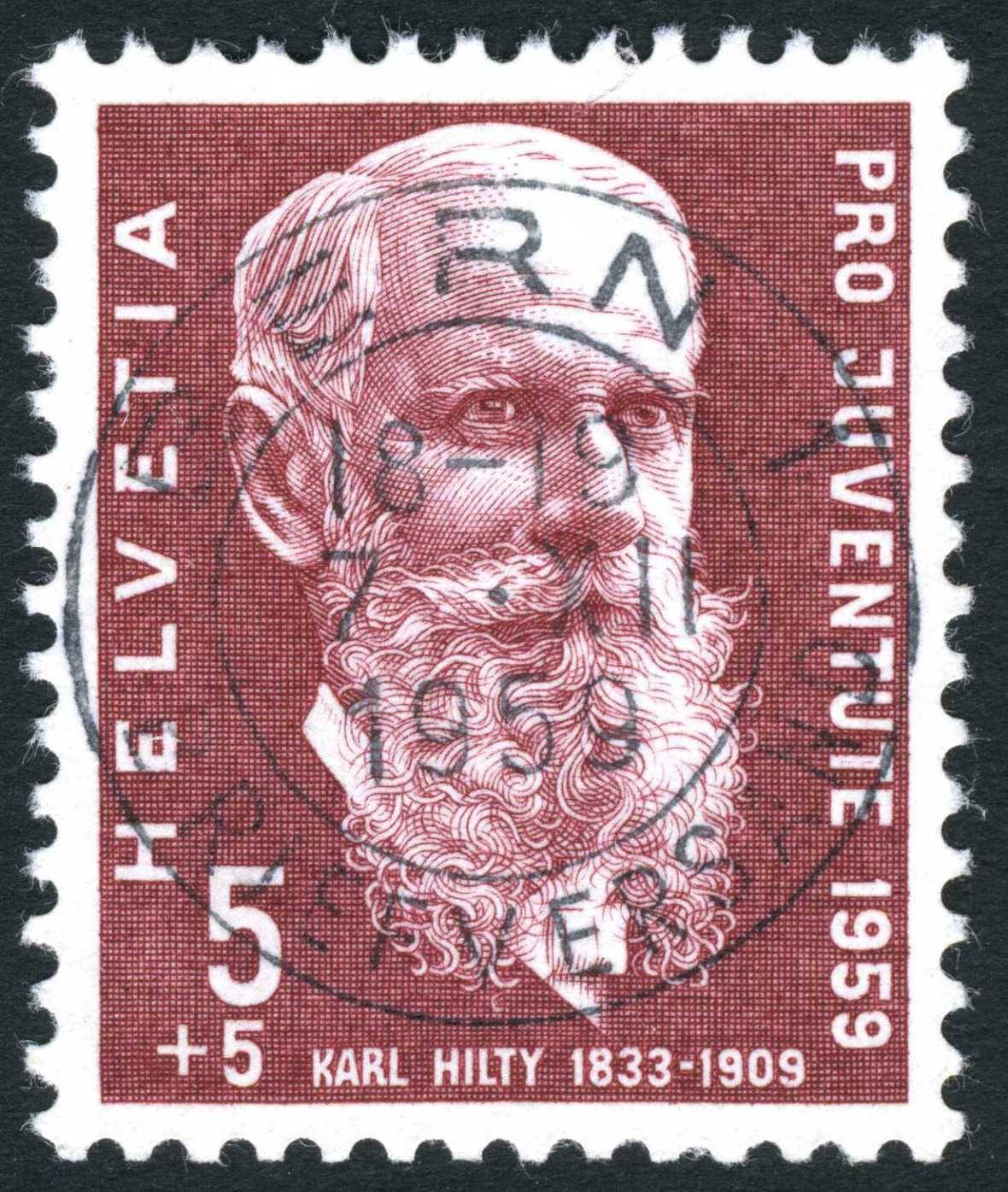
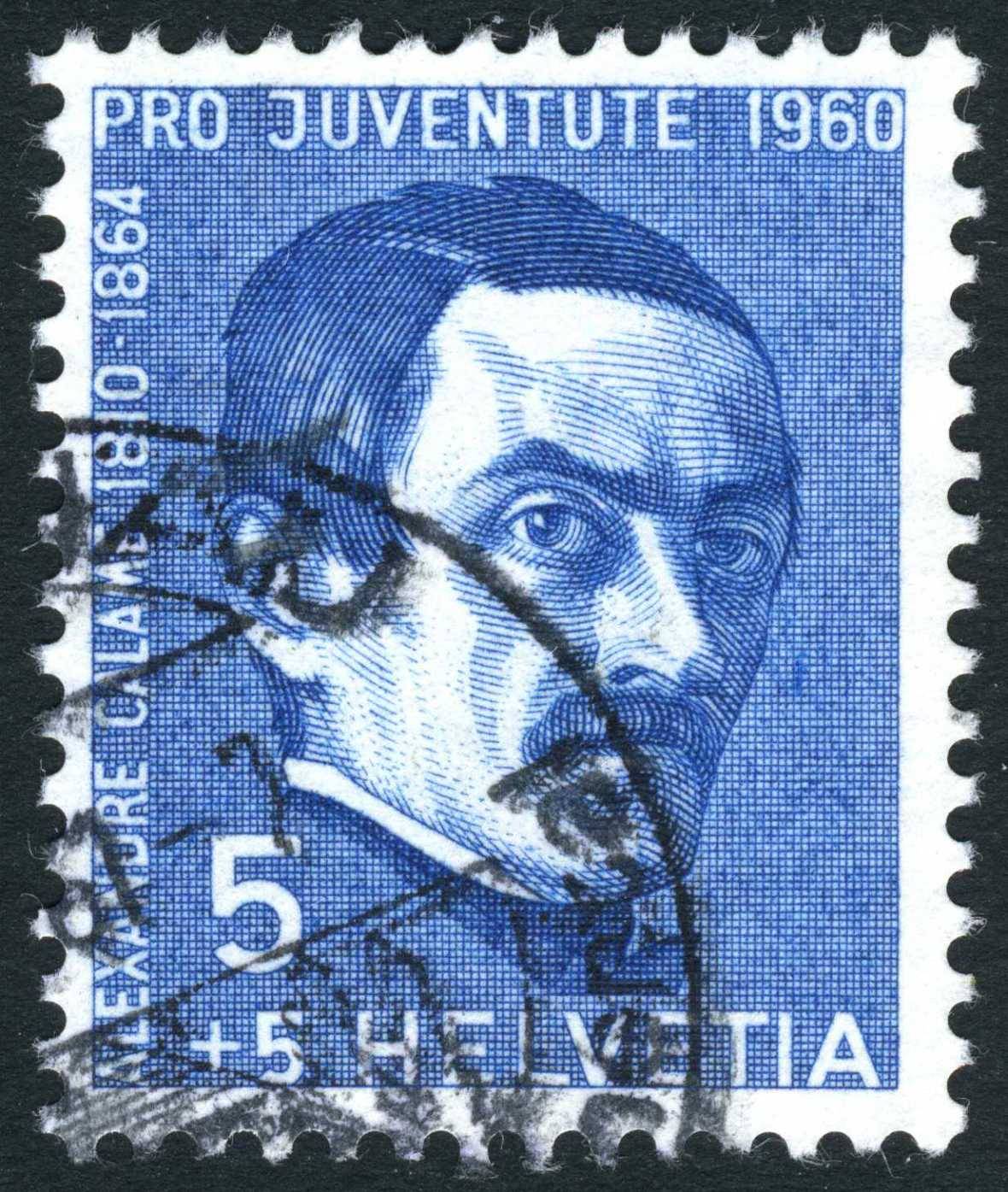
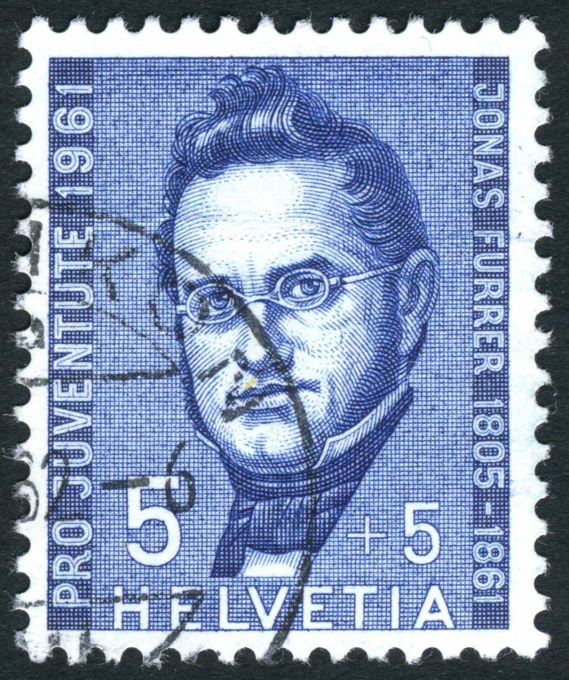
I really like those "dark" images, especially the Polish miner. What other colour would be more fitting for that subject than black engraving? Here are some examples of Karl Bickel's work for the annual Pro Juventute stamp series. Usually only one value was engraved showing notable Swiss personalities and the other values were printed either typography and from 1931 on by way of photogravure. Quote from Wikipedia Pro Juventute is a charitable foundation in Switzerland established in 1912.
It is dedicated to supporting the rights and needs of Swiss children and youth.
Since 1913, the Swiss post office has issued an annual charity stamp series to
support the work of Pro Juventute.
Karl Bickel was the designer & engraver. The first two were printed by Orell Füssli and the others by PTT Stamp Printing Works, Berne. 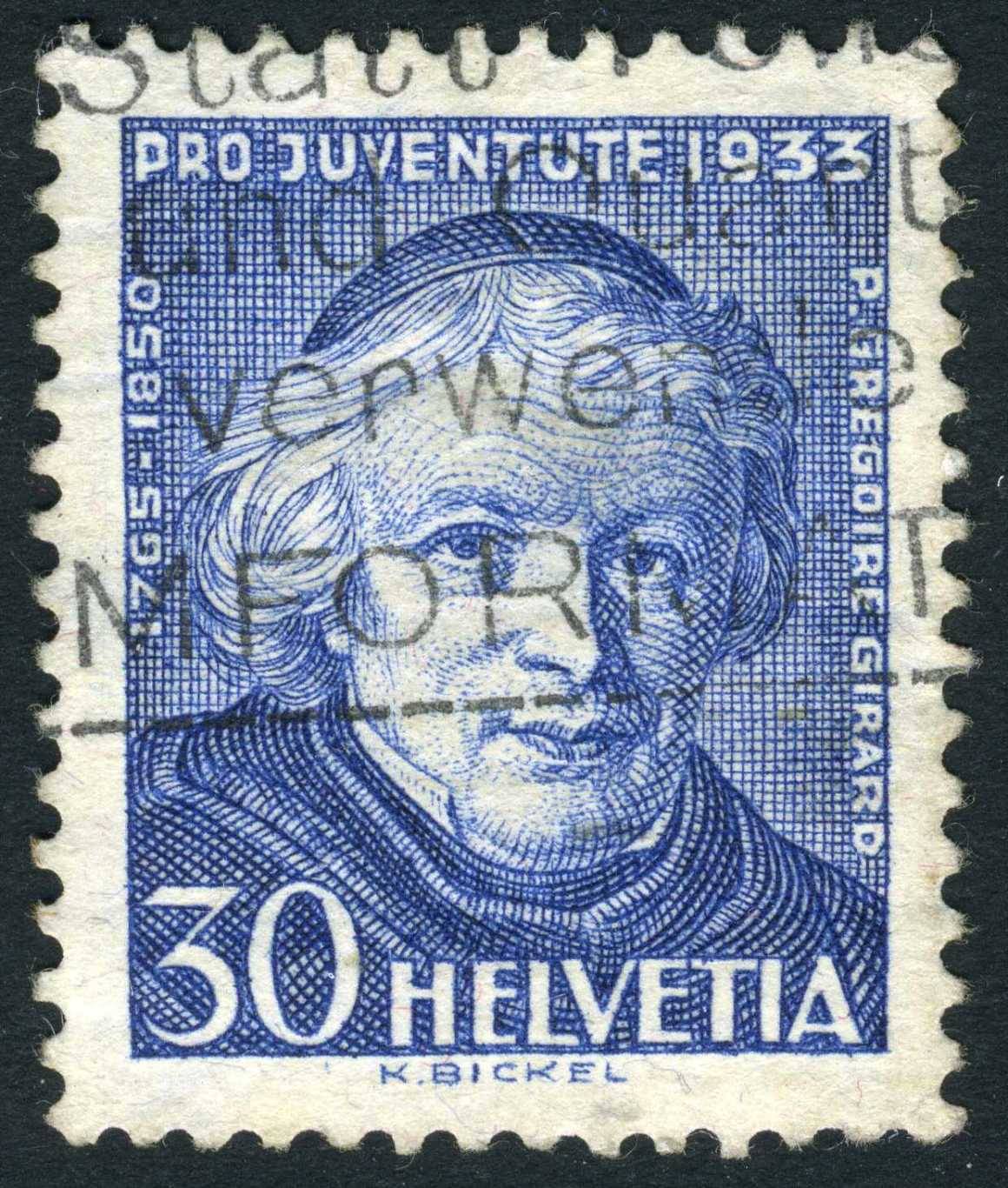 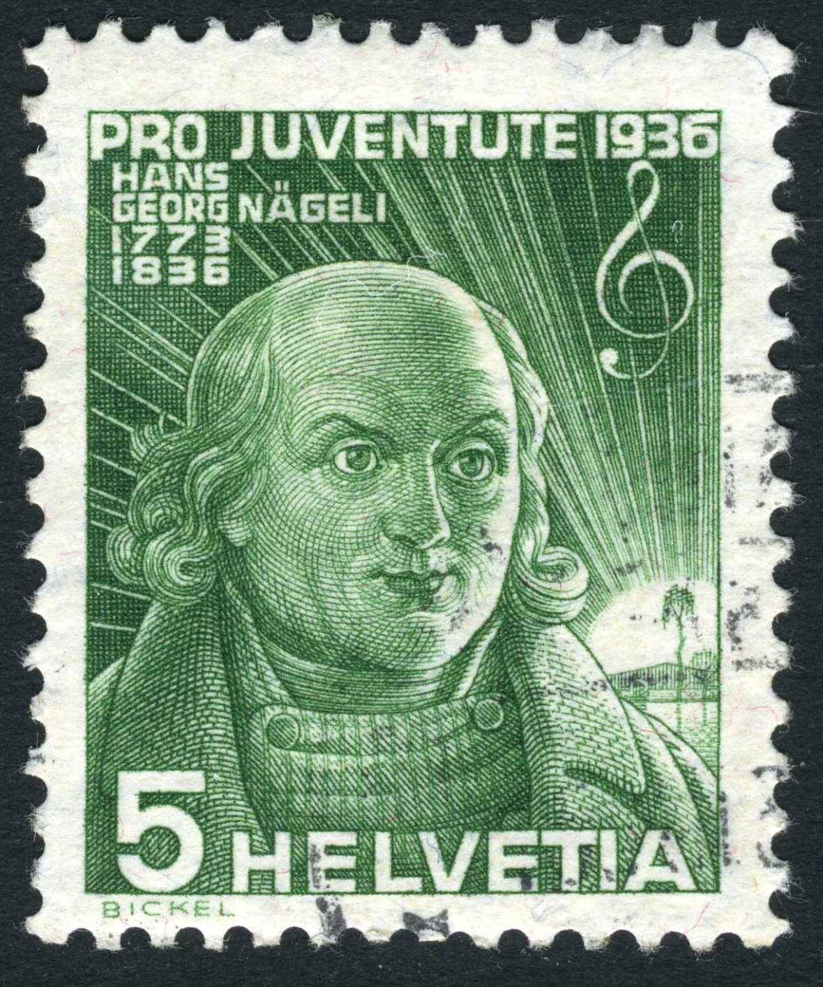 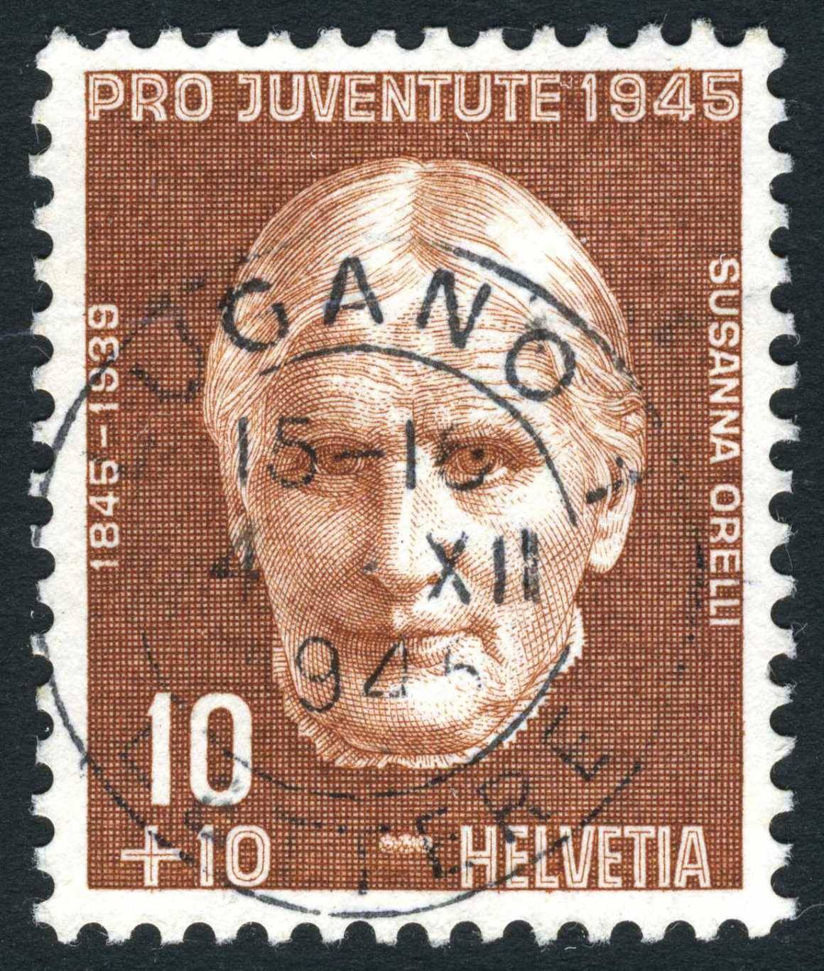 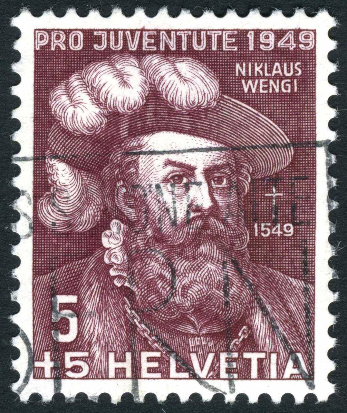 |
|
Send note to Staff
|
| Edited by lithograving - 10/05/2019 02:01 am |
|
|
Pillar Of The Community
Canada
5821 Posts |
|
|
Pillar Of The Community
Canada
5821 Posts |
|
|
Pillar Of The Community
Australia
687 Posts |
|
|
Quote:
Perf14 - Nice concept. Here are a few additional thoughts, based on my experience: 1. If you are thinking of printing a large album on (photo quality?) paper, you may well find that you need MANY of those expensive color ink cartridges. 2. Also, you may find that it's difficult to get true color matches between your stamps and your printed images. 3. My conclusion is that keeping a virtual version of one's stamp collection in electronic form has a LOT of advantages over actually printing them on paper. - nethryk All of your points are extremely valid and I will need to think carefully before I move in any direction. The ink costs had me worried also (I much prefer to spend that money on stamps). On the other hand it is nice to actually hold the physical thing in your hand and/or to leaf through the pages of an album. Another possibility is to burn the album onto a DVD or a USB stick and have it playing on one of those large digital photo-frames...like the eBook version of a stamp album...  Thank you, I appreciate your input  alex |
|
Send note to Staff
|
|
|
Replies: 3,972 / Views: 1,924,198 |
|