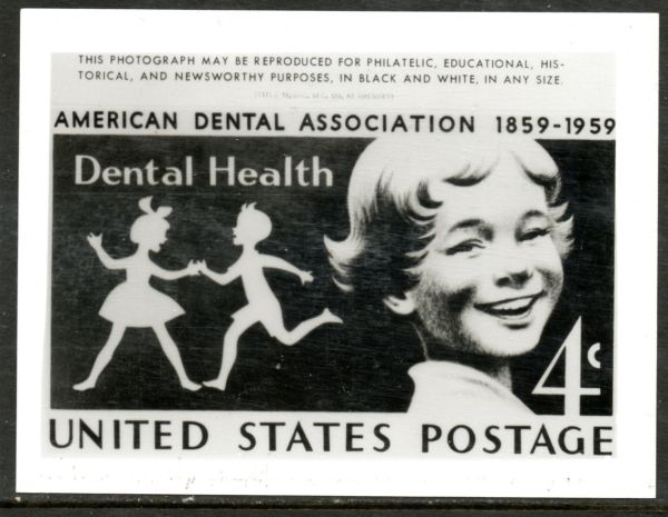
It seems to me as if they were simply "draft" images that were prepared by the stamp designer for consideration and final approval.
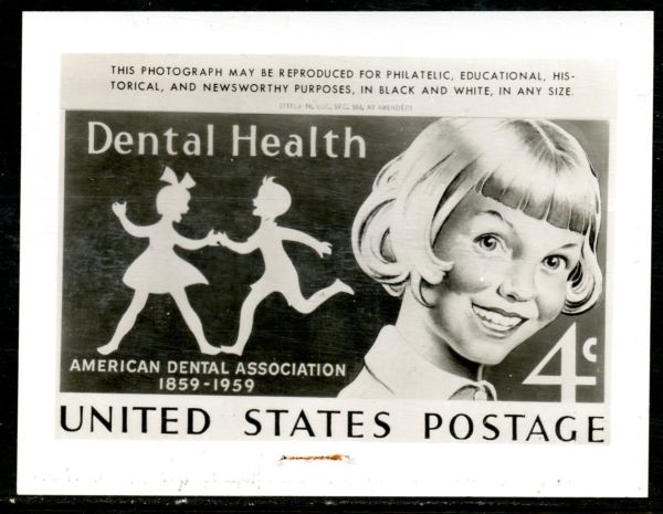
Obviously the second design was taken out of consideration early on. However, even the first image, which is pretty much similar to the actual stamp issued, has subtle differences from the actual stamp that went to print as shown here:

There may be other things to look at, but here are the subtle differences I see in the publicity photo versus the actual stamp:
Quote:
1. Difference in words "Dental Health" and spacing between the letters and the top of the silhouettes heads.
2. Main character's eyes are wider opened on actual stamp.
3. Lock of hair at right side of image is more curled up on actual stamp.
4. More detail shown in bottom of lip/mouth and exposure of lower teeth.
5. Extra line of shading used in collar of shirt.
6. In bottom text "UNITED STATES POSTAGE", the "E" uses longer horizontal lines and the words are slightly less bold. Also noticeable is in the word "STATES" where the shape of the "S" is different as is the letters "TAT".
7. Shading on left side of face is different; more pronounced on actual stamp and higher up toward back of cheek.
Actually, image "proposals" such as shown above are very often used in evaluating a stamp before final printing is authorized, although today it is done much more easily through electronic means than it would have back in 1959 when that Dental Health issue went to press.