Don't know if this helps, but there is a variety of Scott #1363 (known as #1363c) wherein the light yellow color is omitted. Apparently this is not applicable to your example, as there is some yellow color shown, but just know that some varieties do exist.
As mentioned previously, there are also tagged and untagged varieties that could account for some differences in appearance.
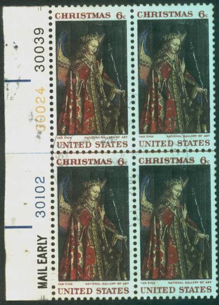
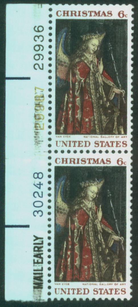
Also, these stamps were printed on the Huck Press and there are known to be a few "mis-registrations" in the printing of the lettering below the design, but again, I don't think this applies to your examples either.
My best guess is to chalk it up to poor inking. Of course, I'm no expert, but I don't think there is a significant enough departure from the normal printing to expect that it would have a premium value because of these irregularities, but they are certainly collectible as an oddity.
Of course, I'd be interested to hear the opinions of others.
P.S. Just went to my stockbook and took five examples of this stamp and highlighted the subtle changes that often occur with this issue, none of which are considered a variety:
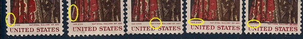
Stamp #1: Red Color starts too far left of design;
Stamp #2: Red Color starts too far right of design;
Stamp #3: Word "NATIONAL" is not completely inked in red;
Stamp #4: "VAN EYCK" in normal position;
Stamp #5: "VAN EYCK" in raised position.