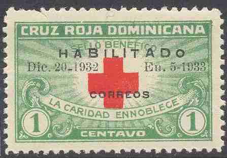
I can`t see any variety (maybe only nr. 8, where the 2 is missing from 1932), the distance between the rows seems regular... but there might be something I don`t see...and maybe nr. 5, where the upper row (HABILITADO) is misaligned (?). In Yvert&T. found nothing about varieties...nr. 4, now I see, only the dot in `Dic.`, the I is missing.
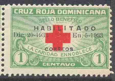
I see in 5 and 9 some of the letters in HABILITADO are odd sizes. B and D larger, O smaller - the O was an optical illustion. In 5 and 9 HABILITADO has shifted to the left, in 8 it has shifted to the right. In 10 the hyphen between 5 and 1933 is more of a dot. I expect we're getting into flyspecking territory here.
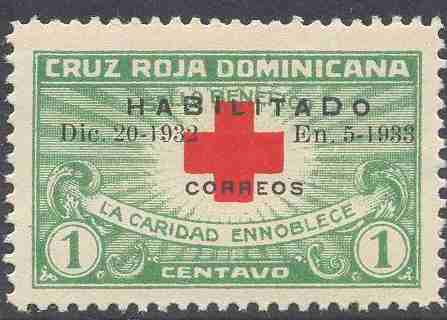
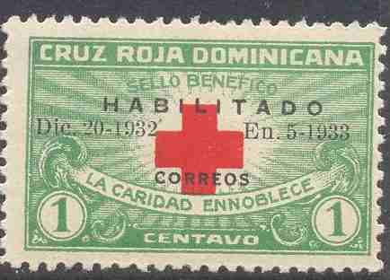
Also in 7 and 8, the second A is larger. The A of 7 has a pointed top while the large A in 8 is a flat top, like all the other A's. In 7 the first I and the T are larger as well. In 8 the second I is larger.
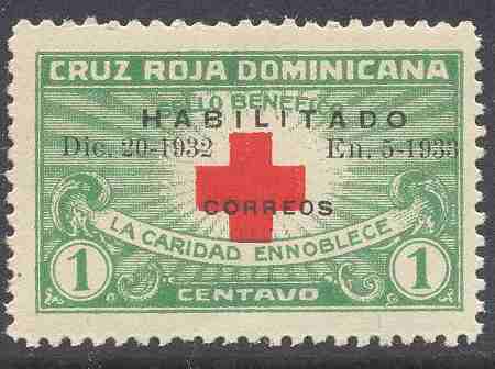
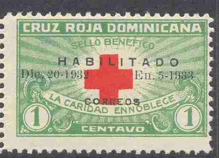
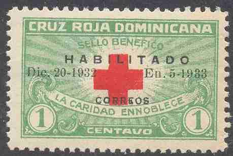
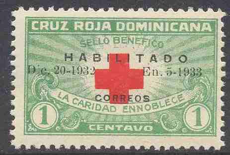
#2 has a smaller 2 at the end on 1932. The hyphen between date & year is shorter or broken. Right shift of Habilitado of center. #3 all I see is the broken or dirty 'e' in Correos. Right shift of Habilitado of center.
#4 a broken 'i' in the month missing the base of the 'i'. Right shift of Habilitado of center.
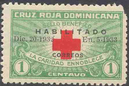
#5 The large 'B' & 'D' in Habilitado. Different font!
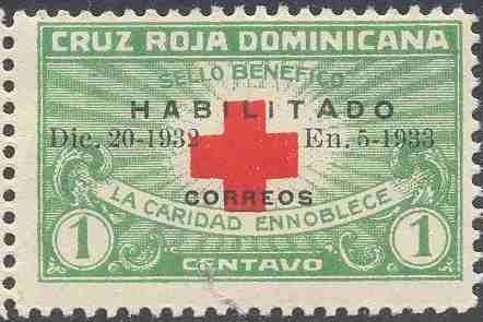
#6 no change noted, but there is an ink floater/spot above the '2'. Right shift of Habilitado off center.
#7 Another font error/variation most notable on the 2nd'A' of Habilitado.
#8 Same as 7, but the '2' in 1932 appears to be missing. Right shift of Habilitado off center.
#9 More font issues 'B' 2nd 'I' & 'D' also the hyphen after '20' is low.
#10 The hyphen between 5 & 1933 is broken or is a point. with ink floater/spot above the '2'.
Well done to Wadmalatz, jamesw and warrehouse. You also pointed out some that I'd missed. Thanks for that! I'll check out the others for more of these varieties.
Still missing the variety I found in #6. It is in the black overprint.
Thanks warrehouse for this comment. I hadn't noticed the smaller 2. I went back and looked through them again only to find a couple of misaligned 3s on one of the stamps.
By the way, the missing 2 from #8 is there in the actual stamp, but does not appear on the scan. Interesting.
The difference in #6 is that CORREOS is shorter. It stretches from the end of the 2 of 1932 to the start of the 'E'. In all the others, the CORREOS either overlaps the 2 or the E. Pasted below are the CORREOS prints from #1 and #6 for comparison. Also, note the differences in the shapes of the Rs.
Disclaimer: While a tremendous amount of effort goes into ensuring the accuracy of the information contained in this site, Stamp Community assumes no liability for errors. Copyright 2005 - 2026 Stamp Community Family - All rights reserved worldwide. Use of any images or content on this website without prior written permission of Stamp Community or the original lender is strictly prohibited. Privacy Policy / Terms of UseAdvertise Here