| Author |
 Replies: 37 / Views: 4,030 Replies: 37 / Views: 4,030 |
|
Pillar Of The Community
United States
6433 Posts |
|
|
For some of the varieties I list, I'm thinking of starting to use the animated GIF format to highlight the variety points. The downside is that GIF has a limited color palette compared to JPG (only 255 possible colors compared to millions with JPG). That means that on some pics, especially those with a wide variety of colors, it may do some wonky things to the color accuracy. The upside is that I can do things like you see below. This is a T13a double transfer that I found at last weekend's show. What do you think of the presentation/timing? 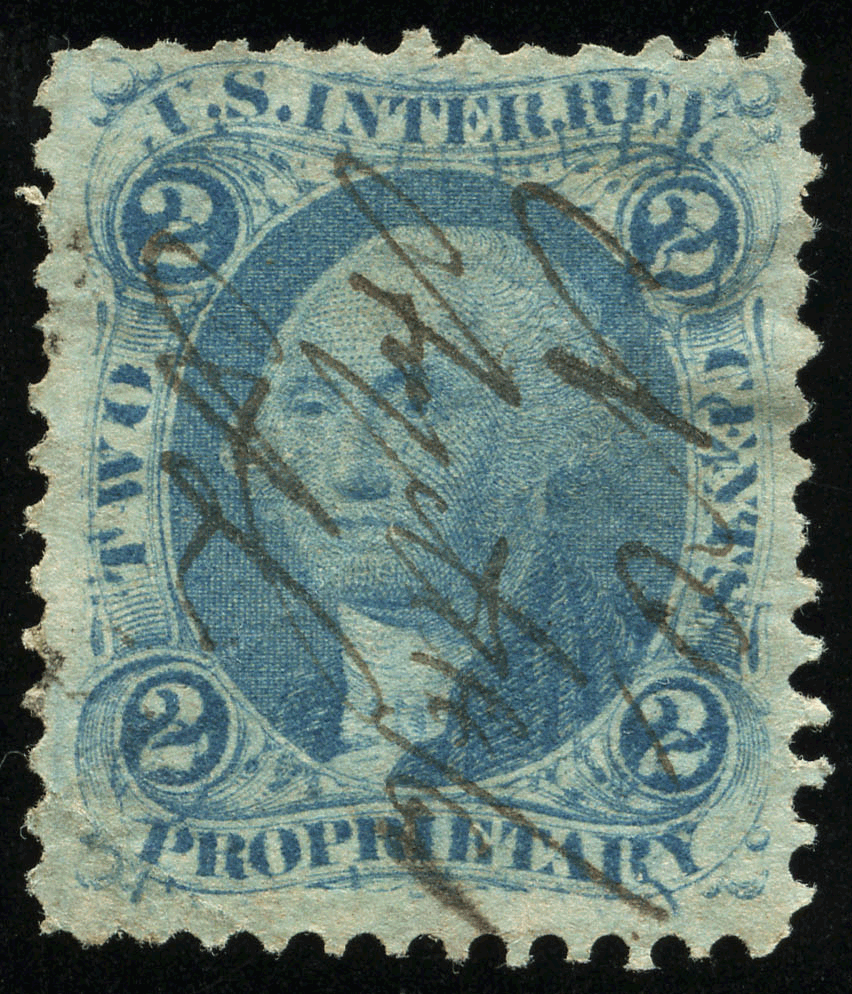 |
|
Send note to Staff
|
|
|
|
|
|
Pillar Of The Community
United States
2948 Posts |
|
|
Quote:
The upside is that I can do things like you see below.
Err, umm. What did you do? The only argument I have against using gif files, is that I often save images for my digital library ... esp for references on colors and shades. |
Send note to Staff 
|
|
|
Pillar Of The Community
United States
2547 Posts |
|
|
Rest in Peace
United States
1225 Posts |
|
|
revenuecollector,
The only down side I see is the amount of time it took to download.
Isn't the file size larger as well?
Art |
|
Send note to Staff
|
A well regulated Militia, being necessary to the security of a free State, the right of the people to keep and bear Arms, shall not be infringed. (The exact & entire wording of the 2nd Amendment to the U.S. Constitution) |
|
|
Pillar Of The Community
United States
6433 Posts |
|
|
Pillar Of The Community
United States
866 Posts |
|
|
Revenue,
The image I see looks super crisp with great coloring. I saw the stamp instantly and love the red flashing arrows. Very nice!
Aimee |
|
Send note to Staff
|
|
|
Pillar Of The Community
United States
6433 Posts |
|
|
I've since tweaked it and made a version that's a little bit easier to watch and is also about half the file size:  |
|
Send note to Staff
|
|
|
|
Pillar Of The Community
United States
6433 Posts |
|
|
Valued Member
United States
427 Posts |
|
|
Me dialup, me see nothing
Maybe wait 5 minutes, maybe then see something
Edit: now me see -- Arrows good |
|
Send note to Staff
|
| Edited by butterfly - 10/30/2011 8:24 pm |
|
|
Pillar Of The Community
United States
866 Posts |
|
|
I still like the arrows. The second set is easier on the eyes than that first set of bright red ones.
The bars of color that fade in and out distort the image for a second or two. |
|
Send note to Staff
|
|
|
Pillar Of The Community
United States
866 Posts |
|
|
I still like the arrows. The second set is easier on the eyes than that first set of bright red ones.
The bars of color that fade in and out distort the image for a second or two. |
|
Send note to Staff
|
|
|
Pillar Of The Community
United States
2941 Posts |
|
|
If you're displaying the photos on your own site (or someone else's that allows Javascript or CSS styling), you could try a rollover. It gives the user more control over the highlights. It requires 2 images instead of 1, but they can be any format. The sample is 2 jpegs, with a combined size of about 211KB (as compared to your second arrow version which is 617KB). I didn't use a Javascript image pre-load, but you could add that as well to speed up the images. |
|
Send note to Staff
|
|
| Edited by PostmasterGS - 10/30/2011 9:34 pm |
|
|
Pillar Of The Community
United States
1721 Posts |
|
|
I think a GIF image should be fine. Unless you are showing minor color differences like the Violet shades. I would use the one with the duller arrows, the bright red is to hard on the eyes and might fatigue the viewer. The bars look lousy and they do not highlight the points only the area. They would also have to be adjusted for the color of each stamp to be effective. I am in favor of PMGS's idea of a rollover. This would allow the user to view the arrows as long as they wanted them.
If you wanted to get real crazy you could also redraw over the area's to be hilighted and do a rollover for them.
My 2 cents for what it's worth. |
|
Send note to Staff
|
| Edited by revstampman - 10/30/2011 11:11 pm |
|
|
Pillar Of The Community
United States
1518 Posts |
|
|
Nice! I like the arrows in a more dull color too. The other version is harder to see what you are pointing at. |
|
Send note to Staff
|
|
|
Pillar Of The Community
United States
6433 Posts |
|
|
Quote:
If you're displaying the photos on your own site (or someone else's that allows Javascript or CSS styling), you could try a rollover. It gives the user more control over the highlights. I toyed with that idea, as it is the best alternative... for my own website. But in terms of portability and being self-contained (for posting on boards like this one or to give to someone), the rollover solution doesn't work as well. I'm still soliciting opinions on a number of different fronts, seeing what people like and dislike. I figured it would be better to get input BEFORE I had a boatload of time invested in creating a revenue variety page rather than after... |
|
Send note to Staff
|
|
|
|
Pillar Of The Community
United States
2948 Posts |
|
|
My original question was completely serious. It's frustrating when I have to wait days and have to read other's comments in order to glean information.
First, I'll answer my own question: What did you do? You added red arrows.
Now, I'll give a response.
I cannot see the red arrows. I'm colorblind.
Perhaps another color would be better? Red does not contrast well with much of anything for me, and the same goes for other people with red/green color blindness. Red blends in with most everything. |
|
Send note to Staff
|
|
|
Replies: 37 / Views: 4,030 |
|