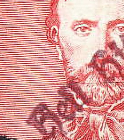
Either some ink seems to have run between the dot and the rest of the 'i' or the dark area is an illusion created by the darker lines in that area on the background stamp.
I've come up against this problem time and time again with postmarks, i.e., I can't read the postmark clearly because the appearance of a letter or number is affected by the appearance of the background stamp.
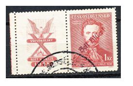
Thanks everybody for your comments. It does look more like hell then heil but then again I do not think "they" would have stamped it hell. After all it was in 1938. I put them in my special album.
fifia - It looks very much like a "Heil Hitler" Sudeten "Liberation" provisional cancel to me. See: http://sudeten.bizland.com/sudetenland9.htm for an explanation and for more examples. - nethryk
Disclaimer: While a tremendous amount of effort goes into ensuring the accuracy of the information contained in this site, Stamp Community assumes no liability for errors. Copyright 2005 - 2026 Stamp Community Family - All rights reserved worldwide. Use of any images or content on this website without prior written permission of Stamp Community or the original lender is strictly prohibited. Privacy Policy / Terms of UseAdvertise Here